1. 플렉스 박스 레이아웃
2. 변형 함수
1. 플렉스 박스(Flex Box)
플렉서블 박스 레이아웃(flexible box layout)은 각 박스를 원하는 위치에 따라 배치하는 것으로, 요소가 정렬되는 방향, 순서, 각 요소 간의 간격을 직접 수치로 지정하지 않아도 알아서 처리해주는 스타일이다. = 플렉스 박스
1.1. 플렉스 박스 용어
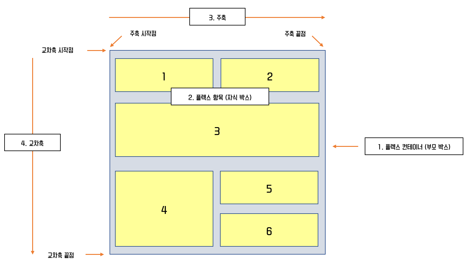
- Flexbox 구성도
1. flex-container : 정렬이 필요한 요소를 감싸는 부모요소
2. item(자식 박스) : 정렬이 적용되는 자식요소
3. 주축(중심축) : 가로
4. 교차축 : 세로
=> flex 박스는 flex-container와 item에 사용되는 스타일 속성이 나누어져 있다.
1.2. 플렉스 박스 항목을 배치하는 속성
(1) 플렉스 컨테이너 지정 (display 속성)
플렉스 박스 레아이웃을 만들기 위해선 먼저 플렉스 컨테이너(부모 요소)를 플렉스 컨테이너로 만들어야 한다.
.flex-container {
    display: flex;
}
(2) 플렉스 방향 지정 (flex-direction 속성)
플렉스 컨테이너 안에서 주축(중심축) 방향과 시작위치를 지정하는 속성
- flex-direction: 속성값;
| 종류 | 설명 |
|---|---|
| row | 주축을 가로로 지정(왼쪽 -> 오른쪽 / 기본값) |
| column | 주축을 세로로 지정(위쪽 -> 아래쪽) |
| row-reverse | row와 동일(오른쪽 ->왼쪽) |
| column-reverse | column과 동일(아래쪽 -> 위쪽) |
.flex-container {
    flex-direction: row;
    flex-direction: row-reverse;
    flex-direction: column;
    flex-direction: column-reverse;
}
(3) 플렉스 항목의 줄 바꿈 (flex-wrap 속성)
item(자식 박스)들을 한줄로 배치할지 여러 줄로 배치할지 지정
- flex-wrap: 속성값;
| 종류 | 설명 |
|---|---|
| nowrap | 아이템을 한 줄로 배치(기본값) |
| wrap | 아이템을 여러 줄로 배치 |
| wrap-reverse | 아이템을 여러 줄로 뒤에서부터 배치 |
.flex-container {
	flex-wrap : nowrap;
    flex-wrap : wrap;
    flex-wrap : wrap-reverse;
}
(4) 플렉스 방향과 줄 바꿈을 한 번에 지정 (flex-flow 속성)
flex-direction 속성과 flex-wrap 속성을 한꺼번에 지정
- flex-flow : flex-directino의 속성값 flex-wrap의 속성값
.flex-container {
	flex-flow : row wrap;
    flex-flow : column-reverse nowrap;
    ...
}
(5) 주축 정렬 방법을 지정 (justify-content 속성)
item 항목의 주축 정렬 방법 (justify-content)
- justify-content: 속성값;
| 종류 | 설명 |
|---|---|
| flex-start | 중심축의 시작점에 맞춰 배치 |
| flex-end | 중심축의 끝점에 맞춰 배치 |
| center | 중심축의 중앙에 맞춰 배치 |
| space-between | 첫 항목과 끝 항목을 주축의 시작점과 끝점에 배치 후 나머지 항목은 그 사이 같은 간격으로 배치 |
| space-around | 모든 항목을 주축에 같은 간격으로 배치 |
| space-evenly | around와 동일하나 모든 공간이 동일한 크기 |
.flex-container {
	justify-content: flex-start; /* 기본값 */
	justify-content: flex-end;
	justify-content: center;
	justify-content: space-between;
	justify-content: space-around;
	justify-content: space-evenly;
}
item 항목의 교차축 정렬 방법 (align-items)
- align-items: 속성값
| 종류 | 설명 |
|---|---|
| flex-start | 교차축의 시작점에 맞춰 배치 |
| flex-end | 교차축의 끝점에 맞춰 배치 |
| center | 교차축의 중앙에 맞춰 배치 |
| baseline | 교차축의 문자 기준선에 맞춰 배치 |
| stretch | 플렉스 항목을 늘려 교차축에 가득 차게 배치 |
.flex-container {
    align-items: flex-start;
	align-items: flex-end;
	align-items : center;
 	align-items: baseline;
    align-items: stretch;
}
(6) 특정 항목만 정렬 방법을 지정 (align-self)
아이템을 교차축 기준으로 특정 항목만 지정하고 싶을 때 정렬하는 속성 (자식 요소에 지정)
- 사용 속성은 align-items와 동일
- align-self: 속성값;
.self-start{align-self:flex-start;}
.self-end{align-self:flex-end;}
.self-center{align-self:center;}
...
(7) 여러 줄일 때 교차축 정렬 방법을 지정 (align-content)
중심축에서 줄 바꿈이 생겨 플렉스 항목을 여러 줄로 표시할 때 align-content 속성으로 교차축에서 플렉스 항목 간의 간격 지정이 가능하다. (flex-wrap 속성이 wrap일 때만 사용 가능)
- 속성값은 justify-content와 같은 속성값 사용
| 종류 | 설명 |
|---|---|
| flex-start | 교차축의 시작점에 맞춰 배치 |
| flex-end | 교차축의 끝점에 맞춰 배치 |
| center | 교차축의 중앙에 맞춰 배치 |
| space-between | 첫 항목과 끝 항목을 교차축의 시작점과 끝점에 배치 후 나머지 항목은 그 사이 같은 간격으로 배치 |
| space-around | 모든 항목을 교차축에 같은 간격으로 배치 |
| space-evenly | around와 동일하나 모든 공간이 동일한 크기로 배치 |
.flex-container {
	align-content : flex-start;
	align-content : flex-end;
	align-content : center;
	align-content : space-around;
	align-content : space-evenly;
}
(8) 순서를 지정 (order)
자식요소에 순서를 지정하여 배치하는 속성
- order: 정수값;
- 음수부터 양수 순으로 배치한다.
<div class="flex-container">
	<div class="item item1 order1">item1</div>
	<div class="item item2 order2">item2</div>
	<div class="item item3 order3">item3</div>
	<div class="item item4 order4">item4</div>
	<div class="item item5 order5">item5</div>
</div>
.order1{order: 1;}
.order2{order: 2;}
.order3{order: 3;}
.order4{order: 4;}
.order5{order: 5;}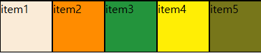
(9) 비어있는 공간 차지하는 속성 (flex-grow)
- 자식 요소인 item이 부모 요소 내부에서 비어있는 공간을 매꿀 수 있도록 자라나는 정도를 지정하는 속성
- 지정된 비율에 맞춰서 요소가 팽창한다.
(기본값 0 -> 팽창하지 않는다.)
<div class="flex-container">
	<div class="item item1 grow1">item1</div>
	<div class="item item2 grow2">item2</div>
	<div class="item item3 grow3">item3</div>
	<div class="item item4 grow4">item4</div>
</div>
.grow1{flex-grow:1;} /* 자식 요소 중 flex-grow 속성을 가진 요소가 없다면 해당 태그가 다 채움 */
(10) item이 중심축 방향으로 각 요소의 기본 크기를 지정하는 속성 (flex-basis)
- 중심축이 무엇인지 따라 width 또는 height로 결정된다.
- 사용 가능한 크기 단위 : px, %, vh, vw, em, ...
- 속성값으로 정수 입력 시 플렉스 컨테이너 기준 백분율
<div class="flex-container">
    <div class="item item1 basis-150px" >item1</div>
    <div class="item item2 basis-10">item2</div>
    <div class="item item3 basis-25">item3</div>
	<div class="item item4 flex1">item4</div>
</div>
.basis-150px{flex-basis:150px} (현재 row이므로 width)
.basis-10{flex-basis: 10%;}
.basis-25{flex-basis: 25%;}
2. 변형 함수
변형함수란 사용자의 동작에 반응해 텍스트나 이미지 등을 움직이게 하는 속성
아래 형식으로 작성한다.
- transform : 함수
<img src="xxx.jpg" class="trans-x-2d">.trans-x-2d:hover {
transform : translateX(100px);
}2.1. 2차원 변형
좌우로 움직이기
<img src="/C/FrontWorkSpace/resources/image/bono.jpg" class="trans-x-2d">
상하로 움직이기
<img src="/C/FrontWorkSpace/resources/image/bono.jpg" class="trans-y-2d">
대각선으로 움직이기
<img src="/C/FrontWorkSpace/resources/image/bono.jpg" class="trans-d-2d">
가로 방향 확대/축소
<img src="../resources/image/bono.jpg" class="trans-x-scale-2d">
세로 방향 확대/축소
<img src="../resources/image/bono.jpg" class="trans-y-scale-2d">
요소 확대/축소
<img src="../resources/image/bono.jpg" class="trans-scale-2d">
요소 회전
<img src="../resources/image/cat.jpg" class="trans-rotate">
.trans-x-2d:hover {
    transform : translateX(100px);
}
.trans-y-2d:hover {
transform: translateY(100px);
}
.trans-d-2d:hover {
transform: translate(100px, -100px);
/* translate(가로, 세로) */
}
.trans-x-scale-2d:hover {
transform: scaleX(1.5);
margin-left: 200px;
/* 좌우 scaleX(x) x배 증가 */
}
.trans-y-scale-2d:hover {
transform: scaleY(2);
}
.trans-scale-2d:hover {
transform: scale(1.5,1.5);
margin: 150px 150px
}
.trans-rotate:hover {
transform : rotate(320deg); /* 돌릴 각도 */
}2.2. 3차원 변형
x, y, z축 이동
<img src="../resources/image/3d.png" class="trans-3d">

x축 회전, y축 회전, 3차원 회전
<img src="../resources/image/3d.png" class="trans-rotate-x-3d">
<img src="../resources/image/3d.png" class="trans-rotate-y-3d">
<img src="../resources/image/3d.png" class="trans-rotate-3d">
.trans-3d:hover {
/* perspective: z축의 최대 길이 */
transform: perspective(300px) translate3d(50px, 50px, 100px)
}
.trans-rotate-x-3d:hover {
transform: rotateX(45deg);
}
.trans-rotate-y-3d:hover {
transform: rotateY(45deg);
}
.trans-rotate-3d:hover {
transform:perspective(300px) rotate3d(0.5,0.5,0.5, 45deg) ;
}