🔶이미지 준비 및 삽입
-
코딩네컷에 넣을 이미지를 explorer에 background 사진처럼 추가
-
이미지를 image1~4의 id 속성을 이용하여 삽입
-
id니까 #을 이용하여 css 작성
-
url('./파일명')으로 이미지 주소를 가져옴
-
./는 현재 html에 있는 폴대로 접근하게 되는 것임
				#image1 {
					background-image: url("./img1.png");
				}

				#image2 {
					background-image: url("./img2.png");
				}

				#image3 {
					background-image: url("./img3.png");
				}

				#image4 {
					background-image: url("./img4.png");
				}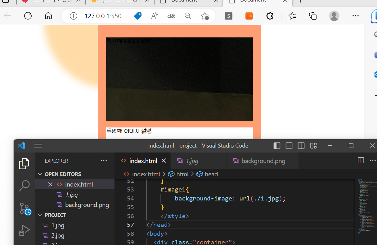
💥왜 까맣게만 보이지..?는 이미지가 일부가 잘린 것임
→ background-size를 cover로 바꿔서 가로 세로 비율 유지하며 전체 컨테이너를 덮으려 이미지 크기를 제어하자
💥근데 비율조절안되고 나오게됨.. 이미지 크기가 작아도 커지지 않음
→ background-size를 contain으로 바꿔서 이미지의 가로 세로 비율을 유지하면서 이미지를 컨테이너 내에 맞게 크기를 조정
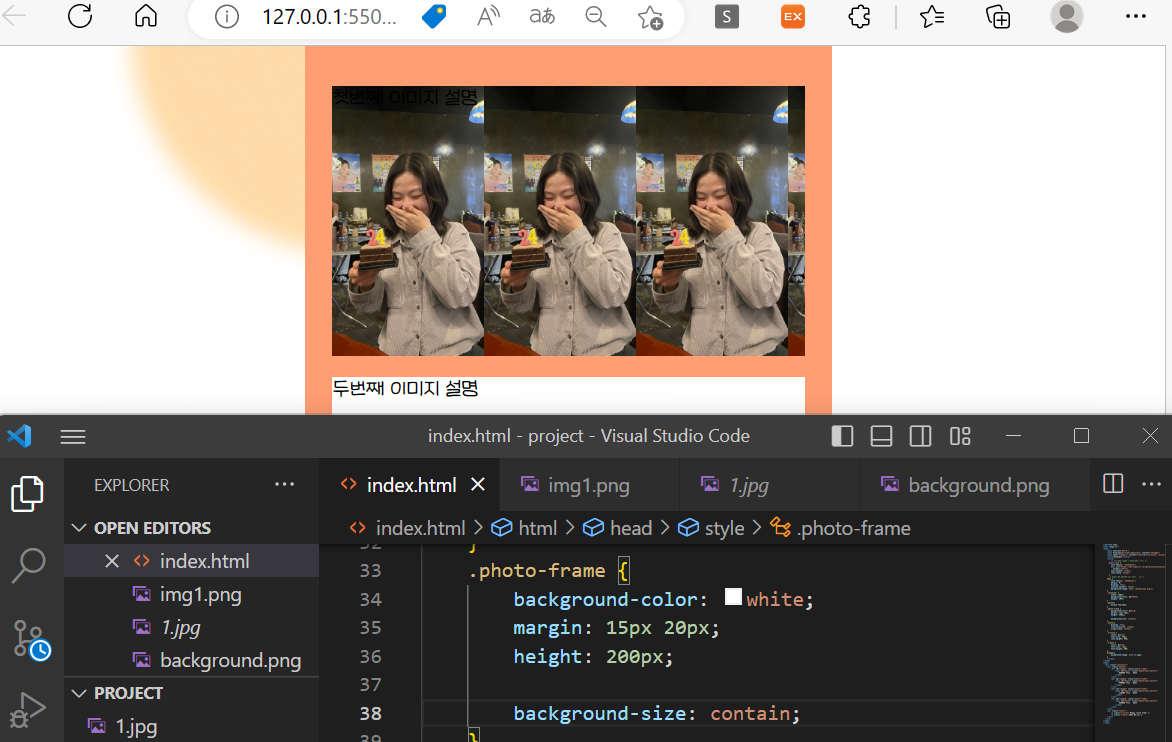
💥계속 반복돼서 사진이 나옴
→ background-repeat 속성을 no-repeat으로 설정하고, background-position 속성을 center center로 설정하여 이미지가 컨테이너 내에서 중앙에 위치하도록 하자.class명 { background-image: url('이미지 경로'); background-size: contain; background-repeat: no-repeat; background-position: center center; }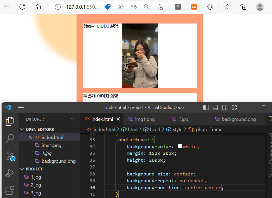
-
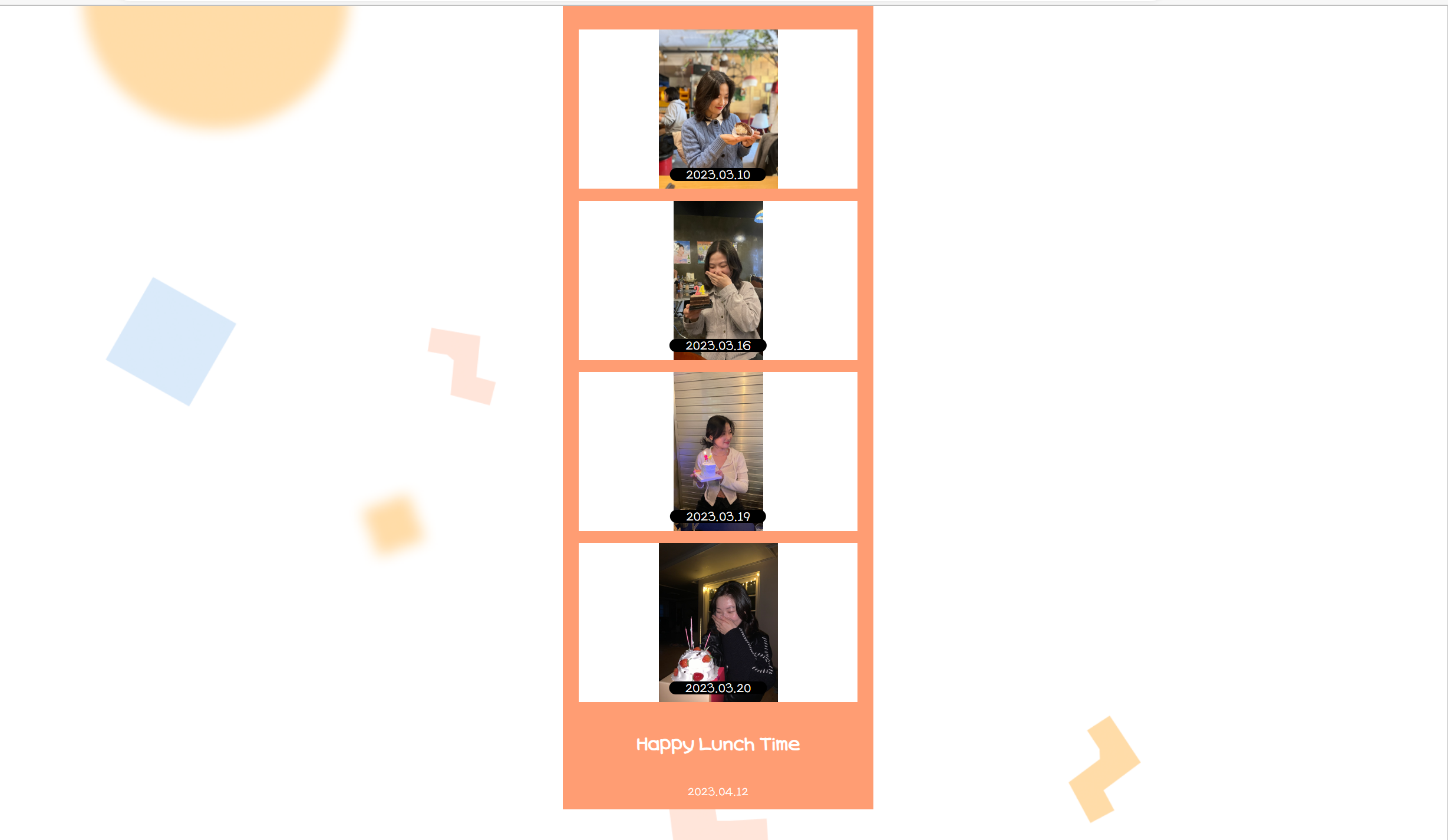
완성 결과:
🔶이미지 설명 글 스타일링
-
설명글을 사진에 맞춰 변경
-
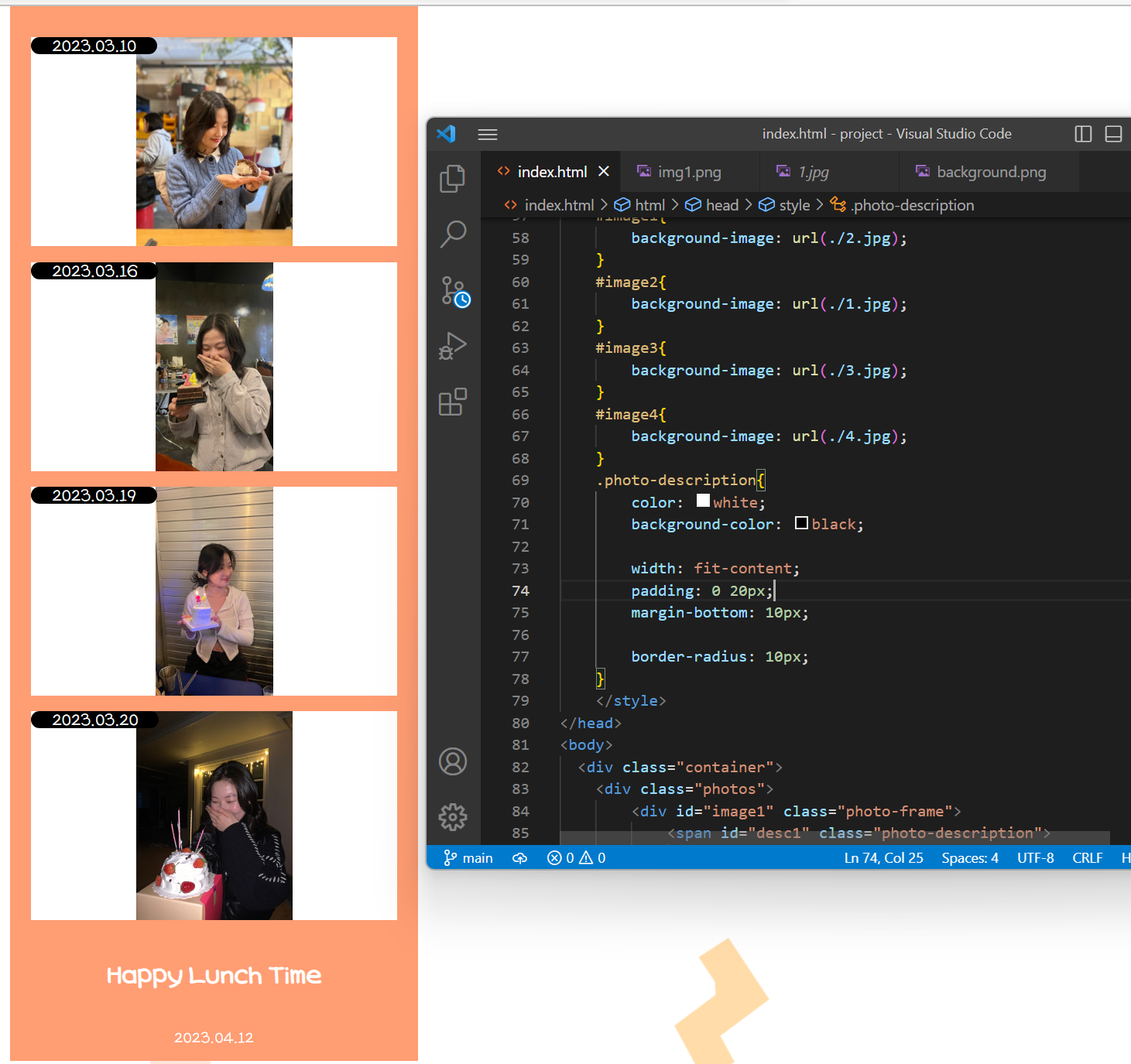
설명글의 글씨를 흰색으로, 그리고 배경을 검정으로 바꾸고, 배경 끝을 동그랗게 만들자
.photo-description {
	/* 배경은 검게, 글자는 흰 색으로 */
	color: white;
	background-color: black;

	/* 가로 너비는 내부 콘텐츠에 딱 맞게! */
	width: fit-content;
	padding: 0 20px;
	margin-bottom: 10px;

	/* 경계선 */
	border-radius: 10px;
}
→ width: fit-content를 사용하면 너비가 글자수에 맞춰 사이즈 조정됨
→ padding을 통해 글자에 위아래, 양옆에 여백을 얼마나 줄지 조정
→ margin-bottom은 나중에 글자를 아래로 내리게 되면 밑에 너무 붙으면 별로니까
→ border-radius는 끝부분을 둥글게 만드는 것으로 10픽셀만큼 둥글게 만들기
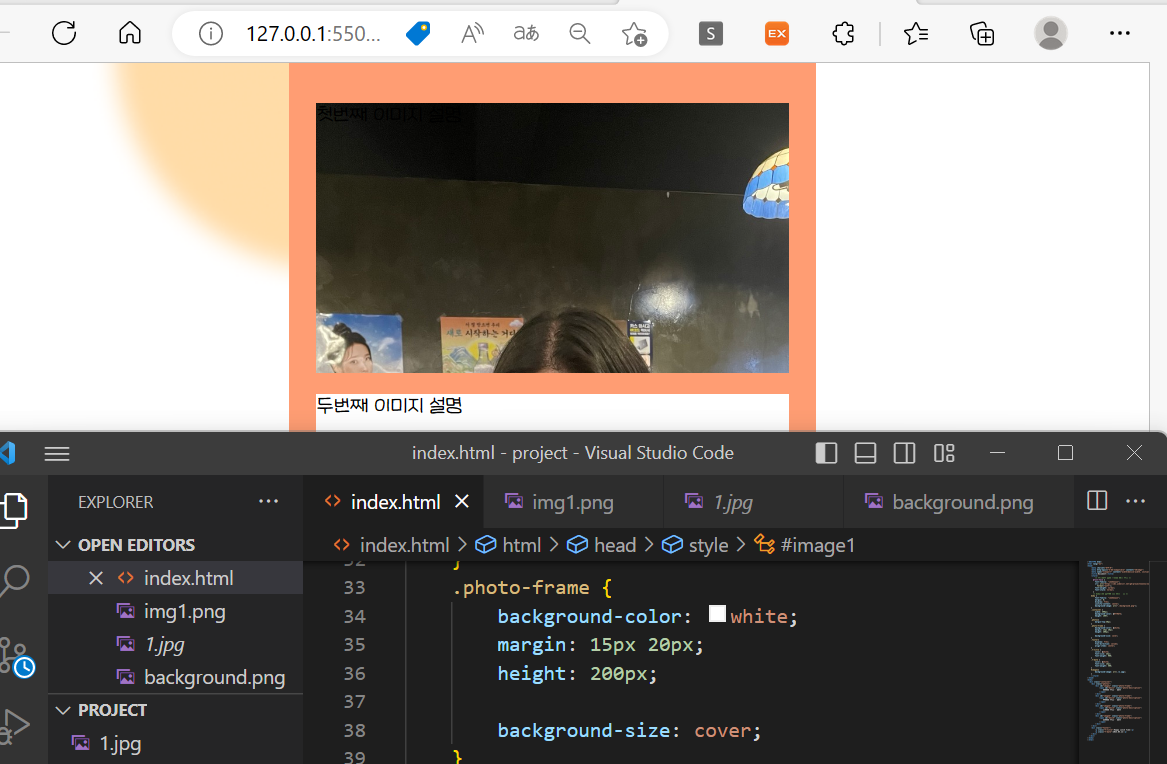
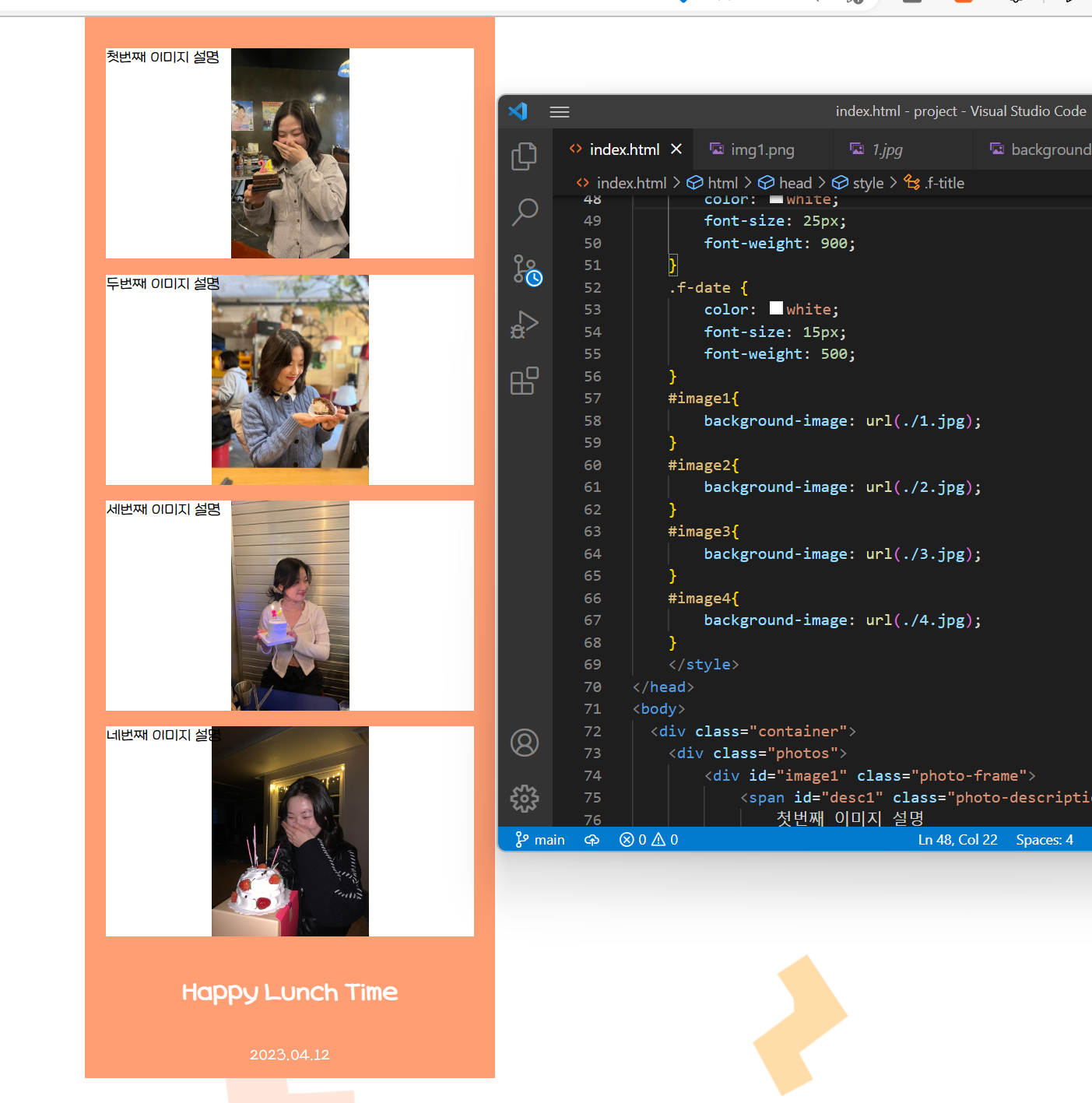
결과:
🔶이미지 설명글을 가운데 아래쪽으로 이동
- photo-frame에서 해당 요소가 원래 있어야할 위치를 기준으로 이동시키자
- ⭐position은 HTML 태그의 위치를 잡는 방법임
- 사용 방법
- 배치방법 정하기(relative, absolute)
- 이동시키기(top, bottom 등)
- 사용 방법
- position: relative;를 사용하면 다른 요소의 위치에는 영향을 미치지 않으며, 자신의 위치를 기준으로 나중 요소의 위치를 조정할 수 있다.
.photo-frame {
	position: relative;
}- photo-description에서는
- position: absoulte;는 위의 relative로 설정한 것을 기준으로 잡자는 의미
- bottom: 0;은 프레임 기준으로 밑에서 0만큼 올라오라는 의미
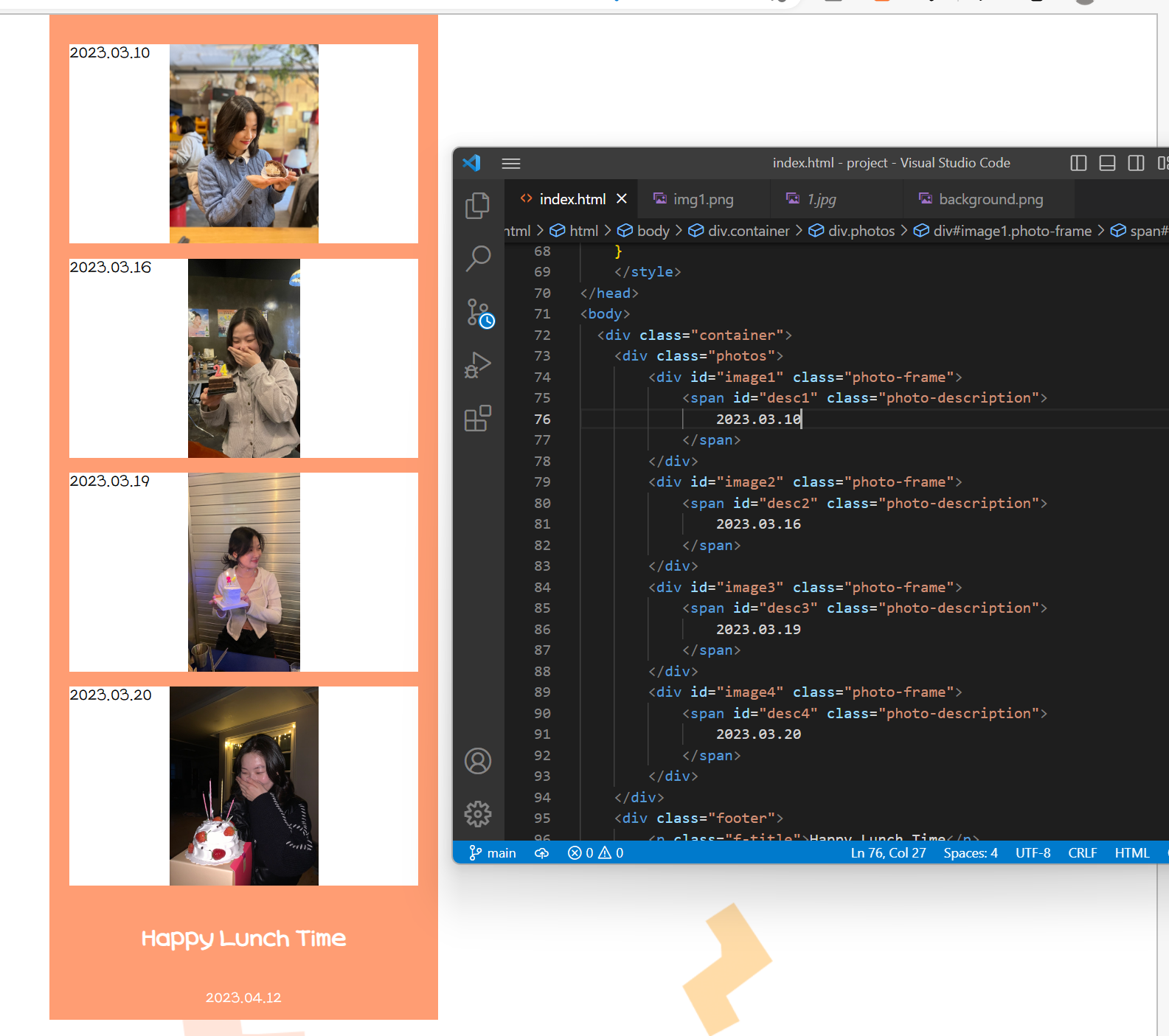
➡️ 결국 1번재 사진 기준으로, 사진 정 가운데에 밑에 붙어있게 되는 것(위에서 margin때문에 10픽셀만큼 위로 올라와있는 것임) - 마지막 2줄은 왼쪽에서 50%만큼 정확히 가운데 정렬이 됨
			.photo-description {
				...
			  position: absolute;
			  bottom: 0;
			  transform: translate(-50%);
			  left: 50%;
			}
결과: