하위 선택자(자손 결합자)
- class="st1"인 태그의 자식 요소들을 선택
<ul class="st1">
        <li>A</li>
        <li>B</li>
        <li>C
            <ul>
                <li>1</li>
                <li class="sb1">2</li>
                <li>3</li>
            </ul>
        </li>
        <li>D</li>
    </ul>
    <ul>
        <li>E</li>
        <li>F</li>
        <li>G</li>
        <li>H</li>
    </ul>
.st1 li {
border: 1px solid blue;
}자식 선택자(자식 결합자-1촌 자손)
- class="st1"인 태그의 바로 아래 있는 요소 선택
.st1 > li {
border: 1px solid blue;
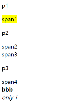
}인접 형제 선택자
- 문서 구조 상 같은 부모를 가진 요소 중 class="sb1" 바로 아래 요소 선택(나하고 인접한 실제 요소 하나만 선택! 한 칸 이라도 떨어지면 선택 안됨! 붙어 있어야 함)
.sb1+li {
background-color: yellow;
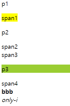
}형제 선택자
- 문서 구조 상 같은 부모를 가진 요소 중 class="sb1" 아래에 있는 요소 모두 선택
.sb1 ~ li {
            background-color: yellow;
        }
속성 선택자
- class 선택자를 사용하는게 더 나을수도
- 속성을 가지고 있는 요소를 찾아서 스타일을 적용한다
예시)
- a태그에 href속성을 가진 요소들만 선택
<ul>
        <li><a>메인메뉴</a></li>
        <li><a href="abc">메뉴1</a></li>
        <li><a href="" class="aaa bbb">메뉴2</a></li>
        <li><a href="" class="xx yy">메뉴3</a></li>
        <li><a href="" class="xx">메뉴4</a></li>
    </ul>
a[href] {
background-color: yellow;
}- a태그에 href속성의 값이 abc인 요소들만 선택
a[href="abc"] {
            background-color: yellow;
}- a태그에 class값이 여러개일때
a[class="aaa"] {
            background-color: yellowgreen;
→ 값이 완전히 일치해야 적용된다 -> 위는 false
a[class~="aaa"] {
            background-color: violet;
        }
→ 값이 여러 개 일 때 하나만 일치해도 적용된다.
→ 특정 클래스 값이 붙었을 때 이벤트 등을 적용하는 등 에 사용
- 원래 의미 : xx이라는 값이 맨 앞에 있으면
- 현재 적용 : 값과 완전히 일치하면("="이퀄 연산자와 같다고 생각하기)
a[class|="xx"] {
            background-color: tomato;
}- 맨 앞의 접두어가 x로 시작하면
a[class^="x"] {
            background-color: turquoise;
}- 맨 끝 글자가 y인 속성 선택
a[class$="y"] {
            border: 1px solid brown;
}- href속성에 "b"를 포함하는 속성
a[href*="b"] {
            border: 2px solid red;
        }
가상 클래스
:link, :visited
- :link 방문하지 않은 링크
- :visited 사용자가 방문했던 링크
<ul>
        <li><a href="#1">a</a></li>
        <li><a href="#2">b</a></li>
        <li><a href="#3">c</a></li>
        <li><a href="#4">d</a></li>
    </ul>
→ href값을 다 다르게 하면 누른 링크만 색이 바뀜(같은 링크이면 하나만 눌러도 다 색이 바뀐다)
a:link {
            color: black;
        }

a:visited {
            color: seagreen;
        }
→ 링크를 누르기 전 : black
→ 링크를 누르고 난 후 : seagreen
:focus
- 클릭해서 초점이 맞춰져있으면
input[type="text"]:focus {
	outline: 1px solid red;
}

[class*="focus"]:focus {
	outline: 1px solid blue;
}

/*마우스가 아닌 키보드 tab으로 포커스된 요소에 적용된다*/
/*브라우저 지원 되는지 확인 후 사용*/
[class*="tab-focus"]:focus-visible {
	outline: 1px solid blue;
}
→ outlilne : border 밖의 선(박스 요소가 아님!)
⇒ focus는 지원되지 않는 브라우저도 있으니 확인하고 사용해야한다.
⇒ type이 text인 input같은 타이핑 인풋 요소는 focus-visible 사용하면 클릭과 탭 모두 적용된다.
:hover
- 마우스를 올렸을 때
:active
- 대상 요소를 클릭하거나 활성화됐을 때(클릭한 순간에 반짝)
:enabled
- input에만 사용
- 사용 가능 상태를 의미(활성화)
input[type=radio]:enabled+label {
	color: tomato;
}
:disabled
- input에만 사용
- 사용 불가능 상태를 의미(비활성화)
input[type=radio]:enabled+label {
	color: gray;
}
:required
- 필수 입력 요소
input:required {
	border-color: orange;
}
:valid
- 값이 유효함
input[type="email"]:valid {
	border-color: green;
}
→ :not(:valid) 값이 무효함
input[type="email"]:not(:valid) {
	border-color: red;
}
input:checked
- input(type="checkbox")이 체크 되어있으면 span부분이 파란색으로 바뀐다
input:checked + span {
            color: blue;
        }
first-child
- 첫번째 요소를 선택한다.
ol li:first-child {
	color: yellowgreen;
}
last-child
- 마지막 요소를 선택한다.
ol li:last-child {
	color: yellowgreen;
}
nth-child
- nth-child(n) : n번째 요소를 선택한다(하나만 선택 가능)
- nth-child(2n) : 짝수 번째 선택
- nth-child(2n+1) : 홀수 번째 선택
not
- ~가 아닌 요소를 선택한다.
/*class가 outer인 요소의 바로 아래 li 중 last-child가 아닌 li 선택*/
.outer > li:not(:last-child) {
	text-decoration: line-through;
}

ul:not(.outer) li {
	font-weight: bold;
}
first-of-type
- 부모 요소 내 첫번째 특정 요소 선택
div:first-of-type {
	background-color: yellow;
}
last-of-type
- 부모 요소 내 마지막 특정 요소 선택
div:last-of-type {
	background-color: yellowgreen;
}
nth-of-type(n)
- 부모 요소 내 n번째 특정 요소 선택
p:nth-of-type(2) {
	color: tomato;
}
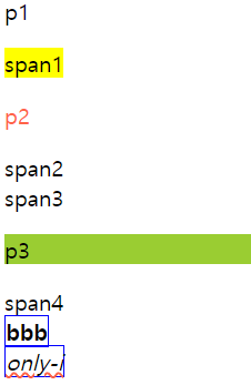
only-of-type
- 부모 요소 내 유일한 특정 요소 선택
div :only-of-type {
	border: 1px solid blue;
}
only-child
- 부모 요소 내 형제 요소 없이 유일한 요소
div :only-child {
    text-decoration: wavy underline tomato;
}
가상클래스 MDN
의사 클래스 - CSS: Cascading Style Sheets | MDN
가상 요소
::after
- 바로 뒤에 가상의 요소를 추가한다.
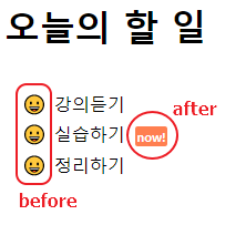
<h1>오늘의 할 일</h1>
  <ul>
    <li>강의듣기</li>
    <li class="try">실습하기</li>
    <li>정리하기</li>
  </ul>
li.try::after {
content: 'now!';
margin-left: 0.8em;
padding: 0.15em 0.15em;
font-size: 0.7em;
font-weight: 700;
color: #fff;
background-color: coral;
border-radius: 0.2em;
}::before
- 바로 앞에 가상의 요소를 추가한다.
li::before {
  content: '😀';
  display: inline-block;
  margin: 0 1em 0 0;
  width: 0.8em;
  height: 0.8em;
}
::selection
- 드래그를 사용하여 선택한 영역에 가상의 요소를 추가한다.
.orange::selection {
  background-color: orange;
  color: #fff;
}

.skyblue::selection {
  background-color: skyblue;
  color: #fff;
}
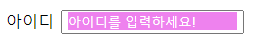
::placeholder
- placeholder 가상의 요소를 추가한다.
- html코드에 placeholder를 작성하고 적용한다.(위에 after나 before처럼 content속성으로 넣는거 아님)
<label for="id">
  아이디<input type="text" placeholder="아이디를 입력하세요!" required id="id">
</label>
#id {
margin-left: 0.5em;
padding: 0.2em 0.4em;
}
input:required::placeholder {
background-color: violet;
color: #fff;
}
가상 요소 MDN

프론트엔드 개발자를 꿈꾸는 사람( •̀ ω •́ )✧