5월 27일 개발일지
학습한 내용
훨씬 수월하게 했고 라임텍스트 다루는 법도 익혔다.
라임텍스트는 </>다는 태그를 자동으로 만들어주진 않아 좀 불편한 듯 하다.
배운 내용
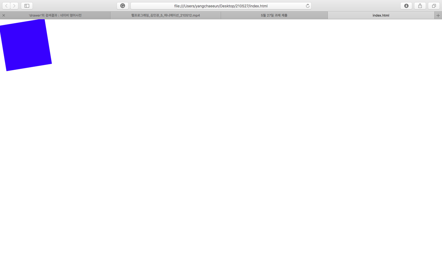
.transform {
width: 300px;
height: 300px;
background-color: yellow;
/transform: rotate(-10deg);/
-2D회전
transform: skew(10deg, 20deg);
3D회전 (x축회전, y축회전)
transform: translate(100px, 100px);
->선택한 영역의 오브젝트 위치 변경
(x축, y축)으로 움직인다.
transform: scale(2, 3);
-좌우 2배
-상하 3배
margin-left: 300px;
margin-right: 500px;
}
transform 익스프롤러10 이상일 때 사용 가능
근데 더 낮은 버전에서 사용하고 싶다면?
-webkit-transform: rotate(10deg); ->크롬/사파리
-moz-transform: rotate(10deg); ->파이어폭스
-ms-transform: rotate(10deg); ->익스플로러
-o-transform: rotate(10deg); ->오페라
transform: rotate(10deg); ->프리픽스가 없는 값을 디폴트로 넣어준다.
앞에 붙은 애들이 prefix이다.
각각의 브라우저 고유 버전이 있다.
-ms-transform: rotate(10deg); 라고 하면 ms 9.0까지 포함해서 적용시키겠다는 말.
그 아래 버전은 안 된다.
.transition {
width: 300px;
height: 300px;
background-color: yellow;
}
.transition:hover {
width: 600px;
->마우스를 올렸을 때 600으로 늘어난다. 근데 어색한 애니메이션
이 움직이는 과정을 보여주려면?
.transition {
width: 300px;
height: 300px;
background-color: yellow;
transition-property: width;
transition-duration: 2s;
transition-timing-function: linear;
transition-delay: 1s;
}
.transition:hover {
width: 600px;
}
얘를 이렇게 넣으면 된다.
한 줄로 줄이면 transition: width 2s linear 1s;
숫자가 두 개일 경우 먼저 나오는 애가 duration 그 이후가 delay
숫자 하나만 넣으면 duration으로 인식.
메뉴에 마우스 올렸을 때 바로 색상을 바꾸는 게 아니라 자연스럽게 변화할 때 트랜지션 사용.
transition: width 2s linear, height 2s linear;
동시에 바뀐다.
쉼표를 사용해서 늘려나갈 수 있다.
.animation {
width: 300px;
height: 300px;
background-color: yellow;
animation-name: changeWidth;
animation-duration: 3s;
animation-timing-function: linear;
animation-delay: 1s;
animation-iteration-count: 6; -> 6싸이클
animation-direction: normal;
}
@keyframes changeWidth {
from {
width: 300px;
}
to {
width: 600px;
}
-> 어디서 어디까지
animation-direction: alternate;
사용하는 경우 3회 반복만 일어남. 편도가 한 번으로 체크.
무한히 반복되면 좋겠다?
animation-interation-count: infinite;
학습한 내용 중 어려웠던 점 또는 해결못한 것들
없었다. 중간중간 안 되는 것들은 다시 하니까 잘 되었다.
해결방법 작성
반복해서 오류를 잡아낸다.
학습 소감
배운 내용 다시 반복해서 복습해야겠다!