[React] styled-components ThemeProvider (4)
드디어 ThemeProvider를 활용하는 방법이다.
다크모드, 화이트 모드를 적용하기 위해서는 어플리케이션의 모든 컴포넌트들이 모드가 변경될 때마다 적용되어야하기 때문에 App.js가 아니라 index.js에 설정을 추가한다.
- 화이트모드, 다크모드일때의 인스턴스를 만든다.
- ThemeProvider태그로 App을 감싸고 theme prop 설정을 추가한다.
- App.js에 있는 textcolor, backgoundcolor 설정을 theme의 설정을 받아올수 있게 동적인 코드로 바꿔준다.
index.js
...
import { ThemeProvider } from 'styled-components';
...

const darkTheme = {
  textColor: 'whitesmoke',
  backgroundColor: '#111',
};

const lightTheme = {
  textColor: '#111',
  backgroundColor: 'whitesmoke',
};

ReactDOM.render(
  <React.StrictMode>
    <ThemeProvider theme={lightTheme}>
      <App />
    </ThemeProvider>
  </React.StrictMode>,
  document.getElementById('root')
);
App.js
const Wrapper = styled.div`
display: flex;
background-color: ${(props) => props.theme.backgroundColor};
`;
const Box = styled.div`
color: ${(props) => props.theme.textColor};
height: 200px;
width: 200px;
background-color: ${(props) => props.theme.backgroundColor};
display: flex;
`;
function App() {
return (
<Wrapper>
<Box>
<Emoji>😀</Emoji>
</Box>
<Emoji>😁</Emoji>
<Box>This is a box</Box>
</Wrapper>
);
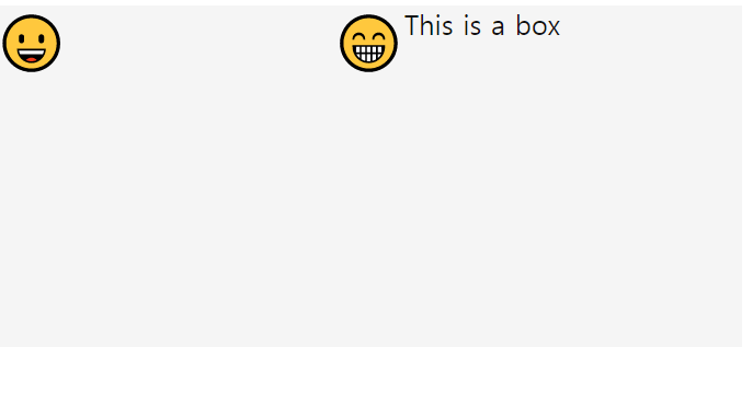
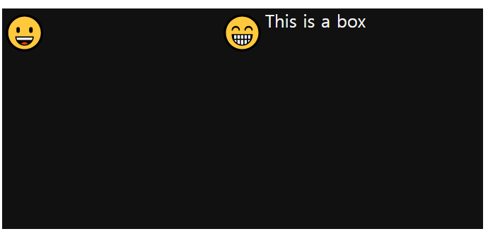
}index.js ThemeProvider의 theme속성 하나가 바뀌면 전체 테마가 바뀐다.
ligthTheme
darkTheme

루틴을 만들자