블록요소 VS 인라인요소
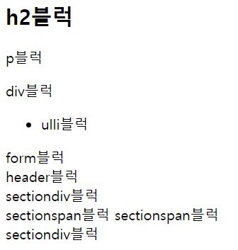
01. [블럭요소 VS 인라인요소] :줄바꿈이 일어나고 블럭크기를 가진다. 블럭요소는 블럭요소, 인라인요소를 자식으로 가질 수 있다.
<h2>h2블럭</h2>
    <p>p블럭</p>
    <div>div블럭</div>
    <ul>
        <li>ulli블럭</li>
    </ul>
    <form>
        form블럭
    </form>
    <header>
        header블럭
    </header>
    <section>
        <div>sectiondiv블럭</div>
        <span>sectionspan블럭</span>
        <span>sectionspan블럭</span>
        <div>sectiondiv블럭</div>
    </section>
🙏 실행결과
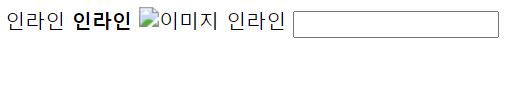
인라인요소
1. 줄바꿈이 없습니다(한줄로 출력)
2. 인라인요소는 인라인요소만 자식으로 포함할 수 있습니다.
<span>인라인</span>
<strong>인라인</strong>
<img src="" alt="이미지">
<a>인라인</a>
<input>
🙏 실행결과
▶ CSS문법
<style></style> - CSS가 기술되는 영역
선택자(selector) - 스타일을 변경할 HTML 요소 선택
선언(declartion) - 선택자 뒤에 중괄호 부분 영역,
이 부분에 속성(property)와 값(value)를 기술한다.
*형식

<style>
선택자 {속성 : 값}
<style>
  ex) <style>
  		a{color:red;}
   		<style> -> <a>
태그를 사용한 모든 텍스트를 빨간색으로
⁕인라인 형식(inline style sheet)
▶ 태그 안에 속성(property)으로 작성할 수 있다.<li><a href="2.html" style="color:red">CSS</a></li>
📢 Position
position 속성 : static, relative와 absolute, fixed가 있다.
position과 같이 쓸 수 있는 css로는 위치값을 지정하는 top, bottom, left, right와 순서를 지정하는 z-index가 있다.
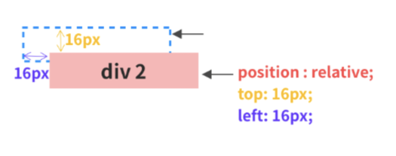
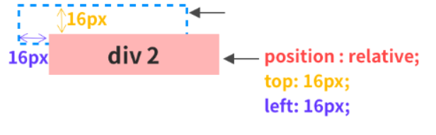
🚀 relative 부모요소
- relative 말 그대로 상대 위치이다.
기본 위치를 기준으로 좌표 프로퍼티를 사용하여 위치를 이동한다.
div2에 position: relative의 top,left에 각각 16px를 할당하면
아래와 같이 position: static이 가질 위치보다 위에서 16px, 왼쪽에서 16px만큼 떨어지게 된다.
.relative{
	position: relative;
    background:skyblue;
    left:16px;
    top:16px;
    }
👉🏻 실행결과
absolute 자식요소
- absolute는 절대 위치이다. 부모 요소나 조상 요소 중 relative, absolute 혹은 fixed가 선언된 곳을 기준으로 좌표 프로퍼티가 작동한다.
<style>
body {
	background-color: skyblue;
}
.box {
	width: 100px;
	height: 50px;
}
.parent {
	border: 2px solid red;
	width: 200px;
	height: 100px;
	position: relative;
}
.absolute {
	background-color: pink;
	position: absolute;
	bottom: 16px;
	right: 16px;
}
</style>
<div class="parent">
	<div class="box absolute">display: absolute;</div>
</div
👉🏻 실행결과
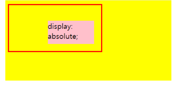
✔ 단, 만약 부모나 조상 프로퍼티에 relative, absolute, fixed가 없다면 최상단 태그인 를 기준으로 위치가 지정된다.
🎈 fixed
fixed는 말 그대로 고정됐다는 뜻이다.
absolute는 relative를 가진 부모가 필요했는데, fixed는 필요 없다.
보이는 화면을 기준으로 좌표 프로퍼티를 이용하여 위치를 고정시킨다.
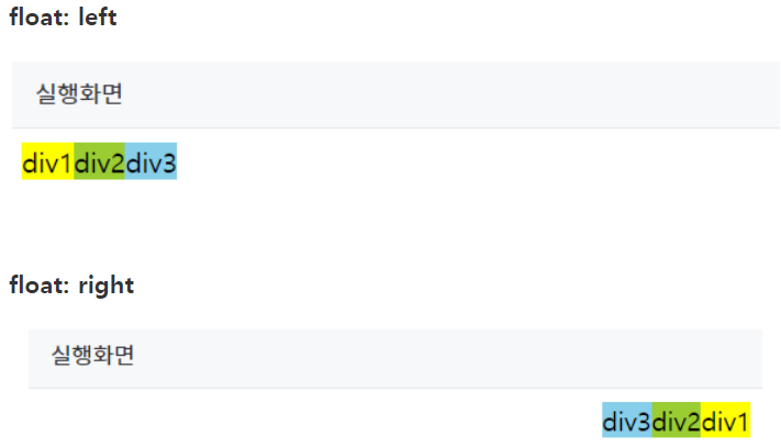
⛳ float
float은 주로 이미지 주변에 텍스트를 감싸기 위해 만들어진 프로퍼티이다.
하지만 페이지 전체의 레이아웃을 잡을 때에도 정말 중요한 도구가 된다.
float을 이용하면 다음과 같이 레이아웃을 가로로 나열할 수 있다.
👉🏻 실행결과
► 또 다른 예시.
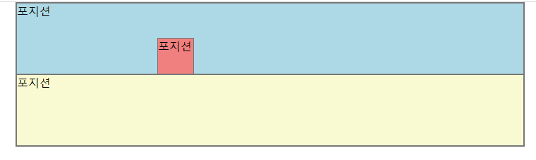
<style>
  *{
  padding: 0;
  margin: 0;
  }
  .list {
  	width: 50%}
  	margin: 0 auto;
  	border: 1px solid #777;
  }
  .content {position : relative;}
  p{border: 1px solid #777; height: 100px;}
  .inner1 {background-color: lightblue;}
  .inner2 {background-color lightcoral;
  			position: absolute;
  			left: 200px;
  			top: 50px;
  			width: 50px;
  			height: 50px;
  }
  .inner3 {background-color: 						lightgoldenrodyellow;}
</style>
<body>
  <div class="list">
    <div>
      <p class="inter1">포지션</p>
      <p class="inter2">포지션</p>
      <p class="inter3">포지션</p>
    </div>
  </div>
  </body>
코드를 정리해보자.
* {padding: 0; margin: 0;}
👉🏻 전체선택자로 모든 기본요소가 가지고 있는 패딩 마진 없앰
.content {position: relative;}
👨👩👦 부모에 포지션 relative
⚡ content기반으로 inner2가 맞춰서 들어간다 (left,top으로 지정한 위치에 따라)
.inner2 {
      background-color: lightcoral;
      position: absolute;
      left: 200px;
          top: 50px;
          width: 50px; /* 상자크기 */
          height: 50px; /* 상자크기 */
      }
🚀 left, right 중 하나 top, bottom 중 하나로 위치조정을 반드시 해줘야합니다
🙋 실행결과
-
부모 요소가 position: relative일 때 그 자식요소에 absolute 속성값을 넣고 부모 요소 안에서 자식 요소들을 원할 하게 배치하고 있는 모습이다.
-
참고로 top, left, right, bottom은 그 기준으로부터 얼마만큼 떨어졌나를 나타낸 것이다. 이 점 헷갈리지 않게 참고하시면서 요소를 배치하는 것이 중요하다.