<div class="container">
	<div class="item item1">1</div>
	<div class="item item2">2</div>
	<div class="item item3">3</div>
	<div class="item item4">4</div>
	<div class="item item5">5</div>
</div>

<!--  div.container>div.item.item${$}*5 를 하면 똑같이 작성됨-->
.container {
background : beige;
height : 100vh;
display: flex;
flex-direction : row;
flex-wrap : wrap;
/* flex-flow: row wrap; */
/* justify-content : flex-end; */
}
.item {
width:40px;
height:40px;
flex-grow:1;
}
.item1 {
backgound : white
}
.item2 {
backgound : black
}
.item3 {
backgound : red
}
.item4 {
backgound : blue
}
.item5 {
backgound : yellow
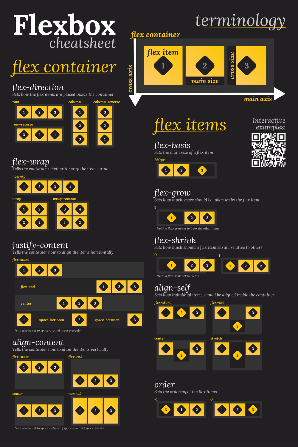
}1. Flexbox 시작
- display : flex : flexbox 지정
2. Flexbox 속성
- flex-direction : row : 가로정렬 (1,2,3,4,5 )
- flex-direction : row-reverse : 가로정렬 반대 ( 5,4,3,2,1)
- flex-direction : column : 세로정렬
- flex-direction : column-reverse : 세로정렬 반대
- flex-wrap : wrap : 화면이 작아지면 밑줄로 내려감
- flex-wrap : wrap-reverse 화면이 작아지면 위로 올라감
- flex-wrap : nowrap : 화면이 작아져도 밑줄로 내려가지 않음
- flex-flow : column nowrap : 한줄로 작성 가능
3. main axis 속성
- justify-content : flex-start : 아이템의 위치를 시작점으로 변경
- justify-content : flex-end : 아이템의 위치를 끝점으로 변경
- justify-content : space-around : 왼쪽, 오른쪽 약간 띄우고 간격 정렬
- justify-content : space-evenly : 똑같은 간격 정렬
- justify-content : space-between : 왼쪽,오른쪽은 딱 붙게 간격 정렬
4. cross axis 속성
- align-items : center : 중심축의 반대축으로 중간 정렬
- align-items : baseline : 만약 item1이 다른 것과 크기가 다를 때 맞춰줌
- align-content : space-around : 위쪽, 아래쪽 약간 띄우고 간격 정렬
- align-content : space-between : 위와 아래는 딱 붙에 간격 정렬
- align-content : space-evenly : 똑같은 간격 정렬
- align-content : center : 가운데로 모아줌
5. item 속성
- flex-grow : 1 : 늘어나는 크기 조절 (기본값:0)
- flex-shrink : 1 : 줄어드는 크기 조절 (기본값:0)
- flex-basis: 10% : 박스 비율 조절 (기본값:auto)
- align-self : center : 특정 아이템만 위치를 조절
6. 참고 페이지 List
Flexbox Froggy (Flexbox 연습게임 페이지)
https://flexboxfroggy.com/#ko
Color Tool (색 조합 해주는 페이지)
https://material.io/resources/color
잘해보자