[Text Ellipsis] Text Ellipsis with flex/grid
Nomal 100% 컨테이너 ( NO Flex or Grid)
넓이 설정에 문제가 있엇는지... 뭔가 자주 꼬이는 ... struggled...
span 같은 display : inline은 고정 넓이가 없으므로 ellipsis가 생기지 않는다.
*You Do need a Element which is "display : block"
Parent element must have width attribute clarified by you not "width: auto" but "width: 100%"
In case Parent element has flex, the ellipsis element have to be covered by one more element which just is able to cut the flex attribute effect on width and be set of 'width : 100%"
latest
easiest way with grid: maybe
export const TextGridRowWrapper = styled.div`
  width: 100%;
  overflow: hidden;
  display: grid;
  gap: 8px;
  grid-template-columns: 1fr auto;
  grid-template-rows: auto;
`;

export const TextOverflowHiddenWrapper = styled.div`
  overflow: hidden;
`;

export const TextEllipsis = styled.div`
  text-overflow: ellipsis;
  white-space: nowrap;
  overflow: hidden;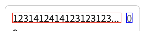
`;<div> // anything, grid or flex box does not matter
<TextFlexRowWrapper> // make sure from here
<TextOverflowHiddenWrapper>
<TextEllipsis>
Text you wanna put
</TextEllipsis>
</TextOverflowHiddenWrapper
</TextFlexRowWrapper>
<p> 0 </p>
</div>+++++++++++++++++++++++++++++++++++++++++++++++++++++++++++++++++++++++++++++
html
 <div className={styles["container-ellipsis"]}>
      <div className={styles["ellipsis-text-wrapper"]}>
        Lorem ipsum dolor sit amet consectetur adipisicing elit. Illo, rem
        libero quae beatae sed, commodi ex sint omnis et voluptate doloribus
        eligendi inventore est? Neque eveniet provident explicabo velit ex?
      </div>
    </div>
css
  .container-ellipsis {
  width: 100%;
  overflow: hidden;
}

.ellipsis-text-wrapper {
  text-overflow: ellipsis;
  overflow: hidden;
  white-space: nowrap;
}
100% 컨테이너 + child flex/grid container
html
<div className={[styles["container"]].join(" ")}>
      <div className={styles["content"]}>
        <h1 className={styles.label}>Row flex Ellipsis</h1>
        <div className={styles["ellipsis"]}>
          Lorem ipsum dolor sit amet consectetur adipisicing elit. Illo, rem
          libero quae beatae sed, commodi ex sint omnis et voluptate doloribus
          eligendi inventore est? Neque eveniet provident explicabo velit ex?
        </div>
      </div>

      <TextEllipsis />
    </div>
css
.container {
  width: 100%;
  height: 100%;
  overflow: hidden;
}

.content {
  background: rgba(0, 0, 0, 0.3);
  display: flex;
}

.label {
  font-weight: bold;
  text-transform: uppercase;
  letter-spacing: 1px;
}
.ellipsis {
  text-overflow: ellipsis;
  overflow: hidden;
  white-space: nowrap;
}

.title {
  display: flex;
  width: 100%;
  position: relative;
  padding-top: 8px;
  padding-bottom: 8px;
}
React, React-Native https://darcyu83.netlify.app/