HIG
Human Interface Guidelines
The HIG contains guidance and best practices that can help you design a great experience for any Apple platform.
Components
Menus and actions
Button
A button initiates an instantaneous action.
Best practices
Make buttons easy for people to choose
Hit target of at least 44 * 44 pt, it’s essential to include enough space around a button so that people can visually distinguish it from surrounding componenets and contents.
Ensure that each button clearly communicates it purpose
A button always includes a text label or a symbol or interface icon (sometimes a combination) — to help people predict what it does.
Style
iOS and iPadOS have four button styles
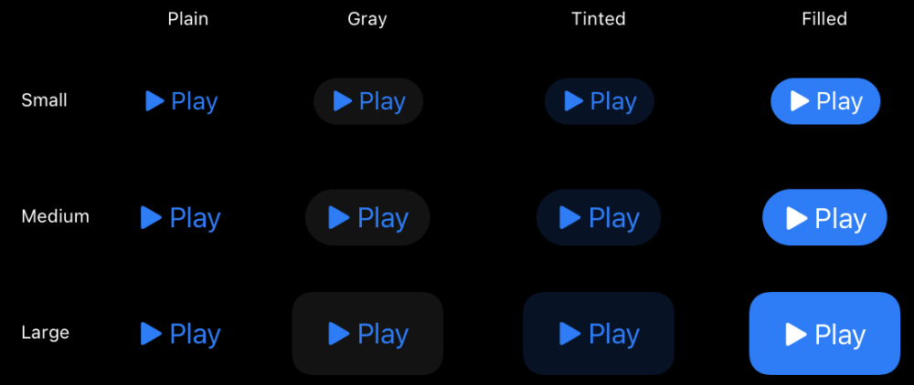
Use a filled button for the most likely action in a view
The filled style is the most visually prominuent, so it helps people quickly identify the action they’re most likely to want.
At the same time, Avoid using too many filled buttons in a view. Too many filled buttons can increase cognitive load because people must spend time comparing multiple likely options before making a choice.
Use style — not size — to visually distinguish the preferred choice among multiple options.
If you want to highlight the preferred or most likely option in a set, use a more prominent button style for that option and a less prominent style for the remaining one.
Content
Create button content that helps people instantly understand what the button does.
If an interface icon makes sense in your button, using SF Symbol.
To use text, create a short label that succinctly describes what the button does.
Using title-style capitalization, consider starting the label with a verb
Include additional text below the label only if it provides useful details.
Additional text uses a smaller text size than the label, showing that the information is secondary to the button’s action. Avoid writing a subtitle that explains more about what the button does; make sure a button’s containing view, label or image, style, and role provide all the information people need to understand its action.
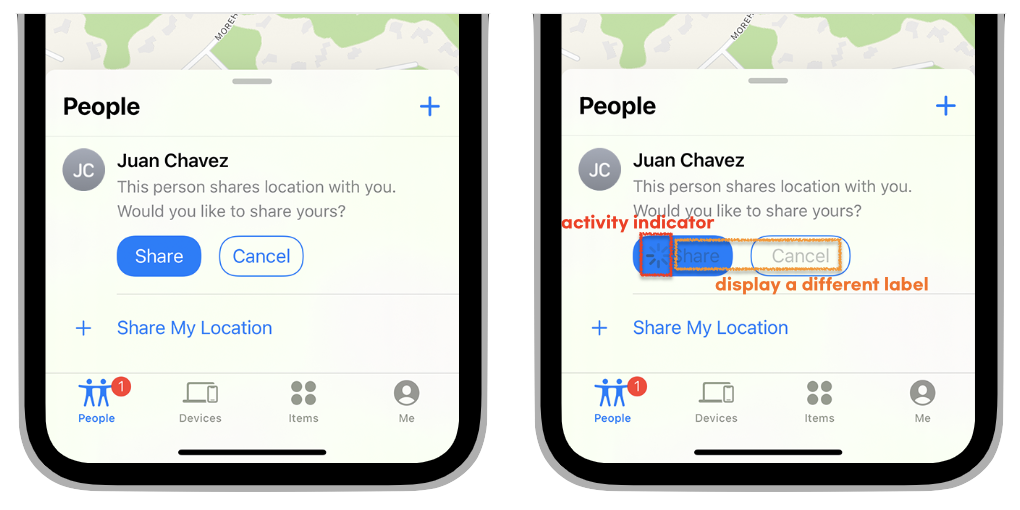
Configure a button to display an activity indicator when you need to provide feedback about an action that doesn’t instantly complete.
Displying an activity indicator whitin a button can save space in your user interface while clearly communicating the reson for the delay. To help clarify what’s happening, you can also configure the button to display a different label alongside the activity indicator. When a delay occurs after people click or tap your configured button, the system displays the activity indicator next to the original or alternative label, hiding the button image, if there is one.
Role
A system button can have one of the following roles:
- Normal. No specific meaning.
- Primary. The button is the default button — the button people are most likely to choose.
- Cancel. The button cancels the current action.
- Destructive. The button performs an action that can result in data destruction.
A button’s role can have additional effects on the appearance you configure. For example, the system uses bold text for the label in a primary button, whereas a destructive button uses a red color.
Assign the primary role to the button people are most likely to choose.
When a primary button responds to the Return key, it makes it easy for people to quickly confirm their choice. In addition, when the button is in a temporary view — like a sheet, an editable view, or an alert — assigning it the primary role means that the view can automatically close when people press Return.
Don’t assign the primary role to a button that performs a destructive action, even if that action is the most likely choice.
Because of its visual prominence, people sometimes choose a primary button without reading it first. Help people avoid losing content by assigning the primary role to nondestructive buttons.
출처