각 컴포넌트들을 먼저 만들고 나중에 합치는 방식으로 만들 예정임. -> 나중에 다른 페이지에서도 해당 컴포넌트를 재사용하기 위함.
일단 컴포넌트들을 넣어둘 폴더를 만든다.
mern_project/mern_client/src 안에 components라는 이름의 폴더를 생성한다.
그리고 그 아래에 일반적인 컴포넌트들을 넣을 common 폴더를 생성한다.
VScode에서 리액트를 사용할 때
react라고 검색하면 제일 위에 뜨는 익스텐션을 깔면 아주 쉽게..단축어로..코드를 짤 수 있다...
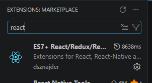
이겅
컴포넌트
1. Block
common 폴더 안에 Block.tsx 파일을 생성한다.
rfce라고 입력하면 기본 뼈대가 자동으로 완성됨.
import React, {memo} from "react";
import styled from "styled-components";

// width: 100%
// height: props.height
// onClick: props.onClick

interface BlockProps {
    height: string;
    onClick?: () => void; //optional하다는 뜻
}

const StyledBlock = styled.div<BlockProps>`
  width: 100%;
  height: ${(props) => props.height};
  cursor: ${(props) => props.onClick && "pointer"}; //해당 컴포넌트를 마우스로 선택 가능하게 해줌
`;


function Block({height, onClick}: BlockProps) {
    return <StyledBlock height={height} onClick={onClick} />;
}

export default memo(Block); //리렌더링 불가
2. Button
동일하게 common 폴더 안에 Button.tsx 파일을 생성한다.
default 버튼, link 버튼 두 개를 만들 예정
- default 버튼: 버튼을 클릭했을 때 함수 실행
- link 버튼: 버튼을 클릭했을 때 다른 페이지로 이동
import React from "react";
import styled from "styled-components";
import { Link } from "react-router-dom";
import { memo } from "react";

// children
// onClick
// type: 'link' | 'button'
// url

interface ButtonProps {
    children?: React.ReactNode;
    onClick?: (e: any) => void;
    type: "link" | "button";
    url?: string;
}

const StyledButton = styled.button<ButtonProps>`
    outline: none;
    border: none;
    display: flex;
    align-items: center;
    justify-content: center;

	background: none;
    padding: 0;
    cursor: pointer;
`;

function Button({ children, onClick, type="button", url }: ButtonProps) {
    // type에 따라서 link button인지 default 버튼인지 분리해서 사용 -> 각각의 컴포넌트를 분리해서 정의

    const RealButton = (
        <StyledButton onClick={onClick}>
            {children}
        </StyledButton>
    );

    const RealLink = (
        <StyledButton>
            <Link to={url!}>{children}</Link>  //react는 a태그보다는 link태그를 더 많이 사용한다 / 느낌표는 해당 옵션이 필수로 들어올 것이라는 표시
        </StyledButton>
    );

    return type === "link" && url ? RealLink : RealButton;
}

export default memo(Button);
(e: any)에서 e는 event다...
3. Divider
동일하게 common 폴더 안에 Divider.tsx 파일을 생성한다.
import React from 'react';
import styled from 'styled-components';
import { memo } from 'react';


// width
// height

interface DividerProps {
    width?: string;
    height?: string;
}

const StyledDivider = styled.div<DividerProps>`
    width: ${(props) => (props.width ? props.width : "1px")};
    height: ${(props) => (props.height ? props.height : "20px")};
    opacity: 0.2;
    background: #707070;
    margin: 0 8px;
`;

function Divider({width, height}: DividerProps) {
  return <StyledDivider width={width} height={height} />;
}

export default memo(Divider);
4. Span
Span.tsx 파일 생성
import React from 'react';
import styled from 'styled-components';
import { memo } from 'react';

// children
// size : 'small' | 'normal' | 'title'
// color : string

interface SpanProps {
    children?: React.ReactNode;
    size?: 'small' | 'normal' | 'title';
    color?: string;
}

const StyledSpan = styled.span<SpanProps>`
    color: ${(props) => props.color || "black"};

    &.small {
        font-size: 0.8rem;
        }  // &기호는 StyledSpan 컴포넌트를 가리킨다
    &.normal {
        font-size: 1rem;
    }
    &.title {
        font-size: 2rem;
        font-weight: bold;
    }
`;

function Span({children, size = "normal", color}: SpanProps) {
  return (
    <StyledSpan className={size} color={color}>
      {children}
    </StyledSpan>
  );
}

export default memo(Span)
5. ShadowBox
ShadowBox.tsx 파일 생성
검색창 박스 만드는거
import React from 'react'
import styled from 'styled-components';
import { memo } from 'react';


// children

interface ShadowBoxProps {
    children?: React.ReactNode;
}

const StyledShadowBox = styled.div`
    display: flex;
    align-items: center;
    position: absolute;
    top: 16px;
    left: 16px;
    right: 16ps;
    max-width: 400px;
    border-radius: 10px;
    padding: 6px 8px;
    box-shadow: rgb(0 0 0 / 16%) 0px 3px 6px 0px;
    border: 1px solid #e8e8e8;
    box-sizing: border-box;
    z-index: 101; // navermap 100
    background: #ffffff

`;

function ShadowBox({children}: ShadowBoxProps) {
  return (
    <StyledShadowBox>{children}</StyledShadowBox>
  );
}

export default memo(ShadowBox)
6. Input
Input.tsx 파일 생성
enter 키를 눌렀을 때 뭘 반환하게 만들기
import React from 'react'

// children
// name
// value
// onChange
// onSubmit


interface InputProps {
    children?: React.ReactNode;
    name?: string;
    value?: string;
    onChange?: (e: any) => void;
    onSubmit?: () => void;
}

const StyledInput = styled.input<InputProps>`
    display: inline-block;
    border: none;
    width: 100%;
    min-height: 2em;
    font-size: 14px;
`;


function Input({children, name, value, onChange, onSubmit}: InputProps) {
    const onEnterSubmit = (e:any) => {
        if (!onSubmit) return;
        if (e.key == "Enter") {
            onSubmit();
        }
    }
    return (
        <StyledInput name={name} value={value} onChange={onChange} onKeyDown={onEnterSubmit}>
                {children}
        </StyledInput>
    )
}

export default memo(Input)
이벤트 타입
위의 요소들에서 모두 이벤트 타입을 (e: any)로 설정해 놓았는데, 이렇게 하면 타입을 strict하게 정의해 놓은 것이 아니기 때문에 에러가 생길 확률도 높고 생각한대로 코드가 작동하지 않을 수도 있다...라고한다..
일단
Button.tsx
any라고 되어있는 부분을 바꿔줌
그럼 무슨 타입으로 정의해야 하느냐? 그거슨 onClick을 넣는 해당 property에 마우스를 호버해보면 타입이 나와있음
그거 복붙하면 된다.
onClick?: (e: React.MouseEvent<HTMLButtonElement>) => void;로 수정을 해주는데, 복붙하라고 해놓고는 약간 수정을 해야하긴 하네...
알아서 잘 하면 되는건가보다.
Input.tsx
이것도 onChange의 event 타입을 마우스 호버를 통해 알아내서 any에 넣어준다.
onChange?: (e: React.ChangeEvent<HTMLInputElement>) => void;onEnterSubmit의 경우에도
const onEnterSubmit = (e:React.KeyboardEvent<HTMLInputElement>) => {
        if (!onSubmit) return;
        if (e.key == "Enter") {
            onSubmit();
        }
    }
이렇게 수정해준다.