
요런 컴포넌트를 만들어서 리뷰를 넣어 이 페이지 저 페이지 재사용 해야 됨
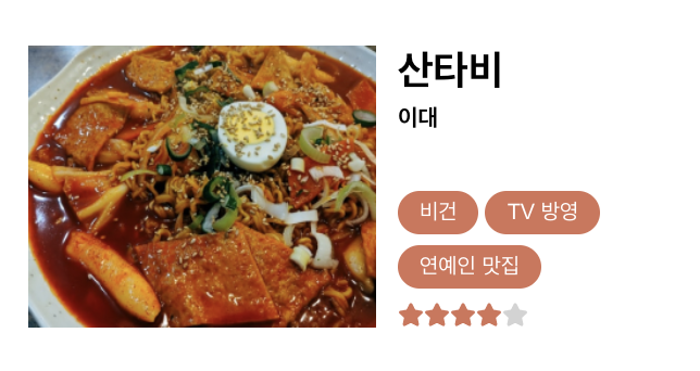
사진 - 산타비 - 태그들 간에 아무 관계 없음...

이미지 위로 hover 했을 때 리뷰가 보이도록 구현해야 했다!
👩🏻💻 전체 코드
import React, { useState } from "react";
import styled from "styled-components";
import { FaStar } from "react-icons/fa";

const Container = styled.a`
    margin: 15px;
    display: flex;
    flex-direction: row;
    align-items: center;
    justify-content: space-between;
    width: 300px;
    height: 150px;
    text-decoration: none;
`
const ImageWrapper = styled.div`
    width: 160px;
    height: 130px;
    position: relative;
`
const Image = styled.img`
    width: 160px;
    height: 130px;
    position: absolute;
`
const Content = styled.button`
    background-color: rgba(0,0,0,0.5);
    color: white;
    width: 160px;
    height: 130px;
    position: absolute;
    border: none;
    cursor: pointer;
`
const Wrapper = styled.div`
    width: 130px;
    height: 130px;
    display: flex;
    flex-direction: column;
    justify-content: space-between;
`
const Tag = styled.button`
    background-color: #d57358;
    font-size: xx-small;
    color: white;
    padding-inline: 10px;
    border: none;
    height: 20px;
    border-radius: 50px;
    margin-right: 3px;
    margin-bottom: 3px;
    cursor: pointer;
`

const Review = ({ image, content, restaurantName, university, tags, score }) => {
    const [hover, setHover] = useState('off');
    const onMouseEnter = () => setHover('on');
    const onMouseLeave = () => setHover('off');
    const rating = (score) => {
        const result = [];
        for (let i = 5; i > 0; i--){
            score--;
            if (score>=0){
                result.push(<FaStar size="12" color="#d57358"></FaStar>);
            }
            else {
                result.push(<FaStar size="12" color="lightgray"></FaStar>);
            }
        }
        return result;
    }

    return (
        <Container href="http://www.naver.com">
            <ImageWrapper onMouseEnter={onMouseEnter} onMouseLeave={onMouseLeave}>
                <Image src={image}></Image>
                {
                    hover==='on' && <Content>{content}</Content>
                }
            </ImageWrapper>
            <Wrapper>
                <h3 style={{color: "black", fontWeight:"bold", margin:"0px"}}>{restaurantName}</h3>
                <h6 style={{color: "black", marginTop:"3px"}}>{university}</h6>
                <div>
                    {
                        tags.map(tag => (
                            <Tag>{tag}</Tag>
                        ))
                    }
                </div>
                <div>
                    {
                        rating(score)
                    }
                </div>
            </Wrapper>
        </Container>
    );
  }

export default Review;👩🏻💻 참고 자료 정리 (TIL?)
-
react-icons
아이콘을 바로 임포트 해 와서 쓸 수 있는 패키지. 왜 이제서야 알았을까... 다 이미지로 갖고 왔었는데 ㅠㅠ
이걸 사용해서 rating 함수에서 별 다섯 개 색깔을 다르게 해서 배열로 return 했더니 그대로 쭉 나온다 신기 -
hover 시, 설명이 뜨는 애니메이션
EBS 클론 때 작성했던 useState 코드를 가지고 와서 조금 수정했다. 근데 겹쳐서 뜨지를 않고 옆에 떠서 링크 걸어 놓은 블로그를 참고해서 겨우 완성했다.부모요소의 position : relative로 하고, 자식요소의 position : absolute로 한다.
-
button, img 태그 마우스 오버 되면 커서가 손모양으로 바뀌게 하기
클릭은 되는데 그냥 화살표 커서로만 떠서 위 블로그대로 해줬더니 됐다ㅏcursor: pointer; 속성 주기
-
Opacity
hover 했을 때 뜰 버튼 투명도를 조절하기 위해서background-color: rgba(0,0,0,0.5);로 줬다.맨 마지막 숫자가 투명도 (0~1)
👩🏻💻 그래서 어떻게 쓰냐면
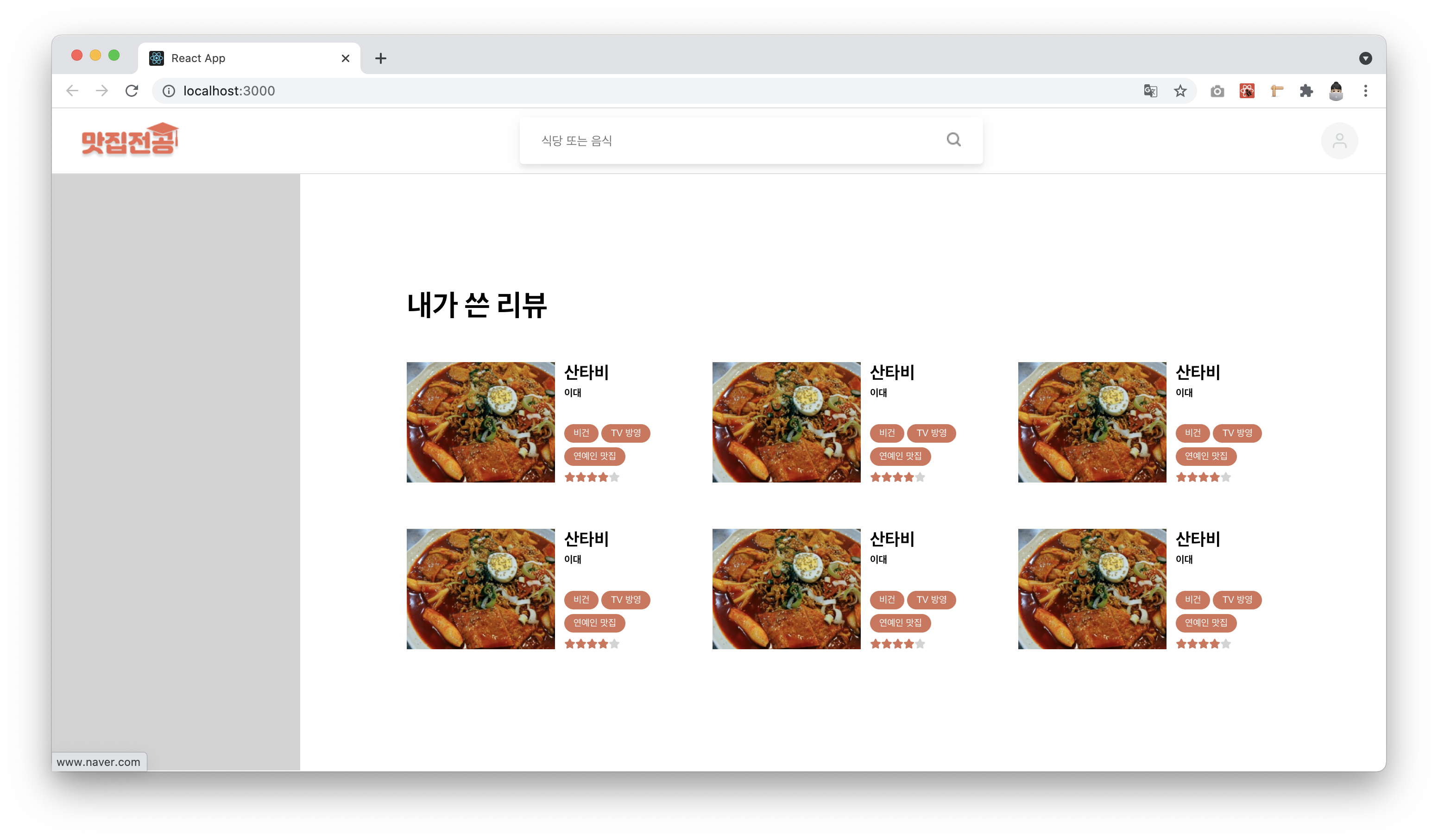
작업 중인 마이페이지에서의 그리드 속 리뷰 컴포넌트의 모습

wanderlust