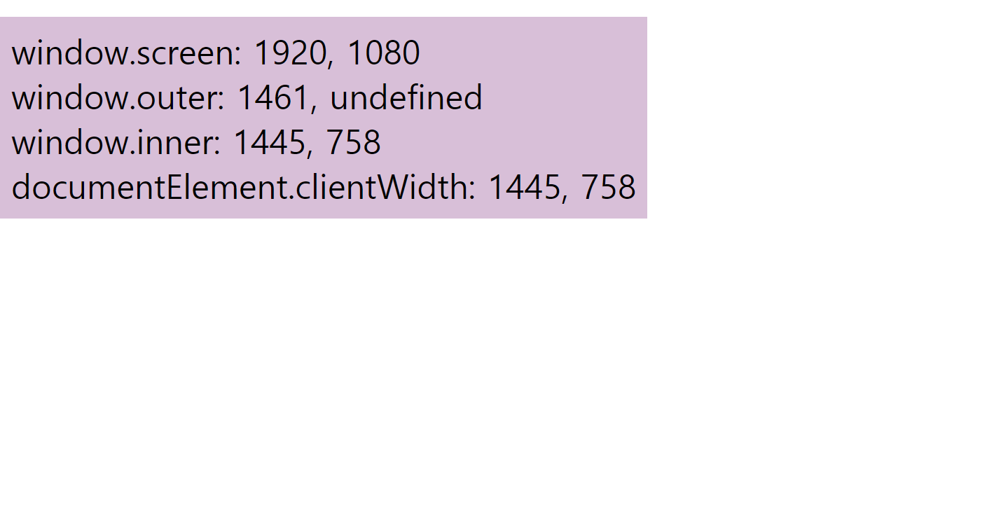
Q1. Window-size 표기
screen/outer/inner을 이용하여 웹화면을 움직였을 때 사이즈가 변화됨을 나타내기.
A.
<!DOCTYPE html>
<html lang="en">
<head>
    <meta charset="UTF-8">
    <meta name="viewport" content="width=device-width, initial-scale=1.0">
    <title>Window Size</title>
    <style>
        .tag{
            display: inline-block;
            background-color: thistle;
            padding: 16px;
            margin-top: 16px;
            font-size: 48px;
        }
    </style>
</head>
<body>
    <div class="tag">Window Size</div>
    <script>
        const tag = document.querySelector('.tag');
        function updateTag() {
            tag.innerHTML = `
            window.screen: ${window.screen.width}, ${window.screen.height} </br>
            window.outer: ${window.outerWidth}, ${window.outerheight} </br>
            window.inner: ${window.innerWidth}, ${window.innerHeight} </br>
            documentElement.clientWidth: ${document.documentElement.clientWidth}, ${document.documentElement.clientHeight} </br>
            `;
        }
        window.addEventListener('resize', () => {
            updateTag();
        });
        updateTag();
    </script>
</body>
> </html>코드를 입력하세요
result)

디자이너에서 개발자로 가는 발자국들을 기록하는 공간입니다.