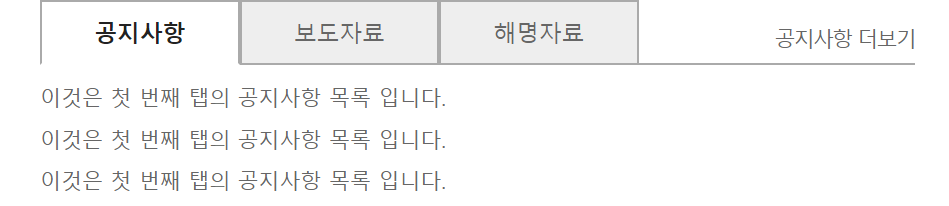
01. Tabmenu
<!DOCTYPE html>
<html lang="ko">
<head>
	<meta charset="UTF-8">
	<title>menu</title>
	<style>
		/*reset*/
		html,body{width:100%;height:100%}
		body,p,h1,h2,h3,h4,h5,h6,ul,ol,li,dl,dt,dd,table,th,td,form,fieldset,legend,input,textarea,button,select{margin:0;padding:0}
		body,input,textarea,select,button,table{font-family:'Malgun Gothic',Dotum,AppleGothic,sans-serif;font-size:12px}
		img,fieldset{border:0}
		ul,ol{list-style:none}
		em,address{font-style:normal}
		a{text-decoration:none}
		a:hover,a:active,a:focus{text-decoration:underline}

		/*style*/
		.wrap {
			width: 960px;
			margin: 0 auto;
		}
		.tab_list {
			position: relative;
			width: 500px;
		}
		.tab_list li.m1,
		.tab_list li.m2,
		.tab_list li.m3 {}
		.tab_list li.m1 > a,
		.tab_list li.m2 > a,
		.tab_list li.m3 > a {
			display: block;
			float: left;
			padding:0 30px;
			background-color: #eee;
			border:1px solid #aaa;
			line-height: 35px;
			color: #666;
			font-size: 13px;
			text-decoration: none;
		}
		.tab_list li.m1.active > a,
		.tab_list li.m2.active > a,
		.tab_list li.m3.active > a {
			position: relative;
			z-index: 1;
			border-bottom-color: #fff;
			background-color: #fff;
			color: #222;
			font-weight: bold;
		}
		.tab_list li.m1 ul,
		.tab_list li.m2 ul,
		.tab_list li.m3 ul {
			position: absolute;
			left: 0;
			top: 36px;
			width: 100%;
			border-top: 1px solid #aaa;
			display: none;
			padding-top: 10px;
		}
		.tab_list li.m1 ul li,
		.tab_list li.m2 ul li,
		.tab_list li.m3 ul li {
			margin-bottom: 6px;
			line-height: 1.5;
		}
		.tab_list li.m1 ul li a,
		.tab_list li.m2 ul li a,
		.tab_list li.m3 ul li a {
			color: #666;
		}
		.tab_list li.m1.active ul,
		.tab_list li.m2.active ul,
		.tab_list li.m3.active ul {
			display: block;
		}
		.tab_list li.m1 .more,
		.tab_list li.m2 .more,
		.tab_list li.m3 .more {
			position: absolute;
			right: 0;
			top:13px;
			display: none;
			line-height: 1.5;

		}
		.tab_list li.m1 .more a,
		.tab_list li.m2 .more a,
		.tab_list li.m3 .more a {
			color: #666;
			letter-spacing: -1px;
		}
		.tab_list li.m1.active .more,
		.tab_list li.m2.active .more,
		.tab_list li.m3.active .more {
			display: block;
		}

	</style>
</head>
<body>

<div class="wrap">
	<!-- UI Object -->
	<div class="tab_list">
		<ul>
			<li class="m1 active"><a href="#"><span>공지사항</span></a>
				<ul>
					<li><a href="#">이것은 첫 번째 탭의 공지사항 목록 입니다.</a></li>
					<li><a href="#">이것은 첫 번째 탭의 공지사항 목록 입니다.</a></li>
					<li><a href="#">이것은 첫 번째 탭의 공지사항 목록 입니다.</a></li>
				</ul>
				<p class="more"><a href="#">공지사항 더보기</a></p>
			</li>
			<li class="m2"><a href="#"><span>보도자료</span></a>
				<ul>
					<li><a href="#">이것은 두 번째 탭의 보도자료 목록 입니다.</a></li>
					<li><a href="#">이것은 두 번째 탭의 보도자료 목록 입니다.</a></li>
					<li><a href="#">이것은 두 번째 탭의 보도자료 목록 입니다.</a></li>
					<li><a href="#">이것은 두 번째 탭의 보도자료 목록 입니다.</a></li>
				</ul>
				<p class="more"><a href="#">보도자료 더보기</a></p>
			</li>
			<li class="m3"><a href="#"><span>해명자료</span></a>
				<ul>
					<li><a href="#">이것은 세 번째 탭의 해명자료 목록 입니다.</a></li>
					<li><a href="#">이것은 세 번째 탭의 해명자료 목록 입니다.</a></li>
					<li><a href="#">이것은 세 번째 탭의 해명자료 목록 입니다.</a></li>
					<li><a href="#">이것은 세 번째 탭의 해명자료 목록 입니다.</a></li>
					<li><a href="#">이것은 세 번째 탭의 해명자료 목록 입니다.</a></li>
				</ul>
				<p class="more"><a href="#">해명자료 더보기</a></p>
			</li>
		</ul>
	</div>
	<!-- //UI Object -->
</div>

</body>
</html>
위 코딩이 적용된 웹화면
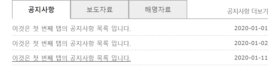
02. Tabmenu_날짜
<!DOCTYPE html>
<html lang="ko">
<head>
	<meta charset="UTF-8">
	<title>menu</title>
	<style>
		/*reset*/
		html,body{width:100%;height:100%}
		body,p,h1,h2,h3,h4,h5,h6,ul,ol,li,dl,dt,dd,table,th,td,form,fieldset,legend,input,textarea,button,select{margin:0;padding:0}
		body,input,textarea,select,button,table{font-family:'Malgun Gothic',Dotum,AppleGothic,sans-serif;font-size:12px}
		img,fieldset{border:0}
		ul,ol{list-style:none}
		em,address{font-style:normal}
		a{text-decoration:none}
		a:hover,a:active,a:focus{text-decoration:underline}

		/*style*/
		.wrap {
			width: 960px;
			margin: 0 auto;
		}
		.tab_list {
			position: relative;
			width: 500px;
		}
		.tab_list li.m1,
		.tab_list li.m2,
		.tab_list li.m3 {}
		.tab_list li.m1 > a,
		.tab_list li.m2 > a,
		.tab_list li.m3 > a {
			display: block;
			float: left;
			padding:0 30px;
			background-color: #eee;
			border:1px solid #aaa;
			line-height: 35px;
			color: #666;
			font-size: 13px;
			text-decoration: none;
		}
		.tab_list li.m1.active > a,
		.tab_list li.m2.active > a,
		.tab_list li.m3.active > a {
			position: relative;
			z-index: 1;
			border-bottom-color: #fff;
			background-color: #fff;
			color: #222;
			font-weight: bold;
		}
		.tab_list li.m1 ul,
		.tab_list li.m2 ul,
		.tab_list li.m3 ul {
			position: absolute;
			left: 0;
			top: 36px;
			width: 100%;
			border-top: 1px solid #aaa;
			display: none;
			padding-top: 10px;
		}
		.tab_list li.m1 ul li,
		.tab_list li.m2 ul li,
		.tab_list li.m3 ul li {
			/*overflow: hidden;*/
			/*float해지위해*/
			margin-bottom: 6px;
			padding-bottom: 4px;
			border-bottom: 1px dashed #ddd;
			line-height: 1.5;
			*zoom:1;
		}
		.tab_list li.m1 ul li:after,
		.tab_list li.m2 ul li:after,
		.tab_list li.m3 ul li:after {
			content: '';
			display: block;
			clear: both;
			/*float해지*/

		}
		.tab_list li.m1 ul li a,
		.tab_list li.m2 ul li a,
		.tab_list li.m3 ul li a {
			float: left;
			color: #666;
		}
		.tab_list li.m1 ul li span,
		.tab_list li.m2 ul li span,
		.tab_list li.m3 ul li span {
			float: right;
			color: #666;
			font-family: verdana,sans-serif;
			font-size: 11px;

		}
		.tab_list li.m1.active ul,
		.tab_list li.m2.active ul,
		.tab_list li.m3.active ul {
			display: block;
		}
		.tab_list li.m1 .more,
		.tab_list li.m2 .more,
		.tab_list li.m3 .more {
			position: absolute;
			right: 0;
			top:13px;
			display: none;
			line-height: 1.5;

		}
		.tab_list li.m1 .more a,
		.tab_list li.m2 .more a,
		.tab_list li.m3 .more a {
			color: #666;
			letter-spacing: -1px;
		}
		.tab_list li.m1.active .more,
		.tab_list li.m2.active .more,
		.tab_list li.m3.active .more {
			display: block;
		}

	</style>
</head>
<body>

<div class="wrap">
	<!-- UI Object -->
	<div class="tab_list">
		<ul>
			<li class="m1 active"><a href="#"><span>공지사항</span></a>
				<ul>
					<li><a href="#">이것은 첫 번째 탭의 공지사항 목록 입니다.</a><span>2020-01-01</span></li>
					<li><a href="#">이것은 첫 번째 탭의 공지사항 목록 입니다.</a><span>2020-01-02</span></li>
					<li><a href="#">이것은 첫 번째 탭의 공지사항 목록 입니다.</a><span>2020-01-11</span></li>
				</ul>
				<p class="more"><a href="#">공지사항 더보기</a></p>
			</li>
			<li class="m2"><a href="#"><span>보도자료</span></a>
				<ul>
					<li><a href="#">이것은 두 번째 탭의 보도자료 목록 입니다.</a><span>2020-01-20</span></li>
					<li><a href="#">이것은 두 번째 탭의 보도자료 목록 입니다.</a><span>2020-01-11</span></li>
					<li><a href="#">이것은 두 번째 탭의 보도자료 목록 입니다.</a><span>2020-01-01</span></li>
					<li><a href="#">이것은 두 번째 탭의 보도자료 목록 입니다.</a><span>2020-01-05</span></li>
				</ul>
				<p class="more"><a href="#">보도자료 더보기</a></p>
			</li>
			<li class="m3"><a href="#"><span>해명자료</span></a>
				<ul>
					<li><a href="#">이것은 세 번째 탭의 해명자료 목록 입니다.</a><span>2020-01-13</span></li>
					<li><a href="#">이것은 세 번째 탭의 해명자료 목록 입니다.</a><span>2020-01-07</span></li>
					<li><a href="#">이것은 세 번째 탭의 해명자료 목록 입니다.</a><span>2020-01-05</span></li>
					<li><a href="#">이것은 세 번째 탭의 해명자료 목록 입니다.</a><span>2020-01-20</span></li>
					<li><a href="#">이것은 세 번째 탭의 해명자료 목록 입니다.</a><span>2020-01-26</span></li>
				</ul>
				<p class="more"><a href="#">해명자료 더보기</a></p>
			</li>
		</ul>
	</div>
	<!-- //UI Object -->
</div>

</body>
</html>
위 코딩이 적용된 웹화면
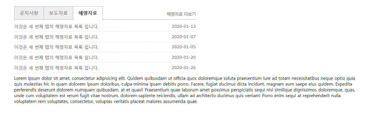
03. Tabmenu_본문추가
<!DOCTYPE html>
<html lang="ko">
<head>
	<meta charset="UTF-8">
	<title>menu</title>
	<style>
		/*reset*/
		html,body{width:100%;height:100%}
		body,p,h1,h2,h3,h4,h5,h6,ul,ol,li,dl,dt,dd,table,th,td,form,fieldset,legend,input,textarea,button,select{margin:0;padding:0}
		body,input,textarea,select,button,table{font-family:'Malgun Gothic',Dotum,AppleGothic,sans-serif;font-size:12px}
		img,fieldset{border:0}
		ul,ol{list-style:none}
		em,address{font-style:normal}
		a{text-decoration:none}
		a:hover,a:active,a:focus{text-decoration:underline}

		/*style*/
		.wrap {
			width: 960px;
			margin: 20px auto;
		}
		.tab_list {
			position: relative;
			width: 500px;
			padding-top: 36px;

		}
		.tab_list li.m1,
		.tab_list li.m2,
		.tab_list li.m3 {}
		.tab_list li.m1 > a,
		.tab_list li.m2 > a,
		.tab_list li.m3 > a {
			display: block;
			position: absolute;
			left: 0;
			top: 0;
			width: 80px;
			background-color: #eee;
			border:1px solid #aaa;
			line-height: 35px;
			color: #666;
			font-size: 13px;
			text-align: center;
			text-decoration: none;
		}
		.tab_list li.m1 > a {left: 0;}
		.tab_list li.m2 > a {left: 81px;}
		.tab_list li.m3 > a {left: 162px;}

		.tab_list li.m1.active > a,
		.tab_list li.m2.active > a,
		.tab_list li.m3.active > a {
			z-index: 1;
			border-bottom-color: #fff;
			background-color: #fff;
			color: #222;
			font-weight: bold;
		}
		.tab_list li.m1 ul,
		.tab_list li.m2 ul,
		.tab_list li.m3 ul {
			display: none;
			width: 100%;
			border-top: 1px solid #aaa;
			padding-top: 10px;
		}
		.tab_list li.m1 ul li,
		.tab_list li.m2 ul li,
		.tab_list li.m3 ul li {
			margin-bottom: 6px;
			padding-bottom: 4px;
			border-bottom: 1px dashed #ddd;
			line-height: 1.5;
			*zoom:1;
		}
		.tab_list li.m1 ul li:after,
		.tab_list li.m2 ul li:after,
		.tab_list li.m3 ul li:after {
			content: '';
			display: block;
			clear: both;
			/*float해지*/

		}
		.tab_list li.m1 ul li a,
		.tab_list li.m2 ul li a,
		.tab_list li.m3 ul li a {
			float: left;
			color: #666;
		}
		.tab_list li.m1 ul li span,
		.tab_list li.m2 ul li span,
		.tab_list li.m3 ul li span {
			float: right;
			color: #666;
			font-family: verdana,sans-serif;
			font-size: 11px;

		}
		.tab_list li.m1.active ul,
		.tab_list li.m2.active ul,
		.tab_list li.m3.active ul {
			display: block;
		}
		.tab_list li.m1 .more,
		.tab_list li.m2 .more,
		.tab_list li.m3 .more {
			position: absolute;
			right: 0;
			top:13px;
			display: none;
			line-height: 1.5;

		}
		.tab_list li.m1 .more a,
		.tab_list li.m2 .more a,
		.tab_list li.m3 .more a {
			color: #666;
			letter-spacing: -1px;
		}
		.tab_list li.m1.active .more,
		.tab_list li.m2.active .more,
		.tab_list li.m3.active .more {
			display: block;
		}

	</style>
</head>
<body>

<div class="wrap">
	<!-- UI Object -->
	<div class="tab_list">
		<ul>
			<li class="m1"><a href="#"><span>공지사항</span></a>
				<ul>
					<li><a href="#">이것은 첫 번째 탭의 공지사항 목록 입니다.</a><span>2020-01-01</span></li>
					<li><a href="#">이것은 첫 번째 탭의 공지사항 목록 입니다.</a><span>2020-01-02</span></li>
					<li><a href="#">이것은 첫 번째 탭의 공지사항 목록 입니다.</a><span>2020-01-11</span></li>
				</ul>
				<p class="more"><a href="#">공지사항 더보기</a></p>
			</li>
			<li class="m2"><a href="#"><span>보도자료</span></a>
				<ul>
					<li><a href="#">이것은 두 번째 탭의 보도자료 목록 입니다.</a><span>2020-01-20</span></li>
					<li><a href="#">이것은 두 번째 탭의 보도자료 목록 입니다.</a><span>2020-01-11</span></li>
					<li><a href="#">이것은 두 번째 탭의 보도자료 목록 입니다.</a><span>2020-01-01</span></li>
					<li><a href="#">이것은 두 번째 탭의 보도자료 목록 입니다.</a><span>2020-01-05</span></li>
				</ul>
				<p class="more"><a href="#">보도자료 더보기</a></p>
			</li>
			<li class="m3 active"><a href="#"><span>해명자료</span></a>
				<ul>
					<li><a href="#">이것은 세 번째 탭의 해명자료 목록 입니다.</a><span>2020-01-13</span></li>
					<li><a href="#">이것은 세 번째 탭의 해명자료 목록 입니다.</a><span>2020-01-07</span></li>
					<li><a href="#">이것은 세 번째 탭의 해명자료 목록 입니다.</a><span>2020-01-05</span></li>
					<li><a href="#">이것은 세 번째 탭의 해명자료 목록 입니다.</a><span>2020-01-20</span></li>
					<li><a href="#">이것은 세 번째 탭의 해명자료 목록 입니다.</a><span>2020-01-26</span></li>
				</ul>
				<p class="more"><a href="#">해명자료 더보기</a></p>
			</li>
		</ul>
	</div>
	<!-- //UI Object -->
	<p>Lorem ipsum dolor sit amet, consectetur adipisicing elit. Quidem quibusdam ut officia quos doloremque soluta praesentium iure ad totam necessitatibus neque optio quia quis molestias hic in quam dolorem ipsum doloribus, culpa minima ipsam debitis porro. Facere, fugiat ducimus dicta incidunt, magnam eum saepe eius quidem. Expedita perferendis deserunt dolorem numquam quibusdam, at et quasi! Praesentium quae laborum amet possimus perspiciatis sequi nisi similique dignissimos doloremque, quas, unde cum voluptatem est rerum fugit vitae nostrum, dolorem sapiente reiciendis, ullam ad architecto ducimus quis veniam! Porro enim sequi at reprehenderit nulla voluptatem rem voluptates, consectetur, voluptas veritatis placeat maiores assumenda quae.</p>
</div>


</body>
</html>
위 코딩이 적용된 웹화면
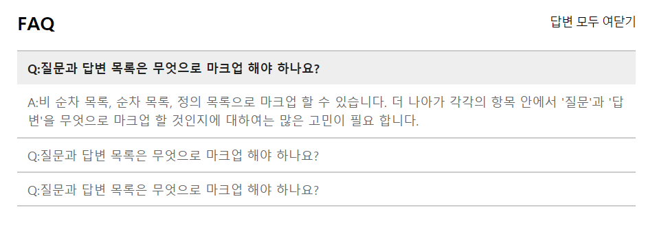
04. faq list_질문과 답변 목록
<!DOCTYPE html>
<html lang="ko">
<head>
	<meta charset="UTF-8">
	<title>faq</title>
	<style>
		/*reset*/
		html,body{width:100%;height:100%}
		body,p,h1,h2,h3,h4,h5,h6,ul,ol,li,dl,dt,dd,table,th,td,form,fieldset,legend,input,textarea,button,select{margin:0;padding:0}
		body,input,textarea,select,button,table{font-family:'Malgun Gothic',Dotum,AppleGothic,sans-serif;font-size:12px}
		img,fieldset{border:0}
		ul,ol{list-style:none}
		em,address{font-style:normal}
		a{text-decoration:none}
		a:hover,a:active,a:focus{text-decoration:underline}

		/*style*/
		.faq {
			width: 600px;
			margin: 0 auto;
		}
		.faq .hgroup {
			*zoom:1;
			/*EI6,7에서 float해지하는 코드가 인식이 안되어서 입력*/
		}
		.faq .hgroup:after {
			content: '';
			display: block;
			clear: both;
			/*float해지*/
		}
		.faq .hgroup h2 {
			float: left;
			padding: 15px 0;
		}
		.faq .hgroup button {
			float: right;
			margin: 18px 0 0 0 ;
			border: 0;
			background:0;
			cursor: pointer;
			letter-spacing: -1px;
		}
		.faq .faq_list {
			border-top:1px solid #ccc;
		}
		.faq .faq_list dt{}
		.faq .faq_list dt a{
			display: block;
			padding: 8px 10px;
			border-bottom: 1px solid #ccc;
			color: #666;
		}
		.faq .faq_list dt a:hover {
			background-color: #eee;
			color: #222;
		}
		.faq .faq_list dd{
			display: none;
			padding:0 10px;
			color: #666;
			line-height: 1.5;
			border-bottom: 1px solid #ccc;
		}
		.faq .faq_list dt.active a {
			border-bottom: none;
			background-color: #eee;
			text-decoration: none;
			color: #222;
			font-weight: bold;
		}
		.faq .faq_list dd.active {
			display: block;
		}
		.faq .faq_list dd p{
			margin: 8px 0;
		}
	</style>
</head>
<body>

<!-- UI Object -->
<div class="faq">
	<div class="hgroup">
		<h2>FAQ</h2>
		<button type="button"><span>답변 모두 여닫기</span></button>
	</div>
	<dl class="faq_list">
		<dt class="active"><a href="#a1">Q:질문과 답변 목록은 무엇으로 마크업 해야 하나요?</a></dt>
		<dd id="a1" class="active">
			<p>A:비 순차 목록, 순차 목록, 정의 목록으로 마크업 할 수 있습니다. 더 나아가 각각의 항목 안에서 '질문'과 '답변'을 무엇으로 마크업 할 것인지에 대하여는 많은 고민이 필요 합니다.</p></dd>

		<dt><a href="#a2">Q:질문과 답변 목록은 무엇으로 마크업 해야 하나요?</a></dt>
		<dd id="a2">
			<p>A:비 순차 목록, 순차 목록, 정의 목록으로 마크업 할 수 있습니다. 더 나아가 각각의 항목 안에서 '질문'과 '답변'을 무엇으로 마크업 할 것인지에 대하여는 많은 고민이 필요 합니다.</p>
			<p>Lorem ipsum dolor sit amet, consectetur adipisicing elit. Debitis esse ullam sapiente itaque, earum porro voluptatum quisquam rerum enim animi!</p></dd>

		<dt><a href="#a3">Q:질문과 답변 목록은 무엇으로 마크업 해야 하나요?</a></dt>
		<dd id="a3">
			<p>A:비 순차 목록, 순차 목록, 정의 목록으로 마크업 할 수 있습니다. 더 나아가 각각의 항목 안에서 '질문'과 '답변'을 무엇으로 마크업 할 것인지에 대하여는 많은 고민이 필요 합니다.</p></dd>
	</dl>
</div>
<!-- //UI Object -->

</body>
</html>
위 코딩이 적용된 웹화면
05. list - 이미지와 텍스트 목록
<!DOCTYPE html>
<html lang="ko">
<head>
<meta charset="UTF-8">
<title>img text list</title>
<style>
/*reset*/
html,body{width:100%;height:100%}
body,p,h1,h2,h3,h4,h5,h6,ul,ol,li,dl,dt,dd,table,th,td,form,fieldset,legend,input,textarea,button,select{margin:0;padding:0}
body,input,textarea,select,button,table{font-family:'Malgun Gothic',Dotum,AppleGothic,sans-serif;font-size:12px}
img,fieldset{border:0}
img{vertical-align: top}
ul,ol{list-style:none}
em,address{font-style:normal}
a{text-decoration:none}
a:hover,a:active,a:focus{text-decoration:underline}
/*style*/
#content {
width: 80%;
margin: 0 auto;
}
#content h1 {
padding: 20px 0;
border-bottom: 1px solid #ccc;
}
.fixed_img_row {}
.fixed_img_row li {
padding: 15px 0;
border-bottom: 1px solid #ccc;
/**zoom:1;*/
}
.fixed_img_row li:after {
content: '';
display: block;
clear: both;
}
.fixed_img_row li a {
color: #333;
}
.fixed_img_row li a .thumb {
position: relative;
float: left;
width: 120px;
background-color: #ddd;
line-height: 81px;
text-align: center;
}
.fixed_img_row li a .thumb img {}
.fixed_img_row li a .thumb em {
display: none;
position: absolute;
left: 0;
top: 0;
opacity: .6;
/*투명도*/
width: 100%;
background-color: #000;
color: #fff;
font-weight: bold;
}
.fixed_img_row li a:hover .thumb em {
display: block;
}
.fixed_img_row li a strong {
display: block;
margin-left: 130px;
margin-bottom: 6px;
}
.fixed_img_row li p {
margin-left: 130px;
margin-bottom: 5px;
color: #666;
line-height: 1.5;
}
</style>
</head>
<body>
<div id="content">
<!-- UI Object -->
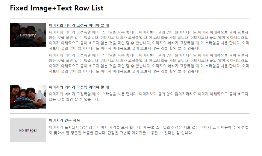
<h1>Fixed Image+Text Row List</h1>
<div class="fixed_img_row">
<ul>
<li>
<a href="#">
<span class="thumb">
<img src="img/@thumb.jpg" width="120" alt="">
<em>Category</em>
</span>
<strong>이미지의 너비가 고정폭 이어야 할 때</strong>
</a>
<p>이미지의 너비가 고정폭일 때 이 스타일을 사용 합니다. 이미지보다 글의 양이 많아지더라도 이미지 아래쪽으로 글이 흐르지 않는 것을 확인 할 수 있습니다. 이미지의 너비가 고정폭일 때 이 스타일을 사용 합니다. 이미지보다 글의 양이 많아지더라도 이미지 아래쪽으로 글이 흐르지 않는 것을 확인 할 수 있습니다. 이미지의 너비가 고정폭일 때 이 스타일을 사용 합니다. 이미지보다 글의 양이 많아지더라도 이미지 아래쪽으로 글이 흐르지 않는 것을 확인 할 수 있습니다. </p>
<p>이미지의 너비가 고정폭일 때 이 스타일을 사용 합니다. 이미지보다 글의 양이 많아지더라도 이미지 아래쪽으로 글이 흐르지 않는 것을 확인 할 수 있습니다. 이미지의 너비가 고정폭일 때 이 스타일을 사용 합니다. 이미지보다 글의 양이 많아지더라도 이미지 아래쪽으로 글이 흐르지 않는 것을 확인 할 수 있습니다. 이미지의 너비가 고정폭일 때 이 스타일을 사용 합니다. 이미지보다 글의 양이 많아지더라도 이미지 아래쪽으로 글이 흐르지 않는 것을 확인 할 수 있습니다. </p>
</li>
<li>
<a href="#"><span class="thumb"><img src="img/@thumb.jpg" width="120" alt=""> <em>Category</em></span> <strong>이미지의 너비가 고정폭 이어야 할 때</strong></a>
<p>이미지의 너비가 고정폭일 때 이 스타일을 사용 합니다. 이미지보다 글의 양이 많아지더라도 이미지 아래쪽으로 글이 흐르지 않는 것을 확인 할 수 있습니다.</p>
</li>
<li>
<a href="#">
<span class="thumb">
No Images
<em>Category</em>
</span>
<strong>이미지가 없는 항목</strong>
</a>
<p>이미지가 포함되지 않은 경우 이미지 자리를 표시 합니다. 이 목록 스타일의 장점은 서로 같은 이미지 크기 때문에 수직 정렬이 맞아서 잘 정돈된 느낌을 줍니다. 단점은 가변폭 이미지를 수용할 수 없다는 점 입니다.</p>
</li>
</ul>
</div>
<!-- //UI Object -->
</div>
</body>
</html>위 코딩이 적용된 웹화면
06. list - 이미지와 텍스트 목록_2
<!DOCTYPE html>
<html lang="ko">
<head>
<meta charset="UTF-8">
<title>img text list</title>
<style>
/*reset*/
html,body{width:100%;height:100%}
body,p,h1,h2,h3,h4,h5,h6,ul,ol,li,dl,dt,dd,table,th,td,form,fieldset,legend,input,textarea,button,select{margin:0;padding:0}
body,input,textarea,select,button,table{font-family:'Malgun Gothic',Dotum,AppleGothic,sans-serif;font-size:12px}
img,fieldset{border:0}
img{vertical-align: top}
ul,ol{list-style:none}
em,address{font-style:normal}
a{text-decoration:none}
a:hover,a:active,a:focus{text-decoration:underline}
/*style*/
#content {
width: 80%;
margin: 0 auto;
}
#content h1 {
padding: 20px 0;
border-bottom: 1px solid #ccc;
}
.flexible_img_row {}
.flexible_img_row li {
border-bottom: 1px solid #ccc;
padding: 20px 0;
*zoom:1;
}
.flexible_img_row li:after {
content: '';
display: block;
clear: both;
}
.flexible_img_row li a {
color: #333;
}
.flexible_img_row li a .thumb {
float: left;
margin: 0 15px 15px 0;
}
.flexible_img_row li a strong {
display: block;
margin-bottom: 8px;
}
.flexible_img_row li p {
color: #666;
line-height: 1.5;
}
</style>
</head>
<body>
<div id="content">
<!-- UI Object -->
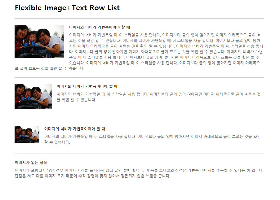
<h1>Flexible Image+Text Row List</h1>
<div class="flexible_img_row">
<ul>
<li>
<a href="#">
<span class="thumb">
<img src="img/@thumb.jpg" width="160" alt="">
</span>
<strong>이미지의 너비가 가변폭이어야 할 때</strong>
</a>
<p>이미지의 너비가 가변폭일 때 이 스타일을 사용 합니다. 이미지보다 글의 양이 많아지면 이미지 아래쪽으로 글이 흐르는 것을 확인 할 수 있습니다. 이미지의 너비가 가변폭일 때 이 스타일을 사용 합니다. 이미지보다 글의 양이 많아지면 이미지 아래쪽으로 글이 흐르는 것을 확인 할 수 있습니다. 이미지의 너비가 가변폭일 때 이 스타일을 사용 합니다. 이미지보다 글의 양이 많아지면 이미지 아래쪽으로 글이 흐르는 것을 확인 할 수 있습니다. 이미지의 너비가 가변폭일 때 이 스타일을 사용 합니다. 이미지보다 글의 양이 많아지면 이미지 아래쪽으로 글이 흐르는 것을 확인 할 수 있습니다. 이미지의 너비가 가변폭일 때 이 스타일을 사용 합니다. 이미지보다 글의 양이 많아지면 이미지 아래쪽으로 글이 흐르는 것을 확인 할 수 있습니다. </p>
</li>
<li>
<a href="#">
<span class="thumb">
<img src="img/@thumb.jpg" width="120" alt="">
</span>
<strong>이미지의 너비가 가변폭이어야 할 때</strong>
</a>
<p>이미지의 너비가 가변폭일 때 이 스타일을 사용 합니다. 이미지보다 글의 양이 많아지면 이미지 아래쪽으로 글이 흐르는 것을 확인 할 수 있습니다.</p>
</li>
<li>
<a href="#"
><span class="thumb">
<img src="img/@thumb.jpg" width="80" alt="">
</span>
<strong>이미지의 너비가 가변폭이어야 할 때</strong>
</a>
<p>이미지의 너비가 가변폭일 때 이 스타일을 사용 합니다. 이미지보다 글의 양이 많아지면 이미지 아래쪽으로 글이 흐르는 것을 확인 할 수 있습니다.</p>
</li>
<li>
<a href="#">
<strong>이미지가 없는 항목</strong>
</a>
<p>이미지가 포함되지 않은 경우 이미지 자리를 표시하지 않고 글만 출력 합니다. 이 목록 스타일의 장점은 가변폭 이미지를 수용할 수 있다는 점 입니다. 단점은 서로 다른 이미지 크기 때문에 수직 정렬이 맞지 않아서 정돈되지 않은 느낌을 줍니다.</p>
</li>
</ul>
</div>
<!-- //UI Object -->
</div>
</body>
</html>위 코딩이 적용된 웹화면
07. list - 이미지와 텍스트 목록_3
<!DOCTYPE html>
<html lang="ko">
<head>
	<meta charset="UTF-8">
	<title>imglidt</title>
	<style>
		/*reset*/
		html,body{width:100%;height:100%}
		body,p,h1,h2,h3,h4,h5,h6,ul,ol,li,dl,dt,dd,table,th,td,form,fieldset,legend,input,textarea,button,select{margin:0;padding:0}
		body,input,textarea,select,button,table{font-family:'Malgun Gothic',Dotum,AppleGothic,sans-serif;font-size:12px}
		img,fieldset{border:0}
		img{vertical-align: top}
		ul,ol{list-style:none}
		em,address{font-style:normal}
		a{text-decoration:none}
		a:hover,a:active,a:focus{text-decoration:underline}

		/*style*/
		.lst_type {
			width: 400px;
			border: 1px solid #888;
			margin: 10px auto;
			padding: 5px;
			*zoom:1;
		}
		.lst_type:after {
			content: '';
			display: block;
			clear: both;
		}
		.lst_type li {
			float: left;
			width: 90px;
			margin: 5px;
		}
		.lst_type li a {
			display: block;
			color: #fff;
		}
		.lst_type li a .thumb {
			display: block;
		}
		.lst_type li a em {
			display: block;
			padding: 5px 5px;
			background-color: #888;
			font-size: 11px;
			letter-spacing: -1px;
			line-height: 1.5;
		}
	</style>
</head>
<body>

<!-- UI Object -->
	<ul class="lst_type">
		<li>
			<a href="#">
				<span class="thumb"><img src="img/thkim.gif" width="90" height="90" alt=""></span>
				<em>하단에 텍스가있는 이미지리스트입니다.</em>
			</a>
		</li>
		<li>
			<a href="#">
				<span class="thumb"><img src="img/thkim.gif" width="90" height="90" alt=""></span>
				<em>하단에 텍스가있는 이미지리스트입니다.</em>
			</a>
		</li>
		<li>
			<a href="#">
				<span class="thumb"><img src="img/thkim.gif" width="90" height="90" alt=""></span>
				<em>하단에 텍스가있는 이미지리스트입니다.</em>
			</a>
		</li>
		<li>
			<a href="#">
				<span class="thumb"><img src="img/thkim.gif" width="90" height="90" alt=""></span>
				<em>하단에 텍스가있는 이미지리스트입니다.</em>
			</a>
		</li>
		<li>
			<a href="#">
				<span class="thumb"><img src="img/thkim.gif" width="90" height="90" alt=""></span>
				<em>하단에 텍스가있는 이미지리스트입니다.</em>
			</a>
		</li>
		<li>
			<a href="#">
				<span class="thumb"><img src="img/thkim.gif" width="90" height="90" alt=""></span>
				<em>하단에 텍스가있는 이미지리스트입니다.</em>
			</a>
		</li>
		<li>
			<a href="#">
				<span class="thumb"><img src="img/thkim.gif" width="90" height="90" alt=""></span>
				<em>하단에 텍스가있는 이미지리스트입니다.</em>
			</a>
		</li>
		<li>
			<a href="#">
				<span class="thumb"><img src="img/thkim.gif" width="90" height="90" alt=""></span>
				<em>하단에 텍스가있는 이미지리스트입니다.</em>
			</a>
		</li>
		<li>
			<a href="#">
				<span class="thumb"><img src="img/thkim.gif" width="90" height="90" alt=""></span>
				<em>하단에 텍스가있는 이미지리스트입니다.</em>
			</a>
		</li>
		<li>
			<a href="#">
				<span class="thumb"><img src="img/thkim.gif" width="90" height="90" alt=""></span>
				<em>하단에 텍스가있는 이미지리스트입니다.</em>
			</a>
		</li>
		<li>
			<a href="#">
				<span class="thumb"><img src="img/thkim.gif" width="90" height="90" alt=""></span>
				<em>하단에 텍스가있는 이미지리스트입니다.</em>
			</a>
		</li>
		<li>
			<a href="#">
				<span class="thumb"><img src="img/thkim.gif" width="90" height="90" alt=""></span>
				<em>하단에 텍스가있는 이미지리스트입니다.</em>
			</a>
		</li>
	</ul>
<!-- //UI Object -->

</body>
</html>
위 코딩이 적용된 웹화면
08. list - 이미지와 텍스트 목록_4
<!DOCTYPE html>
<html lang="ko">
<head>
<meta charset="UTF-8">
<title>imglidt</title>
<style>
/*reset*/
html,body{width:100%;height:100%}
body,p,h1,h2,h3,h4,h5,h6,ul,ol,li,dl,dt,dd,table,th,td,form,fieldset,legend,input,textarea,button,select{margin:0;padding:0}
body,input,textarea,select,button,table{font-family:'Malgun Gothic',Dotum,AppleGothic,sans-serif;font-size:12px}
img,fieldset{border:0}
img{vertical-align: top}
ul,ol{list-style:none}
em,address{font-style:normal}
a{text-decoration:none}
a:hover,a:active,a:focus{text-decoration:underline}
/*style*/
#content {
width: 800px;
margin: 0 auto;
}
.lst_app {
*zoom:1;
}
.lst_app:after {
content: '';
display: block;
clear: both;
}
.lst_app li {
float: left;
margin: 10px;
}
.lst_app li .thmb {
width: 180px;
height: 180px;
background: url(img/bg_thmb.gif) no-repeat;
}
.lst_app li .btn_area {
padding: 15px 0;
text-align: center;
}
.lst_app li a {
text-decoration: none;
}
</style>
</head>
<body>
<div id="content">
<!-- UI Object -->
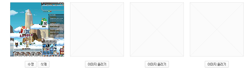
<ul class="lst_app">
<li>
<div class="thmb">
<a href="#">
<img src="img/@tmp_thmb.gif" width="180" height="180" alt="팡야">
</a>
</div>
<div class="btn_area">
<a href="#">
<img src="img/btn_edt.gif" width="39" height="22" alt="수정">
</a>
<a href="#">
<img src="img/btn_del.gif" width="39" height="22" alt="삭제">
</a>
</div>
</li>
<li>
<div class="thmb"></div>
<div class="btn_area"><a href="#"><img src="img/btn_upld_img.gif" width="80" height="22" alt="이미지 올리기"></a></div>
</li>
<li>
<div class="thmb"></div>
<div class="btn_area"><a href="#"><img src="img/btn_upld_img.gif" width="80" height="22" alt="이미지 올리기"></a></div>
</li>
<li>
<div class="thmb"></div>
<div class="btn_area"><a href="#"><img src="img/btn_upld_img.gif" width="80" height="22" alt="이미지 올리기"></a></div>
</li>
</ul>
<!-- //UI Object -->
</div>
</body>
</html>위 코딩이 적용된 웹화면

즐겁게 배우고 꾸준히 블로깅하는 개발자입니다 ;>