React Modal
선정 계기
기존에는 ChatGPT가 Provider를 이용해서 라이브러리 없이 구성했는데 너무 불편한 거 같아서 라이브러리가 있지 않을까 하고 ChatGPT한테 물어봤었다.
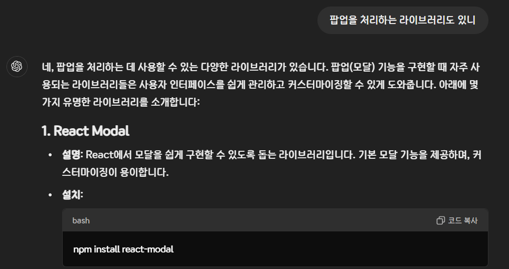
뒤에 더 있긴 하는데 React Modal이 편하다길래 쓰기로 했다.
React Modal이란?
그냥 팝업창 만들 때 쓰는 라이브러리다. 라이브러리 없이 구성했을 때의 엄청난 길이의 코드를 보고 싶지 않을 때 쓰면 되겠다.
얼마나 기냐면
# AlertProvider.tsx
import React, { createContext, useContext, useState } from "react";

interface AlertContextType {
  alert: { title: string; description: string; onConfirm: () => void } | null;
  showAlert: (alertData: {
    title: string;
    description: string;
    onConfirm: () => void;
  }) => void;
  hideAlert: () => void;
}

const AlertContext = createContext<AlertContextType | null>(null);

export const useAlert = () => {
  const context = useContext(AlertContext);
  if (!context) {
    throw new Error("useAlert must be used within an AlertProvider");
  }
  return context;
};

export const AlertProvider: React.FC<{ children: React.ReactNode }> = ({
  children,
}) => {
  const [alert, setAlert] = useState<AlertContextType["alert"]>(null);

  const showAlert = (alertData: AlertContextType["alert"]) =>
    setAlert(alertData);
  const hideAlert = () => setAlert(null);

  return (
    <AlertContext.Provider value={{ alert, showAlert, hideAlert }}>
      {children}
    </AlertContext.Provider>
  );
};

# AlertManager.tsx
import React, { useEffect } from "react";
import styled from "styled-components";
import { useAlert } from "./AlertProvider";

const AlertContainer = styled.div<{ isVisible: boolean }>`
  position: fixed;
  top: 0;
  left: 0;
  width: 100%;
  height: 100%;
  display: ${({ isVisible }) => (isVisible ? "flex" : "none")};
  align-items: center;
  justify-content: center;
  background-color: rgba(0, 0, 0, 0.5);

  font-family: "KCC-Hanbit";

  z-index: 9999;
`;

const Alert = styled.div`
  position: relative;
  background-color: rgb(250, 250, 250);

  width: auto;
  min-width: 300px;
  max-width: 500px;

  padding: 20px 25px;

  border-radius: 8px;

  box-shadow: 0px 0px 15px rgba(0, 0, 0, 0.2);
`;

const Title = styled.p`
  font-size: 18pt;
  margin-bottom: 20px;
  text-align: center;
`;

const Description = styled.p`
  font-size: 12pt;
  margin-bottom: 30px;
  text-align: center;
`;

const BtnContainer = styled.div`
  display: flex;
  justify-content: space-around;
`;

const Yes = styled.button`
  background-color: white;
  width: 100px;
  height: 35px;
  border-radius: 3px;
  border: 1px solid #000;

  font-size: 12pt;
  font-family: "KCC-Hanbit";

  &:hover {
    background-color: rgba(240, 240, 240);
  }

  &:active {
    background-color: rgba(220, 220, 220);
    transform: scale(0.98);
  }

  &:focus {
    outline: none;
  }
`;

const No = styled.button`
  background-color: white;
  width: 100px;
  height: 35px;
  border-radius: 3px;
  border: 1px solid #000;

  font-size: 12pt;
  font-family: "KCC-Hanbit";

  &:hover {
    background-color: rgba(240, 240, 240);
  }

  &:active {
    background-color: rgba(220, 220, 220);
    transform: scale(0.98);
  }

  &:focus {
    outline: none;
  }
`;

export const AlertManager = () => {
  useEffect(() => {
    if (!alert) return;

    const handleKeyDown = (e: KeyboardEvent) => {
      switch (e.key) {
        case "Tab":
          e.preventDefault();
          break;

        case "Enter":
          alert?.onConfirm();
          hideAlert();
          break;

        case "Backspace":
          hideAlert();
          break;
      }
    };

    window.addEventListener("keydown", handleKeyDown);

    return () => {
      window.removeEventListener("keydown", handleKeyDown);
    };
  }, []);

  const { alert, hideAlert } = useAlert();

  return (
    <AlertContainer isVisible={!!alert}>
      <Alert>
        <Title>{alert?.title}</Title>
        <Description>
          {alert?.description?.split("\n").map((line: any, index: any) => (
            <React.Fragment key={index}>
              {line}
              <br />
            </React.Fragment>
          ))}
        </Description>
        <BtnContainer>
          <Yes
            onClick={() => {
              alert?.onConfirm();
              hideAlert();
            }}
          >
            네
          </Yes>
          <No onClick={hideAlert}>아니요</No>
        </BtnContainer>
      </Alert>
    </AlertContainer>
  );
};
그냥 내가 코딩을 못해서 그런 거일 수도 있지만 아무튼 이러고 싶지 않았다.
설치
npm install react-modal
npm i --save-dev @types/react-modal
사용 예시
import React, { useState } from 'react';
import Modal from 'react-modal';

Modal.setAppElement('#root'); // 접근성을 위해 루트 엘리먼트를 지정해야 함

function App() {
  const [isOpen, setIsOpen] = useState(false);

  return (
    <div>
      <button onClick={() => setIsOpen(true)}>모달 열기</button>
      <Modal
        isOpen={isOpen}
        onRequestClose={() => setIsOpen(false)}
        contentLabel="Example Modal"
      >
        <h2>모달 제목</h2>
        <button onClick={() => setIsOpen(false)}>닫기</button>
      </Modal>
    </div>
  );
}

export default App;
그렇다고 한다.
Modal 스타일링
Modal을 CSS로 변경하려면 대충 이렇게 쓰면 된다고 한다.
const StyledModal = styled(Modal)`
  /* 모달 콘텐츠 스타일 */
  .content {
    position: absolute;
    top: 50%;
    left: 50%;
    right: auto;
    bottom: auto;
    transform: translate(-50%, -50%);
    background: white;
    padding: 20px;
    border-radius: 10px;
    max-width: 500px;
    width: 100%;
  }

  /* 오버레이 스타일 */
  .overlay {
    background-color: rgba(0, 0, 0, 0.75);
    position: fixed;
    top: 0;
    left: 0;
    right: 0;
    bottom: 0;
    display: flex;
    justify-content: center;
    align-items: center;
  }
`;

...

<StyledModal
        isOpen={isOpen}
        onRequestClose={() => setIsOpen(false)}
        className="content"
        overlayClassName="overlay"
 />

 ...
주요 Props
isOpen 열고 닫는 거
onRequestClose 닫히는 조건
contentLabel 모달 내용 설명 레이블
style 어차피 styled-components 쓸 거니까 필요없음
포스팅 끝.

프런트엔드 개발자 지망생