공통되는 css 변수를 부여하는 경우에 대한 글입니다.
Theme Provider 작성하기
예시
예시는 아래와 같습니다.
// FilledCard.ts
import { LitElement, css, html } from "lit";
import { customElement } from "lit/decorators.js";

@customElement("filled-card")
export default class FilledCard extends LitElement {
  render() {
    return html`
      <div class="card filled">
        <slot></slot>
      </div>
    `;
  }

  static styles = css`
    div.card {
      background: var(--surface-color, white);
      border-radius: 0.75rem;
      padding: 0.5rem;
    }
  `;
}
위와 같이 단순히 div로 감싼 slot을 가진 lit-element를 작성했습니다.
다음 static styles 속성을 통해 css를 적용하는데, 공통 테마로 작성한 css 변수 --surface-color 를 사용하고 싶은 경우 입니다.
shadowDom 내부에는 외부 css가 영향을 주지 않는다고 알고 계신 분들이 있는데, 우선 :root에 선언된 css 변수는 다른 웹 컴포넌트로 전파됩니다. 따라서 :root에서 선언한 css 변수를 lit element 내부(즉, shadow Dom 내부)에서 사용할 수 있습니다.
상속되는 속성이 있고 안되는 속성이 있으니 필요에 따라 알아보세요.
(https://lamplightdev.com/blog/2019/03/26/why-is-my-web-component-inheriting-styles/)
각설하고 위 코드처럼 스토리북에서도 테마 css를 사용하고 싶은 경우 입니다.
해결
.storybook/preview.cjs 파일에 데코레이터를 작성해 주면 됩니다.
https://storybook.js.org/docs/web-components/writing-stories/decorators#global-decorators
공식 홈페이지의 global decorator 참고
preview.cjs에 아래처럼 코드를 추가합니다.
import { html } from "lit-html";
/**
* assets 폴더에 작성한 theme.css 파일을 불러온다.
* vite를 사용하면 ?inline으로 css 파일의 내용물을
* 가져올 수 있다.
*/
import globalStyle from "@/assets/global.css?inline";
...
/**
* theme-provider를 추가
* theme-provider내부엔 style 코드가 있고,
* 여기에 globalStyle을 작성해준다.
*
* 그리고 마지막으로 story() 를 통해 나머지를 불러와준다.
*/
export const decorators = [
(story) =>
html`<div class="theme-provider">
<style>
${globalStyle}
</style>
${story()}
</div>`,
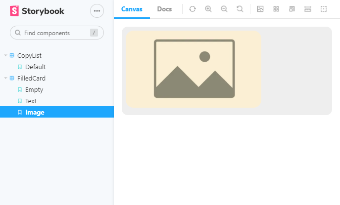
];이제 다음과 같이 스타일이 작동하는 것을 볼 수 있습니다.
/**
 * global.css
 * /

:root {
  --surface-color: #eee;
}
(--surface-color를 읽어 적용함)