Chapter1. CDD
CDD (Component Driven Development)
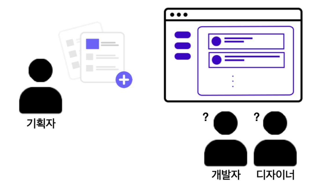
- 기획자로부터 하나의 페이지 기획이 도착했고 ,디자이너와 개발자가 협력하여 디자인과 개발을 진행함.
- 페이지가 모두 완성되었는데, 다른 페이지에 적용되는 버튼에 대한 추가적인 기획안을 요청받음.
-
그런데 기획자가 요청한 사항에서 버튼에 대한 기획이 이전에 요청받았던 버튼을 똑같이 사용 하도록 요청함 그렇다면 디자이너와 개발자는 이 부분을 새로 만들어야 할까?

-
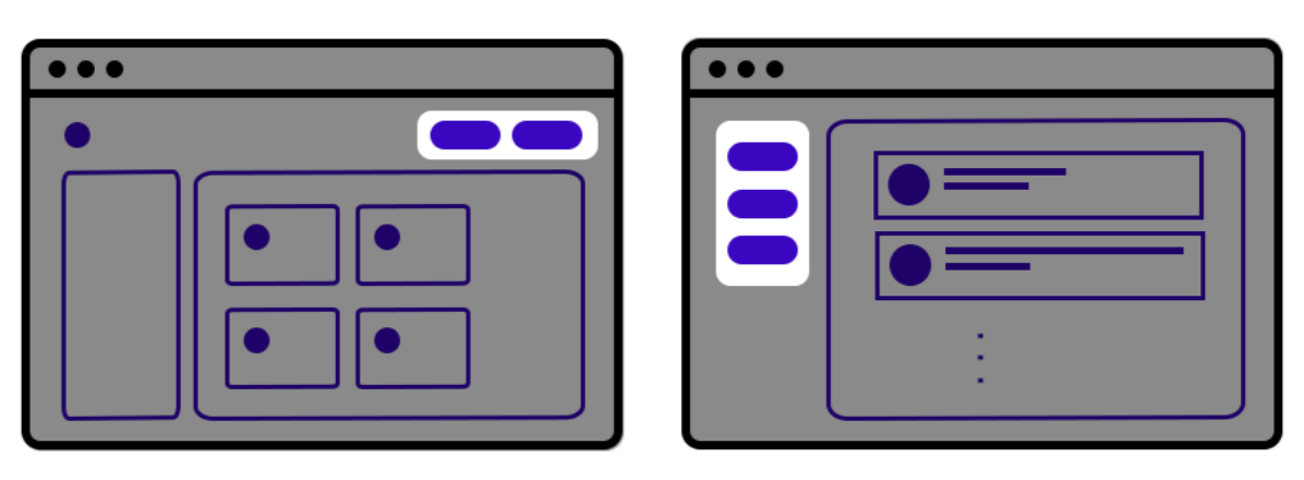
디자인과 개발 단계에서부터 재사용할 수 있는 UI 컴포넌트를 미리 디자인하고 개발하면 이런 고민을 해결할 수 있음!
- 위의 고민을 해결하기 위한 개발 방법이 바로
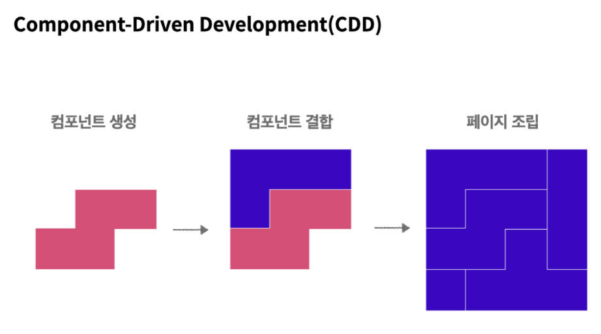
Component Driven Development (CDD) 임. - 부품 단위로 UI 컴포넌트를 만들어 나가는 개발을 뜻함.
- 여러 프로젝트 혹은 여러 팀 간에 같은 UI 컴포넌트를 공유 가능
-실제 CDD 방법을 활용하여 UI 를 구축하는 사이트들 ex) BBC , UN
CSS in JS 발명 과정
구조화된 CSS가 필요하게 된 이유
- 프로젝트의 규모 & 복잡도 증가, 작업하는 팀원들 수 증가
- 모바일이나 태블릿같은 디바이스들의 등장으로 더 복잡해진 CSS
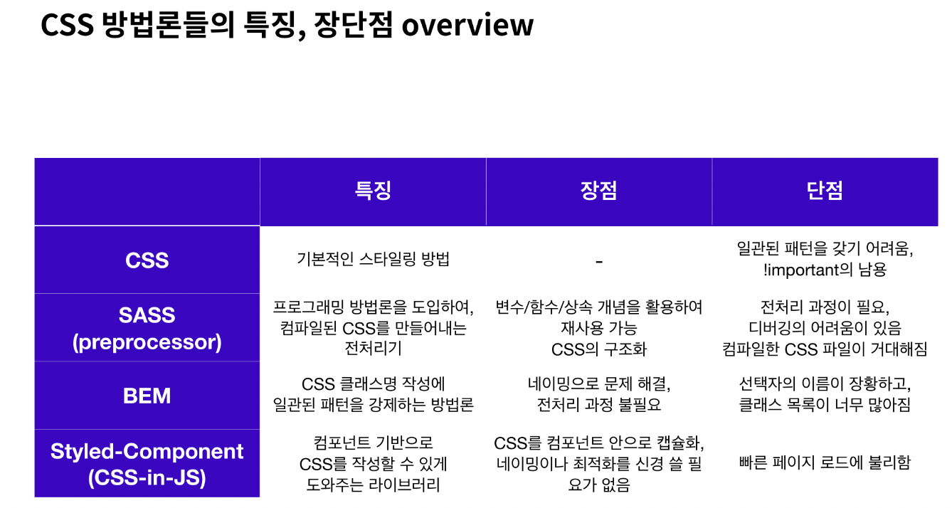
CSS 전처리기(CSS Preprocessor) 등장
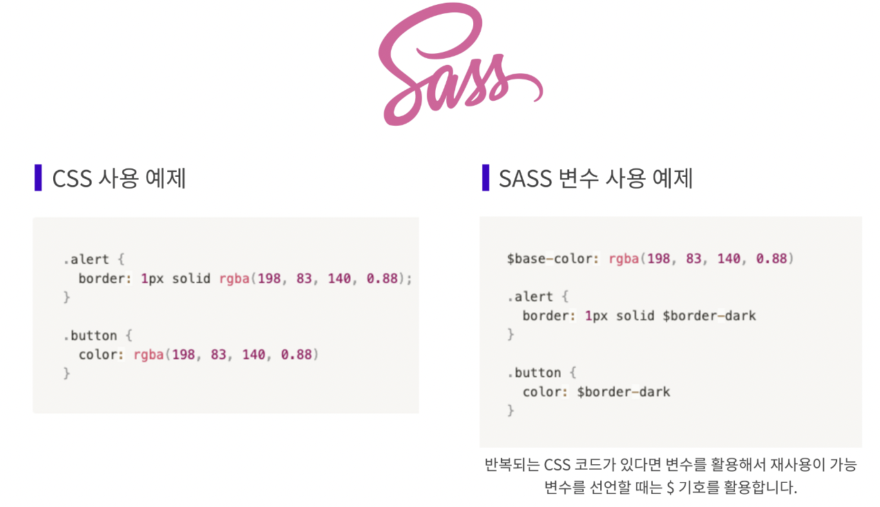
- CSS 전처리기는 CSS가 구조적으로 작성될 수 있게 도움을 주는 도구로, 컴파일러가 필요함.
- CSS 전처리기 중에서는 CSS를 확장해 주는 스크립팅 언어인 SASS( Syntactically Awesome Style Sheets)가 가장 유명함.
=> 선언된 변수를 필요한곳에 적용 및 재사용 가능. - But! 전처리기 내부에서 어떤 작업을 하는지 알지 못한 채, 스타일이 겹치는 문제를 해결하기 위해 단순히 계층 구조를 만들어 내는 것에 의지하게 되고, 그 결과 컴파일된 CSS의 용량이 커지게 되는 문제점을 밝혀냄.
CSS 방법론의 대두
- CSS 전처리기의 문제를 보완하기 위해 BEM, OOCSS, SMACSS 등의 CSS 방법론이 대두됨
- 위의 방법론의 공통 지향점
- 코드의 재사용
- 코드의 간결화(유지 보수 용이)
- 코드의 확장성
- 코드의 예측성(클래스 명으로 의미 예측)
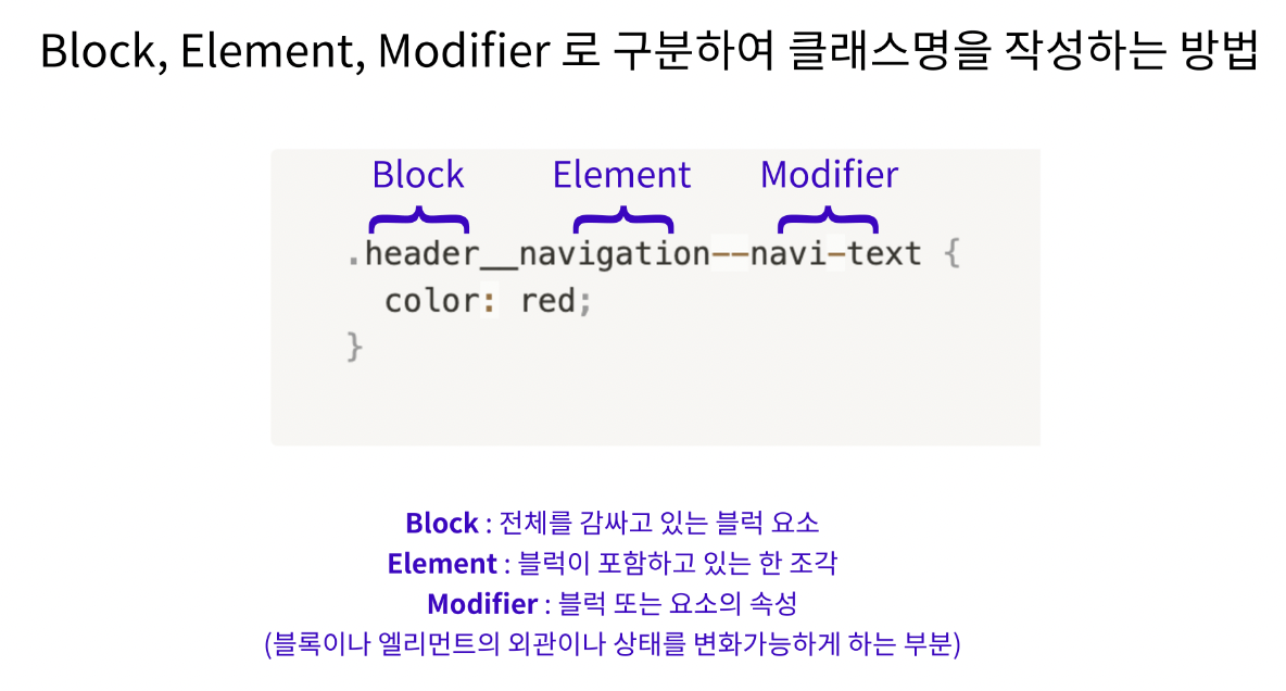
- BEM : 대표적인 CSS 방법론으로 Block, Element, Modifier로 구분하여 클래스명을 작성하는 방법
- But! 이러한 방법론들은 클래스명 선택자가 장황해지고, 긴 클래스명 때문에 마크업이 불필요하게 커지며, 재사용하려고 할 때마다 모든 UI 컴포넌트를 명시적으로 확장, 캡슐화(encapsulation : 객체의 속성과 행위를 하나로 묶고 실제 구현 내용 일부를 외부에 감추어 은닉하는 개념)의 개념이 없는 등의 문제점 발생.
CSS-in-JS의 등장
- 애플리케이션으로 개발 방향이 진화하면서 컴포넌트 단위의 개발은 캡슐화의 중요성을 불러옴.
- 결국 CSS를 컴포넌트 영역으로 불러들이기 위해 CSS-in-JS 탄생.
- 대표적으로 Styled-Component가 있음.
Chapter2. CDD 개발 도구
Styled Components
- React 환경에서 CSS를 컴포넌트화 시킬 수 있는 라이브러리.
- CSS in JS 라이브러리 중에서 현재 가장 인기 있는 라이브러리
설치
//터미널에 아래의 명령어 한 줄을 입력해 설치
// with npm
$ npm install --save styled-components

// with yarn
$ yarn add styled-components

//권장사항: package.json에 아래의 코드를 추가하면 여러 버전의 Styled Components가 설치되어 발생하는 문제를 줄여줌.
{
  "resolutions": {
    "styled-components": "^5"
  }
}

//Styled Components를 사용할 파일로 불러와주면 완성!
import styled from "styled-components"
문법
1. 컴포넌트 만들기
- ES6의 Templete Literals 문법을 사용
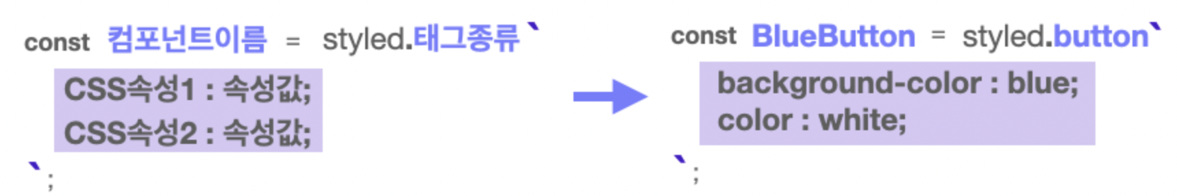
//사용예시

import styled from "styled-components";

//Styled Components로 컴포넌트를 만들고
const BlueButton = styled.button`
  background-color: blue;
  color: white;
`;

export default function App() {
 // React 컴포넌트를 사용하듯 리턴문 안에 작성.
  return <BlueButton>Blue Button</BlueButton>;
}
2. 컴포넌트를 재활용해서 새로운 컴포넌트 만들기
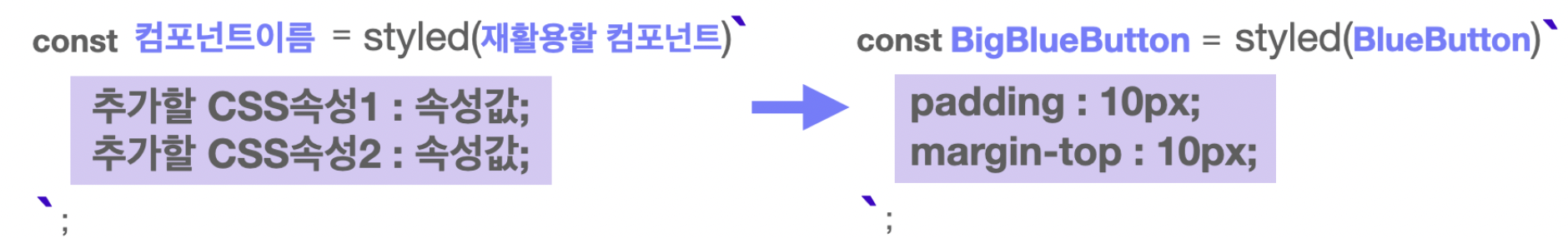
import styled from "styled-components";

const BlueButton = styled.button`
  background-color: blue;
  color: white;
`;

//만들어진 컴포넌트를 재활용해 컴포넌트를 만들 수 있음.
const BigBlueButton = styled(BlueButton)`
  padding: 10px;
  margin-top: 10px;
`;

//재활용한 컴포넌트를 재활용할 수 있음.
const BigRedButton = styled(BigBlueButton)`
  background-color: red;
`;

export default function App() {
  return (
    <>
      <BlueButton>Blue Button</BlueButton>
      <br />
      <BigBlueButton>Big Blue Button</BigBlueButton>
      <br />
      <BigRedButton>Big Red Button</BigRedButton>
    </>
  );
}
3. Props 활용하기
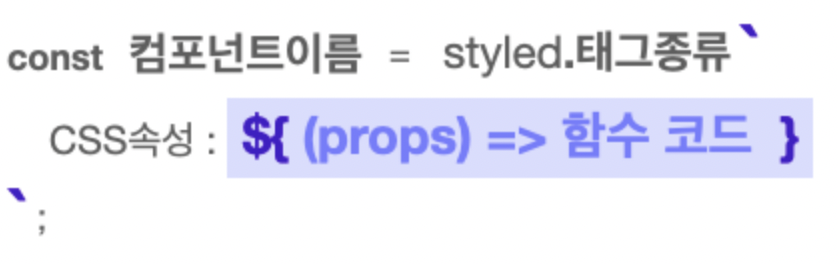
- 템플릿 리터럴 문법( ${ } )을 사용하여 JS코드 사용가능. props를 받아오려면 props를 인자로 받는 함수를 만들어 사용하면 됨.
//1) Props로 조건부 렌더링하기
//삼항연산자를 활용해 <Button> 컴포넌트에 skyblue 라는 props가 있는지 확인하고, 있으면 배경색으로 skyblue를, 없을 경우 white를 지정해주는 코드
const Button = styled.button`
	background: ${(props) => props.skyblue ? "skyblue" : "white"}
`;
/

//2) Props 값으로 렌더링하기
//똑같이 삼항연산자를 사용하고 있지만, props.color 가 없다면 white를, props.color 가 있다면 props.color의 값을 그대로 가져와서 스타일 속성 값으로 리턴
const Button = styled.button`
	background : ${(props) => props.color ? props.color : "white"}
`;

//꼭 삼항연산자만 사용해야하는 것은 아님. JS 코드라면 무엇이든 사용가능
const Button = styled.button`
	background:${(props) => props.color || "white"}
//props 예시 코드
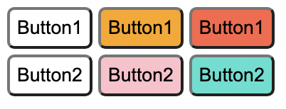
import styled from "styled-components";
import GlobalStyle from "./GlobalStyle";
//받아온 prop 값을 그대로 이용해 렌더링할 수도 있습니다
const Button1 = styled.button`
background: ${(props) => (props.color ? props.color : "white")};
`;
//다음과 같은 형식으로도 활용할 수 있습니다.
const Button2 = styled.button`
background: ${(props) => props.color || "white"};
`;
export default function App() {
return (
<>
<GlobalStyle />
<Button1>Button1</Button1>
<Button1 color="orange">Button1</Button1>
<Button1 color="tomato">Button1</Button1>
<br />
<Button2>Button2</Button2>
<Button2 color="pink">Button2</Button2>
<Button2 color="turquoise">Button2</Button2>
</>
);
}
4. 전역 스타일 설정
//전역 스타일을 설정하기 위해 Styled createGlobalStyle 함수를 불러옴
import { createGlobalStyle } from "styled-components";

// 이 함수를 사용해 CSS 파일에서 작성하듯 설정해주고 싶은 스타일을 작성
const GlobalStyle = createGlobalStyle`
	button {
		padding : 5px;
        margin : 2px;
        border-radius : 5px;
	}
`
//만들어진 <GlobalStyle> 컴포넌트를 최상위 컴포넌트에서 사용해줌
function App() {
	return (
		<>
			<GlobalStyle />
			<Button>전역 스타일 적용하기</Button>
		</>
	);
}
실습 코드
// import "./styles.css";
import styled from "styled-components";
import { createGlobalStyle } from "styled-components";

const GlobalStyle = createGlobalStyle`
  * {
  margin: 0.5rem;
}
`;

const BlueButton = styled.button`
  padding: 1rem;
  font-size: 2rem;
  background: powderblue;
  border-radius: 1rem;
  transition: 0.5s;
  &:hover {
    background: cornflowerblue;
    color: white;
    transition: 0.5s;
  }
`;

export default function App() {
  // return <button id="practice">Practice!</button>;
  return (
    <>
      <GlobalStyle />
      <BlueButton>Practice!</BlueButton>
    </>
  );
}

// const BlueButton = styled.button`
//   background-color: blue;
//   color: white;
// `;

// export default function App() {
//   // React 컴포넌트를 사용하듯이 사용하면 됩니다.
//   return <BlueButton>Blue Button</BlueButton>;
// }

// const GlobalStyle = createGlobalStyle`
//  button {
//    padding : 5px;
//     margin : 2px;
//     border-radius : 5px;
//  }
// `

// function App() {
//  return (
//    <>
//      <GlobalStyle />
//      <Button>전역 스타일 적용하기</Button>
//    </>
//  );
// }
과제 - React Custom Component
Modal.js
import { useState } from 'react';
import styled from 'styled-components';

export const ModalContainer = styled.div`
  // TODO : Modal을 구현하는데 전체적으로 필요한 CSS를 구현합니다.
  display: flex;
  justify-content: center;
  align-items: center;
  width: 100vw;
  height: 100vh;
`;

export const ModalBackdrop = styled.div`
  // TODO : Modal이 떴을 때의 배경을 깔아주는 CSS를 구현합니다.
  background-color: lightgrey;
  position: fixed;
  top:0;
  left: 0;
  bottom: 0;
  right: 0;
`;

export const ModalBtn = styled.button`
  background-color: var(--coz-purple-600);
  text-decoration: none;
  border: none;
  padding: 20px;
  color: white;
  border-radius: 30px;
  cursor: grab;
`;

export const ModalView = styled.div.attrs((props) => ({
  // attrs 메소드를 이용해서 아래와 같이 div 엘리먼트에 속성을 추가할 수 있습니다.
  role: 'dialog',
}))`
  // TODO : Modal창 CSS를 구현합니다.
  // 가운데 정렬
  // 가로길이
  // 세로길이
  position: absolute;
  top: calc(50vh - 100px); left: calc(50vw - 200px);
  width: 300px;
  height: 100px;
  background-color: white;
  display: flex; justify-content: center;
  align-items: center;
  color: var(--coz-purple-600);
  border-radius: 10px;
`;

export const Modal = () => {
  const [isOpen, setIsOpen] = useState(false);

  const openModalHandler = () => {
    // TODO : isOpen의 상태를 변경하는 메소드를 구현합니다.
    setIsOpen(!isOpen)
  };

  return (
    <>
      <ModalContainer>
        <ModalBtn
           onClick = {openModalHandler}
        // TODO : 클릭하면 Modal이 열린 상태(isOpen)를 boolean 타입으로 변경하는 메소드가 실행되어야 합니다.
        >
          {isOpen ? 'Opened!': 'Open Modal'}

          {/* TODO : 조건부 렌더링을 활용해서 Modal이 열린 상태(isOpen이 true인 상태)일 때는 ModalBtn의 내부 텍스트가 'Opened!' 로 Modal이 닫힌 상태(isOpen이 false인 상태)일 때는 ModalBtn 의 내부 텍스트가 'Open Modal'이 되도록 구현해야 합니다. */}
        </ModalBtn>
          {isOpen ?
            <ModalBackdrop onClick={openModalHandler}>
             <ModalView>
                 <div onClick={openModalHandler}> ✕ </div>
                 <div>HELLO CODESTATES!</div>
             </ModalView>
            </ModalBackdrop>
            : null}
        {/* TODO : 조건부 렌더링을 활용해서 Modal이 열린 상태(isOpen이 true인 상태)일 때만 모달창과 배경이 뜰 수 있게 구현해야 합니다. */}
      </ModalContainer>
    </>
  );
};
Toggle.js
import { useState } from 'react';
import styled from 'styled-components';

const ToggleContainer = styled.div`
  position: relative;
  margin-top: 8rem;
  left: 47%;
  cursor: pointer;

  > .toggle-container {
    width: 50px;
    height: 24px;
    border-radius: 30px;
    background-color: #8b8b8b;
    // TODO : .toggle--checked 클래스가 활성화 되었을 경우의 CSS를 구현합니다.
    &.toggle--checked {
       background-color: #B1AFFF
    }
  }

  > .toggle-circle {
    position: absolute;
    top: 1px;
    left: 1px;
    width: 22px;
    height: 22px;
    border-radius: 50%;
    background-color: #ffffff;
    transition: all 0.2s; ease-in;
    // TODO : .toggle--checked 클래스가 활성화 되었을 경우의 CSS를 구현합니다.
  }
  > .toggle--checked {
      left: 28px;
      transition: all 0.2s; ease-in;
  }
`;

const Desc = styled.div`
  // TODO : 설명 부분의 CSS를 구현합니다.
  display: flex;
  justify-content: center;
  align-items: center;
`;

export const Toggle = () => {
  const [isOn, setisOn] = useState(false);

  const toggleHandler = () => {
    // TODO : isOn의 상태를 변경하는 메소드를 구현합니다.
    setisOn(!isOn)
  };

  return (
    <>
      <ToggleContainer
         onClick = {toggleHandler}
        // TODO : 클릭하면 토글이 켜진 상태(isOn)를 boolean 타입으로 변경하는 메소드가 실행되어야 합니다.
      >
        {/* TODO : 아래에 div 엘리먼트 2개가 있습니다. 각각의 클래스를 'toggle-container', 'toggle-circle' 로 지정하세요. */}
        {/* TIP : Toggle Switch가 ON인 상태일 경우에만 toggle--checked 클래스를 div 엘리먼트 2개에 모두 추가합니다. 조건부 스타일링을 활용하세요. */}
        <div className={`toggle-container  ${isOn ? "toggle--checked" : ""}`}/>
        <div className={`toggle-circle ${isOn ? "toggle--checked" : ""}`} />
      </ToggleContainer>
      {/* TODO : Desc 컴포넌트를 활용해야 합니다. */}
      {/* TIP:  Toggle Switch가 ON인 상태일 경우에 Desc 컴포넌트 내부의 텍스트를 'Toggle Switch ON'으로, 그렇지 않은 경우 'Toggle Switch OFF'가 됩니다. 조건부 렌더링을 활용하세요. */}
      {isOn ? <Desc>Toggle Switch ON</Desc> :  <Desc>Toggle Switch OFF</Desc>}
    </>
  );
};
Tab.js
import { useState } from 'react';
import styled from 'styled-components';

// TODO: Styled-Component 라이브러리를 활용해 TabMenu 와 Desc 컴포넌트의 CSS를 구현합니다.

const TabMenu = styled.ul`
  background-color: #dcdcdc;
  color: rgba(73, 73, 73, 0.5);
  font-weight: bold;
  display: flex;
  flex-direction: row;
  justify-items: center;
  align-items: center;
  list-style: none;
  margin-bottom: 7rem;

  .submenu {
    ${'' /* 기본 Tabmenu 에 대한 CSS를 구현합니다. */}
    flex: 1 ;
    text-align: center;
    cursor: pointer;
    padding: 10px;
  }

  .focused {
    ${'' /* 선택된 Tabmenu 에만 적용되는 CSS를 구현합니다.  */}
    background-color: #98A8F8

  }

  & div.desc {
    text-align: center;
  }
`;

const Desc = styled.div`
  text-align: center;
`;

export const Tab = () => {
  // TIP: Tab Menu 중 현재 어떤 Tab이 선택되어 있는지 확인하기 위한
  // currentTab 상태와 currentTab을 갱신하는 함수가 존재해야 하고, 초기값은 0 입니다.
  const [currentTab, setCurrentTab] = useState(0);

  const menuArr = [
    { name: 'Tab1', content: 'Tab menu ONE' },
    { name: 'Tab2', content: 'Tab menu TWO' },
    { name: 'Tab3', content: 'Tab menu THREE' },
  ];

  const selectMenuHandler = (index) => {
    // TIP: parameter로 현재 선택한 인덱스 값을 전달해야 하며, 이벤트 객체(event)는 쓰지 않습니다
    // TODO : 해당 함수가 실행되면 현재 선택된 Tab Menu 가 갱신되도록 함수를 완성하세요.
    setCurrentTab(index)
  };

  return (
    <>
      <div>
        <TabMenu >
          {menuArr.map((el,index) => {
             return <li className={currentTab === index ? 'submenu focused': 'submenu'}
             onClick = {() => selectMenuHandler(index)}>{el.name}</li>
          }) }
          {/*TODO: 아래 하드코딩된 내용 대신에, map을 이용한 반복으로 코드를 수정합니다.*/}
          {/*TIP: li 엘리먼트의 class명의 경우 선택된 tab 은 'submenu focused' 가 되며,
                  나머지 2개의 tab은 'submenu' 가 됩니다.*/}

          {/* <li className="submenu">{menuArr[0].name}</li>
          <li className="submenu">{menuArr[1].name}</li>
          <li className="submenu">{menuArr[2].name}</li> */}
        </TabMenu>
        <Desc>
          {/*TODO: 아래 하드코딩된 내용 대신에, 현재 선택된 메뉴 따른 content를 표시하세요*/}
          <p>{menuArr[currentTab].content}</p>
        </Desc>
      </div>
    </>
  );
};
Tag.js
import { useState } from 'react';
import styled from 'styled-components';

// TODO: Styled-Component 라이브러리를 활용해 여러분만의 tag 를 자유롭게 꾸며 보세요!

export const TagsInput = styled.div`
  margin: 8rem auto;
  display: flex;
  align-items: flex-start;
  flex-wrap: wrap;
  min-height: 48px;
  width: 480px;
  padding: 0 8px;
  border: 1px solid rgb(214, 216, 218);
  border-radius: 6px;

  > ul {
    display: flex;
    flex-wrap: wrap;
    padding: 0;
    margin: 8px 0 0 0;

    > .tag {
      width: auto;
      height: 32px;
      display: flex;
      align-items: center;
      justify-content: center;
      color: #fff;
      padding: 0 8px;
      font-size: 14px;
      list-style: none;
      border-radius: 6px;
      margin: 0 8px 8px 0;
      background: var(--coz-purple-600);
      > .tag-close-icon {
        display: block;
        width: 16px;
        height: 16px;
        line-height: 16px;
        text-align: center;
        font-size: 14px;
        margin-left: 8px;
        color: var(--coz-purple-600);
        border-radius: 50%;
        background: #fff;
        cursor: pointer;
      }
    }
  }

  > input {
    flex: 1;
    border: none;
    height: 46px;
    font-size: 14px;
    padding: 4px 0 0 0;
    :focus {
      outline: transparent;
    }
  }

  &:focus-within {
    border: 1px solid var(--coz-purple-600);
  }
`;

export const Tag = () => {
  const initialTags = ['CodeStates', 'kimcoding'];

  const [tags, setTags] = useState(initialTags);

  const removeTags = (indexToRemove) => {
    // TODO : 태그를 삭제하는 메소드를 완성하세요.
    setTags(tags.filter( (el, index) => indexToRemove !== index ))
    //const filter = tags.filter((tag,index)=>{
    //indexToRemove !== index })
    //setTags(filter)
  };

  const addTags = (event) => {
    // TODO : tags 배열에 새로운 태그를 추가하는 메소드를 완성하세요.
    const newTag = event.target.value;

     if(event.key === "Enter" &&
        newTag.length !== 0 &&
        !tags.includes(newTag)
        ){
         setTags([...tags, newTag])
         event.target.value = '';
        }
     }

    // 이 메소드는 태그 추가 외에도 아래 3 가지 기능을 수행할 수 있어야 합니다.
    // - 이미 입력되어 있는 태그인지 검사하여 이미 있는 태그라면 추가하지 말기
    // - 아무것도 입력하지 않은 채 Enter 키 입력시 메소드 실행하지 말기
    // - 태그가 추가되면 input 창 비우기


  return (
    <>
      <TagsInput>
        <ul id="tags">
          {tags.map((tag, index) => (
            <li key={index} className="tag">
              <span className="tag-title">{tag}</span>
              <span className="tag-close-icon"
              onClick={() => removeTags(index)}>

                {/* TODO :  tag-close-icon이 tag-title 오른쪽에 x 로 표시되도록 하고,
                            삭제 아이콘을 click 했을 때 removeTags 메소드가 실행되어야 합니다. */}
                 x
             </span>
            </li>
          ))}
        </ul>
        <input
          className="tag-input"
          type="text"
          onKeyUp={(event) => { addTags(event);
            {/* 키보드의 Enter 키에 의해 addTags 메소드가 실행되어야 합니다. */}
          }}
          placeholder="Press enter to add tags"
        />
      </TagsInput>
    </>
  );
};

Frontend Developer