드림코딩 엘리님 유튜브 강의를 보고 내가 나중에 참고하려구 정리해놓는 글!!!!🤣
1. display: flex;
일단 flexbox를 사용하기 위해선 item 을 감싸고 있는 container를 display: flex; 로 지정해줘야한다.
.container {
  display: flex;
}
2. flex-direction: row; // 기본값 row
flex-direction은 container 내의 item 을 배치할 때 main axis 및 방향(정방향, 역방향)을 지정한다.
row 는 왼쪽에서 오른쪽,
row-reverse 는 오른쪽에서 왼쪽,
column은 위에서 아래,
column-reverse는 아래에서 위로!
.container {
  display: flex;
  flex-direction: row;
}
3. flex-wrap: nowrap; // 기본값 nowrap
flex-wrap은 item 들이 한줄로 배치되게 할것인지, 또는 가능한 영역 내에서 벗어나지 않고 여러행으로 나누어 표현 할것인지를 지정한다.
nowrap 은 화면의 크기가 줄어들어도 item 들이 밑으로 떨어지지않고 한줄로 붙어있다. 이건 랩핑을 안하겠다고 지정이 되어있기 때문이다.
wrap 은 화면의 크기가 줄어들때 자동으로 다음 라인으로 아이템이 떨어지게 되고,
wrap-reverse 은 반대로 랩핑이 된다.
(ex.
4 5 6
1 2 3)
.container {
  display: flex;
  flex-direction : row;
  flex-wrap : nowrap;
}
4. flex-flow: row nowrap;
flex-derection, flex-wrap 을 한번에 묶어서 표현할 수 있다.
.container {
  display: flex;
  /* flex-direction: row;
  flex-wrap: nowrap; */
  flex-flow: row nowrap;
}
5.justify-content: flex-start; // 기본값 flex-start
justify-content 는 main axis 에서 item 들을 어떻게 배치할껀지를 결정해준다.
flex-start 는 main axis 가 수평축이라면 왼쪽에서 오른쪽으로, 수직축이라면 위쪽에서 아래쪽으로.
flex-end 는 item의 순서는 유지하되, item들이 오른쪽/아래쪽 으로 배치된다.
center 는 말그대로 가운데에 배치.
그 외 space-around, space-evenly, space-between 등은 item 사이에 간격을 띄워 배치한다. 차이가 있는데 말로 설명하기가 어렵다^^........ jsbin으로 코드쳐서 만들어온 이미지라도 첨부..😿
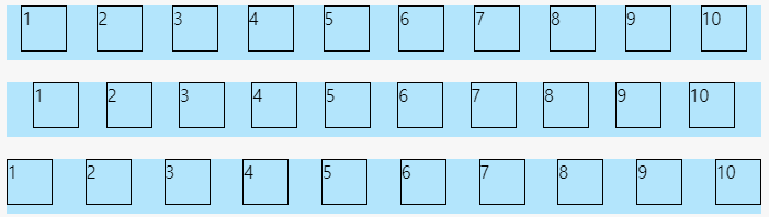
순서대로 space-around, space-evenly, space-between!
around는 item 양쪽으로 간격이 일정하게 생기는거 같고, evenly는 item 처음과 끝을 포함하여 일정한 공백이 생기도록 하는거 같고, between은 item 처음과 끝은 공백없이 나머지 사이사이에만 일정한 공백이 생기도록 하는거같다!ㅎㅎㅎ^^...................
.container {
  display: flex;
  flex-direction: row;
  flex-wrap: nowrap;
  /* flex-flow: row nowrap; */
  justify-content: flex-start;
}
6. align-items: stretch; // 기본값 stretch
align-items 는 cross axis 에서 item을 어떻게 배치할껀지를 결정해준다.
하나의 줄 내에 있는 요소들에 적용된다!!!!!
center 는 말그대로 가운데에 배치된다.
baseline 은 폰트를 기준으로 배치된다.
.container {
  display: flex;
  flex-direction: row;
  flex-wrap: nowrap;
  /* flex-flow: row nowrap; */
  justify-content: flex-start;
  align-items: stretch;
}
7. align-content: stretch; // 기본값 stretch
align-content 도 cross axis 에서 item 배치를 결정해준다.
flex-wrap: wrap; 필수!!!!!!!!!!!!!!!!!!!! item 들이 여러 줄로 배치되어 있을 때 적용된다!!!
justify-content 와 같은 속성값들을 사용할 수 있다.
.container {
  display: flex;
  flex-direction: row;
  flex-wrap: wrap; // 필수!
  /* flex-flow: row nowrap; */
  justify-content: flex-start;
  align-items: stretch;
  align-content: center;
}
🐥오늘의 사족🐥
어제 그냥 인강을 보기만 했을 때는 와 그렇구나 신기하다~ 이러고 이해한 줄 알았는데, 이렇게 블로그에 글을 쓰다보니 어 잘 모르겠는데..? 싶은것이다..? 그래서 구글링해서 조금 더 설명을 덧붙였다..ㅎㅎㅎ아마 이렇게 글을 쓰고도 완벽히 이해하진 못한거같아서 좀 더 공부해야할꺼같다!!!!!!!!!! 화이팅!!!!!!