
스토리북이 무엇인가?
스토리북은 무료로 사용할 수 있는 오픈소스 라이브러리로 컴포넌트 단위의 UI 개발 도구입니다. 복잡한 로직 없이 독립적인 환경에서 컴포넌트를 개발하고 컴포넌트들을 오직 테스트를 위해 특정 페이지에 작성하고 지우고 할 필요 없이 Story를 만들어 컴포넌트를 테스트할 수 있습니다.
CDD(Component Driven Development)
CDD는 컴포넌트 주도 개발의 약자로 재사용 가능한 컴포넌트를 정의하고, 컴포넌트의 조합으로 개발을 진행하는 방식입니다. 이런 컴포넌트 주도 개발을 지원하는 라이브러리 중 하나가 바로 Storybook입니다.
설치
npx storybook@latest init스토리북을 시작하기 위해서 다음 명령어를 입력합니다.
npm run storybookStory란 무엇인가?
story는 UI 컴포넌트의 렌더링된 상태를 캡쳐합니다. stories 디렉토리 내부에 .stories.js 또는 .stories.ts/tsx 로 끝나는 파일을 생성해 스토리를 생성할 수 있습니다.
Story를 작성해보자
컴포넌트를 테스트 및 문서화하기 위해 스토리를 생성할 수 있습니다. default export 구문으로 컴포넌트의 메타 데이터를 지정하고, named export 방식으로 컴포넌트 각각의 story를 내보냅니다. 해당 방식을 CSF(Component Story Format)라고 지칭합니다.
Button이라는 컴포넌트가 이미 존재한다고 가정하고, 버튼에 대한 스토리를 생성하는 방법은 다음과 같습니다.
import type { Meta, StoryObj } from '@storybook/react';
import { Button } from './Button';

const meta: Meta<typeof Button> = {
  title: 'components/button/index.tsx',
  component: Button,
  parameters: { backgrounds: { default: 'dark' } },
};

export default meta;
meta 객체를 default export로 내보내면, 스토리북에 올릴 컴포넌트의 폴더의 메타 데이터를 구성할 수 있습니다.
title에는 스토리북의 Manager Area에 폴더 구조 계층을 나타낼 수 있습니다. component에는 스토리를 작성할 컴포넌트를 넘깁니다.
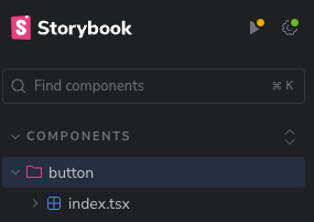
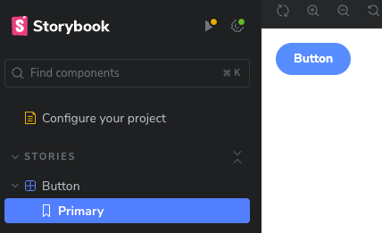
버튼 컴포넌트에 대한 간단한 스토리를 하나 만들어 named export로 내보냈습니다.
import type { Meta, StoryObj } from '@storybook/react';
import { Button } from './Button';

const meta: Meta<typeof Button> = {
  title: 'components/button/index.tsx',
  component: Button,
  parameters: { backgrounds: { default: 'dark' } },
};

export default meta;

type Story = StoryObj<typeof Button>;

// 스토리 생성
export const Primary: Story = {
  render: () => <Button label="Button" primary />,
  parameters: {},
};
스토리북에서 다음과 같이 보여집니다.
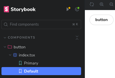
여러가지 use Case를 보여주려면 Story 인터페이스를 충족하는 객체를 named export로 내보냅니다.
export const Default: Story = {
  render: () => <Button label="button" />,
};
스토리 문서화
메타 데이터 tags 배열에 autodocs를 작성해주세요.
const meta: Meta<typeof Button> = {
  title: 'button',
  component: Button,
  tags: ['autodocs'],
};
컴포넌트에 대한 설명을 제공하여 컴포넌트를 스토리북에서 문서처럼 활용할 수 있습니다.
/**
 * 유저와 인터랙션하기 위한 버튼 컴포넌트입니다.
 */
export const Button = ({
  primary = false,
  size = 'medium',
  backgroundColor,
  label,
  ...props
}: ButtonProps) => {
	// ...
}
스토리북에는 다음과 같이 표시됩니다.
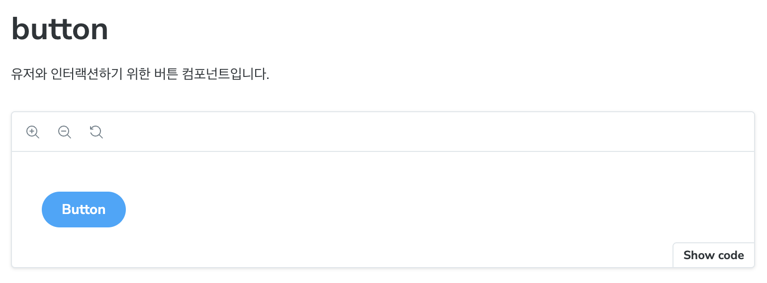
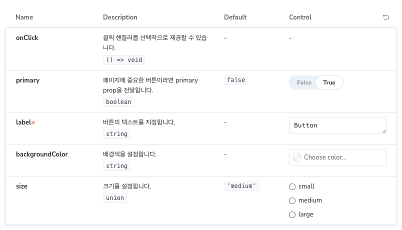
컴포넌트가 받는 prop에 대한 설명을 제공할 수도 있습니다.
interface ButtonProps {
  /**
   * 페이지에 중요한 버튼이라면 primary prop을 전달합니다.
   */
  primary?: boolean;
  /**
   * 배경색을 설정합니다.
   */
  backgroundColor?: string;
  /**
   * 크기를 설정합니다.
   */
  size?: 'small' | 'medium' | 'large';
  /**
   * 버튼의 텍스트를 지정합니다.
   */
  label: string;
  /**
   * 클릭 핸들러를 선택적으로 제공할 수 있습니다.
   */
  onClick?: () => void;
}
args, 컴포넌트의 prop을 스토리북에서 적용하기
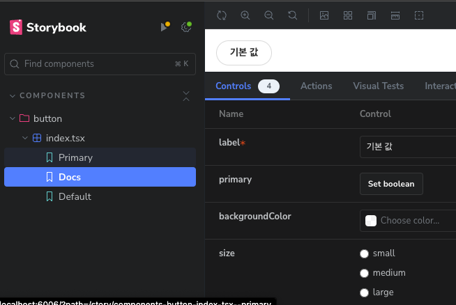
스토리를 좀 더 유연하게 사용하기 위해서 스토리북의 args를 활용할 수 있습니다.
args에 값을 설정해 보여줄 수 있습니다. 빈 객체를 전달하면 사용자가 모든 값을 지정하도록 할 수 있습니다.
export const Docs: Story = {
  args: { label: '기본 값' },
};
매개변수
스토리 매개변수는 Storybook의 기능과 애드온의 동작을 제어하는데 사용됩니다.
여기서는 애드온으로 배경색을 바꾸는 예제만을 다룹니다.
공식문서에서 추가적인 애드온에 대해 확인하실 수 있습니다.추가 애드온 공식문서 - Essential addons • Storybook docs
총 3가지 케이스가 존재합니다.
- 단일 스토리에 적용
- 컴포넌트의 모든 하위 스토리에 적용
- 모든 스토리에 적용
단일 스토리에 적용
매개변수를 통해 단일 스토리에 대한 배경 애드온을 설정하는 예제입니다.
export const Primary: Story = {
  render: () => <Button label="Button" primary />,
  parameters: { backgrounds: { default: 'dark' } },
};
스토리북에서 배경색이 어두운 색으로 설정된 것을 확인할 수 있습니다.

컴포넌트의 모든 하위 스토리에 적용
메타 레벨에서 매개변수를 지정해 컴포넌트의 모든 하위 스토리에 적용할 수도 있습니다.
const meta: Meta<typeof Button> = {
  title: 'components/button/index.tsx',
  component: Button,
  parameters: { backgrounds: { default: 'dark' } },
};
모든 스토리에 적용
.storybook 폴더의 preivew 파일(모든 스토리를 구성하는 파일)에 매개변수를 설정해 모든 스토리에 적용할 수 있습니다.
const preview: Preview = {
  parameters: {
    parameters: { backgrounds: { default: 'dark' } },
  },
};
추가 요소를 렌더링 하는 Decorator
데코레이터는 스토리 컴포넌트를 추가 요소로 감싸 렌더링할 수 있는 방법입니다.
데코레이터도 총 3가지의 케이스가 존재합니다.
- 단일 스토리에 적용
- 컴포넌트의 모든 하위 스토리에 적용
- 모든 스토리에 적용
컴포넌트의 모든 하위 스토리에 적용
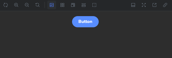
컴포넌트가 여백 없이 보여지는 경우 내부에 간격을 두기 위해 데코레이터를 사용할 수 있습니다. 여기서는 컴포넌트를 중앙으로 정렬 해보겠습니다.
const meta: Meta<typeof Button> = {
  title: 'components/button/index.tsx',
  component: Button,
  parameters: { backgrounds: { default: 'dark' } },
  decorators: [
    Story => (
      <div style={{ display: 'flex', justifyContent: 'center' }}>
        <Story />
      </div>
    ),
  ],
};
단일 스토리에 적용
위 방법과 동일하게 단일 스토리에 적용하시면 됩니다.
모든 스토리에 적용
몇몇 프레임워크별 라이브러리(대표적으로 Styled Componets)는 Context API의 Provider로 감싸야 정상적으로 작동하는 경우가 있습니다. 이런 경우 .storybook/preview 파일에 데코레이터를 추가할 수 있습니다.
import React from 'react';
import { Preview } from '@storybook/react';
import { ThemeProvider } from 'styled-components';

const preview: Preview = {
  decorators: [
    (Story) => (
      <ThemeProvider theme="default">
        <Story />
      </ThemeProvider>
    ),
  ],
};

export default preview;
컴포넌트 시뮬레이션, Play
Play는 스토리가 렌더링 된 이후 컴포넌트에 사용자의 개입 없이 상호작용을 정의하여 자동으로 실행할 수 있는 시나리오를 작성할 수 있는 기능입니다. 이를 통해 UI 컴포넌트의 동작을 시뮬레이션하고 테스트 할 수 있습니다.
요소에 접근하는 query는 Testing Library 공식문서에서 확인하실 수 있습니다.
About Queries | Testing Library
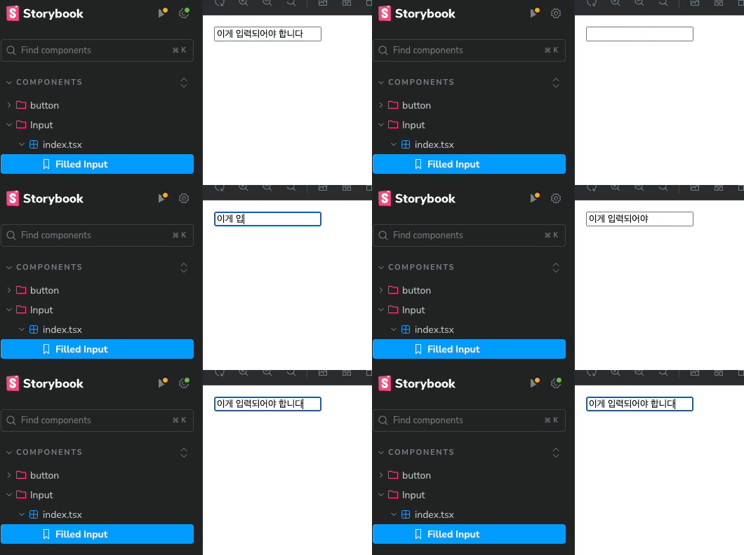
스토리북에서 Input에 접근해 인터랙션을 정의하는 간단한 예제입니다.
import type { Meta, StoryObj } from '@storybook/react';
import { userEvent, within } from '@storybook/test';
import Input from './Input';

const meta: Meta<typeof Input> = {
  title: 'components/Input/index.tsx',
  component: Input,
};

export default meta;

type Story = StoryObj<typeof Input>;

export const FilledInput: Story = {
  render: () => <Input />,
  play: async ({ canvasElement }) => {
    const canvas = within(canvasElement);

    const input = canvas.getByLabelText('text-input');

    await userEvent.type(input, '이게 입력되어야 합니다', { delay: 100 });
  },
};
play 함수는 비동기 함수로 정의해야합니다.
함수의 인자로 canvasElement를 전달받는데, 스토리북은 캔버스 내에서 컴포넌트를 렌더링하기 때문에 캔버스 내부에 있는 컴포넌트를 참조하기 위해 사용됩니다.
비동기 데이터 페칭, Loader
로더는 스토리에서 lazy load 또는 API 데이터를 가져오는데 사용할 수 있습니다. 그러나 스토리 데이터를 관리하기 위해서는 args를 권장하며 로더는 꼭 필요한 경우에만 사용하기를 권장합니다.
예제는 공식문서의 예제로 대체합니다.
import type { Meta, StoryObj } from '@storybook/react';

import fetch from 'node-fetch';

import { TodoItem } from './TodoItem';

/*
 *👇 Render functions are a framework specific feature to allow you control on how the component renders.
 * See https://storybook.js.org/docs/api/csf
 * to learn how to use render functions.
 */
const meta: Meta<typeof TodoItem> = {
  component: TodoItem,
  render: (args, { loaded: { todo } }) => <TodoItem {...args} {...todo} />,
};

export default meta;
type Story = StoryObj<typeof TodoItem>;

export const Primary: Story = {
  loaders: [
    async () => ({
      todo: await (await fetch('https://jsonplaceholder.typicode.com/todos/1')).json(),
    }),
  ],
};