만드는 과정중 발생했던 문제와 해결한 방법
- 처음에 회원가입에 필요한 요소들을 정렬시키기 위해 flex속성을 어떤 요소에 줘야 하는지 헤맸다
- 부모요소에 display: flex 속성값과 가로축 , 세로축 정렬 방향을 설정해줘야 자식요소가 부모요소를 기준으로 정렬된다
- 아래의 html 코드에서 회원가입 폼의 각 요소를 감싸고 있는 container div에 flex 속성을 주었고
- 세로축을 기준으로 정렬하기 위해 flex-direction: column 속성을 추가했다
- 각 요소들 사이에 일정한 공백을 주기 위해 justify-content: space-around 속성을 줬다
- 각 요소들이 세로축을 기준으로 가운데 정렬시키기 위해 align-items: center를 줬다
<div class="container">
<div class="child-div" id="child-div-title">
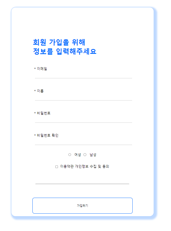
<h1>회원 가입을 위해 <br> 정보를 입력해주세요</h1>
</div>
<div class="child-div">
<label for="email">* 이메일</label>
<input class="em" type="text" name="email">
</div>
<div class="child-div">
<label for="name">* 이름</label>
<input class="nm"type="text" name="name">
</div>
<div class="child-div">
<label for="password">* 비밀번호</label>
<input class="pw" type="password" name="password">
</div>
<div class="child-div">
<label for="password_ok">* 비밀번호 확인</label>
<input class="pw" type="password" name="password_ok">
</div>
<div class="radio-container">
<div id="radio1">
<input type="radio" id="female" name="gender-female" value="여성">
<label for="gender-female">여성</label>
</div>
<div id="radio2">
<input type="radio" id="male" name="gender-male" value="남성">
<label for="gender-male">남성</label>
</div>
</div>
<div class="checkbox-container">
<input type="checkbox" id="signin" name="signin" value="이용약관 개인정보 수집 및 동의">
<label for="signin">이용약관 개인정보 수집 및 동의</label>
</div>
<div class="child-div">
<hr/>
</div>
<div>
<button>가입하기</button>
</div>
</div>* {
box-sizing: border-box;
}
body {
display: flex;
justify-content: center;
}
.container {
width: 670px;
height: 980px;
margin-top: 60px;
margin-left: 625px;
display: flex;
flex-direction: column;
justify-content: space-around;
align-items: center;
border: 1px solid #AACDFF;
background-color: #FFFFFF;
border-radius: 20px;
box-shadow: 7px 7px 7px 7px #0068FF40;
}
.child-div {
width: 466px;
height: 80px;
/* border: 1px solid red; */
display: flex;
align-items: center;
}전체 소스코드:
https://github.com/meeyoungchoi-front-dev/pre-codecamp/tree/main/class
결과화면
flexbox
- 박스 내 요소 간의 공간 배분과 정렬 기능을 제공하기 위한 레이아웃
- 레이아웃을 다룰때 한 번에 하나의 행 또는 열 만을 다룬다
flexbox 만들기
- flexbox를 flex 컨테이너 라고 한다
- div 컨테이너 안에 요소들을 포함하기 때문이다
- flex 컨테이너를 만들기 위해서는 컨테이너에 display: flex를 적용해야 한다
flex 적용전
<!DOCTYPE html>
<html>
    <head>
        <meta charset="utf-8">
        <title>HTML 문서</title>
        <style>
            .item {
                width: 80px;
                height: 80px;
                background-color: orange;

            }
        </style>
    </head>
    <body>
        <div class="container">
            <div class="item">1</div>
            <div class="item">2</div>
            <div class="item">3</div>
        </div>    .

    </body>
</html>
flex 적용후
- 기본적으로 요소들을 행 방향으로 정렬시키는 특징을 갖고 있다 (default)
- 공간 배분과 정렬은 flexbox의 추가 속성들을 사용하여 다양하게 정의할 수 있다
- flex는 기본적으로 자식 요소가 갖고있는 기본 마진 값을 무시하고
- 가로방향 (행 방향)으로 요소를 배치한다
<!DOCTYPE html>
<html>
    <head>
        <meta charset="utf-8">
        <title>HTML 문서</title>
        <style>
            .container {
                display: flex;
                /*
                    자식 요소가 갖고있는 기본 마진 값을 무시하고
                    가 가로방향 (행 방향)으로 요소를 배치한다
                */
            }


            .item {
                width: 80px;
                height: 80px;
                background-color: orange;
            }
        </style>
    </head>
    <body>
        <div class="container">
            <div class="item">1</div>
            <div class="item">2</div>
            <div class="item">3</div>
        </div>
    </body>
</html>
먼저 알아야 할것
- 레이아웃 관리를 위해 flexbox에는 주축 과 교차축이 있다
주축요소의 진행 방향 (가로 방향)교차 축엇갈리는 방향 (세로 방향)- 목적에 따라 주축 과 교차축 을 바꿀수 있다
flex-direction
- flex-direction 속성은 flexbox 내 요소를 배치할 때 사용할 주축 및 방향 (정방향 , 역방향)을 지정한다
- flex-direction 은 flex container를 위한 속성이다
| 속성값 | 의미 |
|---|---|
| row | 기본값 , 주축은 행이고 방향은 콘텐츠의 방향과 동일 |
| row-reverse | 주축은 행이고 방향은 콘텐츠의 방향과 반대 |
| column | 주축은 열이고 방향은 콘텐츠의 방향과 동일 |
| column-reverse | 주축은 열이고 방향은 콘텐츠의 방향과 반대 |
flex-direction : row
- item을 감싸고 있는 컨테이너의 방향이 가로 이다
- 컨테이너는 items를 감싸는 부모 요소이다
- 각 item을 정렬하기 위해서는 container가 필수 이다
- 즉 item들이 가로로 정렬된다
- 참고 - https://heropy.blog/2018/11/24/css-flexible-box/
<!DOCTYPE html>
<html>
    <head>
        <meta charset="utf-8">
        <title>HTML 문서</title>
        <style>
            .container {
                display: flex;
                flex-direction: row;
            }

            .item {
                width: 80px;
                height: 80px;
                background-color: orange;
            }

        </style>
    </head>
    <body>
        <div class="container">
            <div class="item">1</div>
            <div class="item">2</div>
            <div class="item">3</div>
        </div>

    </body>
</html>
flex-direction: column
- 진행 방향이 세로 방향으로 바뀐다
- 이 경우 column이 주축 이 되고 행 (row) 가 교차축이 된다
<!DOCTYPE html>
<html>
    <head>
        <meta charset="utf-8">
        <title>HTML 문서</title>
        <style>
            .container {
                display: flex;
                flex-direction: column;
            }

            .item {
                width: 80px;
                height: 80px;
                background-color: orange;
            }
        </style>
    </head>
    <body>
        <div class="container">
            <div class="item">1</div>
            <div class="item">2</div>
            <div class="item">3</div>
        </div>

    </body>
</html>
flex-direction: row-reverse
- 주축은 행(가로) 방향이다
- 다만 요소의 진행 방향이 반대가 된다
- 따라서 item 들이 역순으로 배치 된다
<!DOCTYPE html>
<html>
    <head>
        <meta charset="utf-8">
        <title>HTML 문서</title>
        <style>
            .container {
                display: flex;
                flex-direction: row-reverse;
            }

            .item {
                width: 80px;
                height: 80px;
                background-color: orange;
            }

        </style>
    </head>
    <body>
        <div class="container">
            <div class="item">1</div>
            <div class="item">2</div>
            <div class="item">3</div>
        </div>

    </body>
</html>
flex-direction: column-reverse
- 주축은 세로(열) 방향이다
- item들이 세로 방향으로 역순으로 정렬된다
<!DOCTYPE html>
<html>
    <head>
        <meta charset="utf-8">
        <title>HTML 문서</title>
        <style>
            .container {
                display: flex;
                flex-direction: column-reverse;
            }

            .item {
                width: 80px;
                height: 80px;
                background-color: orange;
            }
        </style>
    </head>
    <body>
        <div class="container">
            <div class="item">1</div>
            <div class="item">2</div>
            <div class="item">3</div>
        </div>
    </body>
</html>
내용 정리
- flextbox란 박스 내 요소 간의 공간 배분과 정렬 기능을 제공하기 위한 1차원(행 또는 열) 레이아웃 모델이다
- 행 또는 열이 주축이 되어 요소의 정렬 방향을 결정한다
- flex-direction 속성은 요소를 배치할 때 사용할 주축 및 방향을 지정한다
참고
https://wooncloud.tistory.com/10
https://iamdaeyun.tistory.com/entry/CSS-display-flex-수직정렬-중앙정렬-span에도-먹힐까-먹힌다

frontend dev (판교에서 일하는 그날까지)