REVIEW
- Review 'flex' code example
- CSS Enabling Patterns
- Spend time poking around the [Responsive web design](### Responsive Web Design) examples
- <header>, <footer>, <div> are all adjacent siblings
a:first-childvs.a:first-of-type:
former selects only first siblings immediately following a structural tag (parent), that are of 'a' type. Latter indicates the first 'a' type sibling of a parent- minify, lodash library: compresses the scripts (removes the spaces to make it efficient)
background, unlikebackground-color, allows more options than just designating color
Shortcuts
- cmd + opt + i: open inspector -> open elements tab to see the blocks
- In VS Code: 문서서식 -> update to make it pretty formatting-wise
Front-End Work
- CSS를 이용하여 글자에 밑줄을 그어 하이퍼링크로 제작하는 것, 사각형 모양 도형 아래에 그림자 효과를 주어 버튼처럼 보이게 만드는 것, 콘텐츠가 더욱 잘 보이게 레이아웃을 적절히 디자인하는 것
- 네모 혹은 모서리가 둥근 네모, 동그라미와 같은 도형은 CSS로 쉽게 만들 수 있습니다.
- CSS는 심미적인 아름다움 뿐만 아니라 더 나은 사용자 경험(UX)을 주기 위한 콘텐츠 배치와 타이포그래피 등을 적용하기 위해 사용
Common Front-End Tasks:
-
Grouping components together by function for implementation
-
Layout design (screen composition, element allocation)
-
Applying typographic design
-
✨ Developed sensibility for color/layout/alignment a plus
-
✨ Experience analyzing websites & apps with great UX, thinking deeply about UX
-
CSS is incredibly difficult to master and implement meaningfully especially when projects grow in size. 한 페이지에서 특정 HTML 요소를 CSS로 스타일링 하기 위해서 CSS 파일 중 한 부분을 변경했더니, 다른 페이지의 HTML 요소가 변경되는 의도치 않은 상황이 연출되곤 함.
-
Best practices exist to handle the unique quirks and complexity of CSS. Model examples, industry recommendations will be covered in the following weeks
id vs. class
| id | class |
|---|---|
| select with # | select with . |
| applicable to only element in one document | many elements share the same property |
| used for identifying a unique, specific element | used for style classification |
Responsive Web Design
Size Units
- absolute:
px,ptetc. - relative:
%,em,rem,ch,vw,vhetc. - for anything printed on the screen, relative is the way to go!
'rem'for general use:- 1rem is default browser font size, 2rem is x2, etc. it's more accessible because it's based on the font size the user has set. (em, on the other hand, changes its size depending on the parent element, which makes calculation harder)
- when relative screen width vs. height is important: use
vw,vh. *example- vw: viewport width, vh: viewport height. 1vw: 1/100 the width, 1vh: 1/100 the height.
- the % in a <body> tag indicates the percentage vis-a-vis the entire area of the html including the content not shown immediately on screen but scrollable
CSS Properties
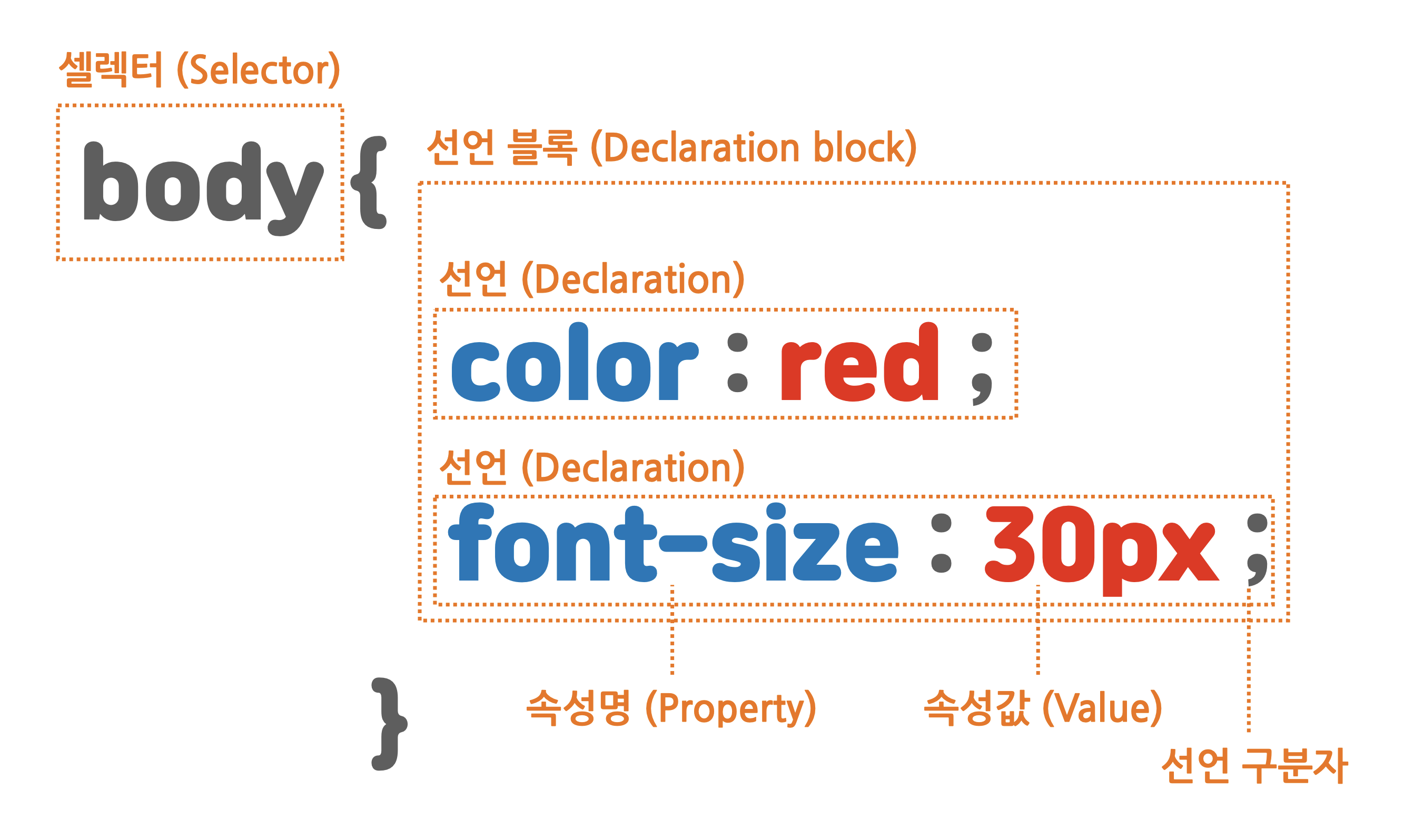
color,background-color,border-colorbackgroundvs.background-color:
you can do a lot more than change color with background
font-family(define fallback fonts in "").emphasize { font-family: "SF Pro KR", "MalgunGothic", "Verdana"; }
font-size,font-weight,text-decoration(underline, strikethrough),letter-spacing,line-heighttext-align(left, right, center, justify) - what about vertical alignment? TBC- Refrain from using <center> or <font>... separation of concerns
- Embed Google Fonts!
Box
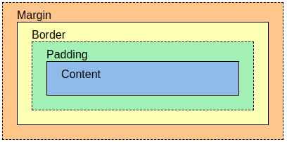
Elements
- Block-level elements: <div> <h1> <p>
- always starts on a new line
- Inline elements: <span>
- always starts on the same line
- Inline-block - unlike inline elements, you can set a width & height
Components
-
border
- styling: border-width, border-style, border-color
- border-style - dotted, etc
- border-radius - rounded corners
- box-shadow
- styling: border-width, border-style, border-color
-
margin (top, right, bottom, left)
-
use negative values to have elements overlap
-
if content size exceeds containing box size, use:
overflow: auto;overflow: hidden -
content-box vs. border-box: common beginner's mistake is equating the content area with box size, and neglecting the added margins and paddings which determines the overall box size. To avoid accidentally designating a bigger size to a nested box, use
border-boxproperty. -
  * {
  box-sizing: border-box
  }
  /* enabling border-box includes border + padding + margin width to the content width size.
this would apply it to the whole document. */
-
CSS Selectors
specificity generally determines priority of conflicting css properties
application priority given to the most specific element
-
Global selector :
* { margin: 0 } -
Tag selector :
h1 { },div { },section, h1 { } -
ID selector :
#only { } -
class selector :
.widget { },.center { ] -
tag + id/class selector:
p.p-tag {color: gray;},p#id1 { text-decoration:dotted },p#id1.class1 {background-color: purple; } -
attribute selector : selects all elements with the specified attribute
a[href] { } p[id="only"] { } p[class~="out"] { } p[class|="out"] { } section [id^="sect"] { } div[class$="2"] { } div[class*="w"] { } -
child combinator :
a > b { }- all direct 'b'-type children of 'a' -
descendent combinator :
a b { }- all 'b'-type descendents of 'a' (incl. all nested 'b' elements) -
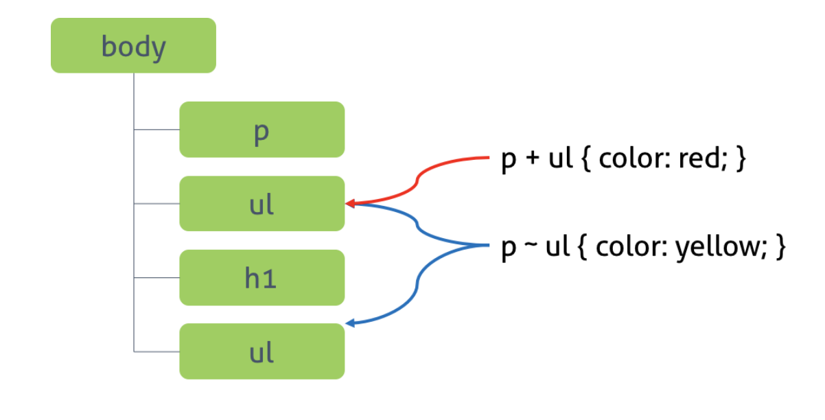
general sibling combinator :
a ~ b { }- all iterations of 'b'-type that have a common parent with 'a' -
adjacent sibling combinator :
a + b { }- 'b'-type sibling immediately following an 'a' sibling (1st one sharing a parent with 'a' vs. being nested inside 'a')
- pseudo-class selector : selection dependent on element's status
a:link { } /*selects unvisited links*/ a:visited { } /*selects visited links*/ a:hover { } /*selects links that mouse hovers over */ a:active { } /*links being activated (clicked on) - that instant*/ a:focus { } /*links that were just activated, or elements just targetted by the keyboard*/ input:checked + span { } /*span element that appears right after checked input*/ input:enabled + span { } input:disabled + span { } p:first-child { } /*first child of a tag structure that is p type if other siblings of different types are listed before it, not selected */ ul > li:last-child { } ul > li:nth-child(2n) { } section > p:nth-child(2n+1) { } ul > li:first-child { } li:last-child { } /*includes ones within a structure with just 1 child*/ div > div:nth-child(4) { } div:nth-last-child(2) { } /* includes second to last div's amongst non-div siblings */ section > p:nth-last-child(2n+1) { } p:first-of-type { } div: last-of-type { } ul:nth-of-type(2) { } p:nth-last-of-type(1) { } - negative selector:
input:not([type="password]) { },div:not(:nth-of-type(2)) { } - validity-check selector :
input[type="text"]:valid { },input[type="text"]:invalid { }