<학습한 내용 및 학습소감>
- 팀원들이 만든 페이지들을 전부 통합시키고 각 페이지와 해당파트id를 연결시켰다
- 이전에 코드를 짜던 중 꼭 기억해야할 2가지가 있었는데
-주의사항-
1. width를 지정한 곳에는 margin이나 padding속성을 넣게되면 가로스크롤이 생기게 됨으로
   그보다 하위 태그에 margin이나 padding속성을 사용해야 한다

2. 항상 태그를 묶기 전에 가장 큰 박스를 만들어 전체 설정을 해 준 뒤에 태그들을 배치해야
position 등 여러가지 문제들을 해결할 때 편하다- 중간에 코딩한 내용 중에 전체를 감싸는 태그에 width와 height를 지정했는데 그 부분에 바로 margin을 적용하니 가로스크롤이 생기는 문제가 생겼다
- 또한 이 부분에 id를 적용해서 페이지 연결을 시켰더니 가로스크롤 부분을 포함한 여백부분이 보여지게 되어서 해당 부분의 css를 수정했다
- 통합하면서 부분부분 생기는 오류들을 수정하다보니 생각보다 시간이 많이 걸렸다
- 확실히 이렇게 전체를 통합하고 수정하다보니 margin이나 padding, position에 대한 이해가 많이 는것 같다
- 처음 리소프트 페이지를 만들 때 보다는 확실히 좀 편한 감이 있다
- 물론 아직도 함수는 좀 힘든 부분들이 많지만 1%라도 이해도는 늘고있다는 점에서 만족스럽다
- 어제만 해도 왜 문제가 생기고 어떻게해야 문제를 해결할 수 있을지 혼자서 찾은 것만 해도 만족스러운 일이다
- 미디어쿼리 <테블릿>부분을 만들어 보고있다
- 처음엔 뭐부터 손을 대야할지 막막했는데 그냥 맨 위에서부터 차례대로 하나씩 적용해보자는 생각으로 만들고 있다
현재까지 진행된 모든 html
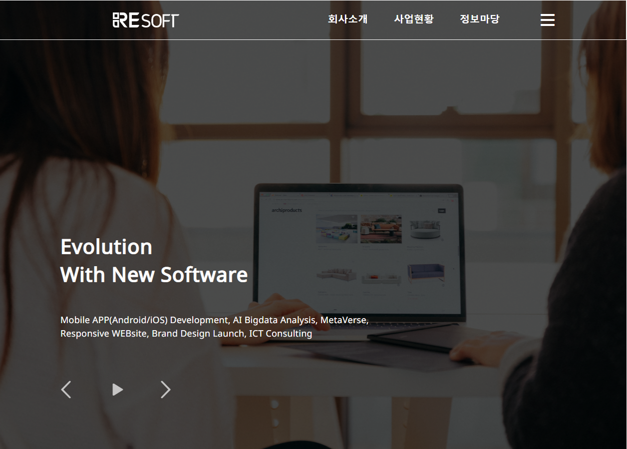
- Main-page
<html lang="en">
<head>
<meta charset="UTF-8">
<meta http-equiv="X-UA-Compatible" content="IE=edge">
<meta name="viewport" content="width=device-width, initial-scale=1.0">
<title>Document</title>
<link rel="stylesheet" href="./css/main.css">
<!-- fontawesome -->
<script src="https://kit.fontawesome.com/01f338039f.js" crossorigin="anonymous"></script>
<!-- jQuery -->
<script src="https://code.jquery.com/jquery-3.6.0.min.js"
integrity="sha256-/xUj+3OJU5yExlq6GSYGSHk7tPXikynS7ogEvDej/m4=" crossorigin="anonymous"></script>
<!-- codrops slider -->
<script src="js/modernizr.custom.js"></script>
<!-- project, service -->
<script src="https://unpkg.com/@lottiefiles/lottie-player@latest/dist/lottie-player.js"></script>
</head>
<body>
<header>
<div class="container">
<h1>
<!--------------------- Resoft Logo ----------------------->
<a href="main.html"><img src="./img/resoft logo.png"></a>
</h1>
<!----------------------- Nav Bar ------------------------->
<nav class="nav">
<ul id="nav-bar">
<li>
<a href="company.html">회사소개</a>
</li>
<li>
<a href="business.html">사업현황</a>
</li>
<li>
<a href="information.html">정보마당</a>
</li>
<!--------------------- Hamberger Button ---------------------->
<li class="btn">
<button type="button" onclick="doDisplay()"><i class="fa-solid fa-bars" style="color:white"></i></button>
</li>
</ul>
</nav>
</div>
<!------------------------- Hamberger Navbar --------------------------->
<div id="myNav" class="overlay">
<div class="overlay-content">
<a href="company.html#introduce-resoft">REsoft소개</a>
<a href="company.html#history">연혁</a>
<a href="company.html#Organization-chart">조직도</a>
<a href="company.html#certification">특허&인증</a>
<a href="company.html#directions">오시는 길</a>
</div>
<div class="overlay-content">
<a href="business.html#ecoce">ECOCE</a>
<a href="business.html#moado">moaDo</a>
<a href="business.html#remainder">Etc</a>
</div>
<div class="overlay-content">
<a href="information.html#information">REsoft소식</a>
</div>
</div>
<!--------------------------- Hamberger Script ----------------------------->
<script>
function doDisplay(){
var con = document.getElementById("myNav");
if(con.style.display == 'block'){
con.style.display = 'none';
}else{
con.style.display = 'block';
}
}
</script>
<!-------------------------------- Main Text ---------------------------------->
<div class="text-box">
<div class="hd-1">
<p class="main-text">Evolution<br />With New Software</p>
<p class="sub-text">
<span>Mobile APP(Android/iOS) Development, </span>
<span>AI Bigdata Analysis, MetaVerse, </span>
<span>Responsive WEBsite, Brand Design Launch, </span>
<span>ICT Consulting</span>
</p>
</div>
</div>
<!---------------------------- codrops Slide Control ------------------------------>
<div class="main">
<ul id="cbp-bislideshow" class="cbp-bislideshow">
<li><img src="./img/Head-back-img.png" alt="image01"/></li>
<li><img src="./img/back-slide-2.png" alt="image02"/></li>
<li><img src="./img/back-slide-3.png" alt="image03"/></li>
</ul>
<div id="cbp-bicontrols" class="cbp-bicontrols">
<span class="cbp-biprev"></span>
<span class="cbp-bipause"></span>
<span class="cbp-binext"></span>
</div>
</div>
<!-------------------------------- codrops slider -------------------------------->
<script src="https://ajax.googleapis.com/ajax/libs/jquery/1.9.1/jquery.min.js"></script>
<script src="js/jquery.imagesloaded.min.js"></script>
<script src="js/cbpBGSlideshow.min.js"></script>
<script>
$(function() {
cbpBGSlideshow.init();
});
</script>
</header>
<!------------------------------------- Header End --------------------------------------->
<!------------------------------------ Resoft-News ---------------------------------------->
<div id="News">
<div class="news">
<div class="title">
<p>리소프트의 새로운 소식</p>
<p>RESOFT NEWS</p>
</div>
<div class="cont">
<div class="link">
<a href="">
<div class="img-wrap"><img src="./img/news_mi.png"></div>
<p>Lorem ipsum dolor sit amet, consetetur sdipscing elit...</p>
<p>2022.01.01</p>
</a>
</div>
<div class="line1"></div>
<div class="link">
<a href="">
<div class="img-wrap"><img src="./img/news_mi.png"></div>
<p>Lorem ipsum dolor sit amet, consetetur sdipscing elit...</p>
<p>2022.01.01</p>
</a>
</div>
<div class="line2"></div>
<div class="link">
<a href="">
<div class="img-wrap"><img src="./img/news_mi.png"></div>
<p>Lorem ipsum dolor sit amet, consetetur sdipscing elit...</p>
<p>2022.01.01</p>
</a>
</div>
<div class="line3"></div>
<div class="link">
<a href="">
<div class="img-wrap"><img src="./img/news_mi.png"></div>
<p>Lorem ipsum dolor sit amet, consetetur sdipscing elit...</p>
<p>2022.01.01</p>
</a>
</div>
</div>
</div>
</div>
<!------------------------------------ project ----------------------------------------->
<div id="project">
<div class="pject-wrap">
<div class="pject-con-wrap">
<div class="pject-con-right">
<div class="pject-ecoce">
<figure class="pject-ecoce-wrap">
<div class="ecoce-back-img imghover">
<img src="./img/home-ecoce.png" alt="에코스3D사진">
</div>
<figcaption>
<h4>에코스 ECOCE (ECO-Clean Earth)</h4>
<p>국내 최초<br />
탄소중립 실천인증 플랫폼</p>
<a href="#"></a>
</figcaption>
</figure>
</div>
<div class="pject-moado">
<figure class="pject-moado-wrap">
<div class="moado-back-img imghover">
<img src="./img/main-visual.png" alt="모아두사진">
</div>
<figcaption>
<h4>모아두 (moaDo)</h4>
<p>내 손안의 모바일 회원수첩</p>
<a href="#"></a>
</figcaption>
</figure>
</div>
</div>
<div class="pject">
<div class="pject-text">
<h2>프로젝트</h2>
<p class="pject-eng">RESOFT PROJECT</p>
<p class="pject-con">첨단 기술 서비스 제공을 위해 사용자 입장에서<br />
생각하고 항상 새로운 도전을 시도합니다.</p>
</div>
<div class="motion-pic-1">
<lottie-player src="https://assets4.lottiefiles.com/packages/lf20_3rqwsqnj.json" background="transparent"
speed="1" style="width: 680px; height: 680px;" loop autoplay></lottie-player>
</div>
</div>
</div>
</div>
</div>
<!------------------------------------------- service ----------------------------------------->
<div class="service">
<div class="left">
<div class="title">
<p>서비스</p>
<p>SERVICE</p>
<p>다양한 기술플랫폼을 제공하여 기능성을 열어주고 의미있는 성공으로 인도하는 서비스를 제공합니다.</p>
</div>
<div class="aniimg">
<lottie-player src="./img/one.json" background="transparent" speed="1" style="width: 680px; height: 680px;" loop autoplay></lottie-player>
</div>
</div>
<div class="right">
<div class="app card">
<span class="front">
<p>앱(APP) 개발</p>
<p>ANDROID / IOS</p>
</span>
<span class="back">
<p>Android 앱 개발</p>
<p>iOS 앱 개발</p>
<p>플랫폼 기획 및 설계</p>
</span>
</div>
<div class="web card">
<span class="front wow fadeIn"data-wow-delay="0.3s">
<p>웹(WEB) 구축</p>
<p>RESPNSIVE WEB</p>
</span>
<span class="back">
<p>반응형 홈페이지 구축</p>
<p>데이터베이스 구축</p>
<p>빅데이터 구축</p>
</span>
</div>
<div class="ai card">
<span class="front">
<p>AI 기반 기술개발</p>
<p>AI BIGDATA</p>
</span>
<span class="back">
<p>AI 대화형 챗봇</p>
<p>자동 객체인식 검출기</p>
<p>딥러닝 학습 모델</p>
</span>
</div>
<div class="xr card">
<span class="front">
<p>XR 콘텐츠 구현</p>
<p>METAVERSE</p>
</span>
<span class="back">
<p>실감형 플랫폼 구축</p>
<p>가상현실 콘텐츠 제작</p>
<p>게임콘텐츠 제작</p>
</span>
</div>
</div>
</div>
<!--------------------------------------- REFERENCE ------------------------------------------->
<section id="Reference">
<div class="refer_web" style="position:relative;">
<div class="refer_header">
<p style="color:#1E1E1E; font-size:40px; font-weight: bold; ">레퍼런스</p>
<p style="color:#C8C8C8; font-size:18px; height:26px;">REFERENCE</p>
</div>
<!-- 박스위 선 -->
<div class="refer_hadeline" style=" margin-top:58px; border-top: #1E1E1E 2px solid;">
<!-- 박스 -->
<ul class="refer-ul">
<li class="Reference_iconbox">
<div class="icon-image" >
<img src="./img/Daegu Architecture.png" class="icon" style="width:179px; height:50px;" >
</div>
</li>
<li class="Reference_iconbox">
<div class="icon-image">
<img src="./img/ColorfulDaegu.png" class="icon" style="width:120px; height:63.15px;" >
</div>
</li>
<li class="Reference_iconbox">
<div class="icon-image">
<img src="./img/maeil.png" class="icon" style="width:176.58px; height: 34.4px;">
</div>
</li>
<li class="Reference_iconbox">
<div class="icon-image">
<img src="./img/kyeongbukuni.png" class="icon" style="width: 160px; height: 41.89px;">
</div>
</li>
<li class="Reference_iconbox">
<div class="icon-image">
<img src="./img/MBC.png" class="icon" style="width: 162px; height: 29px;" >
</div>
</li>
<li class="Reference_iconbox">
<div class="icon-image">
<img src="./img/Daeguphysical.png" class="icon" style="width: 172px; height: 35px;" >
</div>
</li>
<li class="Reference_iconbox">
<div class="icon-image">
<img src="./img/DCU.png" class="icon" style="width: 176.93px; height: 25.07px;" >
</div>
</li>
<li class="Reference_iconbox">
<div class="icon-image">
<img src="./img/Songpa.png" class="icon" style="width: 172.39px; height: 57.03px;" >
</div>
</li>
<li class="Reference_iconbox">
<div class="icon-image">
<img src="./img/PeoplePower.png" class="icon" style="width: 160px; height: 37.66px;">
</div>
</li>
<li class="Reference_iconbox">
<div class="icon-image">
<img src="./img/LionsClub.png" class="icon" style="width: 160px; height: 42.63px;" >
</div>
</li>
<li class="Reference_iconbox">
<div class="icon-image">
<img src="./img/korea electricity.png" class="icon" style="width: 184px; height: 20px;" >
</div>
</li>
<li class="Reference_iconbox">
<div class="icon-image">
<img src="./img/happy.png" class="icon" style="width: 113px; height: 72px;">
</div>
</li>
<li class="Reference_iconbox">
<div class="icon-image">
<img src="./img/KoreaSeaUni.png" class="icon" style="width: 177.93px; height: 38.21px;" >
</div>
</li>
<li class="Reference_iconbox">
<div class="icon-image">
<img src="./img/Daegusanggong.png" class="icon" style="width: 172px; height: 39px;">
</div>
</li>
<li class="Reference_iconbox">
<div class="icon-image">
<img src="./img/CAK.png" class="icon" style="width: 176.58px; height: 55.96px;" >
</div>
</li>
<li class="Reference_iconbox">
<div class="icon-image">
<img src="./img/JCI.png" class="icon" style="width: 135.3px; height: 65.73px;">
</div>
</li>
<li class="Reference_iconbox">
<div class="icon-image">
<img src="./img/University3.png" class="icon" style="width: 174.54px; height: 28.96px;">
</div>
</li>
<li class="Reference_iconbox">
<div class="icon-image">
<img src="./img/University4.png" class="icon" style="width: 186px; height: 28.6px;">
</div>
</li>
<li class="Reference_iconbox">
<div class="icon-image">
<img src="./img/DaeguHighSchool.png" class="icon" style="width: 169px; height: 42px;">
</div>
</li>
<li class="Reference_iconbox">
<div class="icon-image">
<img src="./img/DGICT.png" class="icon" style="width: 171px; height: 31px;">
</div>
</li>
<li class="Reference_iconbox">
<div class="icon-image">
<img src="./img/Korea cooking.png" class="icon" style="width: 188px; height: 43px;">
</div>
</li>
<li class="Reference_iconbox">
<div class="icon-image">
<img src="./img/Kibwa.png" class="icon" style="width: 120px; height: 55px;">
</div>
</li>
<li class="Reference_iconbox">
<div class="icon-image">
<img src="./img/JUNGSo.png" class="icon" style="width: 191.28px; height: 32.5px;">
</div>
</li>
<li class="Reference_iconbox">
<div class="icon-image">
<img src="./img/DaeguCredit.png" class="icon" style="width: 185px; height: 47px;">
</div>
</li>
<li class="Reference_iconbox">
<div class="icon-image">
<img src="./img/Dalseo.png" class="icon" style="width: 177.45px; height: 30.5px;" >
</div>
</li>
<li class="Reference_iconbox">
<div class="icon-image">
<img src="./img/DIP.png" class="icon" style="width: 192px; height: 27px;">
</div>
</li>
<li class="Reference_iconbox">
<div class="icon-image">
<img src="./img/Rotary.png" class="icon" style="width: 159px; height: 59px;" >
</div>
</li>
<li class="Reference_iconbox">
<div class="icon-image">
<img src="./img/Suseong.png" class="icon" style="width: 143.71px; height: 52.72px;">
</div>
</li>
<li class="Reference_iconbox">
<div class="icon-image">
<img src="./img/TBN.png" class="icon" style="width: 170.04px; height: 38.11px;">
</div>
</li>
</ul>
</div>
</div>
</section>
<!------------------------------------- footer ------------------------------------------------->
<footer id="footer">
<div class="footer-wrap">
<div class="footer-logo">
<img src="./img/resoft.png" alt="">
</div>
<div class="address">
<p class="footer-add">© RESOFT CO.LTD. All Rights Reserved.</p>
<p class="footer-inform">
<span>상호 : (주)리소프트</span>
<br>
<span>사업자등록번호 : 722-81-02219</span>
<br>
<span>주소 : (41260) 대구광역시 동구 동대구로 465, 대구스케일업허브(DASH) 713호 (신천동 106)</span>
</p>
<p class="footer-inform-add">
<span>대표이사 : 오유나</span>
<span>개인정보책임자 : 이현지</span>
<br/>
<span>전화 : (053) 475-2110</span>
<span>팩스 : (0504) 257-5966</span>
<span>이메일 : call@resoft.kr</span>
</p>
</div>
</div>
</footer>
</body>
</html>- main-page css
@charset "utf-8";
@import url('https://fonts.googleapis.com/css2?family=Noto+Sans&family=Noto+Sans+KR&display=swap');

/******************************** codrops slider component*******************************/
@font-face {
	font-family: 'entypo';
	src:url('../fonts/controls/entypo.eot');
	src:url('../fonts/controls/entypo.eot?#iefix') format('embedded-opentype'),
		url('../fonts/controls/entypo.woff') format('woff'),
		url('../fonts/controls/entypo.ttf') format('truetype'),
		url('../fonts/controls/entypo.svg#entypo') format('svg');
	font-weight: bold;
	font-style: normal;
}

* {
    margin: 0;
    padding: 0;
    font-family: 'Noto Sans', sans-serif;
    box-sizing: border-box;
    vertical-align: baseline;
}

body {
    max-width: 1920px;
    margin: 0 auto;
    overflow-x: hidden;
    overflow-y: auto;
}
li {
    list-style: none;
}


/********************************* 헤더부분 *************************************/
header {
    width: 100%;
    height: 900px;
    z-index: 1000;
    top:0;
}
/* position fixed를 제거 */

header .container{
    display: flex;
    justify-content: space-between; /* 양 끝으로 배치 */
    align-items: center;
    width: 100%;
    border: 1px solid #ffff;
    height: 80px;
}

header nav ul{
    display: flex; /* 메뉴 가로 배치 */
}

header nav ul li{
    padding: 2rem;
}

header button {
    background: transparent;
    border: 0;
    cursor: pointer;
    color: white;
}

/************************************* 로고 ****************************************/
header h1 a {
    font-weight: bold;
    color: white;
    margin-left: 360px;
}
header h1 a img {
    width: 133px;
    height: 30px;
}

/*************************** 메뉴 ********************************/
header nav ul li button {
    font-size: 20px;
}
header nav ul li.btn button {
    margin-right: 220px;
    margin-left: 30px;
    font-size: 32px;
}

.hd-1 {
    position: absolute;
    top: 400px;
    left: 240px;
    color: #ffff;
    letter-spacing: 0;
    text-align: left;
}

.hd-1 p.main-text {
    font-size: 40px;
    font-weight: bold;
    line-height: 140%;
    margin-bottom: 50px;
}

.hd-1 p.sub-text {
    word-break: normal;
    font-size: 18px;
    width: 60%;
}

/************************* nav-bar ****************************/
.nav {
    margin-right: -9px;
}
#nav-bar a {
    font-weight: bold;
    color: white;
    text-decoration: none;
    font-size: 20px;
}

#nav-bar a:hover {
    color: rgb(9, 89, 209);
}

/************************** Hidden ****************************/
.overlay {
    height: 210px;
    width: 100%;
    z-index: 1;
    top: 80px;
    left: 0;
    background-color: rgba(47, 88, 163, 0.9);
    overflow: hidden;
    transition: 0.5s;
    position: absolute;
    display: none;
}

.overlay-content {
    float: left;
    top: 10%;
    text-align: left;
    margin-right: 50px;
    margin-top: 15px;
    line-height: 0.7;
}
.overlay-content:first-child {
    margin-left: 1160px;
}
.overlay-content:nth-child(2) {
    margin-left: -22px;
}
.overlay-content:last-child {
    margin-left: 10px;
}

.overlay a {
    padding: 8px;
    text-decoration: none;
    font-size: 20px;
    color: #ffff;
    display: block;
    transition: 0.3s;
}

.overlay a:hover, .overlay a:focus {
    color: black;
}

/******************************* codrops slider ************************************/

.cbp-bislideshow {
	list-style: none;
	width: 100%;
    position: absolute;
	top: 0;
	left: 0;
	z-index: -1;
	padding: 0;
	margin: 0;
}

.cbp-bislideshow li {
	position: absolute;
	width: 100%;
	height: 900px;
	opacity: 0;
	-webkit-transition: opacity 1s;
	-moz-transition: opacity 1s;
	transition: opacity 1s;
    filter: brightness(30%);
}

.backgroundsize .cbp-bislideshow li {
	-webkit-background-size: cover;
	-moz-background-size: cover;
	background-size: cover;
	background-position: center center;
}

/************************** hide the images ***************************/
.backgroundsize .cbp-bislideshow li img {
	display: none;
}

.cbp-bislideshow li img {
	display: block;
	width: 100%;
}

/*************************** slider controls ************************/
.cbp-bicontrols {
	position: inherit;
	width: 300px;
	height: 100px;
    margin-top: 650px;
    margin-left: 200px;
}

.cbp-bicontrols span {
	float: left;
	width: 100px;
	height: 100px;
	position: relative;
	cursor: pointer;
}

.cbp-bicontrols span:before {
	position: absolute;
	width: 100%;
	height: 100%;
	top: 0;
	left: 0;
	text-align: center;
	font-family: 'entypo';
	font-style: normal;
	font-weight: normal;
	font-variant: normal;
	text-transform: none;
	line-height: 100px;
	font-size: 40px;
	color: #fff;
	-webkit-font-smoothing: antialiased;
	opacity: 0.7;
}

.cbp-bicontrols span:hover:before {
	opacity: 1;
}

.cbp-bicontrols span:active:before {
	top: 2px;
}

span.cbp-biplay:before {
	content: "\e002";
}

span.cbp-bipause:before {
	content: "\e003";
}

span.cbp-binext:before {
	content: "\e000";
}

span.cbp-biprev:before {
	content: "\e001";
}

.cbp-bicontrols span.cbp-binext {
	float: right;
}

/* Fallback */

.no-js.no-backgroundsize .cbp-bislideshow li:first-child {
	opacity: 1;
}

.no-js.backgroundsize .cbp-bislideshow li:first-child img {
	display: block;
}


/****************** News *******************/
#News {
    width: 100%;
}
.news {
    position: relative;
    width: 1440px;
    height: 450px;
    margin: 100px 240px 100px 240px;
}

.news .title {
    margin-bottom: 50px;
}

.news .title :first-child {
    font-size: 40px;
    font-weight: bold;
}

.news .title :last-child {
    font-size: 18px;
    color: #C8C8C8;
}

.news .cont {
    display: flex;
    gap: 80px;
}

.news .cont .line1 {
    position: absolute;
    left: 340px;
    top: 134px;
    width: 2px;
    height: 316px;
    background-color: #C8C8C8;
}

.news .cont .line2 {
    position: absolute;
    left: 720px;
    top: 134px;
    width: 2px;
    height: 316px;
    background-color: #C8C8C8;
}

.news .cont .line3 {
    position: absolute;
    left: 1100px;
    top: 134px;
    width: 2px;
    height: 316px;
    background-color: #C8C8C8;
}


.news .cont .link a {
    text-decoration: none;
    width: 300px;
}

.news .cont .link a .img-wrap {
    width: 300px;
    height: 200px;
    max-width: 300px;
    max-height: 200px;

    overflow: hidden;
    border-radius: 20px;
    border: 1px solid #707070;
}

.news .cont .link a .img-wrap img {
    width: 100%;
    height: 100%;
    transition-duration: 0.5s;
}

.news .cont .link a :nth-child(2) {
    font-size: 18px;
    font-weight: bold;
    color: #1E1E1E;
    letter-spacing: 0.9px;
    margin-top: 10px;
    margin-bottom: 30px;
}

.news .cont .link a:hover :nth-child(1) img {
    transform: scale(1.3);
    transition-duration: 0.5s;
}

.news .cont .link a:hover :nth-child(2) {
    color: #184B9F;
}

.news .cont .link a :nth-child(3) {
    font-size: 16px;
    color: #AAAAAA;
    letter-spacing: 0.8px;
}


/********************* project ***********************/
.pject-wrap {
    background: #F9F8FF;
    width: 100%;
    height: 1147px;
    z-index: 80;
}

.pject-con-wrap {
    margin: 0 auto;
    display: flex;
    justify-content: space-around;
}


.pject-con-wrap {
    padding-top: 100px;
}

.pject-text {
    text-align: right;
}

.pject-text h2 {
    font-weight: bold;
    font-size: 40px;
    color: #1E1E1E;
}

.pject-text .pject-text-eng {
    color: #C8C8C8;
    padding-bottom: 50px;
    font-weight: Medium;
    font-size: 18px;
}

.pject-text .pject-text-con {
    color: #1E1E1E;
    font-weight: bold;
    font-size: 26px;
}

.motion-pic-1 {
    margin-top: 61px;
}

.pject-con-right {
    margin-top: 111px;
}

.ecoce-back-img {
    border-radius: 10px;
    width: 534px;
    height: 393px;
    background: transparent url('../img/square674.png') 0% 0% no-repeat padding-box;
    background-position: center;
}

.imghover {
    transition: all 0.2s linear;
}

.pject-moado-wrap:hover .imghover {
    transform: scale(1.2);
}

.pject-ecoce-wrap:hover .imghover {
    transform: scale(1.2);
}

.pject-ecoce-wrap {
    overflow: hidden;
    position: relative;
    width: 534px;
    height: 393px;
    margin-left: 90px;
    border-radius: 10px;
}

.pject-ecoce-wrap figcaption,
.pject-moado-wrap figcaption {
    position: absolute;
    color: #FFFFFF;
    font-size: 17px;
    z-index: 2;
    padding: 260px 0 0 21px;
    top: 0;
    right: 0;
    bottom: 0;
    left: 0;
    opacity: 0;
    background-color: rgba(0, 0, 0, 0.5);
    display: block;
    z-index: 1;
    width: 100%;
    height: 100%;
    border-radius: 10px;
    transition-duration: 0.3s;
}

.pject-ecoce-wrap figcaption:hover,
.pject-moado-wrap figcaption:hover {
    cursor: pointer;
    opacity: 1;
    transition-duration: 0.3s;
}

.moado-back-img {
    border-radius: 10px;
    width: 450px;
    height: 355px;
    background: transparent url('../img/main-visual.png') 0% 0% no-repeat padding-box;
}

.pject-moado-wrap {
    overflow: hidden;
    position: relative;
    border-radius: 10px;
    margin-top: 50px;
    width: 534px;
    height: 393px;
    margin-left: 90px;
    background: url('../img/square\ 38.jpg') no-repeat center;
}

.pject-moado-wrap figcaption {
    padding-top: 285px;
}

/**************** secvice *****************/
.service {
    position: relative;
    max-width: 1440px;
    height: 1148px;
    margin: 0 auto;
    top: 100px;
    bottom: 100px;
    /* background-color: red; */
    display: flex;
    gap: 80px;
}

.service .title p {
    margin-left: 10px;
}


.service .left .title :nth-child(1) {
    font-size: 40px;
    font-weight: bold;
    color: #1E1E1E;
}

.service .left .title :nth-child(2) {
    font-size: 18px;
    color: #C8C8C8;
    padding-bottom: 50px;
}

.service .left .title :nth-child(3) {
    font-size: 26px;
    font-weight: bold;
    color: #1E1E1E;
    width: 535px;
    padding-bottom: 50px;
}

.aniimg {
    /* background-color: yellow; */
    width: 680px;
    height: 680px;
}

.right {
    position: relative;
}

.app {
    width: 300px;
    height: 375px;
    background: transparent url('../img/app.png') 0% 0% no-repeat padding-box;
    position: absolute;
    border-radius: 20px;
    display: table;
    table-layout: fixed;
    text-align: center;
}

.web {
    width: 300px;
    height: 375px;
    background: transparent url('../img/web.png') 0% 0% no-repeat padding-box;
    position: absolute;
    border-radius: 20px;
    top: 118px;
    left: 380px;
    display: table;
    table-layout: fixed;
    text-align: center;
}

.ai {
    width: 300px;
    height: 375px;
    background: transparent url('../img/ai.png') 0% 0% no-repeat padding-box;
    position: absolute;
    top: 455px;
    border-radius: 20px;
    display: table;
    table-layout: fixed;
    text-align: center;
}

.xr {
    width: 300px;
    height: 375px;
    background: transparent url('../img/xr.png') 0% 0% no-repeat padding-box;
    position: absolute;
    top: 573px;
    left: 380px;
    border-radius: 20px;
    display: table;
    table-layout: fixed;
    text-align: center;
}

.right .front,
.right .back {
    display: table-cell;
    vertical-align: middle;
}

.right .front :nth-child(1) {
    font-size: 30px;
    color: #FFFFFF;
    letter-spacing: 1.5px;
    /* text-align: center; */
}

.right .front :nth-child(2) {
    font-size: 20px;
    color: #FFFFFF;
    line-height: 29px;
    letter-spacing: 1px;
    /* text-align: center; */
    /* font: var(--unnamed-font-style-normal) normal medium 20px/29px var(--unnamed-font-family-noto-sans-kr);
    text-align: center;
    font: normal normal medium 20px/29px Noto Sans KR;
    letter-spacing: 1px;
    color: #FFFFFF;
    opacity: 1; */
}

.right .back {
    display: none;
    font-size: 24px;
    color: #FFFFFF;
    letter-spacing: 1.2px;
}


.card{
    transition: 0.3s;
}
.card:hover {
    transform: scale(1.246);
    transition: 0.3s;
}
.right .card:hover .back{
    display: table-cell;
}

.right .card:hover .front{
    display: none;
}

@keyframes fadeInTopLeft {
    from {
        opacity: 0;
        -webkit-transform: translate3d(-1%, -1%, 0);
        transform: translate3d(-1%, -1%, 0);
    }

    to {
        opacity: 1;
        -webkit-transform: translate3d(0, 0, 0);
        transform: translate3d(0, 0, 0);
    }
}
.right .front {
    animation: fadeInTopLeft 0.5s;
}

@keyframes fadeInBottomRight {
    from {
        opacity: 0;
        -webkit-transform: translate3d(1%, 1%, 0);
        transform: translate3d(1%, 1%, 0);
    }

    to {
        opacity: 1;
        -webkit-transform: translate3d(0, 0, 0);
        transform: translate3d(0, 0, 0);
    }
}
.right .back {
    animation: fadeInBottomRight 0.5s;
}

/*************** reference ***************/
#reference {
    width: 100%;
    height: 1034px;
}

.refer_web {
    left: 240px;
    width: 1440px;
    height: 734px;
    opacity: 1;
}

.refer_web ul {
    margin-left: 14px;
}

.Reference_iconbox{
    border: 1px solid #DBDBDB;
    display: inline-block;
    width: 220px;
    height: 100px;
    background: #FFFFFF 0% 0% no-repeat padding-box;
    opacity: 1;
    margin-right: 14px;
    margin-top:17px;
}

.icon-image .icon{
    position: relative;
    text-align: center;
    display: flex;
    justify-content:center;
    top: 50%;
    left: 50%;
    bottom:-50px;
    transform: translate(-50%, -50%);
}

/***************** footer ********************/
.footer-wrap {
    position: relative;
    left: 0;
    width: 1920px;
    height: 250px;
    background: #E9E9E9 0% 0% no-repeat padding-box;
    opacity: 1;
}
.footer-wrap img {
    width:200px;
    height:45px;
    margin-top:50px;
    margin-left:240px;
}
.footer-wrap .address {
    letter-spacing: 0px;
    line-height: 26px;
    color: #9E9E9E;
    opacity: 1;
    text-align: left;
}
.footer-wrap .address .footer-add {
    position: relative;
    height: 24px;
    left: 460px;
    bottom:20px;
    font-size: 24px;
}
.footer-wrap .address .footer-inform {
    position: relative;
    margin-left: 240px;
    padding-bottom: 49px;
    height:76px;
}
.footer-wrap .address .footer-inform-add {
    position:relative;
    left: 1000px;
    bottom: 50px;
    height: 50px;
    margin-top: -25px;
}

/*
현재 만들어야 하는 기준 => 모바일은 그대로 적용, 테블릿은 1024px까지

@media (max-width: 767px){
	//모바일
}

@media (min-width: 768px) and (max-width: 1279px) {
    // 테블릿 가로
}
@media (min-width: 1280px) and (max-width: 1920px) {
    // 데스크탑 일반 => 구현 마무리
}*/


/************** media query 1. Header tablet (테블릿 가로)****************/

@media (min-width: 768px) and (max-width: 1279px) {

    body {
        overflow-x: hidden;
        overflow-y: auto;
    }

    /******* header *******/
    header h1 a {
        margin-left: 231.07px;
    }
    header nav ul li{
        margin-left: 88px;;
        margin-right: -100px;
    }
    .overlay-content:first-child {
        margin-left: 672px;
    }
    .overlay-content:nth-child(2) {
        margin-left: -32px;
    }
    .overlay-content:last-child {
        margin-left: -3px;
    }
    .hd-1 {
        margin-left: -113px;
        margin-top: 65px;
        line-height: 1.5;
    }
    .hd-1 p.main-text {
        letter-spacing: 1.1;
    }
    .hd-1 p.sub-text {
        letter-spacing: 0.24;
    }
    .cbp-bicontrols {
        margin-left: 88px;
        margin-top: 650px;
    }
}


@media (max-width: 767px){

}

코딩공부중