실습 26~27일 차
<학습한 내용 및 학습소감>
-
완성은 가까워져가고, 프로젝트도 거의 끝나간다
-
하지만 갈수록 단점만 늘어나는 느낌이다
-
미디어쿼리로 만들어낸 부분들이 너무나도 아쉽다
-
실제로 핸드폰으로 접속했을 때 뭔가 깔끔한 느낌으로 다가오지 않는다
-
이런 부분들을 어떻게 보완해야할지 고민해볼 필요가 있다
-
미디어쿼리 부분도 거의 완성단계에 들어가고 있는데, 사실상 px에 맞춰서 위치만 맞춘거라 이렇게 작업하는게 맞는건가에 대한 의문이 든다
-
1280px, 768px에 맞춰서 시안이 나와 있었기 때문에 거기에 맞추긴했는데 일반적인 미디어쿼리 px과는 달라서 솔직히 맞는건지 잘 모르겠다
-
작업하면 할 수록 끝은 다가오는데 개운한 느낌이 아니다
-
앞으로 정리하고 할게 많은데 매우 찝찝하다
-
그래도 최대한 비슷하게 작업을 했다는 점에서 최대한 만족을 찾아야겠다
-
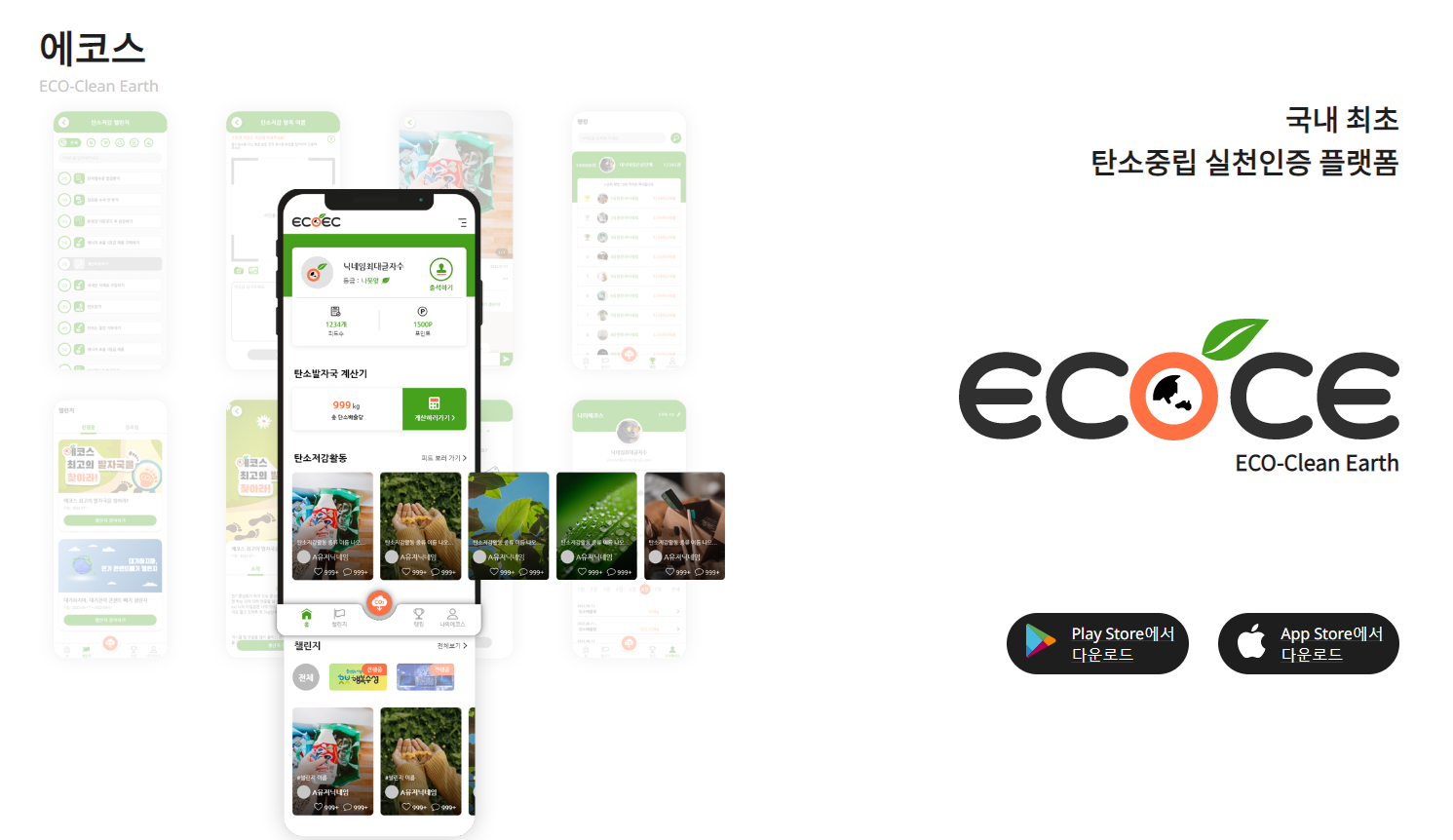
현재까지 만든 사업현황 html
<!DOCTYPE html>
<html lang="en">
<head>
<meta charset="UTF-8">
<meta http-equiv="X-UA-Compatible" content="IE=edge">
<meta name="viewport" content="width=device-width, initial-scale=1.0">
<title>Document</title>
<link rel="stylesheet" href="./css/business.css">
<!-- fontawesome -->
<script src="https://kit.fontawesome.com/01f338039f.js" crossorigin="anonymous"></script>
<!-- jQuery -->
<script src="https://code.jquery.com/jquery-3.6.0.min.js"
integrity="sha256-/xUj+3OJU5yExlq6GSYGSHk7tPXikynS7ogEvDej/m4=" crossorigin="anonymous"></script>
</head>
<body>
<header>
<div class="container" id="business">
<h1>
<!--------------------- Resoft Logo ----------------------->
<a href="main.html"><img src="./img/Header-Logo.svg"></a>
</h1>
<!----------------------- Nav Bar ------------------------->
<ul>
<li class="nav">
<a href="company.html" class="nav-item" active-color="#78EAFF">회사소개</a>
<a href="business.html" class="nav-item is-active" active-color="#78EAFF">사업현황</a>
<a href="information.html" class="nav-item" active-color="#78EAFF">정보마당</a>
<span class="nav-indicator"></span>
</li>
<script src="./js/header5.js"></script>
<!--------------------- Hamberger Button ---------------------->
<li class="btn">
<button type="button" onclick="doDisplay()"><i class="fa-solid fa-bars" style="color:black"></i></button>
</li>
</ul>
</div>
<!------------------------- business header ------------------------->
<div id="business-header">
<h1>사업현황</h1>
</div>
<!------------------------- Hamberger Navbar --------------------------->
<div id="myNav" class="overlay">
<div class="overlay-content">
<a class="mobile" href="company.html">회사소개</a>
<a class="m-line"href=""></a>
<a href="company.html#introduce-resoft">REsoft소개</a>
<a href="company.html#history">연혁</a>
<a href="company.html#Organization-chart">조직도</a>
<a href="company.html#certification">특허&인증</a>
<a href="company.html#directions">오시는 길</a>
</div>
<div class="overlay-content">
<a class="mobile" href="business.html">사업현황</a>
<a href="business.html#ecoce">ECOCE</a>
<a href="business.html#moado">moaDo</a>
<a href="business.html#remainder">Etc</a>
</div>
<div class="overlay-content">
<a class="mobile" href="information.html">정보마당</a>
<a href="information.html#information">REsoft소식</a>
</div>
</div>
<!--------------------------- Hamberger Script ----------------------------->
<script>
function doDisplay(){
var con = document.getElementById("myNav");
if(con.style.display == 'block'){
con.style.display = 'none';
}else{
con.style.display = 'block';
}
}
</script>
</header>
<!------------------------------- ecoce ----------------------------------->
<section id="ecoce">
<div class="ecose_7">
<h2 class="title_1">에코스</h2>
<p class="title_2">ECO-Clean Earth</p>
<div class="ecoce-imga">
<img src="./img/ecosfront.png" alt="">
</div>
<div class="ecoce-right">
<p class="ex_text">국내 최초<br>탄소중립 실천인증 플랫폼</p>
<img src="./img/ecos.png" alt="">
<p class="logo_2">ECO-Clean Earth</p>
<ul class="ecoce-app">
<li>
<a href="">
<img src="./img/playstore.png" alt="">
<p>Play Store에서 다운로드</p>
</a>
</li>
<li>
<a href="">
<img src="./img/apple.png" alt="">
<p>App Store에서 다운로드</p>
</a>
</li>
</ul>
</div>
</div>
</section>
<!----------------------------------- moado ------------------------------------>
<section id = "moado">
<div class="bkg-left">
<div class="bkg-right">
<div class="moado_title">
<h1>모아두</h1>
<p>moado</p>
</div>
<div class = "wrapper">
<div class = "moado_left">
<img src="./img/moado2.png">
</div>
<div class = "moado_right">
<p>내 손안의 모바일 회원수첩</p>
<img src="./img/pass649.png">
<button type="button" style="cursor:pointer;">사이트 바로가기</button>
</div>
<div class = "moado_middle">
<img src="./img/mainmoado.png">
</div>
</div>
</div>
</div>
</section>
<!-------------------------------- remainder ------------------------------------>
<div id="remainder">
<div class="remainder-text">
<p>Etc</p>
<span>PROJECTS</span>
</div>
<div class="remainder-container">
<ul class="remainder-ul">
<li class="remainder-li">
<div class="remainder-image-box">
<img src="./img/mask-go.png" class="remainder-img">
</div>
</li>
<li class="remainder-li">
<div class="remainder-image-box">
<img src="./img/urology.png" class="remainder-img">
</div>
</li>
<li class="remainder-li">
<div class="remainder-image-box">
<img src="./img/maroton-mobile.png" class="remainder-img">
</div>
</li>
<li class="remainder-li">
<div class="remainder-image-box">
<img src="./img/solab.png" class="remainder-img">
</div>
</li>
<li class="remainder-li">
<div class="remainder-image-box">
<img src="./img/kibwa-mobile.png" class="remainder-img">
</div>
</li>
</ul>
</div>
</div>
<!------------------------- footer ------------------------------->
<footer id="footer">
<div class="footer-wrap">
<div class="footer-logo">
<img src="./img/resoft.png" alt="">
</div>
<div class="address">
<p class="footer-add">© RESOFT CO.LTD. All Rights Reserved.</p>
<p class="footer-inform">
<span>상호 : (주)리소프트</span>
<br>
<span>사업자등록번호 : 722-81-02219</span>
<br>
<span>주소 : (41260) 대구광역시 동구 동대구로 465, 대구스케일업허브(DASH) 713호 (신천동 106)</span>
</p>
<p class="footer-inform-add">
<span>대표이사 : 오유나</span>
<span>개인정보책임자 : 이현지</span>
<br/>
<span>전화 : (053) 475-2110</span>
<span>팩스 : (0504) 257-5966</span>
<span>이메일 : call@resoft.kr</span>
</p>
</div>
</div>
</footer>
</body>
</html>- css
@charset "utf-8";
@import url('https://fonts.googleapis.com/css2?family=Noto+Sans&family=Noto+Sans+KR&display=swap');

* {
    margin: 0;
    padding: 0;
    font-family: 'Noto Sans', sans-serif;
    box-sizing: border-box;
    vertical-align: baseline;
}

body {
    max-width: 1920px;
    margin: 0 auto;
    overflow-x: hidden;
    overflow-y: auto;
}
li {
    list-style: none;
}


/********************************* 헤더부분 *************************************/
header {
    width: 1920px;
    z-index: 1000;
    top:0;
}

header .container{
    display: flex;
    justify-content: space-between; /* 양 끝으로 배치 */
    align-items: center;
    width: 100%;
    border: 1px solid #DBDBDB;
    height: 80px;
}

header ul {
    width: 648px;
    position: relative;
    margin-right: 126px;
    height: 80px;
}

header ul li {
    display: inline-block;
}

.nav {
    display: inline-flex;
    position: relative;
    overflow: hidden;
    max-width: 100%;
    padding: 0 20px;
    top: -5px;
}
.nav-item {
    color: black;
    text-decoration: none;
    transition: 0.3s;
    z-index: 1;
    font-size: 20px;
    font-weight: bolder;
    position: relative;
    margin-right: 68px;
    margin-bottom: 10px;
}

.nav-item:before {
    content: "";
    position: absolute;
    bottom: 0px;
    left: -10%;
    width: 100%;
    height: 5px;
    background-color: blue;
    border-radius: 5px 5px 5px 5px;
    opacity: 0;
    transition: 0.5s;
    margin-bottom: -10px;
}

.nav-item:not(.is-active):hover:before {
    opacity: 1;
    bottom: 0;
    left: 1%;
}

.nav-item:not(.is-active):hover {
    color: blue;
}

.nav-indicator {
    position: absolute;
    left: 0;
    bottom: 0;
    height: 5px;
    transition: 0.4s;
    z-index: 1;
    border-radius: 5px;
}

header button {
    background: transparent;
    border: 0;
    cursor: pointer;
    font-size: 32px;
    margin-top: 17px;
}

/************************************* 로고 ****************************************/
header h1 a {
    margin-left: 360px;
}
header h1 a img {
    width: 133px;
    height: 30px;
}


/********************* business-header ***********************/
#business-header {
    background: url(../img/business.png) no-repeat center;
    width: 100%;
    height: 300px;
    display: flex;
    justify-content: center;
    align-items: center;
}
#business-header h1 {
    color: white;
}

/************************** Hidden **************************/
.overlay {
    height: 210px;
    width: 100%;
    z-index: 1;
    top: 80px;
    left: 0;
    background-color: rgba(47, 88, 163, 0.9);
    overflow-y: hidden;
    transition: 0.5s;
    position: absolute;
    display: none;
}

.overlay-content {
    float: left;
    top: 10%;
    text-align: left;
    margin-right: 50px;
    margin-top: 15px;
    line-height: 0.7;
}
.overlay-content:first-child {
    margin-left: 1157px;
}
.overlay-content:nth-child(2) {
    margin-left: -18px;
}
.overlay-content:last-child {
    margin-left: 15px;
}

.overlay .mobile {
    display: none;
}
.overlay .m-line {
    display: none;
}

.overlay a {
    padding: 8px;
    text-decoration: none;
    font-size: 20px;
    color: #ffff;
    display: block;
    transition: 0.3s;
}

.overlay a:hover, .overlay a:focus {
    color: black;
}

/****************에코스*****************/
#ecoce {
    width: 1920px;
    height: 983px;
}
.ecose_7 {
    margin-top: 100px;
    margin-left: 240px;
}
.title_1{
    font: var(--unnamed-font-style-normal) normal var(--unnamed-font-weight-bold) 40px/58px var(--unnamed-font-family-noto-sans-kr);
    letter-spacing: var(--unnamed-character-spacing-0);
    font: normal normal bold 40px/58px Noto Sans KR;
    letter-spacing: 0px;
    color: #1E1E1E;
}
.title_2{
    font: var(--unnamed-font-style-normal) normal medium 18px/26px var(--unnamed-font-family-noto-sans-kr);
    letter-spacing: var(--unnamed-character-spacing-0);
    text-align: left;
    font: normal normal medium 18px/26px Noto Sans KR;
    letter-spacing: 0px;
    color: #C8C8C8;
}
.logo_2{
    font: var(--unnamed-font-style-normal) normal var(--unnamed-font-weight-bold) 22px/32px var(--unnamed-font-family-noto-sans-kr);
    letter-spacing: var(--unnamed-character-spacing-0);
    font: normal normal bold 22px/32px Noto Sans KR;
    letter-spacing: 0px;
    color: #1E1E1E;
    opacity: 1;
}

.ex_text{
    text-align:right;
    margin-bottom:10%;
    font: var(--unnamed-font-style-normal) normal var(--unnamed-font-weight-bold) var(--unnamed-font-size-30)/var(--unnamed-line-spacing-44) var(--unnamed-font-family-noto-sans-kr);
    letter-spacing: var(--unnamed-character-spacing-0);
    font: normal normal bold 30px/44px Noto Sans KR;
    color: #1E1E1E;
    opacity: 1;
    margin:0%;
    margin-bottom:140px;
    word-break:normal;
}

#ecoce {
    position:relative;
}
.ecoce-imga{
    background-image:url("../img/ecosback.png");
    float:left;
    max-width: 679px;
    max-height: 592px;
    margin:0%;
    position: absolute;
}
.ecoce-imga img{
    padding-left:229px;
    padding-top:95px;
    margin:0%;
}
.ecoce-right {
    text-align:right;
    margin:0%;
    margin-right: 284px;
    position:relative;
}

.ecoce-app{
    list-style:none;
    float:right;
}

.ecoce-app li{
    float: left;
    background: #1E1E1E 0% 0% no-repeat padding-box;
    border-radius: 69px;
    opacity: 1;
    margin-top:140px;
    margin-left:30px;
}
.ecoce-app img{
    float:left;
    margin-top:11px;
    margin-left:20px;
    margin-right:15px;
    margin-bottom:11px;
}
.ecoce-app p{
    text-decoration:none;
    color:#fff;
    margin-top:10px;
    margin-bottom:9px;
    margin-left:12px;
    text-align:left;
}

/*****************모아두***************/
#moado {
    top: 1463px;
    left: 0px;
    width: 1920px;
    height: 820px;
    opacity: 1;

}

.bkg-left{
    width: 1920px;
    height: 820px;
    background: linear-gradient(30deg, #339BE133 10%, #E4CDE800 20%);
}
.bkg-right{
    width: 1920px;
    height: 820px;
    background: linear-gradient(161deg, #E4CDE800 40%, #E4CDE8 100%);
}

.moado_title {
    position: absolute;
    top: 1463px;
    margin-left: 240px;
}

.moado_title h1 {
    font-size: 40px;
}
.moado_title p {
    font-size: 18px;
    color: #C8C8C8;
    text-align: center;
}

.wrapper {
    width: 1920px;
    height: 686px;
    opacity: 1;
    position: absolute;
    margin-top: 132px;
}

.moado_left{
    float: left;
    margin-left:11%;
    max-width : 30%;
    display:block;
}
.moado_left img{
    left: 240px;
    height: 471px;
    width: 850px;
    position: absolute;
}

.moado_right {
    display: inline-block;
    width: 452px;
}

.moado_right p {
    top: 0px;
    left: 1300px;
    width: 400px;
    height: 44px;
    font: var(--unnamed-font-style-normal) normal var(--unnamed-font-weight-bold) var(--unnamed-font-size-30)/var(--unnamed-line-spacing-44) var(--unnamed-font-family-noto-sans-kr);
    letter-spacing: var(--unnamed-character-spacing-0);
    text-align: right;
    font: normal normal bold 30px/44px Noto Sans KR;
    letter-spacing: 0px;
    color: #1E1E1E;
    opacity: 1;
    position: absolute;
}

.moado_right button {
    top: 429px;
    left: 1527px;
    width: 153px;
    height: 57px;
    background: #1E1E1E 0% 0% no-repeat padding-box;
    border-radius: 69px;
    opacity: 1;
    text-align: center;
    font: normal normal medium 14px/22px Noto Sans KR;
    letter-spacing: 0px;
    color: #FFFFFF;
    position: absolute;
}
.moado_right img {
    top: 184px;
    left: 1228px;
    width: 452px;
    height: 105px;
    background: transparent 0% 0% no-repeat padding-box;
    opacity: 1;
    position: absolute
}
.moado_middle{
    top: 204px;
    left: 700px;
    width: 680px;
    height: 482px;
    background: transparent 0% 0% no-repeat padding-box;
    opacity: 1;
    position: absolute;
}

/********************************** Etc *********************************/
#remainder {
    width: 1920px;
    height: 784px;
}

.remainder-text {
    margin-bottom: 50px;
}
.remainder-text p {
    position: relative;
    font-size: 40px;
    padding-top: 100px;
    margin-left: 240px;
    font-weight: bolder;
}
.remainder-text span {
    margin-left: 240px;
    font-size: 18px;
    color: #9E9E9E;
}
/********************** Etc 이미지 박스 ***********************/
.remainder-container {
    width: 1440px;
    height: 400px;
}
.remainder-ul {
    display: flex;
    margin-left: 240px;
}
.remainder-li {
    position: inline-block;
    margin-right: 75px;
}
/********************** Etc 이미지 **************************/
.remainder-img {
    width: 228px;
    height: 350px;
    border: 2px solid #E9E9E9;
    box-shadow: 2px 2px 10px #E9E9E9;
}

/***************** footer ********************/
.footer-wrap {
    position: relative;
    left: 0;
    width: 1920px;
    height: 250px;
    background: #E9E9E9 0% 0% no-repeat padding-box;
    opacity: 1;
}
.footer-wrap img {
    width:200px;
    height:45px;
    margin-top:50px;
    margin-left:240px;
}
.footer-wrap .address {
    letter-spacing: 0px;
    line-height: 26px;
    color: #9E9E9E;
    opacity: 1;
    text-align: left;
}
.footer-wrap .address .footer-add {
    position: relative;
    height: 24px;
    left: 460px;
    bottom:20px;
    font-size: 24px;
}
.footer-wrap .address .footer-inform {
    position: relative;
    margin-left: 240px;
    padding-bottom: 49px;
    height:76px;
}
.footer-wrap .address .footer-inform-add {
    position:relative;
    left: 1000px;
    bottom: 50px;
    height: 50px;
    margin-top: -25px;
}


/************** media query 1. Header tablet ****************/
@media (min-width: 769px) and (max-width: 1280px) {
    /******* header *******/
    header h1 a {
        margin-left: 231.07px;
    }
    header ul {
        left: -500px;
    }
    header .nav {
        letter-spacing: -2;
    }
    #business-header {
        width: 1280px;
        height: 300px;
    }
    #business-header h1 {
        font-size: 40px;
    }
    .overlay-content:first-child {
        margin-left: 655px;
    }
    .overlay-content:nth-child(2) {
        margin-left: -17px;
    }
    .overlay-content:last-child {
        margin-left: 14px;
    }
    .overlay .mobile {
        display: none;
    }
    .overlay .m-line {
        display: none;
    }

/************** media query 2. Ecoce tablet ****************/
    #ecoce {
        width: 1280px;
        height: 1000px;
    }

    .ecose_7 {
        margin: 50 auto;
    }

    .title_1 {
        text-align: center;
        margin-left: -150px;
    }

    .title_2 {
        text-align: center;
        margin-bottom: 50px;
        margin-left: -140px;
    }

    .ecoce-right {
        margin-top: 170px;
        margin-right: 50px;
    }

/************** media query 3. Moado tablet ****************/
    #moado {
        width: 1280px;
        height: 820px;
    }

    .bkg-left {
        width: 1280px;
    }

    .bkg-right {
        width: 1280px;
    }

    .moado_title {
        position: static;
        margin-left: 30px;
    }

    .moado_title h1 {
        text-align: center;
    }

    .moado_title p {
        text-align: center;
    }

    .wrapper {
        width: 1280px;
        margin-top: 30px;
    }

    .moado_left img {
        left: 10px;
    }

    .moado_right p {
        top: 120px;
        right: 40px;
    }

    .moado_right img {
        right: 40px;
        top: 200px;
    }

    .moado_right button {
        top: 350px;
        right: 40px;
    }

    .moado_middle {
        top: 229px;
        left: 500px;
    }

/************** media query 4. Etc tablet ****************/
    #remainder {
        width: 1280px;
    }

    .remainder-text :nth-child(1) {
        margin-left: 0px;
        text-align: center;
    }

    .remainder-text :nth-child(2) {
        margin-left: 600px;
        text-align: center;
    }

    .remainder-container {
        width: 1280px;
    }

    .remainder-ul {
        margin-left: 8px;
    }

    .remainder-li {
        margin-right: 28px;
    }

    /************** media query 4. footer tablet ****************/
    .footer-wrap {
        width: 1280px;
    }
    #footer .footer-logo {
        margin-left: -157px;
        width: 100%
    }
    .footer-wrap .address .footer-add {
        margin-left: -157px;
        font-size: 18px;
    }
    .footer-wrap .address .footer-inform {
        margin-left: 83px;
        text-rendering: optimizeSpeed;
        letter-spacing: -1px;
    }
    .footer-wrap .address .footer-inform-add {
        margin-left: -291px;
        text-rendering: optimizeSpeed;
        letter-spacing: -1px;
    }
}


/************** media query mobile ****************/
@media (max-width: 768px) {
    body {
        -ms-overflow-style: none; /* IE and Edge */
        scrollbar-width: none; /* Firefox */
        width: 100%;
    }
    body::-webkit-scrollbar {
        display: none; /* Chrome, Safari, Opera*/
    }
/************** media query 1. Header mobile ****************/
    header {
        width: 768px;
    }
    header h1 a {
        margin-left: 52px;
    }
    header .nav a {
        display: none;
    }
    header ul {
        left: 458px;
    }
    .overlay {
        -ms-overflow-style: none; /* IE and Edge */
        scrollbar-width: none; /* Firefox */
    }
    .overlay::-webkit-scrollbar {
        display: none; /* Chrome, Safari, Opera*/
    }
    .overlay .mobile {
        display: block;
        margin-bottom: 10px;
    }
    .overlay .m-line {
        display: block;
        padding: 0;
        border-bottom: 1px solid #9E9E9E;
        width: 768px;
        margin-left: -275px;
    }
    .overlay-content {
        letter-spacing: 0;
    }
    .overlay-content:first-child {
        margin-left: 275px;
    }
    .overlay-content:nth-child(2) {
        margin-left: 420px;
        margin-top: -190px;
    }
    .overlay-content:last-child {
        margin-left: 560px;
        margin-top: -190px;
    }

/************** media query 2. Ecoce mobile ****************/
    #ecoce {
        width: 768px;
        height: 1350px;
    }

    .ecose_7 {
        margin-top: 50px;
        margin-left: 0px;
    }

    .title_1,
    .title_2 {
        text-align: center;
    }

    .ecoce-imga {
        position: static;
        float: none;
        max-height: 1000px;
        margin: 30 auto;
    }

    .ecoce-right {
        margin-top: 50px;
        margin-left: 100px;
        margin-right: 100px;
        position: static;
        text-align: center;
    }

    .ex_text {
        text-align: center;
        margin-bottom: 10px;
    }
    .ecoce-app {
        float: none;
        display: inline-block;
        margin: 15px;
    }
    .ecoce-app p {
        text-decoration: none;
    }
    .ecoce-app li {
        margin-top: 0px;
        margin-left: 20px;
        margin-right: 20px;
    }

    /******* moado *******/
    #moado {
        width: 768px;
        height: 820px;
    }

    .bkg-left {
        width: 768px;
        height: 880px;
    }

    .bkg-right {
        width: 768px;
        height: 880px;
    }

    .moado_title {
        position: static;
        margin-left: 30px;
    }

    .moado_title h1,
    .moado_title p {
        text-align: center;
    }

    .wrapper {
        width: 768px;
        margin-top: 30px;
    }

    .moado_left img {
        left: 0px;
        width: 768px;
        height: auto;
    }

    .moado_right p {
        top: 305px;
        right: 15px;
        font-size: 20px;
    }

    .moado_right img {
        right: 15px;
        top: 370px;
        width: 315px;
        height: auto;
    }

    .moado_right button {
        top: 460px;
        right: 15px;
    }

    .moado_middle {
        top: 415px;
        left: 250px;
    }

    .moado_middle img {
        width: 500px;
        height: auto;
    }

    /******* ETC *******/
    #remainder {
        width: 768px;
        height: 1000px;
    }

    .remainder-text :nth-child(1) {
        margin-left: 0px;
        text-align: center;
    }

    .remainder-text :nth-child(2) {
        margin-left: 345px;
        text-align: center;
    }

    .remainder-container {
        width: 768px;
    }

    .remainder-ul {
        margin-left: 15px;
        flex-direction: row;
        flex-wrap: wrap;
        width: 100%;
    }

    .remainder-li {
        margin-right: 28px;
        margin-bottom: 28px;
    }
    .remainder-ul :nth-child(4){
        margin-left: 130px;
    }
/************** media query 4.footer mobile ****************/
    #footer {
        height: 331px;
        background-color: #E9E9E9;
    }
    #footer .footer-logo {
        margin-left: -157px;
    }
    .footer-wrap .address {
        letter-spacing: -0.8;
    }
    .footer-wrap .address .footer-add {
        margin-left: -157px;
        font-size: 18px;
    }
    .footer-wrap .address .footer-inform {
        margin-left: 83px;
        line-height: 1.7;
    }
    .footer-wrap .address .footer-inform-add {
        margin-left: -918px;
        margin-top: 90px;
        line-height: 1.7;
    }
}
- 아직 미디어쿼리쪽에서 수정할 부분들이 많다
- 미디어쿼리가 참 어렵다

코딩공부중