🙈 목차
- Why use?
- Styled-components 사용 환경 준비
- Styled-componets 기본 문법
- Styled-componets 활용하기
3-1. 고정 스타일링
3-2. 가변 스타일링
3-3. 기존 스타일 확장시켜 활용하기 - Epilogue
0. Why use?
- 스타일을 자바스크립트 파일에 내장시켜 사용할 수 있습니다
- 재사용이 쉬운 CSS 커스텀 컴포넌트를 만들 수 있습니다
- 리액트에서 컴포넌트를 스타일링하는 방식은 다양한데, 그 중 스타일을 자바스크립트 파일에 내장시켜 사용하기 위해 사용합니다! 스타일을 작성함과 동시에 해당 스타일이 적용된 컴포넌트를 만들 수 있도록 라이브러리를 제공해줍니다. 어떤 스타일링 방법이 더 좋다 단정할 순 없지만, 유용하게 사용할 수 있는 라이브러리인 만큼 한 번 정리해 보았습니다!
1. Styled-components 사용 환경 준비
-
사전 준비
- 새로운 프로젝트에
$ yarn add styled-components추가 import styled from 'styled-components';를 추가해주기 ->styled객체를 이용할 것이다!
- 새로운 프로젝트에
-
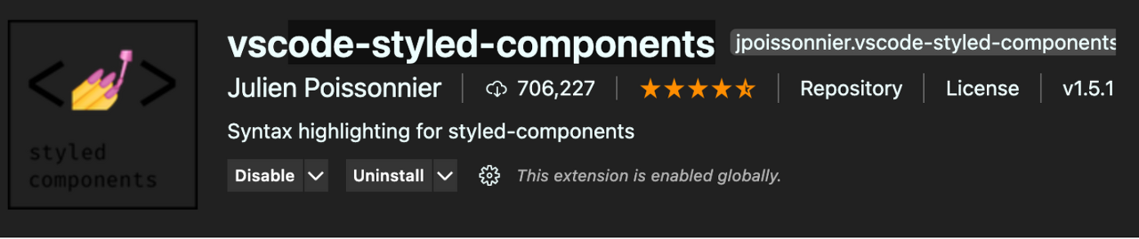
유용한 VScode 확장 프로그램
vscode-styled-components 를 이용하면 코드가 예뻐져요~!
2. Styled-componets 기본 문법
const 상수명 = styled.스타일링하고싶은테그`
    넣을 css 효과들
`;- 예시
//여기서 h1은 테그가 아니라 테그함수이고, 그 테그 안에 아래의 값을 넣는다는 의미를 갖는다
const Title = styled.h1`
  font-size: 1.5em;
  text-align: center;
  color: palevioletred;
`;

function App() {
  return <Title>Styled Components</Title>;
}
3. 활용 방법
3-1. 고정 스타일링
기본적으로 고정적인 값을 이용해 스타일링합니다.
//App.js
import React from "react";
import styled from "styled-components";
import Button from "./components/Button";
//Button테그는 재사용가능한 컴포넌트로부터 데려온다

//고정값을 가지고 스타일링 함
const AppBlock = styled.div`
  width: 512px;
  margin: 0 auto;
  margin-top: 4rem;
  border: 1px solid black;
  padding: 1rem;
`;

function App() {
  return (
    <AppBlock>
      <Button>Button</Button>
    </AppBlock>
  );
}

export default App;- Styled-components를 통해 재사용이 가능한 css 컴포넌트를 만들 수도 있습니다!
- 버튼에 css를 추가해주는 StyleButton컴포넌트를 만듦.
- 그 값을 리턴함
- 이 컴포넌트를 임포트 하면 다른 컴포넌트에서도 이 컴포넌트를 사용할 수 있음!
//Button.js
//스타일이 적용된 Button 컴포넌트를 어디서든 import해서 사용할 수 있다!
import React from "react";
import styled from "styled-components";

const StyleButton = styled.button`
  /* 공통 스타일 */
  display: inline-flex;
  outline: none;
  border: none;
  border-radius: 4px;
  color: white;
  font-weight: bold;
  cursor: pointer;
  padding-left: 1rem;
  padding-right: 1rem;
`;

function Button({ children, ...rest }) {
  console.log({ children }); //{children: "Button"}
  console.log({ ...rest }); //{} (빈 객체--props가 딱히 없으므로)
  return <StyleButton {...rest}>{children}</StyleButton>;
}

export default Button;- styled component에서의 재사용 흐름은
- 부모 컴포넌트에서 자식 컴포넌트를 호출
<Button>Button</Button> - 자식 컴포넌트는 부모가 자신을 호출했으므로 그 호출 값을 인자로 받음 -> 테그 사이 값은
children, 속성들은...rest에 저장 - 다시 자식컴포넌트는
StyleButton함수를 적용시켜서 부모한테 보냄
3-2. 가변스타일링
🐰 props 활용 기본
가변 스타일링에는 props를 사용한다! (여기서 props는 property 느낌이다!)
- 테그 안에 props로 넘긴 값은 props.넘긴값 으로 접근할 수 있습니다.
- 여러 줄의 css코드를 조건부로 넘겨줄 때에는 css를 불러와서 사용해야합니다. 이때
import styled, { css } from "styled-components";를 잊지 말 것!!
import React from "react";
import styled, { css } from "styled-components";

//div테그를 스타일링해서 Circle컴포넌트에 넣음
//Circle컴포넌트에 color라는 props를 줌
const Circle = styled.div`
  width: 5rem;
  height: 5rem;
  background: ${(props) => props.color || "black"};
  border-radius: 50%;
  ${(props) =>
    props.huge &&
    css`
      width: 10rem;
      height: 10rem;
    `}
`;
// 여러 줄의 css코드를 조건 식으로 넘김

function App() {
  return <Circle color="blue" huge />;
}

export default App;
-> Tagged Template Literal 문법을 통해 props의 값을 ${}로 감싸 읽어들일 수 있습니다!
<참고: Tagged Template Literal 문법이란?>
const red = "빨간색";
const blue = "파란색";
function favoriteColors(texts, ...values) {
console.log(texts);
console.log(values);
}
favoriteColors`제가 좋아하는 색은 ${red}과 ${blue}입니다.`;- Template literal 문법으로 쓰인, 백틱으로 싸여진 구문 내부의 값을 읽어들입니다!
- text는 들어온 문자열을 분해해 문자열을 배열값으로 할당하고,
- ...values는 rest연산자로 ${} 내부의 값을 하나씩 받습니다. (template literal문법으로 쓰인 아이들)
🐰 모듈화 하여 이용 - props를 이용해 재사용 가능한 컴포넌트 생성하기
//Button.js

import React from "react";
import styled, { css } from "styled-components";

//size를 제어
const sizeStyles = css`
  ${(props) =>
    props.size === "large" &&
    css`
      height: 3rem;
      font-size: 1.25rem;
    `}

  ${(props) =>
    props.size === "medium" &&
    css`
      height: 2.25rem;
      font-size: 1rem;
    `}

    ${(props) =>
    props.size === "small" &&
    css`
      height: 1.75rem;
      font-size: 0.875rem;
    `}
`;

const StyleButton = styled.button`
  /* 공통 스타일 */
  display: inline-flex;
  outline: none;
  border: none;
  border-radius: 4px;
  color: white;
  font-weight: bold;
  cursor: pointer;
  padding-left: 1rem;
  padding-right: 1rem;

  /* 크기 */
  ${sizeStyles}
`;

function Button({ children, size, ...rest }) {
  return (
    <StyleButton size={size} {...rest}>
      {children}
    </StyleButton>
  );
}

export default Button;
//App.js
import React from "react";
import styled from "styled-components";
import Button from "./components/Button";
//Button테그는 재사용가능한 컴포넌트로부터 데려온다
//고정값을 가지고 스타일링 함
const AppBlock = styled.div`
width: 512px;
margin: 0 auto;
margin-top: 4rem;
border: 1px solid black;
padding: 1rem;
`;
function App() {
return (
<AppBlock>
<Button size="large">Button</Button>
<Button size="small">Button</Button>
<Button size="medium">Button</Button>
</AppBlock>
);
}
export default App;- 이처럼 props값을 받아서 각각의 props값에 따라 다르게 스타일링 할 수 있습니다!
- 아까 고정 컴포넌트에서의 재사용 css 컴포넌트는 내부에 가변형 인자가 없었지만,
이 경우는 가변형 인자를 가지고 재사용 css컴포넌트를 만들었다고 보면 될 것 같습니다~!
3-3. 기존 스타일 확장시켜 활용하기!
- 기존에 만든 스타일과 비슷하지만 몇몇가지를 추가해 확장한 새로운 스타일을 만들고 싶다면 아래의 방법을 이용할 수 있습니다!
const 확장스타일컴포넌트이름 = styled(상속받을스타일컴포넌트)`추가할 코드 작성`; const StyleButton = styled.button`
/* 공통 스타일 */
display: inline-flex;
outline: none;
border: none;
border-radius: 4px;
color: white;
font-weight: bold;
cursor: pointer;
padding-left: 1rem;
padding-right: 1rem;
`;
//StyleButton값은 자동으로 세팅이 되어 있는 상태에서 새로운 스타일을 추가할 수 있다!
const RedButton = styled(Stylebutton)`
color: red;
`4. Epilogue
기본적인 styled-components를 정리해보았는데, 사실 이 뿐만 아니라 활용할 수 있는 것들이 정말정말 많습니다! animation, Global Theme, Nesting 등등 수많은 활용할 수 있는 것들이 있으니까 실제로 필요할 때 찾아서 이용해보면 좋을 것 같습니다!
🙉 Reference
레퍼런스는 쿠키파킹을 통해 볼 수 있습니다~!

개발하는 돌멩이
너무 잘 읽었습니다 ㅎㅎ
다른 글도 그렇고 다른 사람을 쉽게 이해시키고, 깔끔하게 정리하시는 능력이 있으신 것같아요!