AlertDialog (showdialog)
- 사용자에게 알림을 띄우거나 사용자의 입력값을 받아야 할때 사용하는 대화상자이다.
- 팝업창의 형태로 하고있다.
- showdialog 메서드를 사용할때는 중요한 점이 있다.
- 크게 title, content, actions로 구성이되어있다.
- showDialog는 정확히는 Dialog Box를 띄어주는 기능이다.
- showdialog는 부모위젯의 Matarialapp 이있는 BuildContext 에서만 호출 할수있다.
- 따라서 하나의 코드로 계속 쓰기보다 새로운 Widget을 하나 생성해서 만들어줘야한다.
- stateless에서도 돌아간다는데 기본적으로는 Statefulwidget에서 작동한다.
Object → DiagnosticableTree → Widget → StatelessWidget → AlertDialog
Property
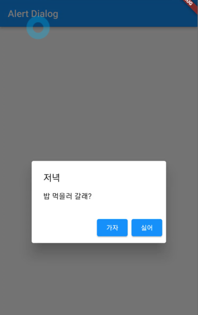
- title : 제목 부분
- content : 내용 부분
- actions : actions 는 리스트로 구성이 되어있으며, 리스트안에 다양하게 구성할수있다. 오늘은 아이콘으로 구성이되어있으며 누르면 뒤로 돌아오는 기능을 넣었다.
class Demo extends StatefulWidget {
const Demo({Key key}) : super(key: key);
State<Demo> createState() => _DemoState();
}
class _DemoState extends State<Demo> {
Widget build(BuildContext context) {
return MaterialApp(
home: Scaffold(
appBar: AppBar(
title: Text('Alert Dialog'),
),
body: Test(),
),
);
}
}
class Test extends StatelessWidget {
const Test({
Key key,
}) : super(key: key);
Widget build(BuildContext context) {
return Center(
child: ElevatedButton(
onPressed: () {
_showdialog(context);
},
child: Text('push')),
);
}
Future<dynamic> _showdialog(BuildContext context) {
return showDialog(
context: context,
builder: (BuildContext context) => AlertDialog(
title: Text('저녁'),
content: Text('밥 먹을러 갈래?'),
actions: [
ElevatedButton(
onPressed: () => Navigator.of(context).pop(),
child: Text('가자')),
ElevatedButton(
onPressed: () => Navigator.of(context).pop(),
child: Text('싫어')),
],
),
);
}
}
-
스탠다드 하게는 이렇게 구성이된다.
-
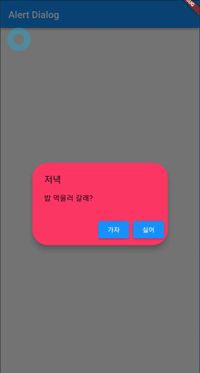
elevation : 입체적으로 보일때(그림자 등등 수정)
-
backgroundColor : 색을 바꿀수있다. 물론 밑바탕이며 아이콘을 수정하고싶다면, actions의 리스트에서 아이콘 수정을 하면된다.
-
shape : 박스의 끝부분을 수정할수있다.
class Demo extends StatefulWidget {
const Demo({Key key}) : super(key: key);
State<Demo> createState() => _DemoState();
}
class _DemoState extends State<Demo> {
Widget build(BuildContext context) {
return MaterialApp(
home: Scaffold(
appBar: AppBar(
title: Text('Alert Dialog'),
),
body: Test(),
),
);
}
}
class Test extends StatelessWidget {
const Test({
Key key,
}) : super(key: key);
Widget build(BuildContext context) {
return Center(
child: ElevatedButton(
onPressed: () {
_showdialog(context);
},
child: Text('push')),
);
}
Future<dynamic> _showdialog(BuildContext context) {
return showDialog(
context: context,
builder: (BuildContext context) => AlertDialog(
title: Text('저녁'),
content: Text('밥 먹을러 갈래?'),
actions: [
ElevatedButton(
onPressed: () => Navigator.of(context).pop(), child: Text('가자')),
ElevatedButton(
onPressed: () => Navigator.of(context).pop(), child: Text('싫어')),
],
elevation: 10.0,
backgroundColor: Colors.pink,
shape: RoundedRectangleBorder(
borderRadius: BorderRadius.all(Radius.circular(32)),
),
),
);
}
}

flutter