Storybook 사용기

개요
Storybook이란?
Storybook은 가장 인기있는 UI 컴포넌트 개발, 문서화 툴입니다.
Storybook은 UI 컴포넌트 개발을 더 빠르게 할 수 있도록 도와주고 문서화를 더 쉽게 할 수 있도록 도와줍니다.
그렇다면 과연 어떻게 도와줄 수 있는 것일까요?
더 빠른 UI 컴포넌트 개발
Storybook은 UI 컴포넌트를 따로 분리하여 개발할 수 있도록 도와줍니다. 이것은 개발자가 아직 완성되지 않은 API나 다른 로직들에 방해 받지 않고 독립적으로 UI 컴포넌트를 개발할 수 있다는 것을 의미합니다.
직접 React에서 사용해보면서 알아보겠습니다.
먼저 CRA로 리액트 프로젝트를 만든 후 storybook을 초기화해줍니다.
npx sb init
그러면 root 폴더 하위에 .storybook 폴더와 그 안에 storybook 관련 설정들을 관리 main.js, preview.js 파일이 생긴 것을 알 수 있고, src 폴더 하위에는 stories 폴더와 그 하위에 여러 예시 파일들이 들어있는 것을 볼 수 있습니다.
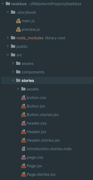
그리고 package.json 파일을 열어보면 scripts 안에 storybook이 생겨난 것을 볼 수 있습니다.
"scripts": {
"start": "react-scripts start",
"build": "react-scripts build",
"test": "react-scripts test",
"eject": "react-scripts eject",
"storybook": "start-storybook -p 6006 -s public",
"build-storybook": "build-storybook -s public"
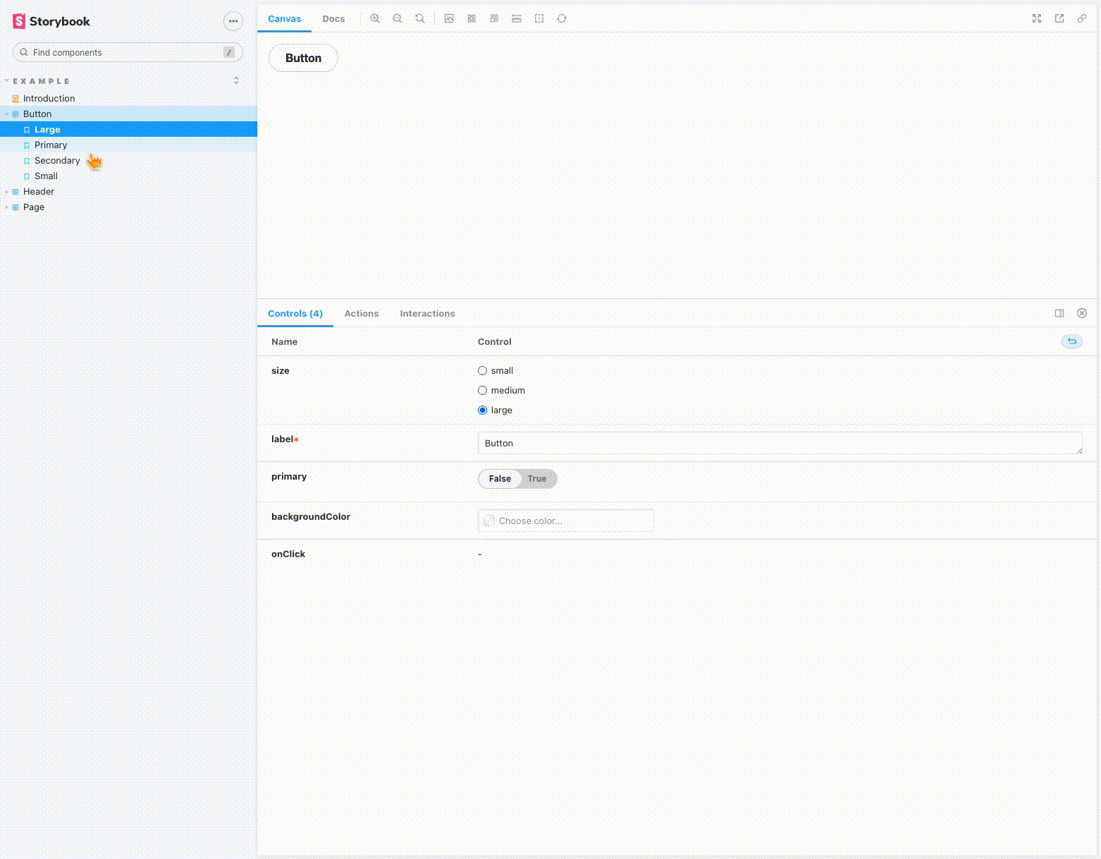
},npm run storybook 또는 yarn storybook 명령어로 storybook을 실행시킨 뒤 localhost:6006으로 들어가보면 아래와 같이 대시보드 형태로 나타나는 것을 볼 수 있습니다.
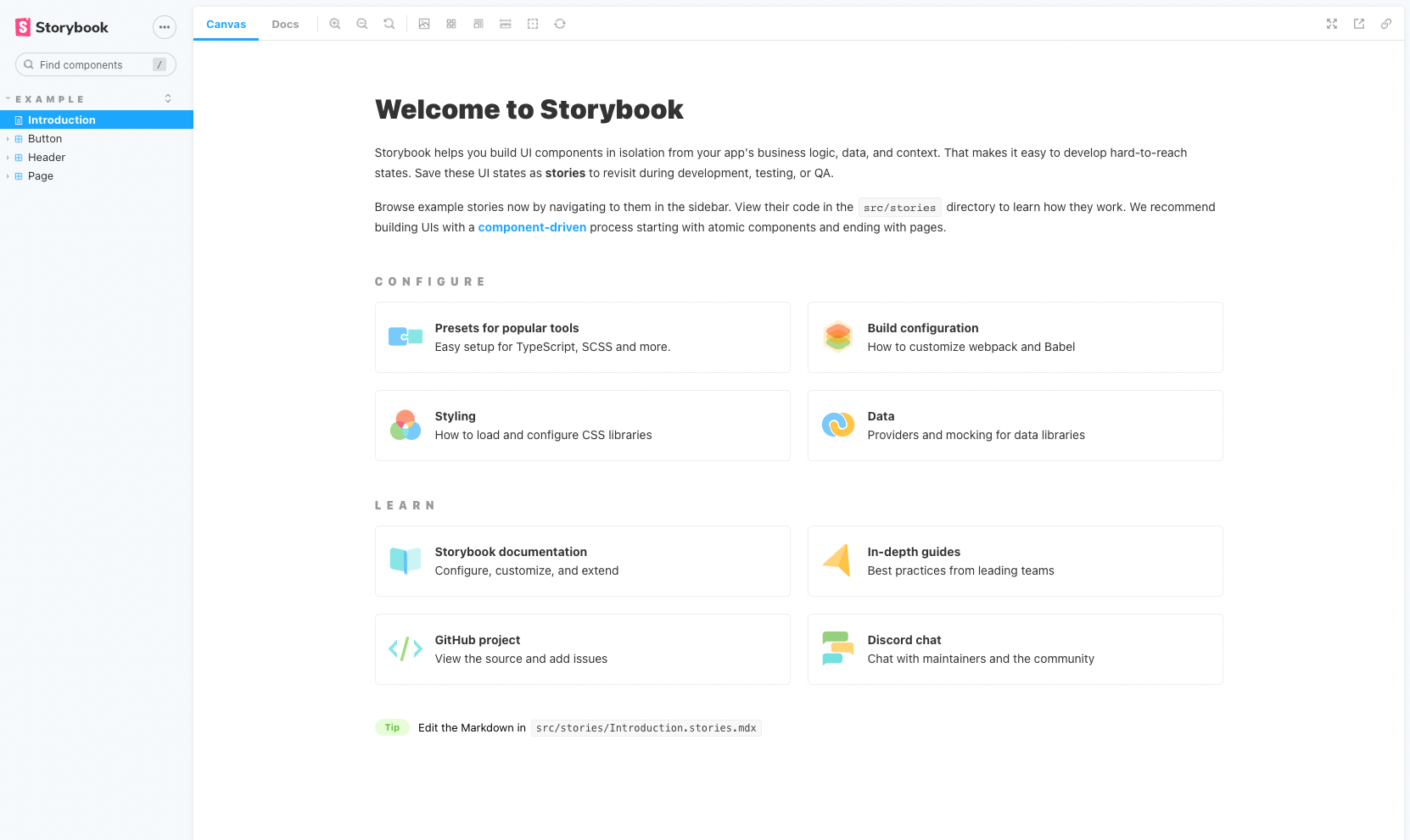
왼쪽 사이드바의 Introduction, Button, Header, Page는 모두 src/stories 하위의 Introduction.stories.mdx 파일과 *.stories.jsx 파일들 때문에 생겨난 것입니다.
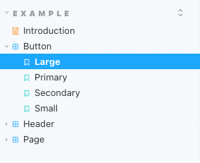
*.stories.jsx 안에는 여러개의 story를 작성할 수 있습니다. 그렇다면 story란 무엇일까요?
하나의 UI 컴포넌트에는 여러개의 story 를 작성할 수 있고 UI 컴포넌트에서 나올 수 있는 여러 형태를 나타낼 수 있습니다.
먼저 Button.stories.jsx 파일을 보면서 *.stories.jsx 파일을 어떻게 작성해야하는지 알아보겠습니다.
#1
먼저 export default에서 title과 component를 설정해줍니다. title은 왼쪽 사이드바에서 나타날 이름을 정하는 것이고 component는 사용할 UI 컴포넌트를 의미합니다.
title을 Example/Button으로 설정했기 때문에 왼쪽 사이드바에서 EXAMPLE 밑에 Button이 있는 것을 알 수 있습니다.
#2
그 다음에 args를 매개변수로 받고 UI 컴포넌트를 리턴하는 Template이라는 함수를 만들어줍니다.
#3
그리고 bind 메서드를 사용해 Template 함수를 복사한 뒤 story마다 args에 UI 컴포넌트에서 사용할 매개변수를 다르게 넣어주고 export 해주면 storybook에서 Button 하위에 export한 story들이 생겨납니다.
// src/stories/Button.stories.jsx
import React from 'react';

import { Button } from './Button';


// #1
export default {
  title: 'Example/Button',
  component: Button,
};

// #2
const Template = (args) => <Button {...args} />;

// #3
// Primary story
export const Primary = Template.bind({});
Primary.args = {
  primary: true,
  label: 'Button',
};

// 아래와 같이 작성할 수도 있지만
// Controls 탭에서 props 를 수정할 수 없고, 클릭 이벤트가 발생하지 않습니다.
// export const Primary = () => <Button primary={true} label='Button' />;

export const Secondary = Template.bind({});
Secondary.args = {
  label: 'Button',
};

export const Large = Template.bind({});
Large.args = {
  size: 'large',
  label: 'Button',
};

export const Small = Template.bind({});
Small.args = {
  size: 'small',
  label: 'Button',
};
아래는 버튼 컴포넌트 코드입니다. propTypes를 작성하면 넘어온 args를 제외한 다른 prop으로도 storybook을 통해 UI 컴포넌트를 실시간으로 수정해볼 수 있습니다.
// src/stories/Button.jsx
import React from 'react';
import PropTypes from 'prop-types';
import './button.css';

export const Button = ({ primary, backgroundColor, size, label, ...props }) => {
  const mode = primary ? 'storybook-button--primary' : 'storybook-button--secondary';
  return (
    <button
      type="button"
      className={['storybook-button', `storybook-button--${size}`, mode].join(' ')}
      style={backgroundColor && { backgroundColor }}
      {...props}
    >
      {label}
    </button>
  );
};

Button.propTypes = {
  primary: PropTypes.bool,
  backgroundColor: PropTypes.string,
  size: PropTypes.oneOf(['small', 'medium', 'large']),
  label: PropTypes.string.isRequired,
  onClick: PropTypes.func,
};

Button.defaultProps = {
  backgroundColor: null,
  primary: false,
  size: 'medium',
  onClick: undefined,
};
이렇게 UI 컴포넌트를 storybook을 통해 관리한다면 모든 컴포넌트를 한 눈에 볼 수 있기 때문에 협업을 할 때 다른 사람이 만든 UI 컴포넌트여도 금방 사용법을 익힐 것 같아서 UI 컴포넌트를 이해하기 위해 의사소통해야 하는 노력이 줄어들 것 같습니다.
그리고 나중에 어떤 prop이 들어갔을 때 어떻게 컴포넌트가 나타나는지 기억이 안날 때도 금방 복기할 수 있을 것 같다는 생각이 들었습니다.
또 컴포넌트만 따로 떼어내서 볼 수 있기 때문에 UI 컴포넌트 개발이 더 빨리질 것 같다는 생각도 듭니다. 어디선가 storybook은 연습장과 같다는 비유를 봤었는데 그 비유가 많이 와닿는 것 같습니다.
쉬운 문서화
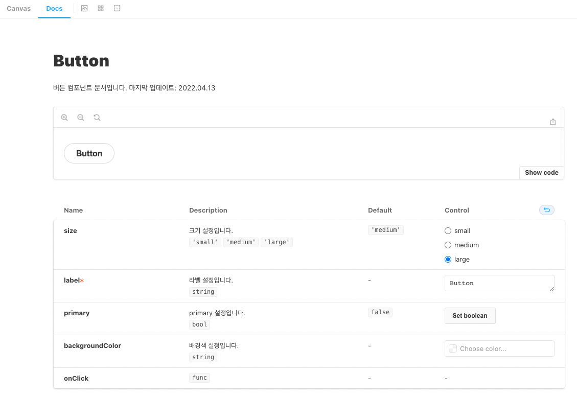
다음으로 문서화하는 방법입니다. 위의 버튼 컴포넌트에서는 주석을 달지 않았지만 아래처럼 주석을 달아주면 Docs탭으로 갔을 때 주석의 내용이 추가되어 있는 것을 볼 수 있습니다.
// src/stories/Button.jsx
import React from 'react';
import PropTypes from 'prop-types';
import './button.css';

/**
 * 버튼 컴포넌트 문서입니다. 마지막 업데이트: 2022.04.13
 */
export const Button = ({ primary, backgroundColor, size, label, ...props }) => {
  const mode = primary ? 'storybook-button--primary' : 'storybook-button--secondary';
  return (
    <button
      type="button"
      className={['storybook-button', `storybook-button--${size}`, mode].join(' ')}
      style={backgroundColor && { backgroundColor }}
      {...props}
    >
      {label}
    </button>
  );
};

Button.propTypes = {
  /**
   * primary 설정입니다.
   */
  primary: PropTypes.bool,
  /**
   * 배경색 설정입니다.
   */
  backgroundColor: PropTypes.string,
  /**
   * 크기 설정입니다.
   */
  size: PropTypes.oneOf(['small', 'medium', 'large']),
  /**
   * 라벨 설정입니다.
   */
  label: PropTypes.string.isRequired,
  onClick: PropTypes.func,
};

Button.defaultProps = {
  backgroundColor: null,
  primary: false,
  size: 'medium',
  onClick: undefined,
};
이렇게 주석으로 편하게 문서화를 할 수 있다는 특징이 있습니다.
그리고 문서화를 해놓는다면 협업을 할 때 다른 사람들이 이해하기가 훨씬 수월할 것 같고 나중에 본인을 위해서도 문서화를 해놓는 것이 좋을 것 같습니다.
레퍼런스
https://storybook.js.org/docs/react/get-started/introduction