
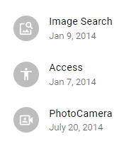
<List />
목록들을 나열하는 리스트 컴포넌트이다.
<List sx={{ width: '100%', maxWidth: 360, bgcolor: 'background.paper' }}>
  <ListItem>
    <ListItemAvatar>
      <Avatar>
        <ImageSearch />
      </Avatar>
    </ListItemAvatar>
    <ListItemText primary="Image Search" secondary="Jan 9, 2014" />
  </ListItem>
  <ListItem>
    <ListItemAvatar>
      <Avatar>
        <AccessibilityRounded />
      </Avatar>
    </ListItemAvatar>
    <ListItemText primary="Access" secondary="Jan 7, 2014" />
  </ListItem>
  <ListItem>
    <ListItemAvatar>
      <Avatar>
        <PhotoCameraFront />
      </Avatar>
    </ListItemAvatar>
    <ListItemText primary="PhotoCamera" secondary="July 20, 2014" />
  </ListItem>
</List>-
ListItem 컴포넌트
리스트에 들어가는 아이템 컴포넌트 -
ListItemText 컴포넌트
<ListItem />의 들어갈 텍스트이다.primary속성은 텍스트의 상단 제목,secondary는 하단 텍스트이다.
<Skeleton />
데이터 패칭시 로딩시간 중에 보여줄 수 있는 UI이다.
<Stack spacing={1}>
  <Skeleton variant="text" sx={{ fontSize: '1rem' }} />
  <Skeleton variant="circular" width={40} height={40} />
  <Skeleton variant="rectangular" width={210} height={60} />
  <Skeleton variant="rounded" width={210} height={60} />
</Stack>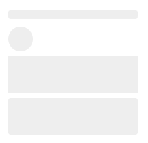
- Skeleton의 variant 속성
스켈레톤의 형태를 나타낸다.
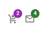
<Badge />
숫자와 함께 개인정보를 표시하는 작인 벳지이다.
<Stack spacing={2} direction="row">
  <Badge badgeContent={4} color="secondary">
    <MailIcon color="action" />
  </Badge>
  <Badge badgeContent={4} color="success">
    <MailIcon color="action" />
  </Badge>
</Stack>- badgeContent 속성
해당 벳지의 상태를 나타내준다.
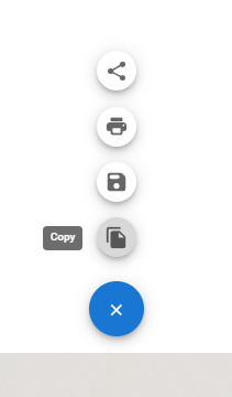
<SpeedDial />
화면에서 측면의 작은 도구 모음 메뉴버튼이다.
// 아아콘 배열
const actions = [
    { icon: <FileCopy />, name: 'Copy' },
    { icon: <SaveRounded />, name: 'Save' },
    { icon: <PrintRounded />, name: 'Print' },
    { icon: <ShareRounded />, name: 'Share' },
];

return (
  <Box sx={{ height: 320, transform: 'translateZ(0px)', flexGrow: 1 }}>
    <SpeedDial
      ariaLabel="SpeedDial basic example"
      sx={{ position: 'absolute', bottom: 16, right: 16 }}
      icon={<SpeedDialIcon />}
      >
      {actions.map((action) => (
        <SpeedDialAction
          key={action.name}
          icon={action.icon}
          tooltipTitle={action.name}
          />
      ))}
    </SpeedDial>
  </Box>
);- SpeedDialAction 컴포넌트
다이얼 리스트에 들어갈 목록 컴포넌트이다.tooltipTitle속성은 hover시 적용될 툴팁이다.

안녕하세요! 26살 프론트엔드 개발자입니다! (2024/03 ~)