
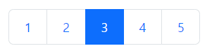
<Pagination />
페이지네이션 기능을 작동시킬 수 있다.
const PaginationEx: FC = () => {

    const items = [];

    for (let i = 1; i <= 5; i++) {
        items.push(<Pagination.Item key={i} active={i === 3}>{i}</Pagination.Item>);
    }

    return (
        <div className='m-5'>
            <Pagination size='lg'>
                {items}
            </Pagination>
        </div>
    );
};
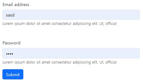
<Form />
폼의 형식을 꾸밀 수 있다. Form의 세부 컴포넌트들은 다음과 같다.
- Group : 유효성검사에 도움을 줌
- Label: 레이블 역할
- Control :
input태그를 가지고 있음 - Text : 폼의 텍스트
브라우저는 기본적으로 html 자체적으로 유효성 검사를 진행한다. 때문에 react-bootstrap의 유효성 검사와 겹치지 않으려면 noValidate 속성을 true로 지정해줘야 한다. 이때, 유효성 검사를 진행시킬 항목은 required 속성을 부여한다.
<Form noValidate validated={validate} onSubmit={onSubmit}>
  <Form.Group controlId='formBasicEmail' className='mb-5'>
    <Form.Label>Email address</Form.Label>
    <Form.Control type='email' placeholder='email..'/>
    <Form.Text className='text-muted '>
      Lorem ipsum dolor sit amet consectetur adipisicing elit. Ut, officia!
    </Form.Text>
  </Form.Group>
  <Form.Group controlId='formBasicEmail' className='mb-3'>
    <Form.Label>Password</Form.Label>
    <Form.Control type='password' placeholder='pw..'/>
    <Form.Text className='text-muted '>
      Lorem ipsum dolor sit amet consectetur adipisicing elit. Ut, officia!
    </Form.Text>
  </Form.Group>
  <Button type='submit'>
    Submit
  </Button>
</Form>
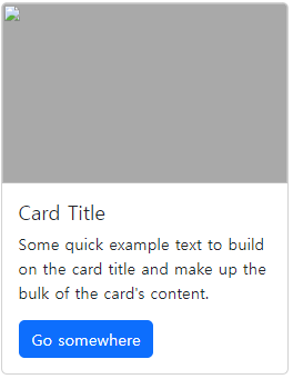
Card
유연하고 간략한 데이터들의 정보를 제공하는 카드모양의 컴포넌트이다. 구할 수 있는 방들의 목록, 수강 가능한 강의들의 목록, 구매 가능한 고기들의 목록 등의 상황에 적용하면 좋다. 세부 컴포넌트 역시 가지고 있다.
- Title : 카드의 제목
- Img : 카드의 이미지
- Body : 카드의 내부 구성 요소
- Text : 카드의 텍스트
<Card style={{ width: '18rem' }}>
  <Card.Img variant="top" src='/' style={{ width: '100%', height: 180, background: 'grey }}/>
  <Card.Body>
    <Card.Title>Card Title</Card.Title>
    <Card.Text>
      Some quick example text to build on the card title and make up the
      bulk of the card's content.
    </Card.Text>
    <Button variant="primary">Go somewhere</Button>
  </Card.Body>
</Card>
<Collapse />
축소 토글 애니메이션을 요소 또는 구성 요소에 추가한다.
const RB5: FC = () => {

    const [open, setOpen] = useState<boolean>(false);

    return (
        <div>
            <Button
                onClick={() => setOpen(prev => !prev)}
                aria-controls="example-collapse-text"
                aria-expanded={open}
            >
                click
            </Button>
            <div style={{ minHeight: '150px' }} id='example-collapse-text'>
                <Collapse in={open} dimension='width'>
                    <Card body style={{ width: 400 }}>
                        Anim pariatur cliche reprehenderit, enim eiusmod high life
                        accusamus terry richardson ad squid. Nihil anim keffiyeh
                        helvetica, craft beer labore wes anderson cred nesciunt sapiente
                        ea proident.
                    </Card>
                </Collapse>
            </div>
        </div>
    );
};


안녕하세요! 26살 프론트엔드 개발자입니다! (2024/03 ~)