오늘은 2차 프로젝트에서 처음 써먹어 본 Styled Component에 대해 알아보자 🥰

✅ Styled Component란?
- styled-components란 Javascript 파일 내에서 CSS를 사용할 수 있게 해주는 대표적인 CSS-in-JS 라이브러리로 React 프레임워크를 주요 대상으로 한 라이브러리이다.
본질적으로,
styled-coponents는styled-components라이브러리를 사용하여 리액트 컴포넌트를 쉽게 만들 수 있으며 Javascript 코드 내에서 일반 CSS로 구성 요소의 스타일을 지정할 수 있다.
설치
$ npm install --save styled-components✅ 기본문법
// styled-components 라이브러리에서 import 해온 styled라는 객체를 이용합니다
// 아래와 같이 h1 태그를 만들어 Title이라는 스타일드 컴포넌트를 만들 수 있습니다

import styled from 'styled-componets'


render(
  <Wrapper>
    <Title>
      Hello World!
    </Title>
  </Wrapper>
);

const Title = styled.h1`
  font-size: 1.5em;
  text-align: center;
  color: palevioletred;
`;

const Wrapper = styled.section`
  padding: 4em;
  background: papayawhip;
`;
생긴 모양은 다음과 같다.
const {위에서 지정해준 component명} = styled.{태그명} ``;
스타일을 지정기 위해 위의 예시처럼 tagged template literal를 사용한다.
styled.{태그명} ``; 부분에 해당한다.
✅ Adapting based on props‼️
render(
  <div>
    <Button>Normal</Button>
    <Button width="100">Primary</Button>
  </div>
);

const Button = styled.button`
  /* Adapt the colors based on primary prop */
  background: ${props => props.width < 200 ? "palevioletred" : "white"};
  color: ${props => props.primary ? "white" : "palevioletred"};
  font-size: 1em;
  margin: 1em;
  padding: 0.25em 1em;
  border: 2px solid palevioletred;
  border-radius: 3px;
`;
가장 기본적이고 많이 쓰이는 속성으로
Styled Component를 쓰는 주 이유중 하나이다. 특히 이번 2차 프로젝트에서 Styled Component 사용법을 잘 몰라 첫 PR시props속성을 안썼는데 멘토님의 리뷰로 바꿔 보았다.
Styled Component Props 속성을 사용하기 전
<TagBox className={isHidden ? "hidden" : "visible"}>

----- -----   -----   -----   -----   -----   -----   -----
.hidden {
  visibility: hidden;
}
.visible {
  visibility: visible;
}
Styled Component Props 속성을 사용 후
<TagBox unVisibility={isHidden}>
----- -----   -----   -----   -----   -----   -----   -----

visibility: ${(props) => (props.unVisibility ? "hidden" : "visible")};
이렇게 useState로 관리되는 상태값을 props로 넘겨줄 수도 있다! 핵꿀팁~~!~!~!!~
✅ Extending Styles
render(
  <div>
    <Button>Normal Button</Button>
    <TomatoButton>Tomato Button</TomatoButton>
  </div>
);

// The Button from the last section without the interpolations
const Button = styled.button`
  color: palevioletred;
  font-size: 1em;
  margin: 1em;
  padding: 0.25em 1em;
  border: 2px solid palevioletred;
  border-radius: 3px;
`;

// A new component based on Button, but with some override styles
const TomatoButton = styled(Button)`
  color: tomato;
  border-color: tomato;
`;
이런 식으로 TomatoButton은 기존의 스타일링된 Button을
Extend해서 사용할 수 있다~!
✅ Nesing Global Style
가장 크게 체감할 수 있는 Pure CSS와 SASS의 차이라면 nesting 기능 유무에 있을 것이다. Styled Components 역시 해당 기능을 제공한다. 적절히 사용한다면 모든 컴포넌트를 스타일드 컴포넌트화 시키지 않더라도 충분히 스타일링할 수 있다.
render(
  <>
    <Thing>Hello world!</Thing>
    <Thing>How ya doing?</Thing>
    <Thing className="something">The sun is shining...</Thing>
    <div>Pretty nice day today.</div>
    <Thing>Don't you think?</Thing>
    <div className="something-else">
      <Thing>Splendid.</Thing>
    </div>
  </>
)

const Thing = styled.div`
  color: blue;

  &:hover {
    color: red;
  }

  #id {
		div {

		}

    background: orange;
  }

  .something-else & {
    border: 1px solid;
  }
`render(
<>
<GlobalStyle />
<Thing>
I'm blue, da ba dee da ba daa
</Thing>
</>
)
const Thing = styled.div`
&& {
color: blue;
}
`
const GlobalStyle = createGlobalStyle`
div${Thing} {
color: red;
}
`✅ Global Style
Sass에서 common.scss와 reset.scss 의 역할도Styled Component에 존재한다 바로Global Style이다
이번 프로젝트 첫 날에 이 녀석 때문에 첫 날에 아무것도 못했다는 슬픈 사실은 안비밀.... 😭
src 폴더 아래 아래와 같이 Styles 폴더를 만들었고 그 아래 common역할의 StyleTheme 그리고 reset 역할의 StyleGlobal을 만들어준다
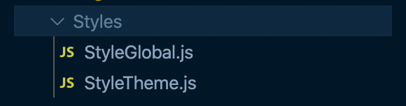
그리고 index.js에만 import 해주면 자동으로 모든 페이지, 컴포넌트 적용 !!
import StyleTheme from "./Styles/StyleTheme";
import StyleGlobal from "./Styles/StyleGlobal";
각 컴포넌트에서 커먼 css를 쓰는 방식은 아래와 같다
color: ${(props) => props.theme.colors.grayColor};