안녕하세요 이번에는 Custom BottomSheetScaffold 에 대해 다뤄보려고 합니다.
Material에서 제공해주는 BottomSheetScaffold를 사용해 요구사항을 구현할 수 있었으면 좋겠지만...
다들 아시다시피 BottomSheetScaffold 는 두 가지 상태를 제공합니다.
@ExperimentalMaterial3Api
enum class SheetValue {
    /** The sheet is not visible. */
    Hidden,

    /** The sheet is visible at full height. */
    Expanded,

    /** The sheet is partially visible. */
    PartiallyExpanded,
}
Hideen 까지 3단계로 할 수 있겠군요.
하지만 디자인 팀에서 요구한 요구사항은 이렇습니다.
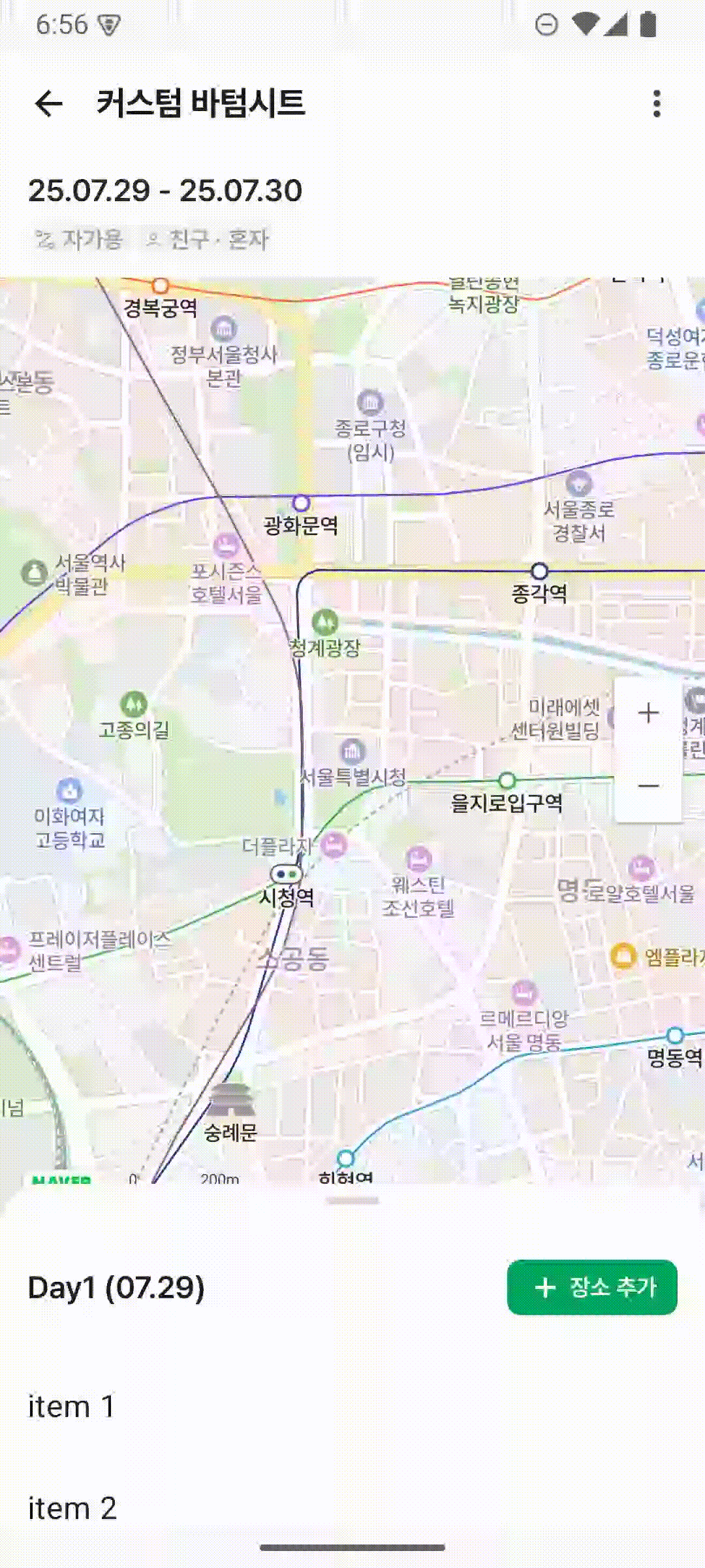
총 3단계로 이뤄져있는데요
Collapsed, HalfExpanded, Expanded 의 상태로 정리해보자면 다음과 같습니다.
- Hidden 상태는 없음
- Collapsed 상태에서 위로 드래그 시
HalfExpanded상태로 변환 HalfExpanded,Expanded상태에서는 LazyColumn의 스크롤이 가능하고 위의 DragHandle 영역으로 BottomSheet를 조절할 수 있다.
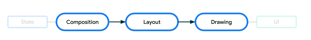
어떻게 구현했는지 알아보기 전에 우선 Compose의 Layout 단계에 대해 간단하게 알아보고 가겠습니다.
Layout
Compose에서는 3단계에 걸쳐 UI를 그립니다.
Compose가 어떻게 UI를 그리는지 자세한 내용은 Compose 공식문서를 통해 알 수 있습니다.
이번 포스팅에서는 Layout에 대해 간단하게 설명하고 넘어가겠습니다.
Layout 단계에서는 UI 요소들의 크기를 측정(measure)하고 위치를 배치(place)하는 과정을 거치게 됩니다.
Layout 컴포넌트
Layout 단계를 직접 제어할 수 있게 해주는 저수준 API
Layout 를 사용하여 Layout 단계를 직접 제어할 수 있습니다.
BottomSheet의 각 상태(Collapsed, HalfExpanded, Expanded)에 대한 정확한 y 좌표(앵커)를 계산하려면, 전체 화면의 높이와 TopBar의 높이 같은 다른 컴포저블의 측정된 크기를 알아야 합니다. Layout 컴포저블의 measure 람다는 바로 이 측정(measure) 시점에 개입하여 필요한 값들을 얻고, 이를 바탕으로 앵커를 동적으로 설정할 수 있게 해줍니다.
@Suppress("ComposableLambdaParameterPosition", "NOTHING_TO_INLINE")
@UiComposable
@Composable
inline fun Layout(
    contents: List<@Composable @UiComposable () -> Unit>,
    modifier: Modifier = Modifier,
    measurePolicy: MultiContentMeasurePolicy
) {
    Layout(
        content = combineAsVirtualLayouts(contents),
        modifier = modifier,
        measurePolicy = remember(measurePolicy) { createMeasurePolicy(measurePolicy) }
    )
}- contents: 여러 개의 자식 컴포넌트들을 리스트 형태로 받습니다.
- measurePolicy: 측정과 배치 로직을 정의하는 부분
이 Layout 컴포넌트를 통해 직접 Composable 함수들의 크기를 측정하고 배치하여 요구사항에 맞는 화면을 만들 수 있습니다.
어떻게 크기를 측정하고 위치를 배치하는지 알아보겠습니다.
@Composable
internal fun CustomBottomSheetScaffoldLayout(
    modifier: Modifier = Modifier,
    topBar: @Composable () -> Unit,
    titleContent: @Composable () -> Unit,
    mapContent: @Composable () -> Unit,
    bottomSheet: @Composable () -> Unit,
    snackbarHost: @Composable () -> Unit,
    sheetOffset: () -> Float,
    sheetState: CustomBottomSheetState,
) {
    Layout(
        modifier = modifier.background(Color.White),
        contents =
            listOf<@Composable () -> Unit>(
                topBar,
                titleContent,
                mapContent,
                bottomSheet,
                snackbarHost
            )
    ) { (topBarMeasurable, titleMeasurable, mapMeasurable, sheetMeasurable, snackbarMeasurable),
        constraints ->
        val layoutWidth = constraints.maxWidth
        val layoutHeight = constraints.maxHeight
        // 자식 컴포넌트들이 "곡 최소 크기를 가져야 한다" 라는 제약에서 해방
        val looseConstraints = constraints.copy(minWidth = 0, minHeight = 0)

		// Measurable -> Placeable 변환
        // Placeable 객체: 측정이 완료된 객체, 실제 크기 정보 보유, 배치 메서드 제공
        val topBarPlaceable = topBarMeasurable.fastMap { it.measure(looseConstraints) }
        // 측정된 topBarHeight를 구할 수 있음
        val topBarHeight = topBarPlaceable.fastMaxOfOrNull { it.height } ?: 0

        .
        .
        .

		// 최종 배치, 위에서 계산한 정보들을 x,y 좌표에 배치합니다.
        layout(layoutWidth, layoutHeight) {
            val sheetWidth = sheetPlaceable.fastMaxOfOrNull { it.width } ?: 0
            val sheetOffsetX = Integer.max(0, (layoutWidth - sheetWidth) / 2)

            mapPlaceable.fastForEach {
                it.placeRelative(0, mapY)
            }

            titlePlaceable.fastForEach {
                it.placeRelativeWithLayer(
                    x = 0,
                    y = titleY
                ) {
                    alpha = 1f - titleProgress
                }
            }

            sheetPlaceable.fastForEach {
                it.placeRelative(sheetOffsetX, currentOffset.roundToInt())
            }

            topBarPlaceable.fastForEach { it.placeRelative(0, 0) }
			.
            .
            .
        }
    }
}- contents에 전달한
Composable의List<Measurable>객체들을 받습니다. - Layout이 가질 수 있는 최소 / 최대 크기를 의미하는
Constraints객체를 받습니다. - 받은 객체들을
measure함수를 통해 크기를 측정합니다. - 측정된 객체들을
placeRelative함수를 통해 x,y 좌표에 배치할 수 있습니다.
이렇게 Layout 컴포넌트를 이용하여 우리가 원하는대로 크기를 지정하고 위치를 배치시킬 수 있습니다.
AnchoredDraggableState
Compose에서 특정 지점들(앵커)에 스냅되는 드래그 동작을 관리하는 상태 클래스입니다.
위에서 Layout 컴포넌트를 통해 원하는 모양의 컴포넌트들을 만들 수 있게 되었습니다.
이제 Layout으로 만든 컴포넌트에 BottomSheet 부분을 스크롤 시 우리가 정의한 상태에 드래그하는 동작이 필요합니다.
이를 구현하기 위해 AnchoredDraggableState를 이용할 수 있습니다.
/**
 * State of the [anchoredDraggable] modifier. Use the constructor overload with anchors if the
 * anchors are defined in composition, or update the anchors using [updateAnchors].
 *
 * This contains necessary information about any ongoing drag or animation and provides methods to
 * change the state either immediately or by starting an animation.
 *
 * @param initialValue The initial value of the state.
 */
@Stable
class AnchoredDraggableState<T>(initialValue: T)- initialValue: 컴포저블이 처음 화면에 표시될 때의 위치(앵커)를 지정합니다.
우선 각 위치를 나타내는 enum class를 작성합니다.
enum class CustomSheetValue {
    Collapsed,
    HalfExpanded,
    FullyExpanded,
}
DraggableAnchors 를 통해 각 앵커의 위치를 지정할 수 있습니다.
{ (topBarMeasurable, titleMeasurable, mapMeasurable, sheetMeasurable, snackbarMeasurable),
        constraints ->
        val layoutWidth = constraints.maxWidth
        val layoutHeight = constraints.maxHeight
        val looseConstraints = constraints.copy(minWidth = 0, minHeight = 0)

        val topBarPlaceable = topBarMeasurable.fastMap { it.measure(looseConstraints) }
        val topBarHeight = topBarPlaceable.fastMaxOfOrNull { it.height } ?: 0

        val collapsedSheetHeight = 200.dp.toPx()
        val halfExpandedSheetHeight = layoutHeight / 2f

        val newAnchors = DraggableAnchors {
            CustomSheetValue.Collapsed at layoutHeight - collapsedSheetHeight
            CustomSheetValue.HalfExpanded at layoutHeight - halfExpandedSheetHeight
            CustomSheetValue.FullyExpanded at topBarHeight.toFloat()
        }
        sheetState.updateAnchors(newAnchors)
        .
        .
        .
AnchoredDraggableState의 상태는 CustomBottomSheetState에서 관리하도록 하였습니다.
class CustomBottomSheetState(
    initialValue: CustomSheetValue = CustomSheetValue.Collapsed,
) {
    val currentValue: CustomSheetValue
        get() = anchoredDraggableState.currentValue

    fun requireOffset(): Float = anchoredDraggableState.requireOffset()

    internal suspend fun animateTo(
        targetValue: CustomSheetValue,
    ) {
        anchoredDraggableState.animateTo(targetValue)
    }

    fun updateAnchors(anchors: DraggableAnchors<CustomSheetValue>) {
        anchoredDraggableState.updateAnchors(anchors)
    }

    var anchoredDraggableState =
        AnchoredDraggableState(
            initialValue = initialValue,
        )

    companion object {
        fun Saver(): Saver<CustomBottomSheetState, CustomSheetValue> =
            Saver(
                save = { it.currentValue },
                restore = { savedValue ->
                    CustomBottomSheetState(
                        initialValue = savedValue,
                    )
                }
            )
    }
}
각 앵커에 대한 위치를 지정했고 스크롤 했을 시 앵커의 위치까지 시트를 올리지 않아도 바텀 시트가 올라갈 수 있어야 합니다. 이는 Modifier의 anchoredDraggable 를 사용할 수 있습니다.
fun <T> Modifier.anchoredDraggable(
    state: AnchoredDraggableState<T>,
    orientation: Orientation,
    enabled: Boolean = true,
    interactionSource: MutableInteractionSource? = null,
    overscrollEffect: OverscrollEffect? = null,
    flingBehavior: FlingBehavior? = null
): Modifier =
    this then
        AnchoredDraggableElement(
            state = state,
            orientation = orientation,
            enabled = enabled,
            reverseDirection = null,
            interactionSource = interactionSource,
            overscrollEffect = overscrollEffect,
            flingBehavior = flingBehavior
        )
내부 파라미터 또한 AnchoredDraggableState를 받고 있습니다.
.anchoredDraggable(
             state = state.anchoredDraggableState,
             orientation = orientation,
             enabled = true,
             flingBehavior = AnchoredDraggableDefaults.flingBehavior(state.anchoredDraggableState)
)
Layout의 measure 블록 안에서 constraints.maxHeight를 통해 전체 높이를 알 수 있으므로, 바로 이 시점에서 AnchoredDraggableState가 사용할 앵커 위치를 계산하고 updateAnchors를 통해 갱신해주줄 수 있습니다.
만약 바텀시트의 중복 스크롤을 허용하고 싶다면
NestedScrollConnection 을 사용하여 좀더 커스텀하게 바텀시트의 스크롤을 다룰 수 있습니다.
NestedScrollConnection 이용 시 스크롤 전 후에 동작해야 할 함수들을 작성할 수 있습니다. 이에대해서는 추후 자세히 다뤄보도록 하겠습니다.
정리
목표: 3단 BottomSheet와 AnchoredDraggableState"
우리의 목표는 Collapsed, HalfExpanded, Expanded 세 지점(앵커)에 자석처럼 달라붙는 BottomSheet를 만드는 것입니다. Compose에서는 이런 동작을 AnchoredDraggableState를 통해 손쉽게 구현할 수 있습니다.
// 1. 상태 정의
enum class CustomSheetValue { Collapsed, HalfExpanded, FullyExpanded }
// 2. State 생성
val state = remember { AnchoredDraggableState(initialValue = CustomSheetValue.Collapsed) }문제점: 앵커 위치는 어떻게 계산할까?"
AnchoredDraggableState를 사용하려면 각 상태에 해당하는 정확한 Y축 좌표(오프셋)를 알려주어야 합니다.
Collapsed 위치 = 전체 화면 높이 - 200.dp
HalfExpanded 위치 = 전체 화면 높이 / 2
FullyExpanded 위치 = 상단 TopBar의 높이
여기서 문제가 발생합니다. 전체 화면 높이나 TopBar의 높이는 렌더링 과정에서 동적으로 결정되는 값입니다. 일반적인 컴포저블 함수 내에서는 이 값들을 미리 알 수 없습니다.
3. 해결책: Layout 컴포저블로 측정 시점에 개입하기
바로 이 문제를 해결하기 위해 저수준 API인 Layout 컴포저블을 사용합니다. Layout을 사용하면 Compose의 3단계(Composition -> Layout(Measure, Place) -> Drawing) 중 Layout 단계에 직접 관여할 수 있습니다.
Layout 컴포저블의 measurePolicy 람다 내부에서는 다음 두 가지가 가능해집니다.
측정(Measure): 자식 컴포저블들의 크기를 측정하고, constraints를 통해 부모 레이아웃의 최대 높이(layoutHeight) 같은 정보를 얻을 수 있습니다.
배치(Place): 측정된 정보를 바탕으로 자식들을 원하는 x, y 좌표에 배치합니다.
4. 합치기
이제 우리의 CustomBottomSheetScaffoldLayout이 어떻게 동작하는지 명확해집니다.
Layout(...) { measurables, constraints ->
    // (1) 측정 단계 (Measure)
    // layoutHeight와 topBarHeight 등 필요한 모든 크기를 측정합니다.
    val layoutHeight = constraints.maxHeight
    val topBarPlaceable = ...
    val topBarHeight = topBarPlaceable.height

    // (2) 앵커 계산 및 업데이트
    // 위에서 측정한 값들을 이용해 `AnchoredDraggableState`가 필요로 하는 앵커 위치를 계산합니다.
    val newAnchors = DraggableAnchors {
        CustomSheetValue.Collapsed at layoutHeight - collapsedSheetHeight
        CustomSheetValue.HalfExpanded at layoutHeight / 2f
        CustomSheetValue.FullyExpanded at topBarHeight.toFloat()
    }
    // 계산된 앵커를 State에 즉시 업데이트합니다!
    sheetState.updateAnchors(newAnchors)

    // (3) 배치 단계 (Place)
    // 측정된 컴포저블들을 최종 위치에 배치합니다.
    // BottomSheet의 y 좌표는 anchoredDraggableState가 관리하는 오프셋 값(`sheetState.requireOffset()`)을 사용합니다.
    layout(layoutWidth, layoutHeight) {
        mapPlaceable.placeRelative(...)
        sheetPlaceable.placeRelative(x = ..., y = sheetState.requireOffset().roundToInt())
        topBarPlaceable.placeRelative(...)
    }
}
자세한 코드는
https://github.com/dongykung/Compose_Component/tree/main/app/src/main/java/com/dkproject/compsoe_component/custombottomsheetscaffold
을 통해 확인하실 수 있습니다!