지난번에 이어서 학습.
홈 섹션
@Composable
fun HomeSection(
    @StringRes title: Int,
    modifier: Modifier = Modifier,
    content: @Composable () -> Unit
) {
    Column(modifier) {
        Text(text = stringResource(title),
            style = MaterialTheme.typography.titleMedium,
            modifier = Modifier
                .paddingFromBaseline(top = 40.dp, bottom = 16.dp)
                .padding(horizontal = 16.dp)
        )
        content()
    }
}
제목과 미리만들었던 슬롯을 합쳐준다.
홈 섹션 미리보기
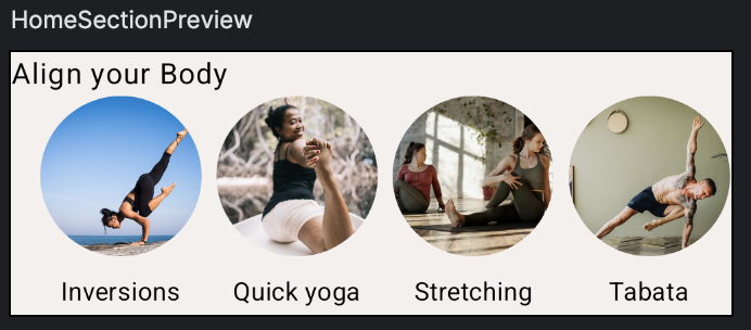
@Preview(showBackground = true, backgroundColor = 0xFFF5F0EE)
@Composable
fun HomeSectionPreview() {
    MySootheThemeTheme {
        HomeSection(R.string.align_your_body) {
            AlignYourBodyRow()
        }
    }
}
홈 화면
모든 개별 요소들을 만들었으니 이제 이 요소들을 전체 화면으로 결합할 차례이다.
@Composable
fun HomeScreen(modifier: Modifier = Modifier){
    Column(modifier){
        Spacer(Modifier.height(16.dp))
        SearchBar(Modifier.padding(horizontal = 16.dp))
        HomeSection(title = R.string.align_your_body) {
            AlignYourBodyRow()
        }
        HomeSection(title = R.string.favorite_collections) {
            FavoriteCollectionsGrid()
        }
        Spacer(Modifier.height(16.dp))
    }
}
제일위에 SearchBar를 두고 그아래 두개의 HomeSection을 두면 원하던 이미지로 완성된다.
여기서 보지못하던 Spacer가 있는데 이는 레이아웃 요소들 사이에 간격을 추가해서 UI를 깔끕하게 구성하도록 도와준다.
홈화면 미리보기
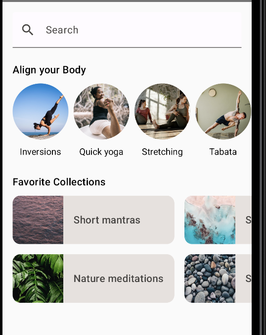
@Preview(showBackground = true, backgroundColor = 0xFFF5F0EE, heightDp = 180)
@Composable
fun ScreenContentPreview() {
    MySootheThemeTheme { HomeScreen() }
}
바텀 네비게이션
사용자가 여러 화면간에 전환할 수 있는 탐색 메뉴를 만들어 준다.
이 컴포저블은 처음부터 구현하지 않아도된다. Compose Material라이브러리의 일부인 NavigationBar 컴포저블을 사용하면 된다.
@Composable
private fun SootheBottomNavigation(modifier: Modifier = Modifier) {
   NavigationBar(
       containerColor = MaterialTheme.colorScheme.surfaceVariant,
       modifier = modifier
   ) {
       NavigationBarItem(
           icon = {
               Icon(
                   imageVector = Icons.Default.Home,
                   contentDescription = null
               )
           },
           label = {
               Text(
                   text = stringResource(R.string.bottom_navigation_home)
               )
           },
           selected = true,
           onClick = {}
       )
       NavigationBarItem(
           icon = {
               Icon(
                   imageVector = Icons.Default.AccountCircle,
                   contentDescription = null
               )
           },
           label = {
               Text(
                   text = stringResource(R.string.bottom_navigation_profile)
               )
           },
           selected = false,
           onClick = {}
       )
   }
}
containerColor설정을 통해서 바텀네비게이션의 색을 설정해준다.
그리고 아이콘을 벡터이미지로, 설명은 비워둔다. 홈화면이 선택된 상태로 두기 위해서 Home은 selected = true를, Profile은 false로 설정해준다. 나머지는 비슷하다.
바텀 네비게이션 미리보기
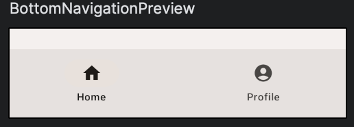
@Preview(showBackground = true, backgroundColor = 0xFFF5F0EE)
@Composable
fun BottomNavigationPreview() {
    MySootheThemeTheme { SootheBottomNavigation(Modifier.padding(top = 24.dp)) }
}
바텀 네비게이션을 포함한 전체 화면구성
네비게이션을 포함한 전체 화면을 구성하려면 Material의 Scaffold컴포저블을 사용하면 된다. Scaffold는 Material Design을 구현하는 앱을 위한 구성 가능한 최상위 수준 컴포저블을 제공한다.
@Composable
fun MySootheAppPortrait(){
    MySootheThemeTheme {
        Scaffold (
            bottomBar = { SootheBottomNavigation() }
        ){ padding ->
            HomeScreen(Modifier.padding(padding))
        }
    }
}
Scaffold에 bottomBar에다가 만들어둔 Composable함수를 넣어준다.
그리고 바텀네비게이션 외에 만들어둔 전체화면을 넣어준다.
전체 화면구성 미리보기
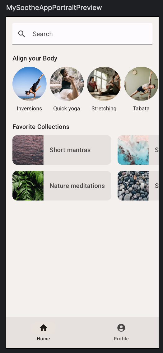
@Preview(showBackground = true, backgroundColor = 0xFFF5F0EE)
@Composable
fun MySootheAppPortraitPreview() {
    MySootheThemeTheme { MySootheAppPortrait() }
}
가로모드
가로모드를 비롯한 여러 구성에서 앱이 어떻게 표시될지도 고려해야 한다. 가로모드 디자인은 바텀 네비게이션이 화면왼쪽의 레일로 전환되는 방식으로 하려한다.
이를 구현하려면 Compose Material 라이브러리의 일부이고 NavigationBar와 유사한 NavigationRail을 사용하면 된다.
@Composable
private fun SootheNavigationRail(modifier: Modifier = Modifier){
    NavigationRail(
        modifier = modifier.padding(start = 8.dp, end = 8.dp),
        containerColor = MaterialTheme.colorScheme.background
    ) {
        Column(
            modifier = modifier.fillMaxHeight(),
            verticalArrangement = Arrangement.Center,
            horizontalAlignment = Alignment.CenterHorizontally
        ) {
            NavigationRailItem(
                icon = {
                    Icon(
                        imageVector = Icons.Default.Home,
                        contentDescription = null
                    )
                },
                label = {
                    Text(stringResource(R.string.bottom_navigation_home))
                },
                selected = true,
                onClick = {}
            )
            Spacer(modifier = Modifier.height(8.dp))
            NavigationRailItem(
                icon = {
                    Icon(
                        imageVector = Icons.Default.AccountCircle,
                        contentDescription = null
                    )
                },
                label = {
                    Text(stringResource(R.string.bottom_navigation_profile))
                },
                selected = false,
                onClick = {}
            )
        }
    }
}

@Composable
fun MySootheAppLandscape(){
    MySootheThemeTheme {
        Surface(color = MaterialTheme.colorScheme.background) {
            Row{
                SootheNavigationRail()
                HomeScreen()
            }
        }
    }
}
마찬가지로 합쳐주고, Row로 합쳐서 가로모드로 만들어준다.
가로모드 미리보기
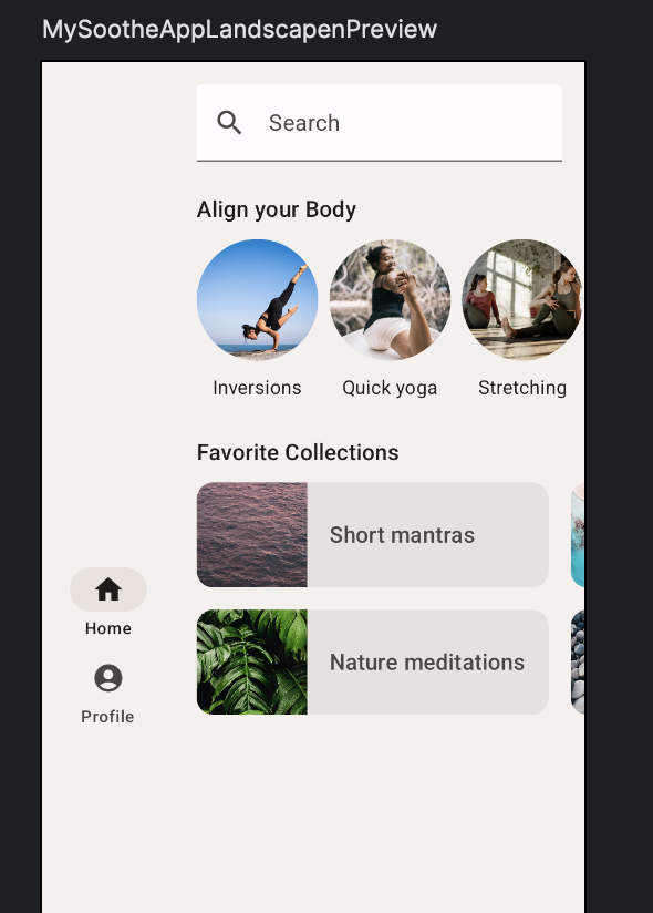
@Preview(showBackground = true, backgroundColor = 0xFFF5F0EE)
@Composable
fun MySootheAppLandscapenPreview() {
    MySootheThemeTheme { MySootheAppLandscape() }
}
결과물
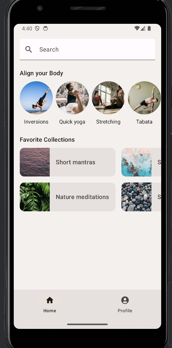
성공~~