그래프 그려보기
import matplotlib.pyplot as plt

# state machine interface
x = [1,2,3,4,5]
y = [1,2,3,4,5]
plt.plot(x,y)
plt.title('First Plot')  # 그래프의 제목 설정
plt.xlabel('x')  # x label 설정
plt.ylabel('y')  # y label 설정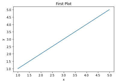
# object oriented interface
x = [1,2,3,4,5]
y = [1,2,3,4,5]
fig, ax = plt.subplots()
ax.plot(x,y)
ax.set_title('First Plot')
ax.set_xlabel('x')
ax.set_ylabel('y')
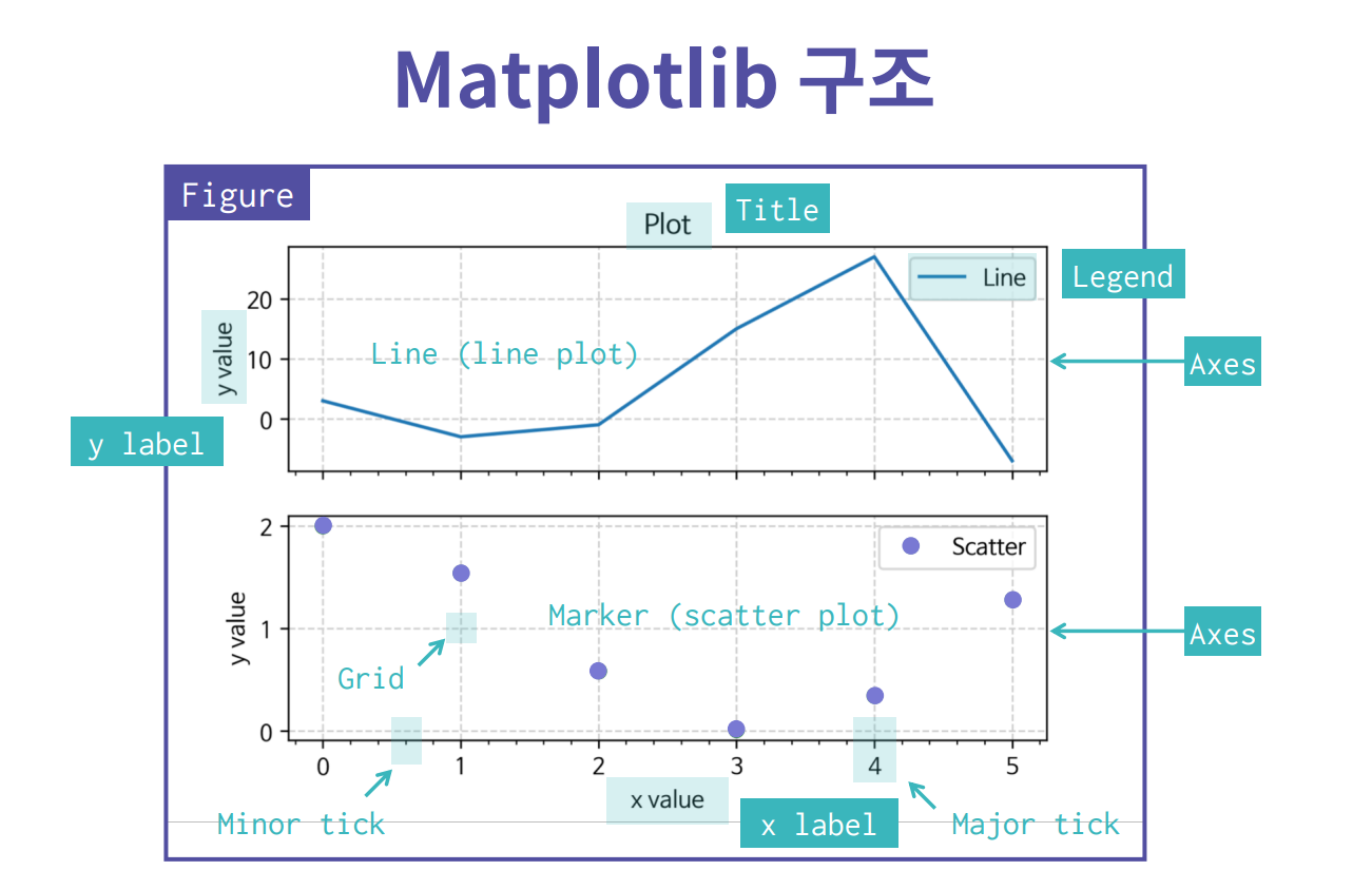
- Figure : 도화지
- ax : 도화지 안의 그래프
- Major tick : 큰 눈금
- Minor tick : 작은 눈금
저장하기
- fig.set_dpi(300) : 1인치에 몇 개의 dots를 넣을 것이냐. 도화지의 크기
- fig.savefig("저장하고 싶은 파일이름.png") : 현재 파일이 있는 곳에 이미지가 저장된다.
여러개 그래프 그리기
x = np.linspace(0, np.pi*4, 100)
fig, axes = plt.subplots(2,1)
axes[0].plot(x, np.sin(x))
axes[1].plot(x, np.cos(x))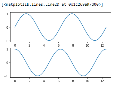
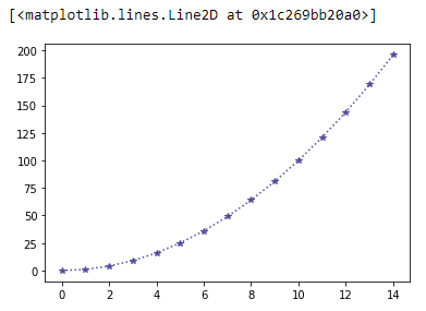
Line plot
fig, ax = plt.subplots()
x = np.arange(15)
y = x**2
ax.plot(
    x,y,
    linestyle=':',
    marker='*',
    color='#524FA1'
)
Line style
x = np.arange(10)
fig, ax = plt.subplots()
ax.plot(x, x, linestyle='-')  # solid
ax.plot(x, x+2, linestyle='--')  # dashed
ax.plot(x, x+4, linestyle='-.')  # dashdot
ax.plot(x, x+6, linestyle=':')  # dotted
Marker
x = np.arange(10)
fig, ax = plt.subplots()
ax.plot(x, x, marker='.')
ax.plot(x, x+2, marker='o')
ax.plot(x, x+4, marker='v')
ax.plot(x, x+6, marker='s')
ax.plot(x, x+8, marker='*')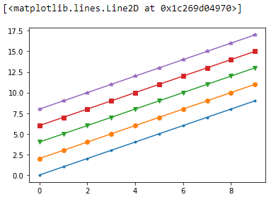
축 경계 조정하기
x = np.linspace(0,10,1000)
fig, ax = plt.subplots()
ax.plot(x, np.sin(x))
ax.set_xlim(-2, 12)
ax.set_ylim(-1.5, 1.5)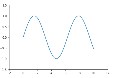
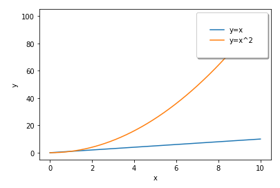
범례
fig, ax = plt.subplots()
ax.plot(x, x, label='y=x')
ax.plot(x, x**2, label='y=x^2')
ax.set_xlabel('x')
ax.set_ylabel('y')
ax.legend(
    loc='upper right',
    shadow=True,
    fancybox=True,  # 모서리 둥글게
    borderpad=2  # 범례의 크기
)
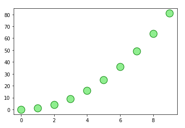
Scatter
fig, ax = plt.subplots()
x = np.arange(10)
ax.plot(
    x, x**2, 'o',  # marker 모양 없으면 실선으로 출력
    markersize=15,
    markerfacecolor='lightgreen',  # marker 안쪽 색상
    markeredgecolor='green'  # marker 바깥쪽 선의 색상
)
fig, ax = plt.subplots()
x = np.random.randn(50)
y = np.random.randn(50)
colors = np.random.randint(0, 100, 50)
sizes = 500 * np.pi * np.random.rand(50) ** 2
ax.scatter(x, y, c=colors, s=sizes, alpha=0.3)
# alpha 투명도
Bar plot
x = np.arange(10)
fig, ax = plt.subplots(figsize=(12,4))
ax.bar(x, x+2)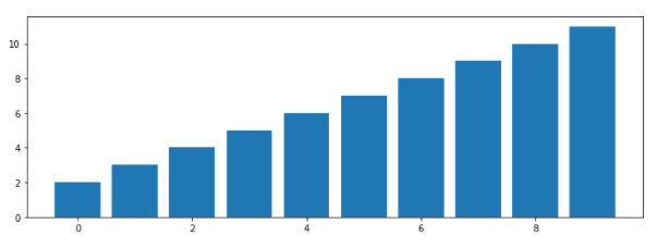
x = np.random.rand(3)
y = np.random.rand(3)
z = np.random.rand(3)
data = [x,y,z]

fig, ax = plt.subplots()
x_ax = np.arange(3)
for i in x_ax:
    ax.bar(x_ax, data[i],
          bottom=np.sum(data[:i], axis=0))
ax.set_xticks(x_ax)
ax.set_xticklabels(['A','B','C'])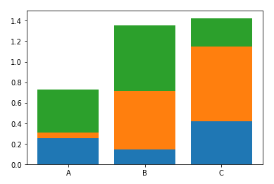
Histogram
fig, ax = plt.subplots()
data = np.random.randn(1000)
ax.hist(data, bins=50)  # bins는 막대기 갯수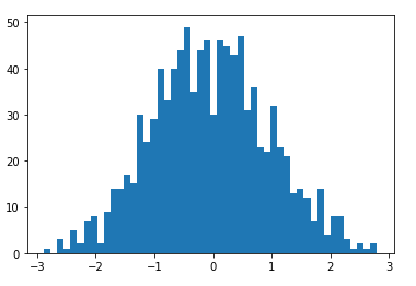
폰트 지정
import matplotlib.font_manager as fm
fname='./NanumBarunGothic.ttf'
font = fm.FontProperties(fname = fname).get_name()
plt.rcParams["font.family"] = font- matplotlib은 한글 폰트를 지원하지 않기 때문에 한글이 있다면 한글 폰트를 따로 지정해줘야 한다.
출처 : 엘리스 AI트랙 3기 11주차 수업

Blockchain & Programming 공부 기록