⚡ 들어가기
React에서 css를 사용해서 switch widget을 만들었다.
mui toggle switch는 custom이 쉽지 않아 css로 만들어둔 예시를 보고 조금 변형해서 사용했다.
 |
 |
🔥 구현
CustomSwitch.css
.switch-label {
    display: flex;
    align-items: center;
    background: rgb(149, 207, 246);
    width: 100px;
    height: 50px;
    border-radius: 10px;
    position: relative;
    cursor: pointer;
}

.switch-div {
    height: 200px;
    line-height: 200px;
    text-align: center;
    border: 2px dashed #f69c55;
}

.switch-button {
    background-color: white;
    width: 45px;
    height: 45px;
    border-radius: 9px;
    position: absolute;
    transition: 0.2s;
    left: 2px;
    font-size: 18px;
    font-weight: bold;
    justify-content: center;
    align-items: center;
    display: flex;
}

.switch-checkbox:checked + .switch-label .switch-button {
    left: calc(100% - 2px);
    transform: translateX(-100%);
}

.switch-checkbox {
    width: 0;
    height: 0;
    display: hidden;
}
CustomSwitch.jsx
import React from 'react'
import '../../../assets/css/CustomSwitch.css'

const CustomSwitch = ({ isChecked, handleSwitch, onColor, offColor }) => {
    return (
        <div>
            <input
                className="switch-checkbox"
                id="switch-checkbox"
                checked={isChecked}
                onChange={handleSwitch}
                type="checkbox"
            />
            <label
                className="switch-label"
                htmlFor="switch-checkbox"
                style={{ backgroundColor: isChecked ? onColor : offColor }}
            >
                <span className="switch-button">
                    {isChecked ? 'ON' : 'OFF'}
                </span>
            </label>
        </div>
    )
}

export default CustomSwitch
SwitchWidget.jsx
원하는 컴포넌트 안에서 불러와서 사용하면 된다.
import { styled, useTheme } from '@mui/system'
import { React, useState } from 'react'
import CustomSwitch from './CustomSwitch'
const SwitchWidget = () => {
const [checked, setChecked] = useState(true)
const { palette } = useTheme()
const textColor = palette.text.primary
return (
<div>
<CustomSwitch
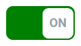
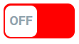
onColor={'green'}
offColor={'red'}
isChecked={checked}
handleSwitch={() => setChecked(!checked)}
/>
</div>
)
}
export default SwitchWidget참조
https://medium.com/@gozdetekalmaz/build-a-custom-switch-with-react-aa0096ef43ce
https://bashooka.com/coding/creative-fun-toggle-switch-button-examples/
https://codepen.io/agoodwin/pen/JBvBPr

Frontend Developer