
2022년 6월부터 2022년 8월까지 진행된 심리상담 어플리케이션의 상담사/관리자가 사용할 대시보드 외주에서 React.js 프레임워크를 사용하며 새로 알게된 것들을 기록하기 위한 포스팅입니다.
AWS EC2 t2.medium instance에 Ubuntu 20.04 버전을 설치하여 작업하였습니다.
이번에 진행한 외주는 심리상담 어플리케이션에 사용될 대시보드를 만드는 외주였습니다. 상담사가 유저와 대화하고 예약을 관리하는 대시보드, 피상담자와 상담사 모두를 총괄하는 관리자용 대시보드를 만드는 업무였고, 이곳에서 새로 배우게 된 점을 기록하고자 합니다.
1. label 태그를 이용한 커스텀 Checkbox
이미 많은 사람들이 정리해 둔 내용이지만, 한번 더 정리하고자 합니다. Styled-components를 이용하여 스타일링된 컴포넌트를 이용하는것을 전제로 하고 있습니다.
기본 구조
const StyledLabel = styled.label`
    display: flex;
    align-items: center;

    :hover {
        cursor: pointer;
    }

    > span {
        min-width: fit-content;
        padding: 0;
        font-family: ${fonts.NotoSans};
        font-weight: 400;
        font-size: 14px;
        line-height: 20px;
        letter-spacing: -0.02em;
        color: ${colors.greyColor2};
    }
`

const StyledCheckbox = styled.input.attrs(() => ({
        type: 'checkbox',
    })
)`
    appearance: none;
    margin: 0 11px 0 0;
    width: 18px;
    height: 18px;
    border: 1.5px solid ${colors.greyColor2};
    border-radius: 4px;

    :hover {
        cursor: pointer;
    }

    :checked {
        background: center url("사용할 svg이미지의 data url") no-repeat;
        border: none;
    }

    :checked ~ span {
        color: #000000;
    }
`

const Checkbox = ({ children, checkEvent, emphasis, value, classname, checked }) => {

  	...

	return (
        <StyledLabel htmlFor={value}>
            <StyledCheckbox
                value={value}
                onChange={checkEvent}
                id={value}
                className={classname}
                checked={checked}/>
            <span>{children}</span>
        </StyledLabel>
    )
}
사용할 checkbox 요소에 Styled-component의 attrs 함수를 이용해 type: checkbox를 지정해 주었습니다.
이후, 체크됐을 때와 체크되지 않았을 때의 스타일을 분리하기 위해 css의 :checked 선택자로 체크합니다. 평소에는 border만 존재하는 회색 네모 모양이지만, 체크됐을 때 미리 지정해둔 이미지가 보여지게 되며, 체크됐다는 것을 사용자에게 알려줄 수 있습니다.
이번 외주같은 경우엔, 디자이너가 미리 만들어둔 스토리보드가 Figma로 존재했기 때문에, 거기서 svg 파일을 다운받아서 data url로 변경하여 사용할 수 있었습니다.
label과 input의 연결은 원래의 html에서는 for 태그로 연결할 수 있지만, React.js의 jsx 용법에서는 htmlFor를 사용하게 됩니다. 원래의 input은 appearance: none을 이용하여 html이 기본적으로 제공하는 체크박스의 모양을 보이지 않게 하고, 그 자리에 제가 만든 스타일이 들어오게 하는 것입니다.
:checked ~ span 요소를 이용하여, 체크됐을 때 값이 뜰 span태그의 글자 색을 검정색으로 바꿔주고, :hover 요소로 cursor: pointer를 주어서 UX를 끌어올렸습니다.
label 태그는 반드시 input 태그를 감쌀 필요는 없습니다. 하지만, 그렇게 하면 체크박스의 글자 부분을 눌렀을 때, 체크박스가 활성화/비활성화 되는 기능을 구현할 수 없으며, 그것은 심각한 UX의 저하로 이어지기 때문에 저는 이런 방식으로 개발하였습니다.
2. label 태그를 이용한 커스텀 RadioButton
기본 구조는 Checkbox와 비슷하지만, Radio는 한 라디오 그룹 안에서 단 한개의 버튼만 활성화 되어야 한다는 규칙이 있습니다. 따라서, 그 이벤트에 대한 처리를 해주어야 합니다.
기본 구조
const StyledLabel = styled.label`
    display: flex;
    align-items: center;

    :hover {
        cursor: pointer;
    }

    > span {
        min-width: fit-content;
        padding: 0;
        font-family: ${fonts.NotoSans};
        font-weight: 400;
        font-size: 14px;
        line-height: 20px;
        letter-spacing: -0.02em;
        color: ${colors.greyColor2};
    }
`

const StyledRadio = styled.input.attrs(() => ({
        type: 'radio',
    })
)`
    appearance: none;
    margin: 0 11px 0 0;
    width: 18px;
    height: 18px;
    border: 1.5px solid ${colors.greyColor2};
    border-radius: 50%;

    :hover {
        cursor: pointer;
    }

    :checked {
        background: center url("사용할 svg 이미지의 data url") no-repeat;
        border: none;

        :disabled {
            background: center url("사용할 svg 이미지의 data url") no-repeat;
        }
    }

    :disabled {
        & + span {
            cursor: default;
        }

        :hover {
            cursor: default;
        }
    }

    :checked ~ span {
        color: #000000;
    }

    ${props => props.emphasis && css`
        ~ span:after {
            content: '*상담심리사 1급';
            margin-left: 7px;
            color: ${colors.mainColor};
            font-weight: 400;
            font-size: 13px;
            line-height: 19px;
            letter-spacing: -0.02em;
        }
    `};
`

const RadioButton = ({ children, value, name, id, disabled, checked, changeEvent, emphasis }) => {

  	...

    return (
		<StyledLabel htmlFor={id}>
    		<StyledRadio
				value={value}
				name={name}
				id={id}
				disabled={disabled}
				checked={checked}
				onClick={changeEvent}
				emphasis={emphasis}/>
  			<span>{children}</span>
		</StyledLabel>
    )
}
기본 구조는 Checkbox때와 거의 비슷하지만, 한 개의 요소만 체크해야 한다는 규칙 때문에, name 태그가 추가되었습니다. 같은 name을 가진 radio끼리는 한 개의 버튼만 체크된 상태로 있을 수 있습니다. 따라서, 같은 라디오 버튼 그룹 끼리는 같은 name을 주고, 각각은 id를 이용하여 분간할 수 있습니다.
제 외주에서는 특별히, RadioButton은 비활성화, 즉, disabled 속성을 줘야 하는 부분이 있었습니다. 따라서 css에서도 :disabled 요소를 사용하여 비활성화 됐을 때의 스타일링을 따로 해 주었습니다
3. 결과 화면
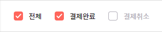
체크박스 실행 화면입니다. 여러 개의 체크박스가 체크가 되는 모습을 볼 수 있으며, 체크가 된 체크박스의 글자가 검정색으로 변하는 것을 볼 수 있습니다.

라디오버튼 실행 화면입니다. 단 한개의 요소만 선택이 가능하며, 선택된 요소는 글자가 검정색으로 변하게 됩니다.
4. 마치며
이번 외주는 짧은 시간에 많은 것을 구현해야 해서 힘들었지만, 그만큼 배우는게 많았습니다. 다음 포스팅부터는 socket.io를 이용한 실시간 채팅 시스템을 구축한 경험에 대하여 써보려고 합니다.
