
From a design perspective, GridLayout is best for lists that can be represented as icons or images, such as lists within a photo browsing app. In the sleep-tracker app, you could show each night of sleep as a grid of large icons. This design would give the user an overview of their sleep quality at a glance.
How GridLayout lays out items GridLayoutManager
GridLayout arranges items in a grid of rows and columns. Assuming vertical scrolling, by default, each item in a row takes up one "span." (In this case, one span is equivalent to the width of one column.)
In the first two examples shown below, each row is made up of three spans. By default, the GridLayoutManager lays out each item in one span until the span count, which you specify. When it reaches the span count, it wraps to the next line.
By default, each item takes up one span, but you can make an item wider by specifying how many spans it is to occupy. For example, the top item in the rightmost screen (shown below) takes up three spans.

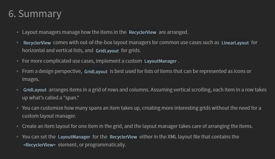
SUMMARY


