버튼 모양
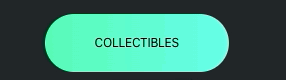
.themelist-head-btn{
    margin: 0px, 10px;
    font-size: 16px;
    cursor: pointer;
    transition: 0.3s ease;
    border: 1px solid rgba(0,0,0,0);
    text-align: center;
    background: linear-gradient(to right, #59f9b7, #66feea);
    padding: 25px 65px;
    border-radius: 50px;
    color: black;
}

.themelist-head-btn:hover{
    letter-spacing: 5px;
}
가로 스크롤

/* 스크롤을 해야하는 부분을 감싸주고 css를 적용해준다 */
.themelist-head{
    display: grid;
    grid-auto-flow: column;
    scroll-behavior: auto;
    gap: 1.2rem;
    overflow-y: auto;
    overscroll-behavior-x: contain;
    scroll-snap-type: x mandatory;
    scrollbar-width: none;
    padding: 20px 0px;
    border-bottom: 1px solid rgba(255,255,255,0.8); ;
}
/* 스크롤바 투명 */
::-webkit-scrollbar{
    display: none;
}
버튼 네온
참조 : https://github.com/codescientists/reel-css-animations/tree/main/56_Neon%20button%20effect

.header {
    background-color: rgb(0, 0, 0);
    display: flex;
    justify-content: space-between;
}

.header__navmenu{
    display: flex;
    justify-content: space-between;
}

.header__navmenu__button{
    position: relative;
    padding: 10px 30px;
    margin: 45px 10px;
    color: #21ebff;
    text-decoration: none;
    font-size: 20px;
    text-transform: uppercase;
    transition: 0.5s;
}
.header__navmenu__button::before{
    content: " ";
    position: absolute;
    top: -1px;
    left: -1px;
    width: 10px;
    height: 10px;
    border-top: 2px solid #21ebff;
    border-left: 2px solid #21ebff;
    transition: 0.5s;
    transition-delay: 0.5s;
}

.header__navmenu__button::after{
    content: " ";
    position: absolute;
    bottom: -1px;
    right: -1px;
    width: 10px;
    height: 10px;
    border-bottom: 2px solid #21ebff;
    border-right: 2px solid #21ebff;
    transition: 0.5s;
    transition-delay: 0.5s;
}
.header__navmenu__button:hover::before,
.header__navmenu__button:hover::after {
    width: 100%;
    height: 100%;
    transition-delay: 0s;
}

.header__navmenu__button:hover {
    background: #21ebff;
    color: #000;
    box-shadow: 0 0 50px #21ebff;
    transition-delay: 0.5s;
}
버튼
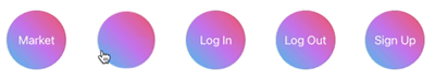
.header {
    display: flex;
    justify-content: center;
    list-style: none;
}

.header__navmenu {
    margin: 0 10px;
    display: flex;
    justify-content: space-between;
}

.header__navmenu__button {
    font-size: 20px;
    height: 150px;
    width: 150px;
    border-radius: 20%;
    display: flex;
    align-items: center;
    justify-content: center;
    text-decoration: none;
    color: white;
    position: relative;
    transition: 0.5s ease;
}

.header__navmenu__button:hover {
    background-image: linear-gradient(45deg, #12c2e9, #c471ed, #f64f59);
    background-clip: text;
    color: transparent;
    -webkit-text-fill-color: transparent;
    -webkit-background-clip: text;
    font-size: 40px;
    cursor: pointer;
}

.header__navmenu__button::before {
    content: '';
    position: absolute;
    z-index: -1;
    height: 100px;
    width: 100px;
    border-radius: 50%;
    background: linear-gradient(45deg, #12c2e9, #c471ed, #f64f59);
    transform: scale(1);
    transition: 0.5s ease-in-out;
}

.header__navmenu__button:hover::before {
    transform: scale(0);
}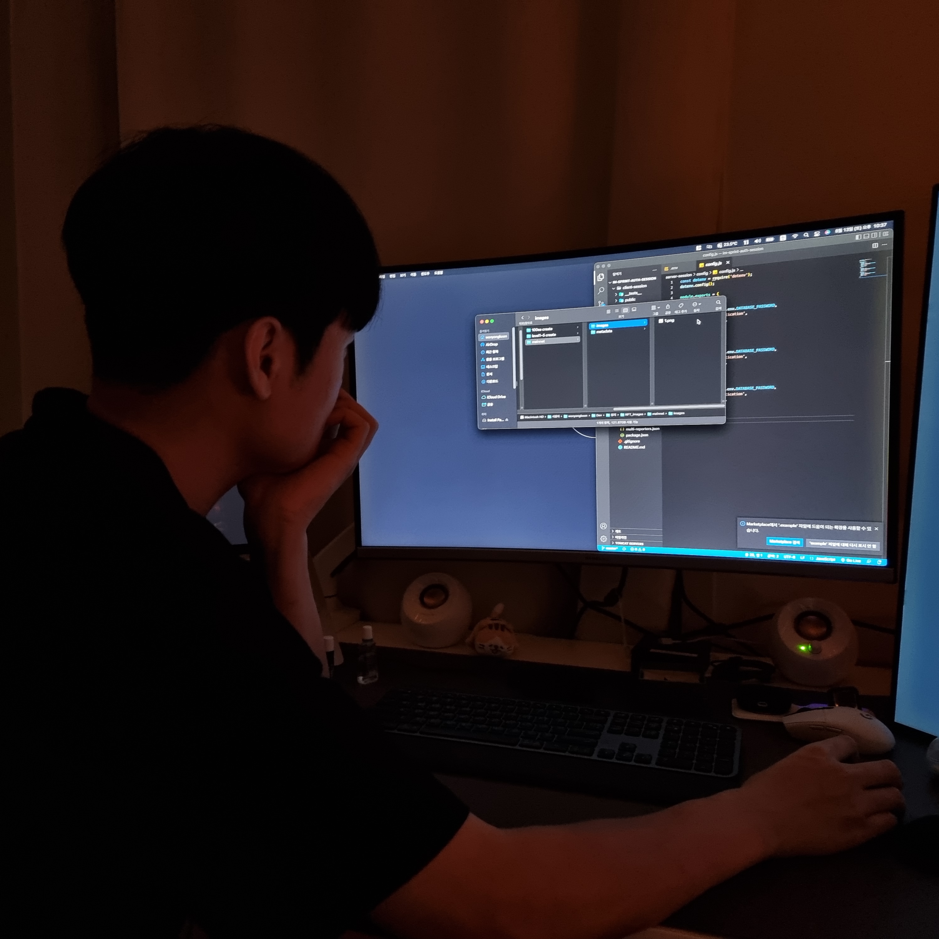
QA 성장기