
2024.02.21(수)
⚛️React 프로젝트 생성
🖥️프로젝트를 생성하는 대표적인 두 가지 방법
| 특징 | ⚛️Create React App(CRA) | ⚡Vite |
|---|---|---|
| 빌드 도구 | webpack | ESBuild |
| 언어 | JavaScript (Node.js) | Golang |
| 서버 | Express | Koa |
| 빌드 | Source build | Module build |
| 환경 변수 접근 | process.env.KEY | import.meta.env.KEY |
| Hot Module Replacement (HMR) | 지원 | 지원 |
| 장점 | 간편한 설정: 초기 설정을 자동화하여 React 애플리케이션을 빠르게 시작 가능 | 빠른 빌드 속도: ESBuild를 사용하여 빠른 모듈 번들링을 제공하므로 초기 빌드 및 개발 서버의 성능이 우수 |
| 단점 | 느린 빌드 속도: 큰 규모의 프로젝트에서는 빌드 속도가 느릴 수 있음 | 상대적으로 새로운 도구: 지원 및 커뮤니티가 CRA보다는 상대적으로 작음 |
- 설치
- CRA
npx create-react-app my-app --template typescript cd my-app npm start - Vite
npm create vite@latest my-app -- --template react-ts
cd my-app
npm install
npm run dev
- CRA
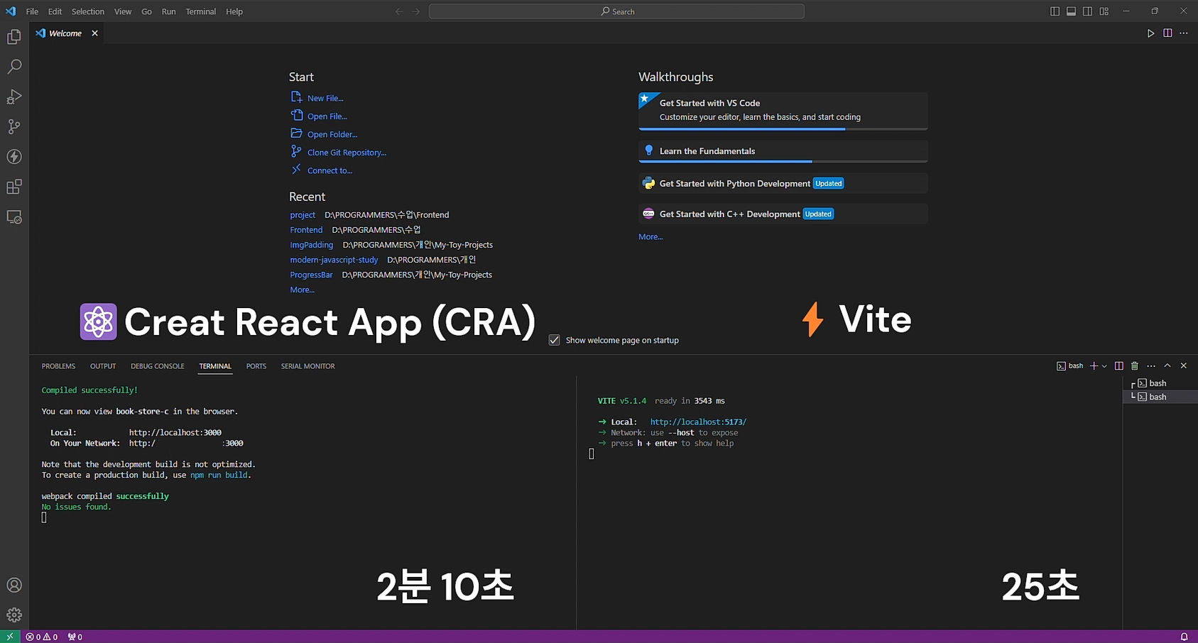
💡 실제로 둘 다 설치해보니 설치부터 서버 시작까지 걸리는 시간이 Vite가 훨씬 빠른 것을 확인할 수 있었다.
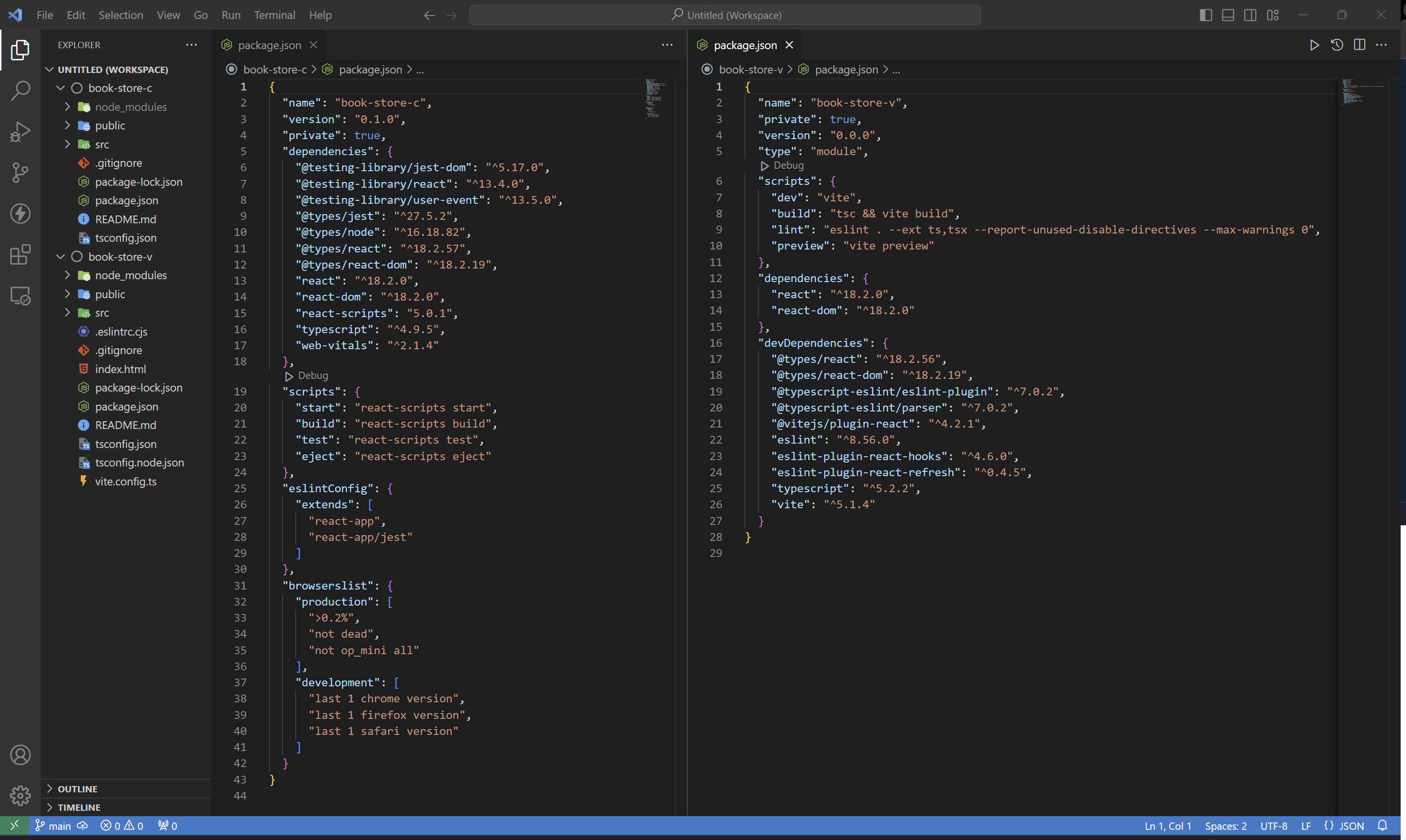
📂book-store 프로젝트 src 폴더 구조
| Directory | Description |
|---|---|
| pages | 라우트에 대응하는 페이지 컴포넌트(컨테이너) |
| components | 공통 컴포넌트 및 각 페이지에서 사용되는 컴포넌트 |
| utils | 유틸리티 |
| hooks | 리액트 훅 |
| model | 모델(타입) |
| api | API 연동을 위한 fetcher 등 |
⌨️React CLI
- package.json 파일의 “scripts” 프로퍼티에 기본적인 명령어가 제공됨 🔗
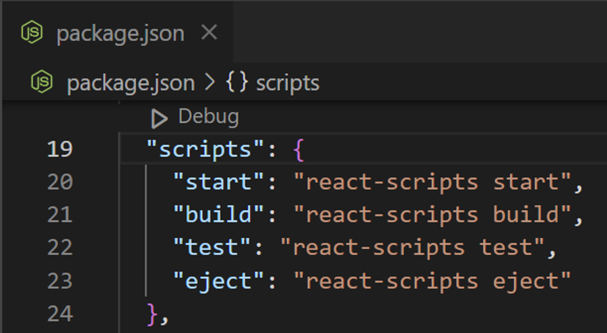
- 명령어 추가하기
"typecheck": "tsc --noEmit --skipLibCheck"npm run typecheck로 사용 가능tsc: TypeScript Compiler--noEmit: JavaScript 파일을 생성 ❌--skipLibCheck: 라이브러리 파일에 대한 유형 검사를 건너뛰기
📐레이아웃 구성하기
- 레이아웃이 필요한 이유
- 프로젝트의 기본적인 화면 구조를 잡기
- 반복적으로 들어가야 하는 header, footer 등을 매 화면마다 제공
- 상황과 필요에 따라 레이아웃이 변경될 수 있도록 대비
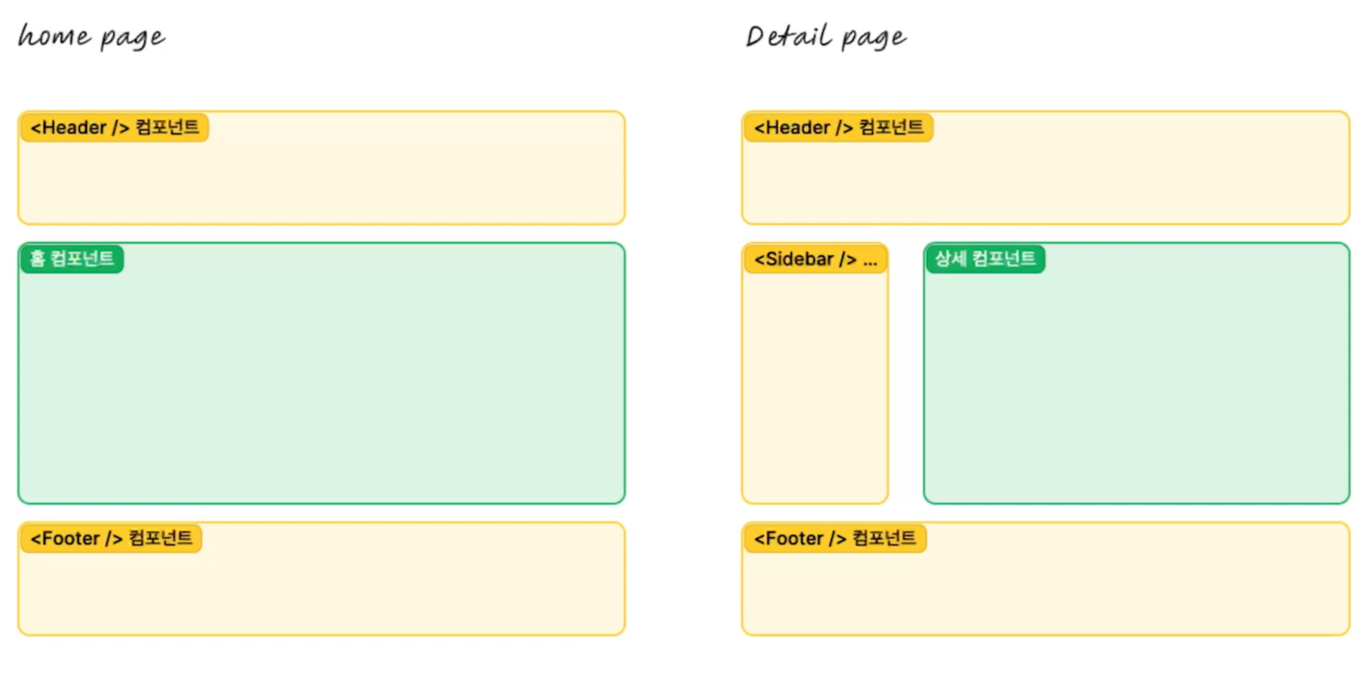
src/components/layout/Layout.tsximport Footer from "../common/Footer"; import Header from "../common/Header"; interface LayoutProps { children: React.ReactNode; } function Layout({ children }: LayoutProps) { return ( <> <Header /> <main>{children}</main> <Footer /> </> ); } export default Layout;- Component를 중첩해서 사용하는 경우 참고
- children 컴포넌트의 타입 🔗 🔗
💡 JSX Element ⊂ React Element ⊂ React Node
-
React.ReactNode: 모든 유형 가능interface ModalRendererProps { title: string; children: React.ReactNode; } -
React.ReactElement: JSX element만 가능interface ModalRendererProps { title: string; children: React.ReactElement; }
-
🌐Global Style
- Global Style이 필요한 이유
- global = 프로젝트 전체에 적용 = 프로젝트에 일관된 스타일링을 적용
- “User Agent Stylesheet”는 각 브라우저의 기본 스타일 시트로, 브라우저마다 각각 고유한 스타일을 가지고 있기 때문에 동일한 웹 페이지를 다르게 표현할 수 있음 ⇒ 브라우저 간의 스타일 차이를 극복하기 위해 global style을 사용
- Global Style CSS 종류
- 에릭 마이어(Eric Meyer)의 Reset CSS
모든 HTML 요소에 대한 기본 스타일을 초기화시키는 스타일 시트
- normalize.css
브라우저의 기본 스타일을 완전히 제거하지 않고 각 요소를 표준화시켜 브라우저 간의 스타일 차이를 보완하는 스타일 시트
- sanitize.css
normalize.css의 발전된 버전
- 설치:
npm install sanitize.css --save - 적용:
import "sanitize.css";
- 설치:
- 에릭 마이어(Eric Meyer)의 Reset CSS
🎨테마
- 테마가 필요한 이유
- UI/UX의 일관성 유지
- 유지보수 용이
- 확장성
- 재사용성
- 사용자 정의
💅Styled Components
- CSS-in-JS가 필요한 이유
- 컴포넌트 단위 스타일링: 각 컴포넌트의 스타일을 분리하여 유지보수를 쉽게 만듦
- 스타일 캡슐화: CSS-in-JS는 스타일을 컴포넌트와 함께 캡슐화하여 스타일 간의 충돌 방지
- 동적 스타일링: JavaScript를 사용하여 스타일을 생성하므로, 동적으로 스타일을 변경 가능
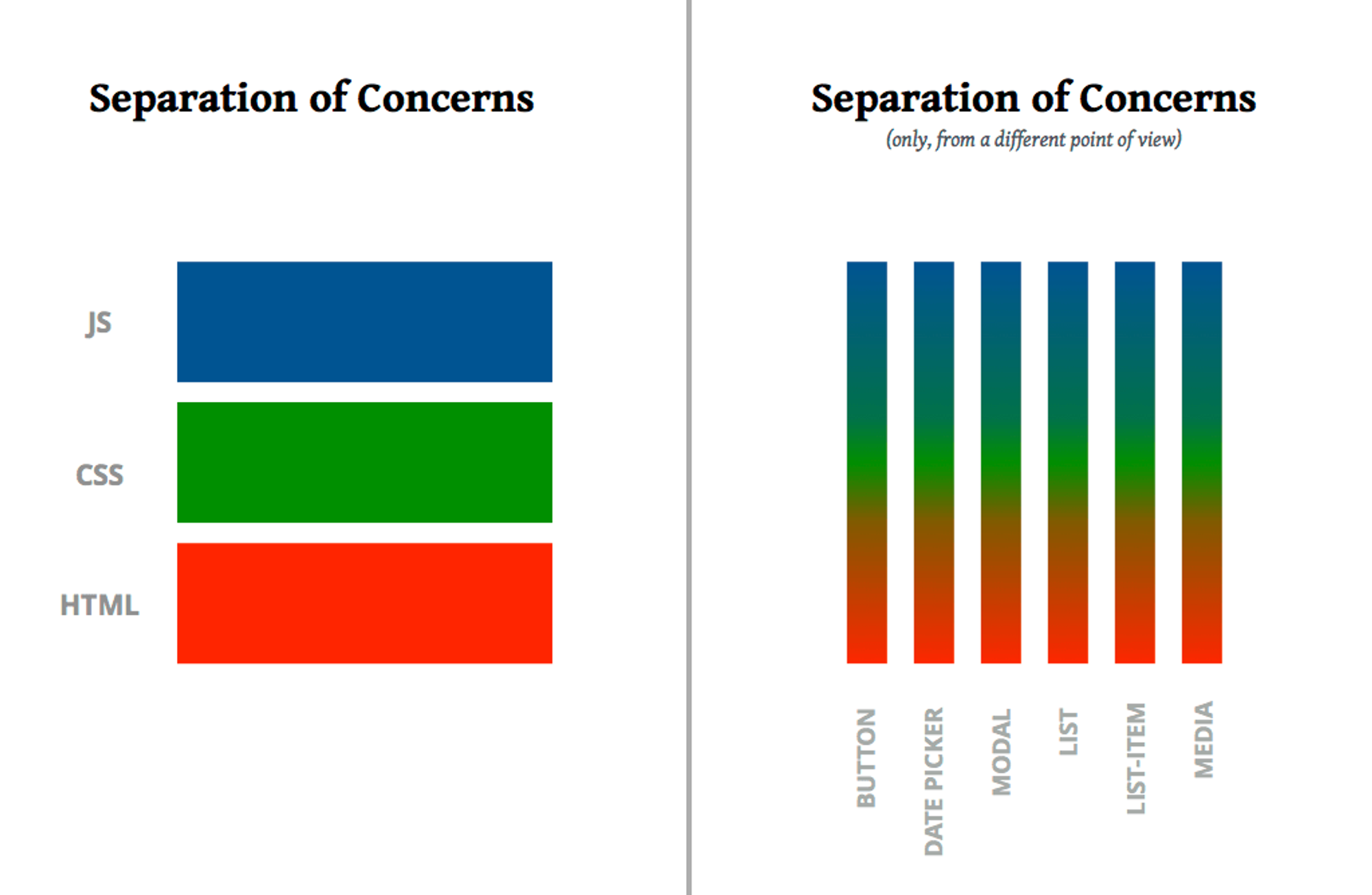
- 관심사의 분리(Separate of Concerns)
- 사용해보기
- styled components 적용 전
function Header() { return ( <header> <h1>Book Store</h1> </header> ); } export default Header; - styled components 적용 후
import styled from "styled-components"; function Header() { return ( <HeaderStyle> <h1>Book Store</h1> </HeaderStyle> ); } const HeaderStyle = styled.header` background-color: #333; h1 { color: white; } `; export default Header;- 개발자 도구에서 살펴보면 class명이 난수화된 것을 확인할 수 있음!
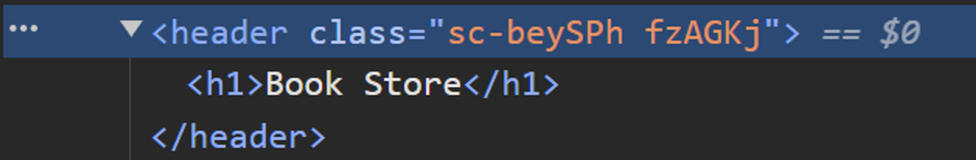
- 개발자 도구에서 살펴보면 class명이 난수화된 것을 확인할 수 있음!
- styled components 적용 전
💡 보통 styled components 코드의 길이도 길기 때문에 파일을 분리하여 작성한다고 함
🖌️Global Style과 테마 만들기
-
src/style/global.tsimport "sanitize.css"; import { createGlobalStyle } from "styled-components"; import { ThemeName } from "./theme"; interface Props { themeName: ThemeName; } export const GlobalStyle = createGlobalStyle<Props>` body { padding: 0; margin: 0; } h1 { margin: 0; } * { color: ${ ({themeName}) => (themeName === "light") ? "black" : "white" }; } `; -
src/style/theme.ts-
Theme의 color 정의 방법
-
export type ThemeName = "light" | "dark"; interface Theme { name: ThemeName; color: { [key: string]: string; }; }- key가 string이기만 하면 되기 때문에 bad
- Index signature parameter type은 literal type(특정 값을 나타내는 타입)이나 generic type(파라미터화한 타입)이 불가능
-
export type ThemeName = "light" | "dark"; type ColorKey = "primary" | "background" | "secondary" | "third"; interface Theme { name: ThemeName; color: { [key in ColorKey]: string } }-
ColorKey 타입에 있는 각 문자열 리터럴을 반복하여 해당 문자열 리터럴을 키로 갖는 객체를 생성
color: {
    primary: string;
    background: string;
    secondary: string;
    third: string;
}
-
-
Utility Types:
Record<Keys, Type>export type ThemeName = "light" | "dark"; type ColorKey = "primary" | "background" | "secondary" | "third"; interface Theme { name: ThemeName; color: Record<ColorKey, string>; }-
Keys: 키 집합을 나타내는 타입 (여러 개 가능) -
Type: 각 키에 대응하는 값의 타입 (단일 값)⇒ 각 키는 주어진 값 타입에 매핑됨
-
export type ThemeName = "light" | "dark"; type ColorKey = "primary" | "background" | "secondary" | "third"; interface Theme { name: ThemeName; color: Record<ColorKey, string>; } export const light: Theme = { name: "light", color: { primary: "brown", background: "lightgray", secondary: "blue", third: "green", } }; export const dark: Theme = { name: "dark", color: { primary: "coral", background: "midnightblue", secondary: "darkblue", third: "darkgreen", } }; -
-
-
src/App.tsximport Layout from "./components/layout/Layout"; import Detail from "./pages/Detail"; import Home from "./pages/Home"; import { GlobalStyle } from './style/global'; import { ThemeProvider } from "styled-components"; import { dark, light } from "./style/theme"; function App() { return ( <ThemeProvider theme={light}> <GlobalStyle themeName="light"/> <Layout> <Home /> {/* <Detail /> */} </Layout> </ThemeProvider> ); } export default App;실제 theme은 state를 사용해서 사용자에게 입력받을 예정

이것저것 관심 많은 개발자👩💻