오늘의 강의 내용
1.transform
.png)
<!-- html언어 -->
<div class="transform"></div>

<!-- css언어 -->
.transform {
	width: 300px;
	height: 300px;
	background-color: yellow;

	/*transform: rotate(45deg);*/
	/*transform: scale(2, 3);*/
	/*transform: skew(-10deg, 20deg);*/
	/*transform: translate(100px, 100px);*/

	/*margin-left: 300px;*/
	/*margin-top: 500px;*/

	transform: rotate(10deg);
}-
transform : 선택한 object크기를 확대하거나 축소하거나 회전, 위치변경을 할때
-
transform: rotate(deg) : 선택한영역을 회전 시킬때 사용 ()안에 양수, 음수 기입가능
-
transform: scale( , ) : 선택한영역을 가로, 세로의 비율을 키우고자 할때 사용. 쉼표 앞에는 x축, 뒤에는 y축 양수와 크기를 줄이고 싶을때는 소수점 단위를 써서 사용
-
transform: skew(deg, deg) : 3차원적인 회전효과를 적용할때 사용, 쉼표 앞에는 x축으로 회전, 뒤에는 y축으로 회전
-
transform: translate(px, px) : 선택한영역의 object위
위치를 변경할때 사용, 쉼표 앞에는 x축, 뒤에는 y축 을 변경 -
transform 주의할점
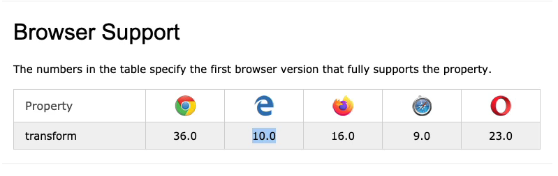
위이미지는 현재 transform속성 을 지원하고 있는 브라우저의 버전을 나타낸것이다. explorer를 예를 들어 10버전 이하의
explorer에서는 transform속성을 쓸수 없다는 이야기 이다. 이때 최소 9버전에서 쓸려고 한다면, 예시를 들어
<!-- css언어 -->
	-webkit-transform: rotate(10deg); //구글,사파리
	-moz-transform: rotate(10deg); //파이어폭스
	-ms-transform: rotate(10deg); //익스폴로러
	-o-transform: rotate(10deg); //오페라
    transform: rotate(10deg);  //기본값으로 넣어둔다
위 소스코드 처럼 transform: rotate(10deg); 앞에 접두사를 붙이는데 이를 Prefix 라 하며, 하위버전 의 브라우저에 쓸려고 할때 사용한다.이때 디폴트 값으로 transform:rotate(10deg);
는 남겨둔다.
2.transition
<!-- html언어 -->
<div class="transition"></div>

<!-- css언어 -->
.transition {
	width: 300px;
	height: 300px;
	background-color: yellow;

	/*
	transition-property: width;
	transition-duration: 2s;
	transition-timing-function: linear; //linear 일정하게 하겠다는것
	transition-delay: 1s;
	*/

	transition: width 2s linear 1s, height 2s linear 1s;
}  //바로위에 4줄을 한줄로 표현가능하다.

.transition:hover {   //마우스커서를 올렸을때 변화시키는 속성
	width: 600px;
	height: 600px;
}-
transition : 애니메이션의 움직임이 변화하는 과정을 보여주고자 할때 사용, hover속성과 같이 사용하는 조건이 있다.
-
transition-property : 변화하고자 하는것을 지정
-
transition-duration : 변화하는 시간을 지정
-
transition-timing-function : 변화의 속도값을 지정 ex)점점 느리게, 점점 빠르게
-
transition-delay : 약간의 기다림을 가진뒤 애니메이션 효과를 발동시키는 속성. 기다리는 시간을 설정
-
transition 주의할점
transition-duration과 transition-delay의 순서는 바뀌어서는 안된다. 먼저 쓰는것은 transition-duration을 사용한다.
3.animation
<!-- html언어 -->
<div class="animation"></div>

<!-- css언어 -->
.animation {
	width: 300px;
	height: 300px;
	background-color: yellow;

	animation-name: changeWidth;
	animation-duration: 3s;
	animation-timing-function: linear;
	animation-delay: 1s;

	animation-iteration-count: infinite;
	animation-direction: alternate;
}

@keyframes changeWidth {
	from {
		width: 300px;
		height: 300px;
		background-color: yellow;
	}

	to {
		width: 600px;
		height: 600px;
		background-color: red;
	}
}-
animation : 자연스럽게 자동으로 효과를 주고싶을때 사용
-
animation-name : 만들고자 하는 animation의 이름을 정의
-
animation-duration : animation이 전체 동작하는 시간을 설정
-
animation-timing-function : animation의 속도값을 지정
-
animation-delay : 기다리는 시간을 설정
-
animation-iteration-count : animation의 진행 횟수를 의미
-
animation-direction : animation의 진행방향을 의미
-
arternate : 0~10 갔다가 10~1로 돌아오는 왔다갔다를 의미
-
@keyframes : animation속성을 사용할려면 반드시 필요한 코드. @keyframes 옆에는 본인이 설정한 animation name을 입력하여 작성한 animation설정값 과 연동시킨다. @keyframes에는 실제 일어나는 animation의 형태값을 입력한다.
-
@keyframes에 작성형태는 위 소스코드 처럼 from, to로 작성할수도 있고,
.png)
이렇게 %로 나타낼수 있다. %로 작성시에는 쫌더 세밀한 animation 효과를 부여할수 있다.
4.키즈가오 사자 움직임
<!-- html언어 -->
<div class="spin-lion"></div>

<!-- css언어 -->
.spin-lion {
	width: 150px;
	height: 150px;
	background-color: blue;

	/*
	animation-name: spinLion;
	animation-duration: 1500ms;
	animation-timing-function: linear;
	animation-iteration-count: infinite;
	animation-direction: alternate;
	*/

	-webkit-animation: spinLion 1500ms linear infinite alternate;  //Prefix사용시
	animation: spinLion 1500ms linear infinite alternate;   //위 animation속성 5줄과 같다
}

@-webkit-keyframes spinLion {  //Prefix사용시
	from {
		-webkit-transform: rotate(-10deg);
	}

	to {
		-webkit-transform: rotate(10deg);
	}
}

@keyframes spinLion {
	from {
		transform: rotate(-10deg);
	}

	to {
		transform: rotate(10deg);
	}
}- @keyframes 를 작성시 다양한 형태값을 넣는것이 매우 복잡하기에 https://jeremyckahn.github.io/stylie/ 이사이트를 통해 좀더 쉽게 다양한 값을 적용할수 있다.
.png)
이런식으로 우측의 입력칸을 이용하여 원하는 효과를 주고, 코드 복사를 이용하여 그대로 작성중인 소스코드에 적용하면 쉽게 복잡한 소스코드를 해결할수있다.
5.실무에서 활용할수 있는 다양한 animation
마우스를 올렸을때 만들어진 메뉴의 배경색깔이 변경되게 하기
.png)
<!-- html언어 -->
<nav class="mouse-animation">
		<ul>
			<li><a href="#">메뉴1</a></li>
			<li><a href="#">메뉴2</a></li>
			<li><a href="#">메뉴3</a></li>
			<li><a href="#">메뉴4</a></li>
		</ul>
</nav>

<!-- css언어 -->
html, body {
	margin: 0;
	padding: 0;
}

ul {
	list-style: none;
}

a {
	text-decoration: none;
	color: #000000;
}

.mouse-animation li {
	width: 250px;
	background-color: rgba(0, 0, 0, 1); //마지막 숫자투명도
	padding: 20px;

	border-top: solid 5px #dfdfdf;
	transition: opacity 0.5s, margin-left 0.5s;
}

.mouse-animation li:hover {
	background-color: rgba(0, 0, 0, 0.5);
	margin-left: 10px;
}

.mouse-animation li a {
	color: red;
	font-size: 20px;
}-
background-color 에 opacity를 사용할수 있지만 rgba를 사용하는것이 작업에 더 용이하다.
-
opacity : 투명도
box 가 움직일때 마다 box의 형태와 색상이 바뀌는 효과
<!-- html언어 -->
<div class="move-box"></div>

<!-- css언어 -->
.move-box {
	position: relative;
	width: 200px;
	height: 200px;
	background-color: red;

	animation-name: moveBox;
	animation-duration: 4s;
	animation-timing-function: linear;
	animation-delay: 1s;
	animation-iteration-count: infinite;
	animation-direction: alternate;
	animation-play-state: running;
	animation-fill-mode: backwards;
}

@keyframes moveBox {
	0% {
		background-color: green;
		left: 0;
		top: 0;
	}

	25% {
		background-color: yellow;
		left: 500px;
		top: 0px;
	}

	50% {
		background-color: gray;
		left: 500px;
		top: 500px;
		border-radius: 50%;
	}

	75% {
		background-color: blue ;
		left: 0px;
		top: 500px;
	}

	100% {
		background-color: red;
		left: 0px;
		top: 0px;
	}
}-
animation-play-state: running; : 브라우저 접속할때 animation을 바로 동작 시킬때 사용
-
animation-play-state: paused; : animation 정지시킬때 사용
-
animation-fill-mode: backwards; : 0%혹은 from에서 설정한 최초의 효과값으로 보여줄때 사용
-
보통 0%상태일때의 color는 최초로 설정한 color와 같게 하는게 일반적이다.
-
animation-fill-mode 속성과 backwards 속성값은 유용하게 사용됨으로 기억해두는것이 좋다. (설명참고)
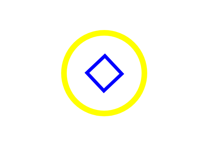
원형과 원형안에 있는 사각형박스의 크기 변화
<!-- html언어 -->
<div class="outer-border">
		<div class="inner-border"></div>
</div>

<!-- css언어 -->
.outer-border {
	display: flex;  //크기를변환할때
	justify-content: center; //가로축 - 중심축 정렬설정
	align-items: center;  //세로축 - 교차축 정렬설정

	width: 200px;
	height: 200px;
	border: solid 15px red;
	border-radius: 50%;

	margin: 0 auto;
	margin-top: 200px;

	animation: outetBorder 2s infinite;
}

@keyframes outetBorder {
	0% { border-color: red; transform: scale(1); }
	25% { border-color: yellow; transform: scale(1.2); }
	50% { border-color: blue; transform: scale(1.3); }
	75% { border-color: green; transform: scale(1.2); }
	100% { border-color: pink; transform: scale(1); }
}


.inner-border {
	box-sizing: border-box;
	width: 75px;
	height: 75px;
	border: 5px solid purple;

	animation: innerBorder 2s infinite alternate;
}

@keyframes innerBorder {
	0%{ transform: rotate(0deg); }
	25%{ border-color: blue; border-width: 10px; }
	50%{ border-color: yellow; border-width: 20px; }
	75%{ border-color: green; border-width: 40px; }
	100%{ border-color: gray; border-width: 5px; transform: rotate(360deg); }
}-
scale속성값은 자식영역에 까지 영향을 미침
-
border-width : 테두리 굵기
슈퍼마리오 동전 효과
.png)
<!-- html언어 -->
<div class="mario-container">
		<div class="mario-coin"></div>
		<div class="mario-box"></div>
</div>

<!-- css언어 -->
.mario-container {
	position: relative;
	width: 500px;
	height: 500px;
	border: solid 10px black;

	margin: 0 auto;
	margin-top: 200px;
}

.mario-container .mario-coin {
	position: relative;
	width: 70px;
	height: 70px;
	background-color: yellow;
	border-radius: 50%;

	margin: 0 auto;
	margin-top: 100px;

	animation: jumpCoin 0.8s linear infinite;
}

@keyframes jumpCoin {
	0%{
		transform: translateY(0px);
		opacity: 1;
	}

	50%{
		transform: translateY(-100px) rotatey(180deg);
		opacity: 0;
	}

	100%{
		transform: translateY(-100px) rotatey(360deg);
		opacity: 0;
	}
}

.mario-container .mario-box {
	width: 100px;
	height: 100px;
	background-color: blue;
	margin: 0 auto;

	animation: jumpBox 0.5s linear infinite alternate;
}

@keyframes jumpBox {
	0%{ transform: translatey(0px); }
	50%{ transform: translatey(-10px); }
	100%{ transform: translatey(0px); }
}-
rotatey : y축기준으로 회전
-
transform : 속성값을 여러개 설정할수있다. 주의할점은 쉼표가 아닌 뛰어쓰기를 사용한다
이미지 영역에 마우스를 올렸을때 이미지가 확대 되는 효과
.png)
<!-- html언어 -->
<div class="hover-image">
		<img src="https://images.template.net/wp-content/uploads/2015/08/Mindblowing-Beach-background-Free-Download.png">

		<div class="image-info">
			<h2>Title</h2>
			<p>Parapragh</p>
		</div>
</div>

<!-- css언어 -->
.hover-image {
	cursor: pointer;
	overflow: hidden;
	position: relative;
	width: 400px;
	border: solid 10px #000000;
}

.hover-image img {
	width: 100%;
	vertical-align: middle;
	transition: transform 0.3s linear;
}

.hover-image:hover img {
	transform: scale(1.3);
}

.hover-image .image-info {
	box-sizing: border-box;
	position: absolute;
	width: 100%;

	background-color: rgba(0, 0, 0, 0.5);
	padding: 20px;

	left: 0;
	bottom: -85;

	transition: bottom 0.3s linear;
}

.hover-image:hover .image-info {
	bottom: 0;
}

.hover-image .image-info h2,
.hover-image .image-info p {
	margin: 0;
	padding: 0;
	color: #ffffff;
}

.hover-image .image-info h2 {
	font-size: 20px;
}

.hover-image .image-info p {
	font-size: 15px;
}-
img태그는 태생적으로 하단에 미세한 공백을 가지고 있다
-
img태그에서는 vertical-align: middle; 공백을 없애주는 역활을 한다. img태그에서는 디폴트값으로 넣어주어야 한다.
-
scale업과 관련된 효과를 쓸때에는 overflow: hidden; 를 같이 써주는것이 좋다.
-
cursor: pointer : 마우스 커서를 올렸을때 손가락 모양으로 변경
강의를 마치고 소감
오늘도 애니메이션 효과에 대한 강의를 들었는데, 속성과 속성값이 너무 너무 많아 전부 암기하는것은 불가능해보였다. 그리고 점점 헷갈려진다고 해야할까? 머리속이 정리가 필요해보인다. 그래도 웹사이트에서 보던 효과를 직접 해보고난뒤 다시 웹사이트에가서 그효과를 보니 '이건 이렇게 했구나' 라는 그림이 그려졌다.
다시한번 복습하고 연습해야겠다.