오늘의 강의 내용
* 네이버모바일 나머지 부분 카피캣
.png)
.png)
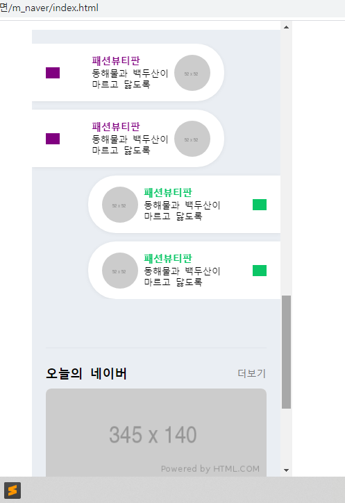
카피캣영역인 네이버모바일 나머지부분
.png)
네이버모바일 나머지부분 카피캣 완료된 모습
<!-- index.html언어 -->
<div id="talk">

			<ul>
				<li class="left_list">
					<a href="#">
						<i class="icon_arrow icon_arrow_left"></i>
						<div class="content_wrap">
							<div class="txt_wrap">
								<h3>패션뷰티판</h3>
								<p>
									동해물과 백두산이<br>
									마르고 닳도록
								</p>
							</div>
							<img src="https://via.placeholder.com/52">
						</div>
					</a>
				</li>


				<li class="right_list">
					<a href="#">
						<div class="content_wrap">
							<img src="https://via.placeholder.com/52">
							<div class="txt_wrap">
								<h3>패션뷰티판</h3>
								<p>
									동해물과 백두산이<br>
									마르고 닳도록
								</p>
							</div>
						</div>

						<i class="icon_arrow icon_arrow_right"></i>

					</a>
				</li>
			</ul>
		</div>


		<div id="today">
			<div class="container">

				<div class="content_header">

					<h2>오늘의 네이버</h2>
					<a href="#">더보기</a>

				</div>

				<div class="content_body">
					<img class="banner" src="https://via.placeholder.com/345x140">
					<div class="bottom_wrap">
						<i class="icon"></i>
						<div class="txt_wrap">
							<h3>클로바 램프 최대 42% 혜택</h3>
							<p>
								동해물과 백두산이 마르고 닳도록<br>
								하나님이 보우하사
							</p>
						</div>
					</div>
				</div>

			</div>
		</div>


		<footer id="footer">
			<div class="txt_wrap">
				<div class="link">
					<a href="#">로그인</a>
					<a href="#">전체서비스</a>
					<a href="#">PC버전</a>
				</div>
				<div class="link">
					<a href="#">이용약관</a>
					<a href="#">개인정보처리방침</a>
					<a href="#">고객센터</a>
				</div>
			</div>

			<h1>
				<a href="#">
					<img src="https://via.placeholder.com/74x14">
				</a>
			</h1>
		</footer>

<!-- style.css언어 -->
#talk {
	padding: 20px 0;
}

#talk ul {
	overflow: hidden;
}

#talk ul li {
	position: relative;
	width: 277px;
	background-color: #ffffff;
	padding: 15px 0 15px;
	box-shadow: 0 1px 6px 0 rgb(0 0 0 / 6%), 0 1px 0 0 rgb(0 0 0 / 2%);

	margin-bottom: 12px;
}

#talk ul li:last-child {
	margin-bottom: 0;
}

#talk ul li .icon_arrow {
	display: inline-block;
	width: 20PX;
	height: 16PX;
}

#talk ul li img {
	width: 52px;
	height: 52px;
	border-radius: 50%;
}

#talk ul li a {
	display: flex;
	flex-direction: row;
	flex-wrap: wrap;
	justify-content: space-between;
	align-items: center;
	align-content: center;

	padding: 0 20px;

	color: #000000;
}

#talk ul .content_wrap .txt_wrap h3 {
	font-size: 14PX;
	font-weight: 600;
}

#talk ul .content_wrap .txt_wrap p {
	font-size: 13PX;
	line-height: 16px;
	margin-top: 3px;
}

#talk ul .left_list {
	float: left;

	border-top-right-radius: 40px;
	border-bottom-right-radius: 40px;
}

#talk ul .left_list .icon_arrow_left {
	background-color: purple;
}

#talk ul .left_list .content_wrap {
	display: flex;
	flex-direction: row;
	flex-wrap: wrap;
	justify-content: flex-start;
	align-items: center;
	align-content: center;
}

#talk ul .left_list .content_wrap .txt_wrap h3 {
	color: purple;
}

#talk ul .left_list .content_wrap img {
	margin-left: 8px;
}


#talk ul .right_list {
	float: right;

	border-top-left-radius: 40px;
	border-bottom-left-radius: 40px;
}

#talk ul .right_list .icon_arrow_right {
	background-color: #0ac666;
}

#talk ul .right_list .content_wrap {
	display: flex;
	flex-direction: row;
	flex-wrap: wrap;
	justify-content: flex-start;
	align-items: center;
	align-content: center;
}

#talk ul .right_list .content_wrap .txt_wrap h3 {
	color: #0ac666;
}

#talk ul .right_list .content_wrap img {
	margin-right: 8px;
}


#today {
	padding: 50px 0;
}

#today .container {
	padding: 0 20px;
}

#today .content_header {
	display: flex;
	flex-direction: row;
	flex-wrap: wrap;
	justify-content: space-between;
	align-items: center;
	align-content: center;

	border-top: solid 1px #e0e4ea;

	padding-top: 24px;
	margin-bottom: 10px;
}

#today .content_header h2 {
	font-size: 18px;
	font-weight: bold;
}

#today .content_header a {
	color: #767678;
	font-size: 14px;
	font-weight: 400;
}

#today .content_body {
	width: 100%;
	background-color: #ffffff;
	border-radius: 8px;

	overflow: hidden;

	box-shadow: 0 1px 6px 0 rgb(0, 0, 0 / 6%), 0 1px 0 0 rgb(0, 0, 0 / 2%);
}

#today .content_body .banner {
	width: 100%;
}

#today .content_body .bottom_wrap {
	display: flex;
	flex-direction: row;
	flex-wrap: wrap;
	justify-content: flex-start;
	align-items: center;
	align-content: center;

	padding: 14px 13px 12px 15px;
}

#today .content_body .bottom_wrap .icon {
	display: block;
	width: 52px;
	height: 52px;
	background-color: purple;
	border-radius: 50%;

	margin-right: 8px;
}

#today .content_body .bottom_wrap .txt_wrap {

}

#today .content_body .bottom_wrap .txt_wrap h3 {
	font-size: 15px;
	font-weight: 600;
}

#today .content_body .bottom_wrap .txt_wrap p {
	font-size: 13px;
	font-weight: 400;
	line-height: 16px;
	color: #929294;
}


#footer {
	padding: 35px 0 80px;
}

#footer .txt_wrap {
	text-align: center;
}

#footer .txt_wrap a {
	position: relative;
	display: inline-block;
	padding: 3px 9px;
	color: #929294;
	font-size: 13px;
	font-weight: 400;

	letter-spacing: -0.5px;
}

#footer .txt_wrap a:before {
	display: block;
	content: '';
	position: absolute;

	top: 7px;
	left: 0;

	width: 1px;
	height: 10px;
	background-color: #d7dfe7;
}

#footer .txt_wrap .link a:first-child:before {
	content: none;
}

#footer h1 {
	text-align: center;
}

#footer h1 img {
	width: 74px;
}- border-top-right-radius: ; 오른쪽 상단만 볼더값적용
border-bottom-right-radius: ; 오른쪽 하단만 볼더값 적용 - br태그로 줄바꿈을 적용하였을때 nth-child의 연속성은 끊어지게 된다.
강의를 끝난후 소감
모바일 버전이라 그런지 몰라도 좌우 간격이라던지 스크롤이 생겼을때, 않생겼을때의 모습도 인지하고 있어야 했다.
힘든점, 문제점
딱히 힘든점이라기 보다는 모바일 버전의 연습량이 충분치 않다는 생각이 들었다.
개선방안
모바일 버전의 연습량을 늘려야 겠다. pc버전에 비해 충분치 않다.

i will be the best