
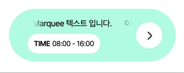
1. marquee란?
- 하단 사진처럼 텍스트가 흘러가는 것을 의미한다.
2. HTML 구조와 구현 내용
- marquee 관련된 구조만 확인해보자면,
.marquee가 marquee wrapper가 되고,.text가 marquee text가 된다. 나의 구현 내용은.text가.marquee보다 width 값이 길면 텍스트가 흐르도록 애니메이션을 동작하고, 그렇지 않으면 애니메이션 동작을 중단시키는 것이다.
<div class="container">
  <div class="content-wrapper">
    <div class="marquee">
      <span class="text">이 텍스트는 Marquee 텍스트 입니다.</span>
    </div>
    <div class="time">
      <span class="sub">TIME</span>
      <span class="text">08:00 - 16:00</span>
    </div>
  </div>
  <div class="button-wrapper">
    <button type="button" class="button-arrow" aria-label="이동하기" />
  </div>
</div>.text가.marquee보다 width 값이 짧을 경우
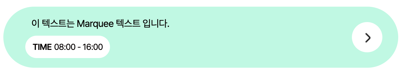
.text가.marquee보다 width 값이 길 경우

3. SCSS (Marquee)
- 텍스트가 흐를 때, 두 개의 marquee 텍스트가 나란히 표시되어야 한다. 첫 번째 텍스트가 흐르면서 끝나는 시점에 두 번째 텍스트가 순차적으로 나타날 수 있도록, 자바스크립트를 통해 해당
.marquee노드에.text를 복사하고.clone클래스를 할당할 예정이다. 일단.clone에는display: none이 적용되고,.marquee노드에.active클래스가 부여될 경우display: block으로 적용된다. 뿐만 아니라,.marquee노드에.active클래스가 부여될 경우.text에 애니메이션이 작동하도록 지정되어 있다. - 2번의 마지막 사진을 자세히 보면 텍스트가 흐를 때 양 옆에 그라디언트가 있는 것을 확인할 수 있다. 마찬가지로
.marquee노드에.active클래스가 부여될 경우.marquee노드의before와after가상 선택자에 그라디언트가 나타난다.
.marquee {
  display: flex;
  overflow: hidden;
  position: relative;
  margin: 0 10px;

  .text {
    font-size: 16px;
    white-space: nowrap;

    &.clone {
      display: none;
    }
  }

  &.active {
    &::before,
    &::after {
      content: '';
      display: block;
      position: absolute;
      z-index: 10;
      top: 0;
      width: 24px;
      height: 24px;
      background-color: transparent;
    }

    &::before {
      left: 0;
      background-image: linear-gradient(to right, #b0fae2, transparent);
    }

    &::after {
      right: 0;
      background-image: linear-gradient(to left, #b0fae2, transparent);
    }

    .text {
      padding-left: 24px;
      animation: textLoop 10s linear infinite;

      &.clone {
        display: block;
      }
    }
  }
}
4. JavaScript를 통한 marquee 텍스트 복사 및 클래스 추가/삭제
cloneNode()를 통해.text노드를 복사하고 해당 노드에.clone클래스를 부여하여.marquee에 자식 노드로 추가한다.activateMarquee()함수에서marqueeWrapper.classList.toggle('active')를 통해wrapperWidth가textWidth보다 길면.active클래스를 삭제하고, 그렇지 않으면.active클래스를 추가한다.- 윈도우 창 사이즈가 변경될 때마다
window.addEventListener('resize')를 통해activateMarquee()함수가 실행되도록 한다.
const onMarqueeText = () => {
  const marqueeWrapper = document.querySelector('.marquee');
  const text = marqueeWrapper?.querySelector('.text');

  /**
   * clodeNode: 노드 복사할 때 사용하는 함수
   * @param {*} node
   * @returns
   */
  const cloneNode = (node) => {
    const clone = node.cloneNode(true);
    clone.classList.add('clone');

    return clone;
  };

  /**
   * activateMarquee: marquee 텍스트를 활성화하기 위해 사용하는 함수
   */
  const activateMarquee = () => {
    const wrapperWidth = marqueeWrapper.offsetWidth;
    const textWidth = text.offsetWidth;

    marqueeWrapper.classList.toggle('active', wrapperWidth <= textWidth);
  };

  if (marqueeWrapper) {
    marqueeWrapper.appendChild(cloneNode(text));
    activateMarquee(); // 처음 실행할 때 동작하는 함수
    window.addEventListener('resize', activateMarquee); // window 사이즈가 변경될 때마다 실행되는 함수
  }
};
5. 결과
- marquee 텍스트가 wrapper보다 width 값이 길면 텍스트가 흐르도록 애니메이션을 동작하고, 그렇지 않으면 애니메이션이 동작하지 않는다.
📌 SCSS 코드 참고
.container {
  display: flex;
  align-items: center;
  position: relative;
  padding: 16px;
  min-width: 300px;
  max-width: 700px;
  color: #060000;
  border-radius: 90px;
  background-color: #b0fae2;

  .content-wrapper {
    display: flex;
    flex-direction: column;
    row-gap: 8px;
    padding-left: 20px;
    width: calc(100% - 60px);

    .marquee {
      display: flex;
      overflow: hidden;
      position: relative;
      margin: 0 10px;

      .text {
        font-size: 16px;
        white-space: nowrap;

        &.clone {
          display: none;
        }
      }

      &.active {
        &::before,
        &::after {
          content: '';
          display: block;
          position: absolute;
          z-index: 10;
          top: 0;
          width: 24px;
          height: 24px;
          background-color: transparent;
        }

        &::before {
          left: 0;
          background-image: linear-gradient(to right, #b0fae2, transparent);
        }

        &::after {
          right: 0;
          background-image: linear-gradient(to left, #b0fae2, transparent);
        }

        .text {
          padding-left: 24px;
          animation: textLoop 10s linear infinite;

          &.clone {
            display: block;
          }
        }
      }
    }

    .time {
      display: flex;
      align-items: center;
      column-gap: 4px;
      padding: 8px 12px;
      width: min-content;
      border-radius: 90px;
      background-color: white;
      font-size: 14px;
      white-space: nowrap;

      .sub {
        font-weight: 600;
      }
    }
  }

  .expander {
    display: flex;
    align-items: center;
    margin-left: auto;
  }

  .button-arrow {
    position: relative;
    width: 50px;
    height: 50px;
    border-radius: 50%;
    background-color: white;
    border: 0 none;

    &::before {
      content: '';
      position: absolute;
      display: block;
      top: 50%;
      left: 50%;
      width: 16px;
      height: 16px;
      margin-top: -7px;
      margin-left: -7px;
      background-image: url("data:image/svg+xml,%3Csvg xmlns='http://www.w3.org/2000/svg' xmlns:xlink='http://www.w3.org/1999/xlink' xml:space='preserve' width='16' height='16'%3E%3Cimage xlink:href='data:image/png;base64,iVBORw0KGgoAAAANSUhEUgAAABAAAAAQCAQAAAC1+jfqAAAAIGNIUk0AAHomAACAhAAA+gAAAIDo AAB1MAAA6mAAADqYAAAXcJy6UTwAAAACYktHRAD/h4/MvwAAAAlwSFlzAAAAdgAAAHYBTnsmCAAA AAd0SU1FB+cLCgYPLoA7PV0AAABlSURBVCjPtZC7DYAwDESfaJgggRGQ2IdpUdgAJMJHTHMUEV1i aLjOuif7zvCoY6LFUECsuDLgWBGnteUTEt8QT0QcFtKwI2ZqC7kQQxqqDCBk/SOlWEonXqr+asOI 2PDl9D0hZ9/Ytye1jhACTQAAACV0RVh0ZGF0ZTpjcmVhdGUAMjAyMy0xMS0xMFQwNjoxNTo0Nisw MDowMGAfS3YAAAAldEVYdGRhdGU6bW9kaWZ5ADIwMjMtMTEtMTBUMDY6MTU6NDYrMDA6MDARQvPK AAAAKHRFWHRkYXRlOnRpbWVzdGFtcAAyMDIzLTExLTEwVDA2OjE1OjQ2KzAwOjAwRlfSFQAAABl0 RVh0U29mdHdhcmUAd3d3Lmlua3NjYXBlLm9yZ5vuPBoAAAAASUVORK5CYII=' width='16' height='16'/%3E%3C/svg%3E");
    }
  }
}
오늘은 나에게 어떤 일이 생길까 ✨