Transform
4_transform.html
<div class="box"></div>css style 태그
body {
background: #333;
display: flex;
align-items: center;
justify-content: center;
height: 100vh;
}
.box {
background: white;
width: 300px;
height: 300px;
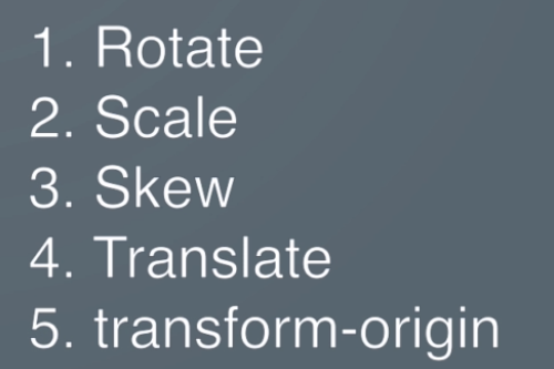
/* Transform - rotate, scale, skew */
transform: rotate(25deg);
/* transform: skew(25deg); */
/* transform: scale(2); */
/* transition: all 1s ease-in-out; */
}
.box:hover {
transform: rotate(180deg);
/* transform: skew(25deg); */
/* transform: scale(2); */
/* border-radius: 50%;
background-color: blue; */
/* transform: translateY(100px); */
/* transform: translateX(-100px); */
/* x & y */
/* transform: translate(100px, 100px); */
/* transform: translate3d(100px, 100px, 100px); */
}실습
https://codepen.io/learnwebcode/pen/GOWxzz?editors=1100
https://developer.mozilla.org/en-US/docs/Web/CSS/transform-origin

픽서