매번 alert로 알림을 띄우던 나는 신세계를 찾아버렸다.
📦 설치
$ npm install react-toastify
🔧 사용법
두가지 코드만 추가하면 바로 동작한다.
물론 import는 해줘야한다.
import { ToastContainer, toast } from "react-toastify";-
ToastContainer
<ToastContainer/>실제로 알림을 띄우는 컴포넌트이다. 루트 컴포넌트나 App 컴포넌트에 한번만 추가해주면 된다.
-
toast
toast("이것은 알림입니다!");알림을 띄우기위해 실행하는 함수
📝 기본 예제
import React from 'react';
import { ToastContainer, toast } from 'react-toastify';

const App = () => {
  const notify = () => {
    toast("알림 메시지!");
  };

  return (
    <div>
      <button onClick={notify}>알림 띄우기</button>
      <ToastContainer />
    </div>
  );
};

export default App;
⚠️ 알림유형
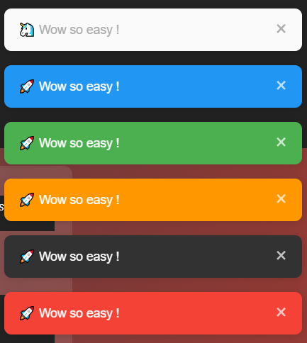
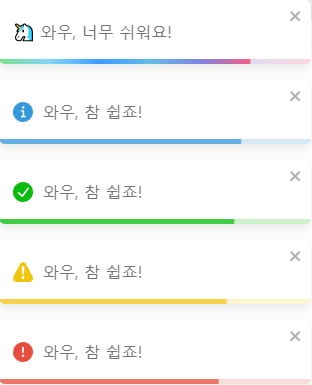
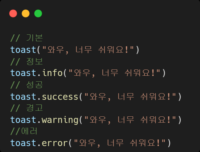
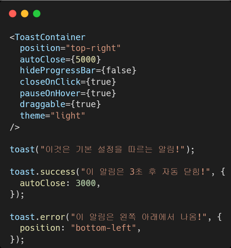
다양한 알림유형을 사용할 수 있다.
|
|
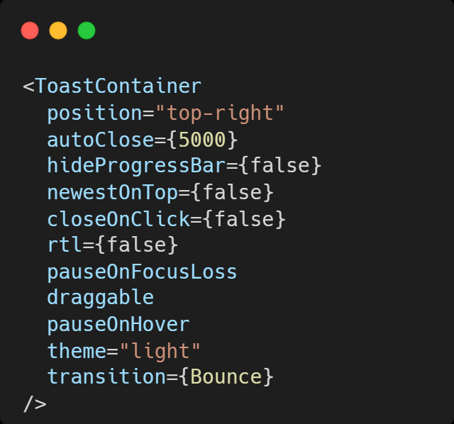
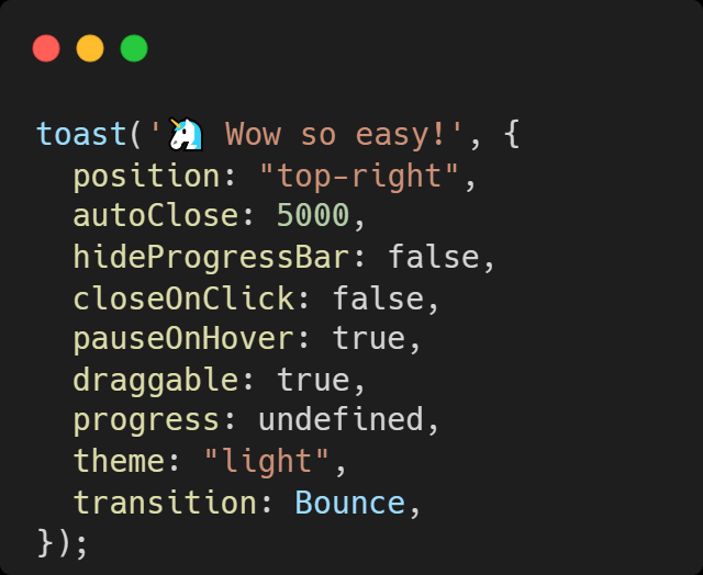
⚙️ 세부 설정
옵션은 ToastContainer 나 toast함수 둘다 설정가능하다.
|
|
ToastContainer은 알림을 표시하는 컨테이너 역할을 하며, 해당 설정이기본값이 된다.toast(...)는 개별 알림을 띄우는 함수이며, 호출할 때마다개별적으로 설정할 수 있다.
ToastContainer에 기본값을 설정해 두고, 특정toast()에서만 일부 옵션을 덮어쓰면 된다.
예)
🔧 다양한 세부옵션
| Props | Type | Default | Description |
|---|---|---|---|
position | string | top-right | 위치: top-right, top-center, top-left, bottom-right, bottom-center, bottom-left 중 하나 |
autoClose | bool , number | 5000 | 토스트가 자동으로 닫히는 시간(ms). false로 설정하면 수동으로 닫아야 함 |
hideProgressBar | bool | false | 토스트 하단에 남은 시간을 표시할지 여부 |
closeOnClick | bool | false | 클릭 시 토스트를 닫을지 여부 |
pauseOnHover | bool | true | 호버 시 타이머가 계속 진행될지 여부 |
pauseOnFocusLoss | bool | true | 윈도우가 포커스를 잃었을 때 타이머를 일시 정지할지 여부 |
draggable | bool | "touch" | 토스트를 드래그할 수 있을지 여부 |
theme | string | light | 테마: light, dark, colored 중 하나 |
transition | ReactNode | Bounce | 유효한 react-transition-group/Transition 컴포넌트를 참조하여 애니메이션 전환 효과 적용 |
newestOnTop * | bool | false | 가장 최신의 토스트를 위에 표시할지 여부 |
rtl * | bool | false | 오른쪽에서 왼쪽으로 읽는 콘텐츠를 지원할지 여부 |
* 는 ToastContainer에서만 작동
✅ 정리
ToastContainer와toast모두 기본적인 설정을 위한 옵션들을 가지고 있다.ToastContainer는 토스트 알림의 위치, 애니메이션, 테마 같은 설정을 다루고,toast는 개별 알림에 대한 텍스트, 아이콘, 진행 상태 등을 설정한다.
🔗 참고
- 이 외에도 다양한 세부 옵션이 존재하니 이 곳을 참고하자.
🎨 스타일 바꾸기
:root {
  --toastify-color-light: #fff; /* 밝은 테마 배경 */
  --toastify-color-dark: #121212; /* 어두운 테마 배경 */
  --toastify-color-info: #3498db; /* 정보 알림 색상 */
  --toastify-color-success: #07bc0c; /* 성공 알림 색상 */
  --toastify-color-warning: #f1c40f; /* 경고 알림 색상 */
  --toastify-color-error: hsl(6, 78%, 57%); /* 에러 알림 색상 */

  --toastify-toast-width: 320px; /* 알림 너비 */
  --toastify-toast-padding: 14px; /* 알림 내용 여백 */
  --toastify-toast-bd-radius: 6px; /* 알림 둥근 모서리 */
  --toastify-toast-shadow: 0px 4px 12px rgba(0, 0, 0, 0.1); /* 알림 그림자 */

  --toastify-z-index: 9999; /* 알림 겹침 순서 */
  --toastify-color-progress-light: linear-gradient(to right, #4cd964, #5ac8fa, #007aff, #34aadc, #5856d6, #ff2d55); /* 진행바 색상 */
  --toastify-color-progress-dark: #bb86fc; /* 진행바 색상 (어두운 테마용) */
}
...
✅ 정리
- 알림의
색상,위치,크기,모양,진행 상태 및 타이머,애니메이션 효과,접근성등 다양한 스타일을 설정할 수 있다. inline,styled-componets,tailwind등 다양한 방법으로 스타일 수정이 가능하다
🔗 참고
- 이 외에도 다양한 스타일 설정이 존재하니 이 곳을 참고하자
🔗 참고

이게 왜 안되지? 이게 왜 되지?