사전캠프 5일차
남은 Layout 위젯 강의를 수강하고, 여러 앱들의 위젯을 분석했다.
그리고, 알람 앱 화면을 구성해보는 실습을 했다.
2주차 강의(위젯)
2. Layout 위젯
2-4 Expanded 위젯
행 또는 열의 공간을 채우는 데 사용하며, 공간을 분배하는 데 쓰인다.
Row(
  mainAxisAlignment: MainAxisAlignment.spaceEvenly,
  children: [
    Expanded(
      flex: 1, // 1
      child: Container(
        height: 40,
        color: Colors.red,
        margin: const EdgeInsets.all(5),
      ),
    ),
    Expanded(
      flex: 3, // 2
      child: Container(
        height: 40,
        color: Colors.red,
        margin: const EdgeInsets.all(5),
      ),
    ),
    Expanded(
      flex: 2, // 1
      child: Container(
        height: 40,
        color: Colors.red,
        margin: const EdgeInsets.all(5),
      ),
    ),
  ],
), // Row 예제
- 공간을 flex 옵션을 통해 영역을 나눌 수 있으며, 같은 값을 입력할 경우 동일한 영역을 갖게 된다.
Column(
    mainAxisAlignment: MainAxisAlignment.spaceEvenly,
    children: [
      Expanded(
        flex: 1, // 1
        child: Container(
          height: 40,
          color: Colors.red,
          margin: const EdgeInsets.all(5),
        ),
      ),
      Expanded(
        flex: 3, // 2
        child: Container(
          height: 40,
          color: Colors.red,
          margin: const EdgeInsets.all(5),
        ),
      ),
      Expanded(
        flex: 2, // 1
        child: Container(
          height: 40,
          color: Colors.red,
          margin: const EdgeInsets.all(5),
        ),
      ),
    ],
), // Column 예제
2-5 Stack 위젯 & Positioned 위젯
레이어 기능과 같이 겹치게 배치하는데 사용한다.
Stack 위젯
Stack(
 children: [
   const CircleAvatar(
     radius: 50,
     child: Icon(
       Icons.person,
       size: 40,
     ),
   ),
   Positioned(
     bottom: 0,
     right: 0,
     child: Container(
       padding: const EdgeInsets.all(7),
       decoration: const BoxDecoration(
           shape: BoxShape.circle, color: Colors.white),
       child: const Icon(
         Icons.camera_enhance,
         size: 24,
       ),
     ),
   )
 ],
),
📕
fit
- Stack 위젯 내에 자식의 위젯 크기를 조절하는데 사용하며,
설정하지 않는다면 기본 값은loose로, Stack의 크기에 맞게 확장되지 않는다.
보통의 경우expand를 주로 사용하며, 이는 Stack 위젯의 크기와 동일하게 확장된다.(자식 위젯 = Stack 위젯)
passthrough은 Stack 위젯의 크기를 넘어 배치되는데, 잘 사용하지 않는다고 한다.
📙children
- Stack에 쌓일 위젯을 작성하며, List<Widget> 타입이다.
먼저 작성 된 위젯이 가장 아래 레이어에 위치하게 되고 원하는 위치에 배치하기 위해서는 Positioned 위젯을 사용한다.
Positioned 위젯
Stack(
  children: [
    Positioned(
      left: 0,
      top: 0,
      child: Container(
        width: 100,
        height: 100,
        decoration: const BoxDecoration(color: Colors.red),
      ),
    )
  ],
),
- 옵션으로는
lefttoprightbottom이 있다.
💡 위와 같은 설정은 부모의 위젯의 크기에 따라 결정이 된다.
3. 기능성 위젯
3-1 Text 위젯
텍스트를 배치하고 꾸미는 위젯이다.
Text(
  'Styled Text',
  style: TextStyle(
    fontSize: 20,
    fontWeight: FontWeight.bold,
    color: Colors.blue,
    fontStyle: FontStyle.italic,
    letterSpacing: 2.0,
    wordSpacing: 4.0,
    decoration: TextDecoration.underline,
    fontFamily: 'Roboto',
  ),
)
📕
fontSize- 크기
📙fontWeight- 굵기
📒color- 색상
📗letterSpacing- 텍스트 문자 간격
📘wordSpacing- 텍스트 단어 간격
📔decoration- 장식(밑줄, 취소선 etc.)
📚fontFamily- 글꼴
3-2 TextField 위젯
사용자가 텍스트를 입력할 수 있는 위젯으로, 사용자 입력을 처리할 수 있다.
TextField 예제TextField( decoration: InputDecoration( labelText: 'Enter your name', ), )
📕
maxLength
사용자가 입력할 수 있는 최대 문자 수를 설정한다.
📙readOnly
읽기 전용으로 설정하여, 사용자가 텍스트를 수정할 수 없다.
📒textAlign
텍스트의 정렬 방식을 설정한다.
📗decoration
텍스트 필드의 장식을 설정한다.
레이블, 힌트 텍스트, 아이콘 등을 포함한다.
📘controller
텍스트 필드의 상태를 제어하는 컨트롤러를 설정한다.
텍스트를 읽고 쓰거나 텍스트 필드의 상태를 관리할 수 있다.
import 'package:flutter/material.dart';
void main() {
runApp(MyApp());
}
class MyApp extends StatelessWidget {
Widget build(BuildContext context) {
return MaterialApp(
home: Scaffold(
appBar: AppBar(
title: Text('TextField Example'),
),
body: Padding(
padding: const EdgeInsets.all(16.0),
child: MyCustomForm(),
),
),
);
}
}
class MyCustomForm extends StatefulWidget {
_MyCustomFormState createState() => _MyCustomFormState();
}
class _MyCustomFormState extends State<MyCustomForm> {
final TextEditingController myController = TextEditingController();
void initState(){
super.initState();
myController.addListener(() {
print(myController.text);
});
}
Widget build(BuildContext context) {
return Column(
children: <Widget>[
TextField(
maxLength: 20,
readOnly: false,
textAlign: TextAlign.left,
decoration: InputDecoration(
labelText: 'Enter your name',
hintText: 'John Doe',
border: OutlineInputBorder(),
counterText: '', // This hides the counter below the TextField
),
controller: myController,
),
SizedBox(height: 20),
ElevatedButton(
onPressed: () {
// 텍스트 필드의 값 출력
print(myController.text);
},
child: Text('Submit'),
),
],
);
}
void dispose() {
myController.dispose();
super.dispose();
}
}3-3 Switch 위젯
Switch(
  value: true,
  onChanged: (bool newValue) {
    // 토글 이벤트 처리
  },
)
- 해당 예제는 고정되어 있는데 작동 되도록 하려면,
StatelessWidget을StatefulWidget으로 바꿔준다.
그리고 따로var state = false;로 변수 선언을 해서 값을 고친다.
마지막으로onChanged안에setState((){state = newValue;}를 넣어 설정한다.
3-4 Slider 위젯
Slider(
  value: 50,
  min: 0,
  max: 100,
  onChanged: (double newValue) {
    // 슬라이더 변경값에 따른 이벤트 처리
  },
)
- 동일하게 고정되어 움직이지 않는데,
StatelessWidget을StatefulWidget으로 바꿔준다.
그리고var state = 50 // 슬라이더 값;변수 선언을 한다.
value: state,를 입력하고,onChanged안에setState()처리를 한다.
>setState((){state = newValue;}
3-5 GestureDetector
탭, 스와이프, 핀치 등과 같이 다양한 제스처를 감지하여, 해당 제스처에 대한 콜백을 제공하는 위젯이다.
사용자의 상호작용을 처리하는 데 사용된다.
GestureDetector(
  onTap: () {
    // 탭 이벤트 발생
  },
  onDoubleTap: () {
  	// 더블탭 이벤트 발생
  }
  child: Container(
    color: Colors.blue,
    width: 100,
    height: 100,
  ),
)
📕
onTap
사용자가 위젯을 탭할 때 호출되는 콜백 함수
📙onLongPress
사용자가 위젯을 길게 누를 때 호출되는 콜백 함수
📒onDoubleTap
사용자가 위젯을 더블 탭할 때 호출되는 콜백 함수
📗behavior
제스처 감지의 범위와 방식 등GestureDetector의 동작 방식을 정의한다.
HitTestBehavior열거형의 세 가지 값 중 하나를 선택할 수 있다
deferToChild,opaque,translucent.
3-6 Image 위젯
네트워크, 로컬 파일 등에서 이미지를 불러오고, 크기 조정 및 배치 옵션을 조정할 수 있다.
 Scaffold(
  backgroundColor: Colors.blue,
  body: Center(
    child: Image.network(
      'https://sudar-life.github.io/images/logo_white_mode.png',
      width: 200,
      height: 200,
    ),
  ),
),
Image.network를Image.asset으로 바꾸게 되면, 프로젝트 내에 포함되어 있는 리소스를 불러오는 것이다.
4. 위젯 분석
강의 중 활용할 것을 가져왔다.
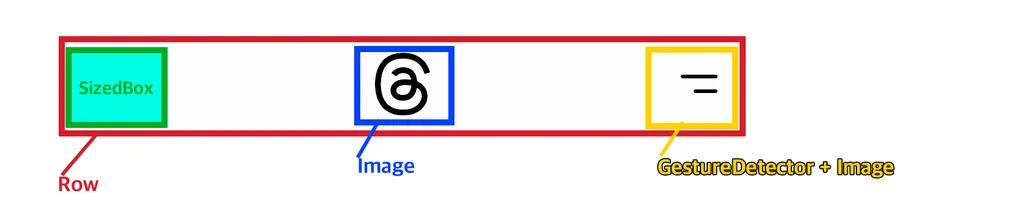
📌 Header
이런 Header를 만들 때 Stack을 사용하는 방법 도 있지만,
Row위젯을 사용하면 더 간편하다.
spaceBetween을 사용하면 좌우로 배치되지만,
이런 식으로 왼쪽에
SizedBox를 배치하면 이 특성으로 인해 로고가 가운데 위치하는 것이다.
💡 빈 Sizedbox를 넣을 때 width 값을 가장 우측에 있는 메뉴 위젯의 사이즈만큼 지정해야 정확하게 로고가 가운데에 위치한다.
여러 앱들을 보면서 어떻게 구성이 되어있는지, 어떤 위젯을 사용했는지 분석하는 공부가 필요할 것 같다.
여러 부분으로 나눠서 어떤 기능을 썼는지 파악하고, 따라 만들다 보면 실력이 늘 것 같다.
5. 대표적인 앱 화면 구성하기
알람
class Home extends StatelessWidget { const Home({super.key}); // Widget _wakeUpAlarm() { return Container( padding: const EdgeInsets.symmetric(horizontal: 10), child: Column( crossAxisAlignment: CrossAxisAlignment.stretch, children: [ Text( '알람', style: TextStyle(fontSize: 40), ), SizedBox(height: 15), Text( '🛌 수면 | 기상', style: TextStyle(fontSize: 20), ), Row( mainAxisAlignment: MainAxisAlignment.spaceBetween, children: [ Text( '알람없음', style: TextStyle(color: Color(0xff8d8d93), fontSize: 50), ), Container( padding: const EdgeInsets.symmetric(horizontal: 15, vertical: 5), decoration: BoxDecoration( borderRadius: BorderRadius.circular(20), color: Color(0xff262629), ), child: Text( '변경', style: TextStyle(color: Color(0xffff9f0a), fontSize: 16), ), ) ], ) ], ), ); } // Widget build(BuildContext context) { return Scaffold( appBar: AppBar( backgroundColor: Colors.transparent, leading: GestureDetector( onTap: () {}, child: Center( child: Text( '편집', style: TextStyle( color: Color(0xffff9f0a), fontSize: 20, ), ), ), ), actions: [ GestureDetector( onTap: () {}, child: Padding( padding: const EdgeInsets.only(right: 15), child: Image.asset('assets/images/icon_add.png'), ), ) ], ), body: SingleChildScrollView( child: Column( children: [ _wakeUpAlarm(), ], ), ), ); } }
❓ body 영역에 Column 하위로 _wakeUpAlarm의 함수를 사용해서 위젯을 return 받고 있다. 이렇게 처리한 이유는?
--> ✅ 하위로 depth가 깊어지면 가독성에도 좋지 않고 유지 보수 역시 어려워지기 때문에 분리해서 관리하는 것이다.
 body: SingleChildScrollView(
        child: Column(
          crossAxisAlignment: CrossAxisAlignment.stretch,
          children: [
            _wakeUpAlarm(),
            SizedBox(height: 50),
            Padding(
              padding: const EdgeInsets.symmetric(horizontal: 10),
              child: Text(
                '기타',
                style: TextStyle(fontSize: 20, fontWeight: FontWeight.bold),
              ),
            ),
            ...List.generate(5, (index) => _etcAlarm()),
          ],
        ),
void main() {
  List<int> list1 = [1, 2, 3];
  List<int> list2 = [4, 5, 6];
  List<int> combinedList = [...list1, ...list2];
//
  print(combinedList); // [1, 2, 3, 4, 5, 6]
}
❓ _etcAlarm 함수를 호출할 때에 List.generate 옆에 …는 무엇인가?
--> ✅ ...은 “스프레드 연산자”라고 하며, 리스트나 맵, 셋과 같은 컬렉션의 요소를 풀어서 다른 컬렉션에 추가할 때 사용된다.
앞에서 이해하고 넘어가는데 시간이 다소 걸렸지만, 대표적인 앱 화면 위젯을 분석할 때 어떤 위젯을 썼는지 눈에 보이니 뿌듯하기도 하고 신기했다.
막상 코드를 작성하는 것은 좀 어려웠지만, 어떤 위젯을 사용하면 되겠다는 생각이 드니 재밌었던 것 같다.
그리고 앱 개발의 기초 지식이 작성되어 있는 블로그를 공유받았다.
해당 블로그
🎉 사전캠프 챌린지 완료 ✨