앞으로 tailwind를 자주 사용할 것 같아서..! 진짜 간단하게 최종프로젝트에서 어떤 확장프로그램을 썼고 config에 어떻게 지정해줬는지 기록용으로 적을 예정...!
tailwind.css 세팅
01. vscode 확장프로그램 🔍
Tailwind CSS IntelliSense
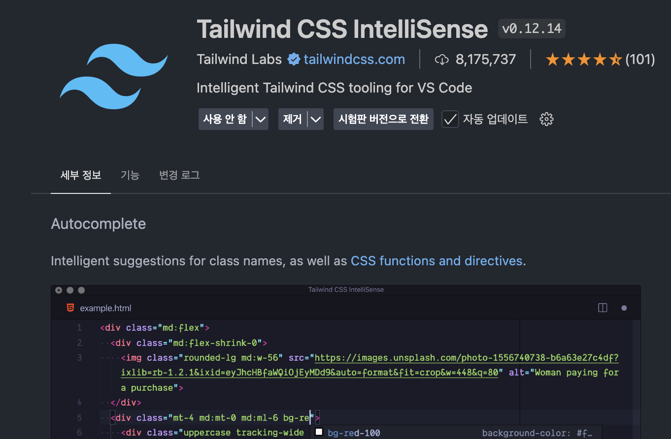
유명하고 가장 기본인 확장프로그램으로 "자동완성" 시켜주는 확장프로그램이다.
Tailwind Fold
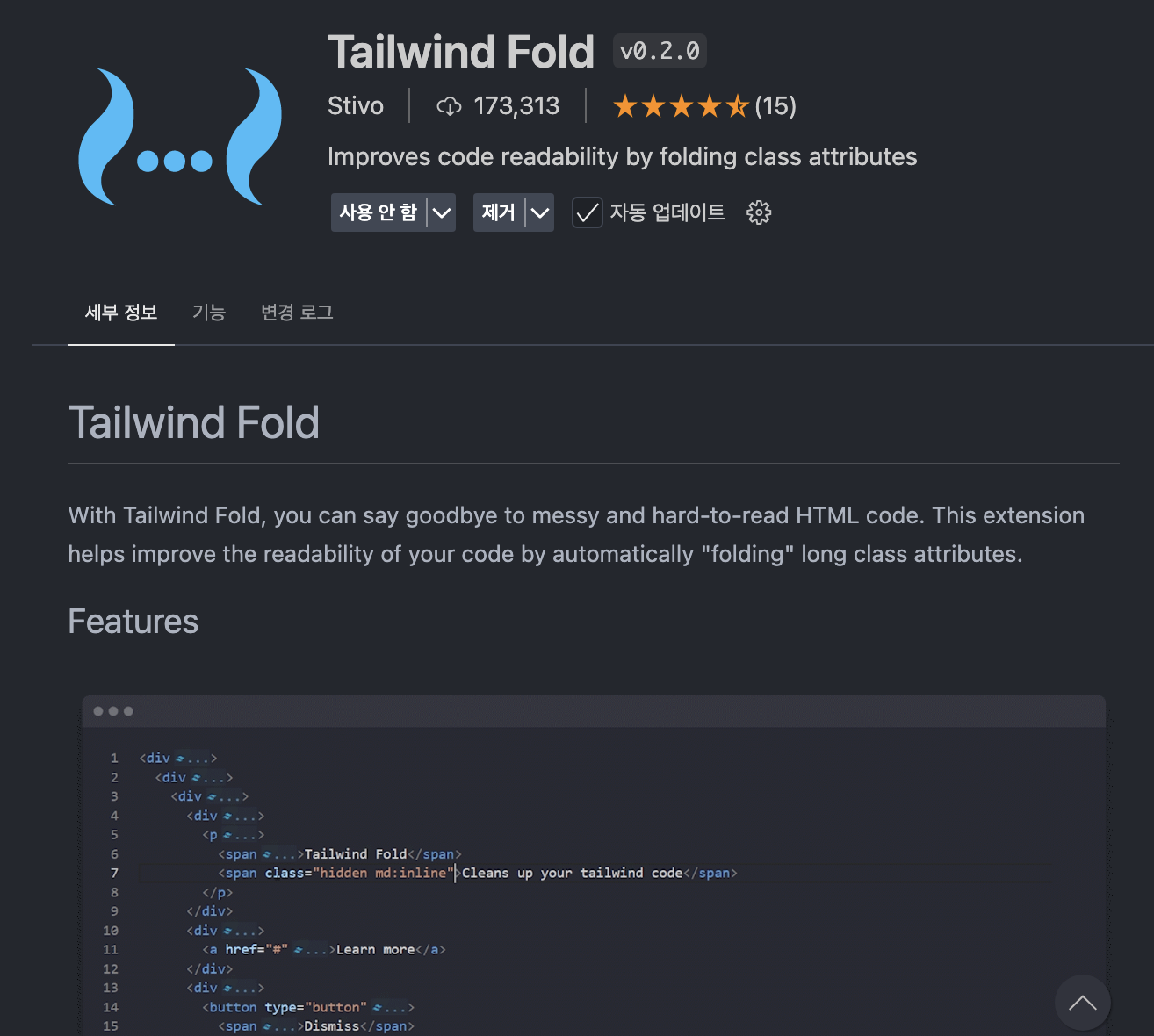
테일윈드를 쓰면서 가장 큰 단점이고 불편한 점이라고 생각되는게 코드가 너무 지저분해진다. 이것도 마음에 쏙 드는건 아니지만 className으로 준 css 속성을 폴더처럼 샥 담아서 접어준다.
02. tailwind.config.ts 🚧
import type { Config } from "tailwindcss";

const config: Config = {
  content: [
    "./src/pages/**/*.{js,ts,jsx,tsx,mdx}",
    "./src/components/**/*.{js,ts,jsx,tsx,mdx}",
    "./src/app/**/*.{js,ts,jsx,tsx,mdx}"
  ],
  theme: { // ✅ 작성 위치 반드시 체크!
    extend: {
      colors: {
        Primary: {
          50: "#FFF6F0",
          100: "#FFD8BD",
          200: "#FFBB8A",
          300: "#FF9143",
          400: "#FF7F24",
          500: "#F06400",
          600: "#BD4B00",
          700: "#8A3500",
          800: "#572100",
          900: "#240F00"
        },
        Secondary: {
          25: "#FFF9E9",
          50: "#FFF4D1",
          100: "#FFE79E",
          200: "#FFDA6A",
          300: "#FFCD38",
          400: "#FFC105",
          500: "#D19600",
          600: "#9E6F00",
          700: "#6B4B00",
          800: "#423100",
          900: "#1A1300"
        },
        Gray: {
          50: "#F6F5F4",
          100: "#DEDCD7",
          200: "#C4C3BE",
          300: "#ABA9A5",
          400: "#91908D",
          500: "#787774",
          600: "#5E5E5B",
          700: "#454443",
          800: "#2B2B2A",
          900: "#121211"
        },
        SystemColor: {
          Red: "#E80018"
        }
      },
      fontSize: {
        "main-54": ["54px", { lineHeight: "120%", fontWeight: "400", letterSpacing: "-0.27px" }],
        "main-30": ["30px", { lineHeight: "120%", fontWeight: "400", letterSpacing: "-0.15px" }],
        "main-28": ["28px", { lineHeight: "120%", fontWeight: "400", letterSpacing: "-0.56px" }],
        "main-24": ["24px", { lineHeight: "120%", fontWeight: "400", letterSpacing: "-0.48px" }],
        "main-20": ["20px", { lineHeight: "120%", fontWeight: "400", letterSpacing: "-0.4px" }],
        "heading-32": ["32px", { lineHeight: "120%", fontWeight: "700", letterSpacing: "-0.16px" }],
        "heading-28": ["28px", { lineHeight: "120%", fontWeight: "700", letterSpacing: "-0.14px" }],
        "heading-24": ["24px", { lineHeight: "120%", fontWeight: "700", letterSpacing: "-0.12px" }],
        "heading-20": ["20px", { lineHeight: "125%", fontWeight: "700", letterSpacing: "-0.1px" }],
        "heading-18": ["18px", { lineHeight: "125%", fontWeight: "700", letterSpacing: "-0.1px" }],
        "title-24": ["24px", { lineHeight: "120%", fontWeight: "600" }],
        "title-20": ["20px", { lineHeight: "130%", fontWeight: "600" }],
        "title-18": ["18px", { lineHeight: "135%", fontWeight: "600" }],
        "title-16": ["16px", { lineHeight: "135%", fontWeight: "600" }],
        "title-14": ["14px", { lineHeight: "130%", fontWeight: "600" }],
        "title-13": ["13px", { lineHeight: "125%", fontWeight: "600" }],
        "body-20": ["20px", { lineHeight: "125%", fontWeight: "500" }],
        "body-18": ["18px", { lineHeight: "125%", fontWeight: "500" }],
        "body-16": ["16px", { lineHeight: "125%", fontWeight: "500" }],
        "body-15": ["15px", { lineHeight: "135%", fontWeight: "500" }],
        "body-14": ["14px", { lineHeight: "130%", fontWeight: "500" }],
        "body-13": ["13px", { lineHeight: "130%", fontWeight: "500" }],
        "body-12": ["12px", { lineHeight: "140%", fontWeight: "500" }],
      fontFamily: {
        pretendard: ["var(--font-pretendard)", "sans-serif"],
        yangjin: ["var(--font-yangjin)", "sans-serif"],
        wiggle: ["var(--font-wiggle)", "sans-serif"]
      }
    },
    screens: {
      ssm: "375px",
      sm: "480px",
      md: "768px",
      lg: "1024px",
      xl: "1440px",
      xxl: "1920px"
    }
  },
  plugins: []
};
export default config;
일단 냅다 프로젝트에서 쓴 코드 박아버리기 ^^
-
screens : 반응형 할 때 break-point 로 줄 화면 해상도 값을 정해줄 수 있다. 기본으로 세팅이 되어있지만 추가해줘야하거나 특수한 경우일 때 이렇게 설정해주면 된다.
(사용법 : className="md:w-20" -> md이상부터는 width 값이 20만큼 설정) -
font-size : 폰트 사이즈는 물론 행간, 굵기 모두 변수에 담아두고 쓸 수 있다.
(사용법 : className="text-heading-20") -
colors : 프로젝트에서 사용할 색상들을 정리해두면 정말 편리하다.
(사용법 : className="bg-Primary-300 text-Gray-500") -
fontFamily : 사용할 폰트 설정하기. 이것도 변수로 담는다고 생각하면 되고 이름은 자유롭게 지을 수 있다.
(사용법 : className="font-wiggle")
03. prettier plugsin ⚒️
{
  "printWidth": 120,
  "tabWidth": 2,
  "useTabs": false,
  "semi": true,
  "singleQuote": false,
  "bracketSpacing": true,
  "trailingComma": "none",
  "plugins": ["prettier-plugin-tailwindcss"]
}
순서 상관없이 마구마구 적은 css 속성들을 이 플러그인이 알아서 착 정리해준다.
다른 팀 프로젝트 보면 일관성있게 css가 정리되어있어서 궁금했는데 이 플러그인 한줄만 .prettierrc 에 추가해주면 된다.
이제 개인프로젝트를 하게 될텐데... 잘 기록해두고 써먹을 수 있도록 하자..! 🔥