개요
내 JS와 CSS 실력이 부족한 듯하여, 이것저것 뒤지다가 어.. 이것 구현해봐야겠다 싶어서 구현해본다.
근데 정작 그것은 svg로 되어있는 코드였다.
일단 사실 구현에 정답은 없으니 난 이렇게 먼저 구현해보고 이후 svg로도 구현을 해봐야지.
이건 구현만 시킨거라서 바로 사용은 어렵다. 왜냐하면 위치를 토닥토닥 하면서 잘 잡아줘야하기 때문이지.
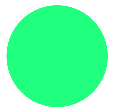
실행
html
우선 바깥 원과 내부 원을 만들어주었다.
<div class="outer">
  <div class="inner"></div>
</div>
css
그리고 이에 맞게 css도 작성해주었다.
둘다 position은 relative로 해주었고, 위치만 살짝 잡아주었다.
실제였으면 div에 넣어두고 display:flex 에 center를 했을 듯 하다.
난 여기서 로딩하는 듯한 느낌을 구현하기 위해서
conic-gradient()
를 이용하기로 했다.
이렇게하면, inner 원이 outer원의 가운데에 위치하고, 또 위에 올라간 것으로 보여서 outer원의 일부를 가려주기 때문에 테두리가 움직이는 로딩바처럼 구현이 가능해진다.
.outer {
  position: relative;
  top: 0;
  left: 0;
  height: 210px;
  width: 210px;
  border-radius: 50%;
  background-image: conic-gradient(#4CAF50 0deg, #4CAF50 0deg, transparent 0deg, transparent 360deg);
  transform: scaleX(-1);
}


.inner{
  position: relative;
  top: 5px;
  left: 5px;
  height: 200px;
  width: 200px;
  border-radius: 50%;
  background: #20ff7d;
}
여기서
transform: scaleX(-1);
을 한 이유는 시계방향보다는 반시계방향이 더 내가 보기엔 좋아서 이렇게 했다. 그리고 기록에 남기기도 이런 특이한게 좋으니께.
Javascript
그리고 이제 javascript 코드로 돌아와보자.
여기서 뻘짓을 꽤 했다.
처음엔 setInterval을 사용했는데, 뭔가 이상하게 작동해서 이것저것 하다가
requestAnimationFrame(함수명)
cancelAnimationFrame(함수명)
이라는 게 있더라. 그래서 이것을 이용해보기로 했다.
변수
우선 사용되는 변수는 아래와 같다.
const outer = document.querySelector('.outer') //outer의 style을 건드려야하니까
let CV = 0	// circle value로 말이 이래서 그렇지 각도임.
let moveValue = 3	// 로딩바 움직이는 속도를 바꿀수 있다.
let animationId	// animationFrame을 작동시키기 위한 변수이다.
함수
크게 decreaseCircle()과 increaseCircle()을 이용했다
function decreaseCircle() {
  if (CV > 0) {
    CV -= moveValue * 2
    outer.style.backgroundImage = `conic-gradient(#4CAF50 0deg, #4CAF50 ${CV}deg, transparent ${CV}deg, transparent 360deg)`
    animationId = requestAnimationFrame(decreaseCircle)
  } else {
    CV = 0
    outer.style.backgroundImage = `conic-gradient(#4CAF50 0deg, #4CAF50 0deg, transparent 0deg, transparent 360deg)`
    cancelAnimationFrame(animationId)
  }
}

function increaseCircle(){
  if(CV > 361){
    CV = 361
    outer.style.backgroundImage = `conic-gradient(#4CAF50 0deg, #4CAF50 361deg, transparent 360deg, transparent 360deg)`
    cancelAnimationFrame(animationId)
  }else if(CV < 361){
    CV += moveValue
    outer.style.backgroundImage = `conic-gradient(#4CAF50 0deg, #4CAF50 ${CV}deg, transparent ${CV}deg, transparent 360deg)`
    animationId = requestAnimationFrame(increaseCircle)
  }
}
decreaseCircle()을 통해서 각도를 감소시키게 하고, 0도 초과면 계속 moveValue의 2배로 감소시키고, 이하면 0이 되게 했다.
increaseCircle()을 통해서는 각도를 증가시키게 하고, 361도 이하면 moveValue 만큼 증가시켰고, 361도 초과면 361도가 되게했다.
여기서 감소에 2배를 한 이유는 마우스를 떼면 더 빨리 감소시켜서 빠르게 0%처럼 보이게 만들기 위해서이다.
그리고 왜 361도나면, 이게 360을 하니까 빈 공간이 선처럼 있더라고... 그래서 360보다는 커야 해결이 되어서 361로 했다.
addEventListener
그리고 마우스가 올라가있을 때 증가하고 마우스가 떠나면 감소해야하니가 addEventListenr를 사용해주자.
outer.addEventListener('mouseenter', () => {
cancelAnimationFrame(animationId)
animationId = requestAnimationFrame(increaseCircle)
})
outer.addEventListener('mouseleave', () => {
cancelAnimationFrame(animationId)
animationId = requestAnimationFrame(decreaseCircle)
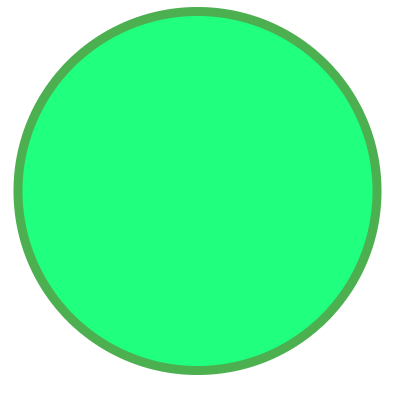
})이렇게 하면 잘 작동되는 모습을 볼 수 있다.
전체 코드
b.html
<!DOCTYPE html>
<html lang="en">
<head>
  <meta charset="UTF-8">
  <meta name="viewport" content="width=device-width, initial-scale=1.0">
  <title>Document</title>
  <link rel="stylesheet" href="b.css">
</head>
<body>
  <div class="outer">
    <div class="inner"></div>
  </div>
  <!-- <circle cx="35" cy="35" r="35" stroke="#e7e7e7" stroke-width="1" fill="transparent"></circle> -->
  <script>
    const outer = document.querySelector('.outer')
    let CV = 0
    let moveValue = 3
    let animationId

    function decreaseCircle() {
      if (CV > 0) {
        CV -= moveValue * 2
        outer.style.backgroundImage = `conic-gradient(#4CAF50 0deg, #4CAF50 ${CV}deg, transparent ${CV}deg, transparent 360deg)`
        animationId = requestAnimationFrame(decreaseCircle)
      } else {
        CV = 0
        outer.style.backgroundImage = `conic-gradient(#4CAF50 0deg, #4CAF50 0deg, transparent 0deg, transparent 360deg)`
        cancelAnimationFrame(animationId)
      }
    }

    function increaseCircle(){
      if(CV > 361){
        CV = 361
        outer.style.backgroundImage = `conic-gradient(#4CAF50 0deg, #4CAF50 361deg, transparent 360deg, transparent 360deg)`
        cancelAnimationFrame(animationId)
      }else if(CV < 361){
        CV += moveValue
        outer.style.backgroundImage = `conic-gradient(#4CAF50 0deg, #4CAF50 ${CV}deg, transparent ${CV}deg, transparent 360deg)`
        animationId = requestAnimationFrame(increaseCircle)
      }
    }

    outer.addEventListener('mouseenter', () => {
      cancelAnimationFrame(animationId)
      animationId = requestAnimationFrame(increaseCircle)
    })

    outer.addEventListener('mouseleave', () => {
      cancelAnimationFrame(animationId)
      animationId = requestAnimationFrame(decreaseCircle)
    })
  </script>
</body>
</html>
b.css
.outer {
  position: relative;
  top: 0;
  left: 0;
  height: 210px;
  width: 210px;
  border-radius: 50%;
  background-image: conic-gradient(#4CAF50 0deg, #4CAF50 0deg, transparent 0deg, transparent 360deg);
  transform: scaleX(-1);
}


.inner{
  position: relative;
  top: 5px;
  left: 5px;
  height: 200px;
  width: 200px;
  border-radius: 50%;
  background: #20ff7d;
}
작동모습
이거 또 활용 방법이 CV가 움직이게 해놨는데, 이거 마우스 이벤트 말고 따로 변수 받아서 계속 변하게 할 수도 있으니 그 방법을 이용해도 괜찮을 듯?!
아니면 아예 변수만 주고, css에서 transition을 줘서 애니메이션 효과를 같이 줘도 어떻게 구현이 가능할 것 같다.