
flex를 알면 더 수월하게 공부할 수 있다고 생각했던 grid, 막상 적용하려니 쉽지 않아서 mini-project를 통해서 연습해보았다.
1. Flex와 Grid의 차이점
- Flex는 한 방향 레이아웃 시스템이고 (1차원)
- Grid는 두 방향(가로-세로) 레이아웃 시스템 (2차원)
2.Flex와 Grid의 공통점
-
display:grid;: 그리드 컨테이너와 아이템을 설정한다.
=display:flex; -
그리드 컨테이너 : 그리드의 가장 바깥영역
=display:flex;를 적용한 부모 요소 -
그리드 아이템 : 그리드 컨테이너의 자식 요소들
=flex item
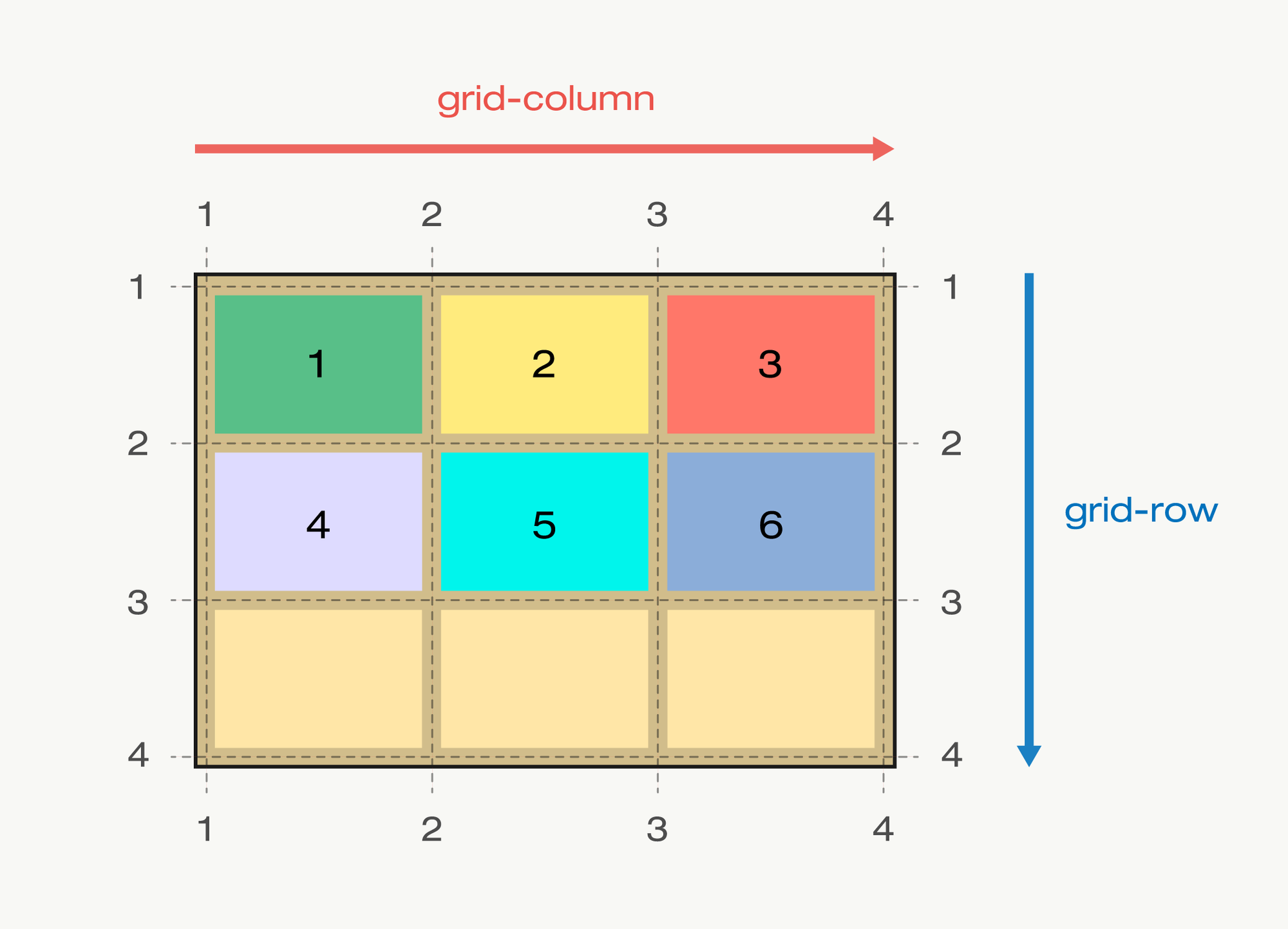
3. Grid의 arrtibute
- 그리드 트랙 : 그리드의 행(row) 또는 열(column) mian, cross axis
- 그리드 셀 : 그리드의 한 칸 (개념적인 정의)
- 그리드 라인 : 그리드 셀을 구분하는 선
- 그리드 넘버 : 그리드 라인의 각 번호
- 그리드 갭 : 그리드 셀 사이의 간격
- 그리드 에어리어 : 그리드 셀의 집합
4. 실전 적용
-
그리드의 특징 : 컨테이너를 꽉 채우려고 한다.
-
display: grid;만 적용한다고 변화하지 않는다.
(item이 block인 경우) flex의 경우엔 부모 요소에display: flex;만 적어줘도 수평으로 고르게 정렬되었는데, 아무런 변화가 없어서 그리드가 잘 적용된 건가? 하였다. -
그리드 형태 정의 :
grid-template-rows,grid-template-columns컨테이너에 Grid 트랙의 크기들을 지정해주는 속성이다. 이때, grid-template-rows는 행(row)의 배치를 나타내며, grid-template-columns는 열(column)의 배치를 나타낸다.
css /* 열의 개수 설정 */ /* grid-template-columns: 100px 100px 100px; */ /* grid-template-columns: 1fr 1fr 1fr; */ /* `grid-template-columns` : 열의 넓이 설정 */ /* `grid-template-rows` : 행의 높이를 설정 */ -
repeat 함수
repeat는 반복되는 값을 자동으로 처리할 수 있는 함수이다.css /* repeat`( 적용할 트랙의 갯수, 반복할 수치 ) 함수를 이용하면 그리드 트랙 별 수치 반복 설정 */ grid-template-columns: repeat(3,1fr); grid-template-rows: 100px 100px 100px;위 예제 코드의 두번째 속성을 repeat 함수로 나타내어 보면,
grid-template-rows: repeat(3, 100px);로 나타낼 수 있다.추가로,
fr은 fraction의 약어로, 숫자 비율대로 트랙의 크기를 균일하게 나누어 준다. -
gap :
row-gap,column-gap,gap
- margin과 유사하다.
- 단 fr 단위가 아닌 고정단위일때는 gap의 영역을 포함해서 작동하여 스크롤이 생긴다.
row-gap,column-gap의 축약형이gap이다.
css
.container {
	row-gap: 10px;
	/* row의 간격을 10px로 */
	column-gap: 20px;
	/* column의 간격을 20px로 */
}

.container {
	gap: 10px 20px;
	/* row-gap: 10px; column-gap: 20px; */
}

.container {
	gap: 20px;
	/* row-gap: 20px; column-gap: 20px; */
}- 각 셀의 영역 지정
Grid 라인 번호를 이용해서 column과 row의 범위를 결정한다. 한글과 컴퓨터의 셀 병합과 유사하다고 생각하면 이해가 쉽다.
-
grid-column-start: column 시작 번호 -
grid-column-end: column 끝 번호 -
grid-column: start와 end 속성을 한번에 쓰는 축약형 -
grid-row-start: row 시작 번호 -
grid-row-end: row 끝 번호 -
grid-row: start와 end 속성을 한번에 쓰는 축약형
css
/* grid-column-start: 1;*/
/*grid-column-end: 3; */

/* 축약형 */
/* grid-column: 1 / 3; */

/* row */
/* grid-row-start: 1;
grid-row-end: 3; */
grid-row: 1/3;

/* span : 칸의 갯수 */
/* span 없다면 기존 그리드 라인과 동일함 */
/* 1번 라인에서 3칸 */
grid-row: 1/ span 3;
5. Grid를 활용한 계산기 만들기
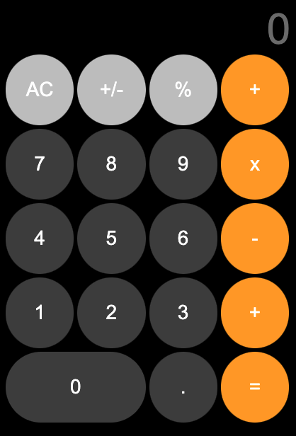
✏️ 설계
- 숫자 값이 출력되는 input tag
grid-column적용하기 - 4 * 5 의 그리드 만들기
- 숫자 '0'에
grid-column적용하기
💻 코드
html
<!DOCTYPE html>
<html lang="ko">
<head>
  <meta charset="UTF-8">
  <meta http-equiv="X-UA-Compatible" content="IE=edge">
  <meta name="viewport" content="width=device-width, initial-scale=1.0">
  <title>calculator</title>
  <link rel="stylesheet" href="./../reset.css">
  <style>
    body {
      box-sizing: border-box;
      margin: 0;
      padding: 0;
    }
    .caculator {
      width: 400px;
      height: 600px;
      margin: 0 auto;
      padding: 10px;
      color: #000000;
      background-color: #000000;
    }

    input {
      width: 100%;
      display: grid;
      grid-column: 1 / span 4;
      text-align: right;
      margin-bottom: 5px;
      background: #0000;
      border: none;
      color: #ffffff;
      font-size: 55px;
      height: 60px;
      font-size: 60px;
    }

    .first-line, .second-line, .third-line, .forth-line, .fifth-line {
      display: grid;
      height: 100px;
      grid-template-columns: repeat(4, 1fr);
      gap: 5px;
      margin-bottom: 5px;
    }

    .circle {
      border-radius: 50%;
      border: none;
      color: #fff;
      font-size: 28px;
    }

    .circle:hover {
      cursor: pointer;
    }

    .light-gray {
      background-color: #c4c4c4;
    }

    .dark-gray {
      background-color: #444444;
    }

    .orange {
      background-color: #fe9f05;
    }

    .fifth-line .circle:first-child{
      grid-column: 1/3;
      border-radius: 60px;
    }


  </style>
</head>
<body>
  <div class="caculator">
    <div class="value">
      <input type="text" placeholder="0">
    </div>
    <div class="first-line">
      <button class="circle light-gray">AC</button>
      <button class="circle light-gray">+/-</button>
      <button class="circle light-gray">%</button>
      <button class="circle orange">+</button>
    </div>
    <div class="second-line">
      <button class="circle dark-gray">7</button>
      <button class="circle dark-gray">8</button>
      <button class="circle dark-gray">9</button>
      <button class="circle orange">x</button>
    </div>
    <div class="third-line">
      <button class="circle dark-gray">4</button>
      <button class="circle dark-gray">5</button>
      <button class="circle dark-gray">6</button>
      <button class="circle orange">-</button>
    </div>
    <div class="forth-line">
      <button class="circle dark-gray">1</button>
      <button class="circle dark-gray">2</button>
      <button class="circle dark-gray">3</button>
      <button class="circle orange">+</button>
    </div>
    <div class="fifth-line">
      <button class="circle dark-gray">0</button>
      <button class="circle dark-gray">.</button>
      <button class="circle orange">=</button>
    </div>
  </div>
</body>
</html>
📒 나의 생각
실제 아이폰 유저인 나로서는 똑같은 UI인 계산기를 바탕으로 재미있게 grid를 실습할 수 있었다. 이후에는 JS를 활용해서 실제로 계산이 가능한 계산기를 만들어서 project를 더 빌드해야겠다는 생각을 하였다.