Div 컴포넌트 구현하기
width 속성과 height 속성을 가진 Div 컴포넌트를 구현해보자.
WitdhHeight 타입 만들기
export type WidthHeight = {
  width?: string
  height?: string
}
Div 컴포넌트 정의
import {WidthHeight} from './WidthHeight'

export type ReactDivProps = React.DetailedHTMLProps<
  React.HTMLAttributes<HTMLDivElement>,
  HTMLDivElement
>

export type DivProps = ReactDivProps & WidthHeight

export const Div: React.FC<DivProps> = ({width, height, style: _style, ...props}) => {
  const style = {...StyleSheetList, width, height}
  return <div {...props} style={style} />
}
컴포넌트 사용
<Div className="text-center text-blue-100 bg-blue-600" height="6rem">Div컴포넌트</Div>Avatar 컴포넌트 구현하기
Avatar 컴포넌트의 조건은 다음과 같다.
- 크기: 가로 세로 각 3rem
- 모양: 원
- 테두리: 회색이고 굵기는 5px
- 사람이미지
Avatar 컴포넌트 정의
type AvatarProps = DivProps & {
  src: string
  size?: string
}

export const Avatar: FC<AvatarProps> = ({
  className: _className,
  style,
  src,
  size,
  ...props
}) => {
  const width_height_size = size ?? '3rem'
  const className = ['rounded-full bg-gray-300 overflow-hidden', _className].join(' ')
  return (
    <Div
      {...props}
      style={style}
      width={width_height_size}
      height={width_height_size}
      className={className}>
      <img src={src} alt={src} className="object-cover object-center w-full h-full" />
    </Div>
  )
}
컴포넌트 사용
export default function AvatarTest() {
  const avatars = D.range(0, 10).map((item, index) => (
    <Avatar
      className="inline-block -ml-6 border-4 border-white"
      key={index}
      src={D.randomAvata()}
    />
  ))
  return (
    <section className="mt-4">
      <Title>Avatars</Title>
      <Div className="px-12 py-4 bg-blue-300">{avatars}</Div>
    </section>
  )
}
결과물

Overlay 컴포넌트 구현하기
Overlay 컴포넌트 정의
import type {ReactDivProps} from './Div'
import {Div} from './Div'

export type OverlayProps = ReactDivProps & {
  opacityClass?: string
}

export const Overlay: FC<OverlayProps> = ({
  className: _className,
  opacityClass,
  ...props
}) => {
  const className = [
    _className,
    'absolute z-50 w-screen h-screen',
    opacityClass ?? 'bg-black/70',
    'flex items-center justify-center'
  ].join(' ')
  return <Div {...props} className={className} top="0" left="0" />
}
DivProps 타입에
{left:string; right: string; top: string; bottom: string}
타입을 추가한 상태라고 가정하자.
컴포넌트 사용
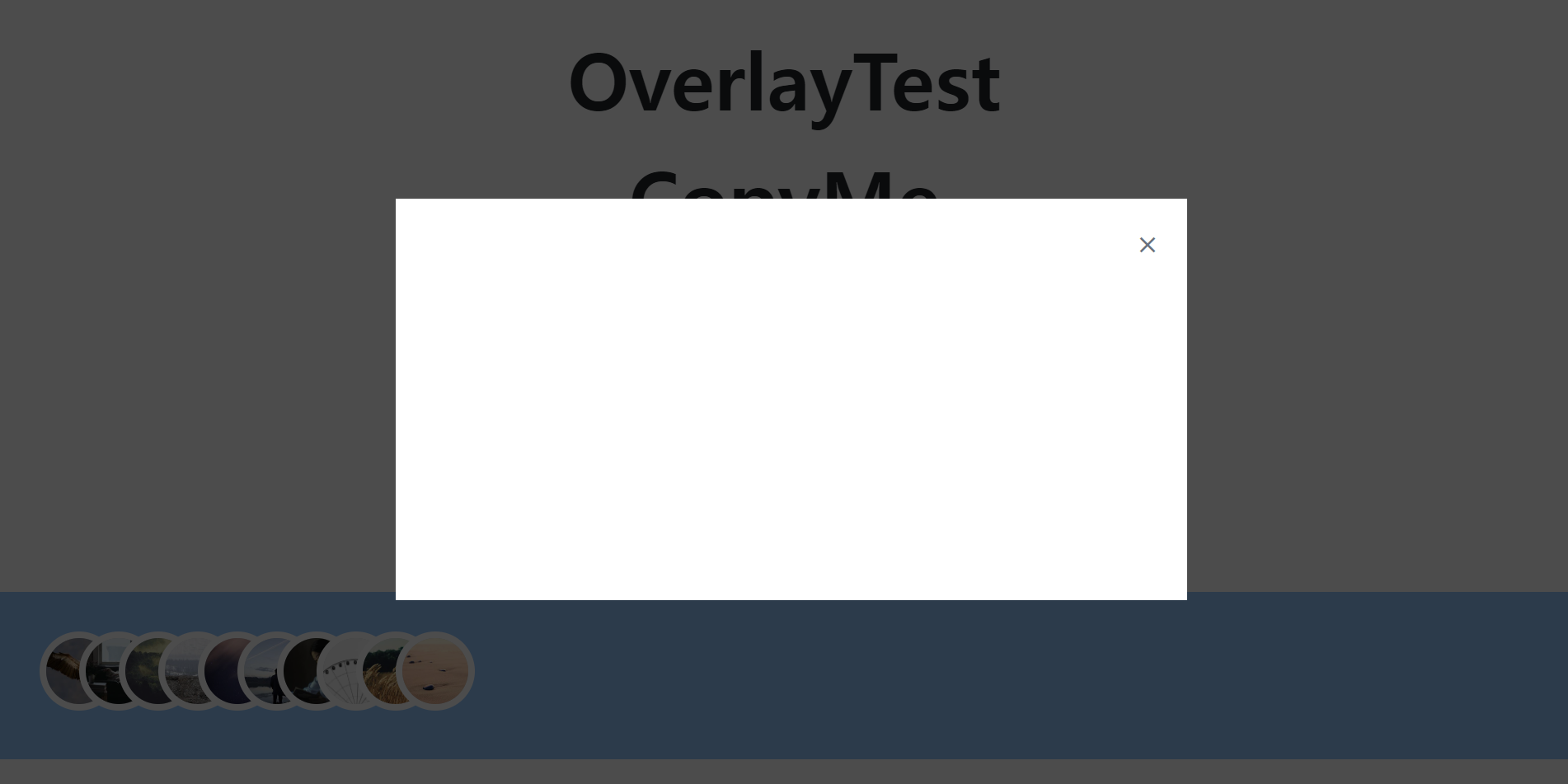
export default function OverlayTest() {
  return (
    <section className="mt-4">
      <Title>OverlayTest</Title>
      <Overlay opacityClass="bg-black/70">
        <Div className="relative flex items-center justify-center w-1/2 p-8 bg-white h-1/2">
          <Div className="absolute" right="1rem" top="1rem">
            <Icon name="close" className="text-gray-500" />
          </Div>
        </Div>
      </Overlay>
    </section>
  )
}
결과물

프론트에_가까운_풀스택_개발자