오늘은 드림코딩 엘리님의 헤더만들기 영상을 따라해 보기로 한다.
1. 구조잡기
헤더의 디자인을 미리 생각하고 HTML을 어떻게 구성할 것인지를 생각한다
반응형으로 하여 너비가 작을때와 클때를 나눠서 만들어 보려고 한다

2. HTML 작성
<!DOCTYPE html>
<html lang="en">
<head>
<meta charset="UTF-8" />
<meta name="viewport" content="width=device-width, initial-scale=1.0" />
<link
rel="stylesheet"
href="https://use.fontawesome.com/releases/v5.15.1/css/all.css"
integrity="sha384-vp86vTRFVJgpjF9jiIGPEEqYqlDwgyBgEF109VFjmqGmIY/Y4HV4d3Gp2irVfcrp"
crossorigin="anonymous"
/>
<link rel="stylesheet" href="style.css" />
<script src="main.js" defer></script> //parsing하는동안 js파일을 다운받게 하기위해 defer사용
<title>Document</title>
</head>
<body>
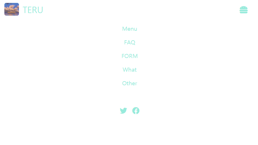
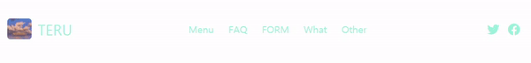
<nav class="navheader">
<div class="navheader__logo">
<a href="#">
<img src="img/chihiro043.jpg" alt="#" />
TERU
</a>
</div>
<ul class="navheader__menu">
<li><a href="#"> Menu</a></li>
<li><a href="#"> FAQ</a></li>
<li><a href="#"> FORM</a></li>
<li><a href="#"> What</a></li>
<li><a href="#"> Other</a></li>
</ul>
<ul class="navheader__icons">
<li>
<a href="#"><i class="fab fa-twitter"></i></a>
</li>
<li>
<a href="#"><i class="fab fa-facebook"></i></a>
</li>
</ul>
<a href="#" class="hambergerBtn">
<i class="fas fa-hamburger"></i>
</a>
</nav>
</body>
</html>
CSS 작성
body {
  margin: 0;
}
a {
  text-decoration: none;
  color: #98ebdc;
}

.navheader {
  display: flex;
  justify-content: space-between;
  align-items: center;
  padding: 8px 12px;
}
.navheader__logo a {
  display: flex;
  align-items: center;
  font-size: 24px;
}
.navheader__logo img {
  width: 40px;
  height: 35px;
  border-radius: 5px;
  margin-right: 10px;
}

.navheader__menu {
  display: flex;
  list-style: none;
  padding-left: 0;
}
.navheader__menu li {
  padding: 8px 12px;
}

.navheader__menu li:hover {
  background-color: beige;
  border-radius: 5px;
}

.navheader__icons {
  display: flex;
  list-style: none;
  padding-left: 0;
  font-size: 20px;
}

.navheader__icons li {
  padding-left: 0;
  padding: 8px 7px;
}

.hambergerBtn {
  display: none;
  position: absolute;
  right: 32px;
  font-size: 22px;
  margin-top: 3px;
}
@media screen and (max-width: 768px) {
  .navheader {
    flex-direction: column;
    align-items: flex-start;
  }
  .navheader__menu {
    display: none;
    width: 100%;
    flex-direction: column;
    text-align: center;
  }
  .navheader__icons {
    display: none;
    justify-content: center;
    width: 100%;
  }
  .hambergerBtn {
    display: block;
  }
  .navheader__icons.active,
  .navheader__menu.active {
    display: flex;
  }
}
javascript 작성
javascript로 toggle버튼을 만들어서 avtive class가 있을때는 메뉴가 보이게 하고 없을때는 안보이게 하도록 만들었다.
const menu = document.querySelector('.navheader__menu');
const icons = document.querySelector('.navheader__icons');
const toggleBtn = document.querySelector('.hambergerBtn');

toggleBtn.addEventListener('click', ()=>{
    menu.classList.toggle('active');
    icons.classList.toggle('active');
});
.gif)
1차: 2시간 (보고 만듬)
2차: 1시간 (보고 만듬)
3차: 27분 (안보고 만듬)

아직은 달걀안의