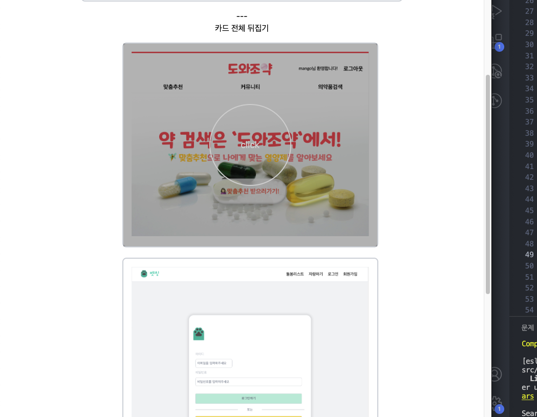
::after 요소의 렌더링
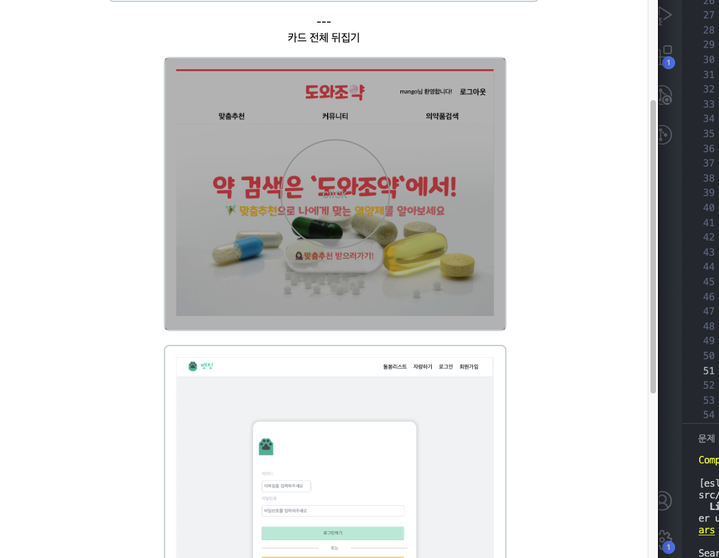
카드 앞부분의 css 작업을 하다가, hover쪽 span 부분이 카드의 ::after 요소에 겹쳐서 쭉 희미하게 보였다.
.front {
  z-index: 2;
  transform: rotateY(0deg);
  position: relative;
}

.front::after {
  content: "";
  position: absolute;
  top: 0;
  left: 0;
  width: 100%;
  height: 100%;
  background: rgba(0, 0, 0, 0);
  transition: background 0.3s ease-in-out;
}

.front span {
  width: 160px;
  height: 160px;
  border: 2px solid lightgray;
  border-radius: 50%;
  position: absolute;
  top: 50%;
  left: 50%;
  transform: translate(-50%, -50%);
  opacity: 0;
  transition: opacity 0.3s ease-in-out;
  font-size: large;
  display: flex;
  align-items: center;
  justify-content: center;
  color: lightgray;
}

.front:hover span {
  opacity: 1;
}

.front:hover::after {
  background: rgba(0, 0, 0, 0.3);
}
처음에는 opacity 문제인가 싶어서 헛다리를 짚었다 ㅜㅜ
실제로는 ::after 가 기본적으로 콘텐츠를 가장 마지막에 추가하기 때문에, 같은 위치에 있는 다른 요소들 위에 렌더링 돼서, span 위에 덧입혀진다고 보면 된다.
해결 방법은 span에 z-index를 집어넣어주면 된다!
z-index: 1;넣어주면 span이 깔끔하게 나오는 모습을 확인할 수 있다.

진화중인 돌리입니다 :>