
오늘은 프론트엔드 개발자 필수 상식 styled-components 사용법을 알아보자.
💅 Styled Components?
먼저 styled components를 공식문서에서 어떻게 설명하고 있는지 살펴보자.
styled-components is the result of wondering how we could enhance CSS for styling React component systems. By focusing on a single use case we managed to optimize the experience for developers as well as the output for end users.
: styled-components는 React 컴포넌트 시스템에서 스타일링을 어떻게 향상시킬 수 있을지에 대한 고민의 결과다. 특정 사례에 중점을 두며 개발자의 경험과 사용자의 결과를 최적화 할 수 있었다.
✨styled-components의 장점✨
-
Automatic critical CSS
: 페이지에 렌더링된 컴포넌트를 추적, 해당 스타일링만 자동 삽입
→ 필요한 최소한의 코드만 로드할 수 있음 -
No class name bugs
: 고유한 클래스 이름을 생성
→ 겹침 또는 철자 오류를 고려할 필요 없음 -
Easier deletion of CSS
: 클래스 이름 사용 시 어디에서 사용되는지 알기 어려울 수 있음. styled-components의 경우 각 스타일링이 특정 컴포넌트에 연결되므로 명확함 -
Simple dynamic styling
: props 또는 글로벌 테마에 기반한 컴포넌트 스타일링으로 간편하고 직관적으로 스타일링 가능 -
Painless maintenance
: 컴포넌트에 영향을 미치는 스타일을 찾기 위해 여러 파일 찾아 다니지 않아도 되므로 유지 보수가 간단 -
Automatic vendor prefixing
: 현재 표준에 맞는 css를 작성하면 나머지는 styled-components가 처리해줌
⬇️ Install..!
# with npm
npm install styled-components

# with yarn
yarn add styled-components
⚙️ 사용법
아래 예시는 react, typescript, styled-components를 사용해 작성되었다.
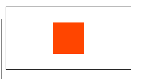
1. 기본 사용법
const 변수명 = styled.html요소`
	...css..
`;

<변수명 /> -> 컴포넌츠처럼 사용
import React from 'react';
import styled from 'styled-components';
import theme from '@/styles/theme';
const Example = () => (
<Container />
);
export default Example;
const Container = styled.div`
width: 400px;
height: 200px;
display: flex;
gap: 10px;
align-items: center;
justify-content: center;
border: 1px solid;
font-family: ${theme.fontFamily.medium};
`;2. props 사용법
interface ExProps{
example: example type;
}
const SimpleDiv = styled.div<ExProps>`
// props의 상태에 따라 동적으로 스타일을 적용
// 아래 두 코드는 같게 동작한다.
제어할 css 코드: ${(props) => props.example && 옵션 };
제어할 css 코드: ${({ example }) => example && 옵션 };›
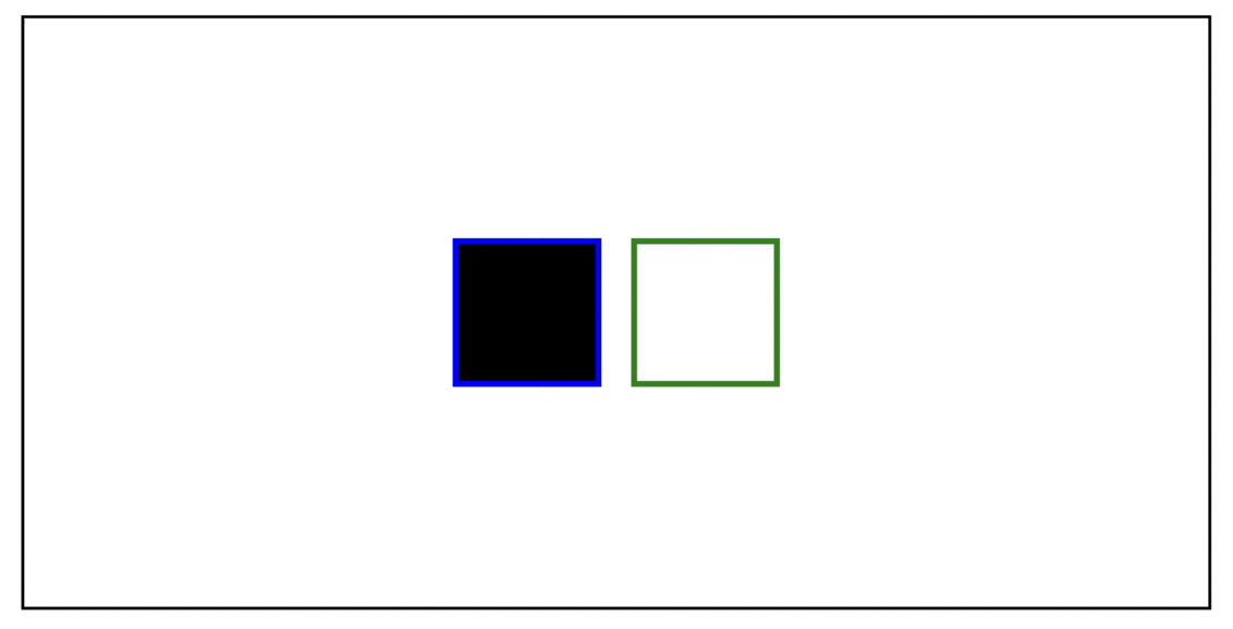
`;다음은 props 사용 예시이다.
import React, { useState } from 'react';
import styled from 'styled-components';
import theme from '@/styles/theme';

const Example = () => {
  const [ex1, setEx1] = useState<boolean>(true);
  const [ex2, setEx2] = useState<boolean>(true);

  return (
    <Container>
      <SimpleDiv example1={ex1} example2={ex2} />
      <SimpleDiv example1={!ex1} example2={!ex2} />
    </Container>
  );
};

export default Example;

const Container = styled.div`
  width: 400px;
  height: 200px;
  display: flex;
  gap: 10px;
  align-items: center;
  justify-content: center;
  border: 1px solid;
  font-family: ${theme.fontFamily.medium};
`;

interface SimpleDivProps{
  example1: boolean;
  example2: boolean;
}
const SimpleDiv = styled.div<SimpleDivProps>`
  width: 50px;
  height: 50px;
  background-color:  ${(props) => props.example1 && 'black'};
  border: 2px solid ${({ example2 }) => (example2 ? 'blue' : 'green')};›
`;
3. 스타일 상속
const 상속할 컴포넌트 = styled.div`
...css 코드...
`;
const 상속받을 컴포넌트 = styled(상속할 컴포넌트)`
...추가할 css 코드...
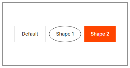
`;다음은 스타일 상속 예시이다.
기본형 DefaultShape를 상속해 Shape1과 Shape2를 만들었다.
import React, { useState } from 'react';
import styled from 'styled-components';
import theme from '@/styles/theme';

const Example = () => {
  const [ex1, setEx1] = useState<boolean>(false);

  return (
    <Container>
      <DefaultShape>Default</DefaultShape>
      <Shape1>Shape 1</Shape1>
      <Shape2>Shape 2</Shape2>
    </Container>
  );
};

export default Example;

const Container = styled.div`
  width: 400px;
  height: 200px;
  display: flex;
  gap: 10px;
  align-items: center;
  justify-content: center;
  border: 1px solid;
  font-family: ${theme.fontFamily.medium};
`;

const DefaultShape = styled.div`
  width: 100px;
  height: 50px;
  display: flex;
  align-items: center;
  justify-content: center;
  border: 1px solid;
`;

const Shape1 = styled(DefaultShape)`
  border-radius: 50%;
`;

const Shape2 = styled(DefaultShape)`
  background-color: orangered;
  color: white;
`;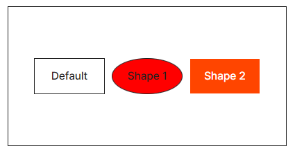
물론 스타일드 컴포넌트의 타입도 상속이 가능하다.
import React, { useState } from 'react';
import styled from 'styled-components';
import theme from '@/styles/theme';

const Example = () => {
  const [ex1, setEx1] = useState<boolean>(false);

  const onClickEx1 = () => {
    setEx1((prev) => !prev);
  };

  return (
    <Container>
      <DefaultShape>Default</DefaultShape>
      <Shape1 example={ex1} onClick={onClickEx1}>Shape 1</Shape1>
      <Shape2>Shape 2</Shape2>
    </Container>
  );
};

export default Example;

const Container = styled.div`
  width: 400px;
  height: 200px;
  display: flex;
  gap: 10px;
  align-items: center;
  justify-content: center;
  border: 1px solid;
  font-family: ${theme.fontFamily.medium};
`;

interface ShapeProps{
  example?: boolean;
}
const DefaultShape = styled.div<ShapeProps>`
  width: 100px;
  height: 50px;
  display: flex;
  align-items: center;
  justify-content: center;
  border: 1px solid;
`;

const Shape1 = styled(DefaultShape)`
  border-radius: 50%;
  background-color: ${({ example }) => (example ? 'red' : 'green')};
`;

const Shape2 = styled(DefaultShape)`
  background-color: orangered;
  color: white;
`;
4. 스타일드 컴포넌트 활용
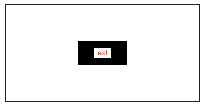
4-1. 하위 요소의 스타일 제어하기
상위요소인 div에서 div안 button 즉 하위 요소에 스타일링을 추가해보자.
import React, { useState } from 'react';
import styled from 'styled-components';
import theme from '@/styles/theme';

const Example = () => {
  const [ex1, setEx1] = useState<boolean>(false);

  const onClickEx1 = () => {
    setEx1((prev) => !prev);
  };

  return (
    <Container>
      <SimpleDiv>
        <button type="button" onClick={onClickEx1}>ex!</button>
      </SimpleDiv>
    </Container>
  );
};

export default Example;

const Container = styled.div`
  width: 400px;
  height: 200px;
  display: flex;
  gap: 10px;
  align-items: center;
  justify-content: center;
  border: 1px solid;
  font-family: ${theme.fontFamily.medium};
`;

const SimpleDiv = styled.div`
  width: 100px;
  height: 50px;
  display: flex;
  align-items: center;
  justify-content: center;
  background-color: black;

  & > button{
    cursor: pointer;
    border: none;
    background: none;
    background-color: white;
    color: orangered;
  }
`;
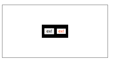
4-2. 특정 클래스에만 스타일 추가하기
div안 두 button 중 check-me-out class에만 스타일을 주고 싶을 때
import React, { useState } from 'react';
import styled from 'styled-components';
import theme from '@/styles/theme';
const Example = () => {
const [ex1, setEx1] = useState<boolean>(false);
const onClickEx1 = () => {
setEx1((prev) => !prev);
};
return (
<Container>
<SimpleDiv>
<button type="button" onClick={onClickEx1}>ex!</button>
<button className="check-me-out" type="button" onClick={onClickEx1}>ex!</button>
</SimpleDiv>
</Container>
);
};
export default Example;
const Container = styled.div`
width: 400px;
height: 200px;
display: flex;
gap: 10px;
align-items: center;
justify-content: center;
border: 1px solid;
font-family: ${theme.fontFamily.medium};
`;
const SimpleDiv = styled.div`
width: 100px;
height: 50px;
display: flex;
gap: 10px;
align-items: center;
justify-content: center;
background-color: black;
& > button.check-me-out {
cursor: pointer;
border: none;
background: none;
background-color: white;
color: orangered;
}
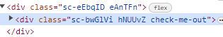
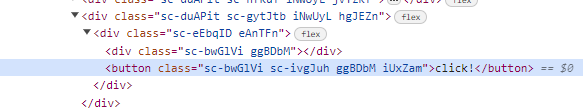
`;참고로 클래스 네임은 이렇게 나온다.
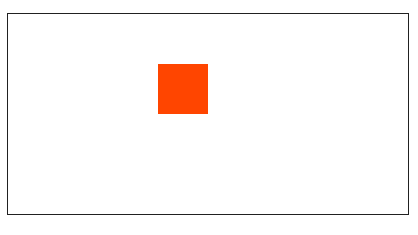
4-3. 애니메이션 적용
간단한 회전 애니메이션을 적용해보자.
import React from 'react';
import styled from 'styled-components';
import theme from '@/styles/theme';

const Example = () => (
  <Container>
    <SimpleDiv />
  </Container>
);

export default Example;

const Container = styled.div`
  width: 400px;
  height: 200px;
  display: flex;
  gap: 10px;
  align-items: center;
  justify-content: center;
  border: 1px solid;
  font-family: ${theme.fontFamily.medium};
`;

const SimpleDiv = styled.div`
  width: 50px;
  height: 50px;
  background-color: orangered;
  animation: spin 1s ease-in-out 0s 1 reverse forwards;
  @keyframes spin  {
      from {
        transform: translate(-50%, -50%) rotate(0);
    }
    to {
      transform: translate(-50%, -50%) rotate(720deg);
    }
  }
`;
아래 코드는 keyframes를 이용해 애니메이션을 정의한 경우로 동작은 위와 같다.
import React from 'react';
import styled, { keyframes } from 'styled-components';
import theme from '@/styles/theme';

const Example = () => (
  <Container>
    <SimpleDiv />
  </Container>
);

export default Example;

const Container = styled.div`
  width: 400px;
  height: 200px;
  display: flex;
  gap: 10px;
  align-items: center;
  justify-content: center;
  border: 1px solid;
  font-family: ${theme.fontFamily.medium};
`;

const spin = keyframes`
  from { transform: translate(-50%, -50%) rotate(0); }
  to { transform: translate(-50%, -50%) rotate(720deg); }
`;

const SimpleDiv = styled.div`
  width: 50px;
  height: 50px;
  background-color: orangered;
  animation: ${spin} 1s ease-in-out 0s 1 reverse forwards;
`;
4-4. & 선택자 사용
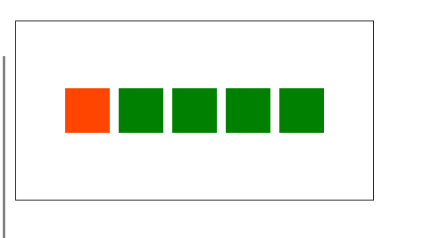
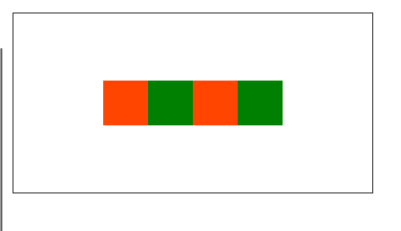
& === 자기 자신을 선택1. & + &
: 형제 요소 중에서 바로 뒤에 나오는 동일한 타입의 요소에 스타일을 적용하는 방법
import React from 'react';
import styled from 'styled-components';
import theme from '@/styles/theme';

const Example = () => (
  <Container>
    <SimpleDiv />
    <SimpleDiv />
    <SimpleDiv />
    <SimpleDiv />
    <SimpleDiv />
  </Container>
);

export default Example;

const Container = styled.div`
  width: 400px;
  height: 200px;
  display: flex;
  align-items: center;
  justify-content: center;
  border: 1px solid;
  font-family: ${theme.fontFamily.medium};
`;

const SimpleDiv = styled.div`
  width: 50px;
  height: 50px;
  background-color: orangered;
  & + & {
    margin-left: 10px;
    background-color: green;
  }
`;
예를들어 border를 줄 때 형제 요소와 보더가 겹친다면?
import React from 'react';
import styled from 'styled-components';
import theme from '@/styles/theme';

const Example = () => (
  <Container>
    <SimpleDiv />
    <SimpleDiv />
    <SimpleDiv />
    <SimpleDiv />
    <SimpleDiv />
  </Container>
);

export default Example;

const Container = styled.div`
  width: 400px;
  height: 200px;
  display: flex;
  align-items: center;
  justify-content: center;
  border: 1px solid;
  font-family: ${theme.fontFamily.medium};
`;

const SimpleDiv = styled.div`
  width: 50px;
  height: 50px;
  background-color: orangered;
  & + & {
    border-left: 2px solid;
    background-color: orange;
  }
`;
이런식으로도 활용 가능하다.
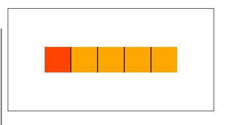
2. 스타일을 짝수 혹은 홀수번째만 적용하고 싶을 때
짝수는 even, 홀수는 odd를 사용하면 된다.
import React from 'react';
import styled from 'styled-components';
import theme from '@/styles/theme';

const Example = () => (
  <Container>
    <SimpleDiv />
    <SimpleDiv />
    <SimpleDiv />
    <SimpleDiv />
  </Container>
);

export default Example;

const Container = styled.div`
  width: 400px;
  height: 200px;
  display: flex;
  align-items: center;
  justify-content: center;
  border: 1px solid;
  font-family: ${theme.fontFamily.medium};
`;

const SimpleDiv = styled.div`
  width: 50px;
  height: 50px;
  background-color: orangered;
  &:nth-child(even) {
    background-color: green;
  }
`;
3. 속성 선택자 활용하기
특정 조건에서만 스타일을 주고 싶을 때
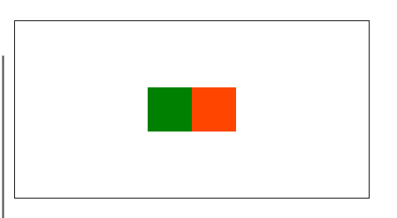
import React, { useState } from 'react';
import styled from 'styled-components';
import theme from '@/styles/theme';

const Example = () => {
  const [num, setNum] = useState<number>(1);
  return (
    <Container>
	// num이 1일때만 스타일링을 주고 싶다면
      <SimpleDiv data-example={num === 1} />
      <SimpleDiv />
    </Container>
  );
};

export default Example;

const Container = styled.div`
  width: 400px;
  height: 200px;
  display: flex;
  align-items: center;
  justify-content: center;
  border: 1px solid;
  font-family: ${theme.fontFamily.medium};
`;

const SimpleDiv = styled.div`
  width: 50px;
  height: 50px;
  background-color: orangered;
  &[data-example = "true"]{
    background-color: green;
  }
`;
4. as & attrs 사용하기
1. attrs
: attributes를 삽입하기 위한 메서드
input button img 등 의 arribute를 바꾸고 싶을 때 사용 가능
아래 예시를 보자
import React from 'react';
import styled from 'styled-components';
import theme from '@/styles/theme';

const Example = () => (
  <Container>
    <SimpleDiv />
  </Container>
);

export default Example;

const Container = styled.div`
  width: 400px;
  height: 200px;
  display: flex;
  gap: 10px;
  align-items: center;
  justify-content: center;
  border: 1px solid;
  font-family: ${theme.fontFamily.medium};
`;

const SimpleDiv = styled.div.attrs({
  size: '100px',
})`
  width: ${(props) => props.size};
  height: ${(props) => props.size};
  background-color: orangered;
`;
as와 attrs 활용하기
이번엔 as와 attrs를 사용해 스타일을 유지하며 div를 button으로 바꿔보자
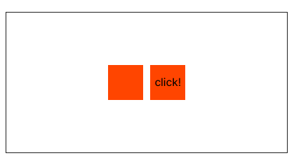
import React from 'react';
import styled from 'styled-components';
import theme from '@/styles/theme';

const Example = () => (
 <Container>
   <SimpleDiv />
   <SimpleButton>click!</SimpleButton>
 </Container>
);

export default Example;

const Container = styled.div`
 width: 400px;
 height: 200px;
 display: flex;
 gap: 10px;
 align-items: center;
 justify-content: center;
 border: 1px solid;
 font-family: ${theme.fontFamily.medium};
`;

const SimpleDiv = styled.div`
 width: 50px;
 height: 50px;
 background-color: orangered;
`;

const SimpleButton = styled(SimpleDiv).attrs({ as: 'button' })`
 cursor: pointer;
 border: none;
`;
아래와 같이 button으로 태그가 변경된 것을 확인할 수 있다.
잘보고갑니다~~~