현재 오즈코딩스쿨 강의를 통해 프론트엔드를 학습하고 있습니다.
본 포스트는 해당 강의에 대한 내용 정리를 목적으로 합니다.
1. SCSS(SASS)

SCSS는 Sass(Syntactically Awesome Style Sheets)의 문법 중 하나로, 기존 CSS 문법과 거의 유사하지만 훨씬 더 강력한 기능을 제공한다.(문법적으로 짱멋진 스타일 시트) Sass는 CSS 전처리기(preprocessor)로, 스타일을 더 체계적이고 효율적으로 작성할 수 있게 해준다.
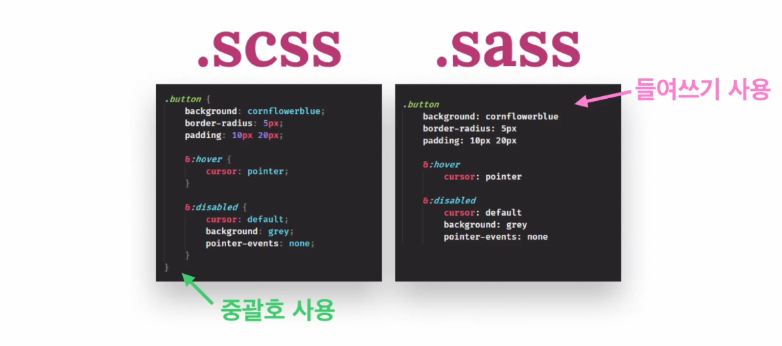
1) 사용 방법
-
설치 :
npm install sass -
SCSS 파일 작성:
.scss확장자로 저장 -
컴파일 필요: SCSS는 브라우저가 직접 이해하지 못하므로 CSS로 변환해줘야 함
- 보통
sass input.scss output.css명령어 사용하거나 - Webpack, Vite 같은 번들러에 설정하거나
- VSCode 확장 프로그램 사용
- 보통
2) 변수(Variables)
a. 🎨 색상 (Color)
$light-gray:rgb(240, 240, 240);
$dark-gray:rgb(100, 100, 100);

element1 {
  background-color: $light-gray;
  color: $dark-gray;
}

element2 {
  background-color: $light-gray;
  color: $dark-gray;
}
b. 🔢 숫자 (Number: 단위 있음/없음)
$base-padding: 16px;
$line-height: 1.5;

.container {
  padding: $base-padding;
  line-height: $line-height;
}
c. 🧵 문자열 (String)
$font-stack: 'Helvetica Neue', sans-serif;
$icon-name: "arrow-right";

.text {
  font-family: $font-stack;
}

.icon::before {
  content: $icon-name;
}
d. 📦 리스트 (List)
$spacing-scale: 4px 8px 16px 32px;

.card {
  margin: nth($spacing-scale, 3); // 16px
}
e. 🗃️ 맵 (Map)
$theme-colors: (
  primary: #3498db,
  secondary: #2ecc71,
  danger: #e74c3c
);

.alert {
  background-color: map-get($theme-colors, danger);
}
3) 중첩(Nesting)
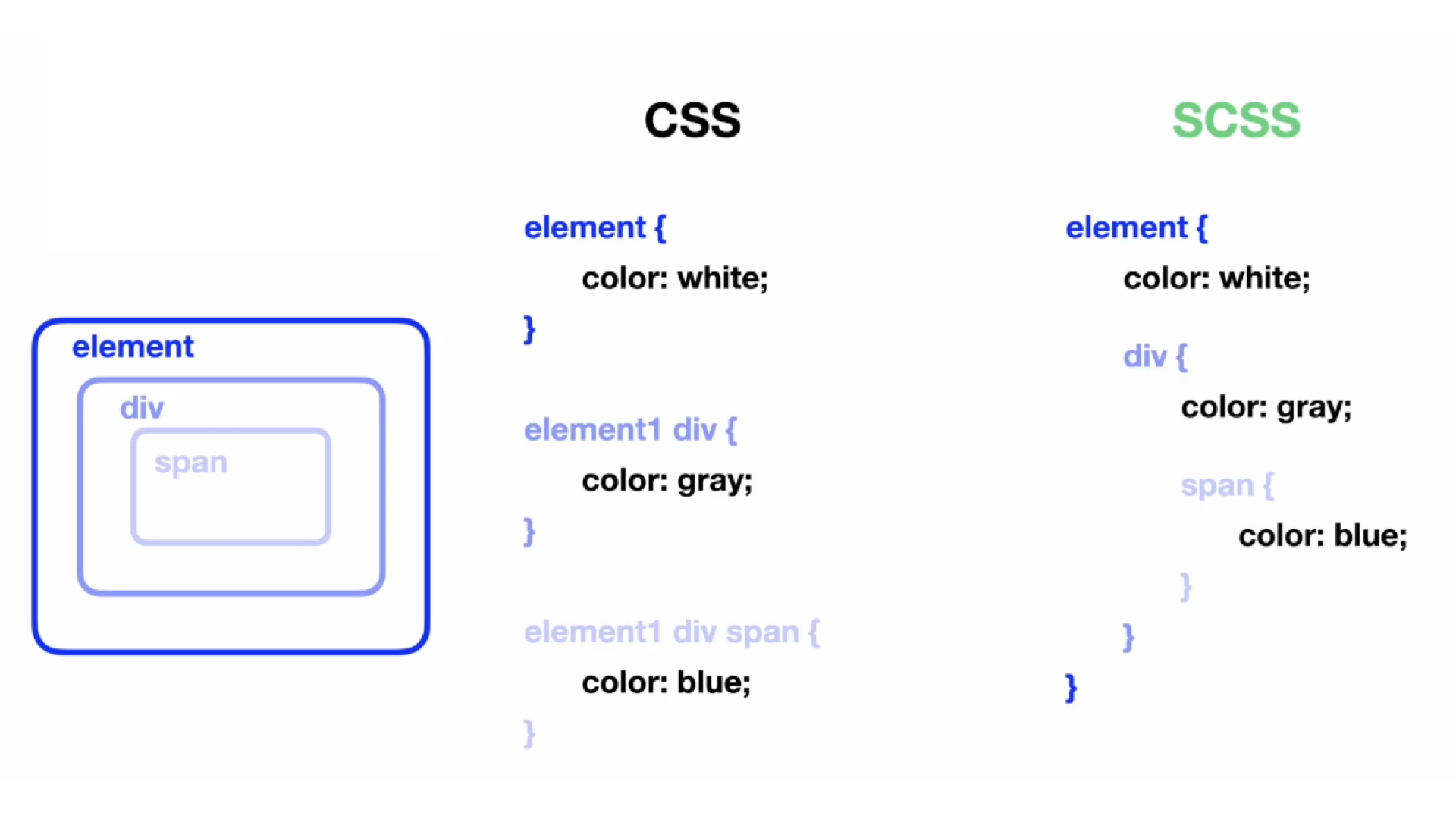
a. 기본 중첩 규칙 예시
scss
.nav {
  background-color: #333;

  ul {
    list-style: none;

    li {
      display: inline-block;

      a {
        color: white;
        text-decoration: none;
      }
    }
  }
}
css
.nav ul {
  list-style: none;
}

.nav ul li {
  display: inline-block;
}

.nav ul li a {
  color: white;
  text-decoration: none;
}
b. 복잡한 CSS 구조에서 중첩으로 코드 간결화 예시
scss
.card {
  border: 1px solid #ccc;
  padding: 16px;

  .title {
    font-size: 20px;
    font-weight: bold;
  }

  .content {
    font-size: 16px;
    color: #555;

    p {
      margin-bottom: 10px;
    }

    a {
      color: blue;

      &:hover {
        text-decoration: underline;
      }
    }
  }
}
css
.card {
  border: 1px solid #ccc;
  padding: 16px;
}

.card .title {
  font-size: 20px;
  font-weight: bold;
}

.card .content {
  font-size: 16px;
  color: #555;
}

.card .content p {
  margin-bottom: 10px;
}

.card .content a {
  color: blue;
}

.card .content a:hover {
  text-decoration: underline;
}
c. 중첩의 장단점
장점
| 장점 | 설명 |
|---|---|
| 가독성 향상 | 부모-자식 관계가 명확하게 표현돼서 구조 파악이 쉬움 |
| 코드 간결 | 선택자를 반복해서 작성할 필요 없음 |
| 구조적인 코딩 | 컴포넌트 기반 구조와 잘 어울림 |
단점
| 단점 | 설명 |
|---|---|
| 과도한 중첩 | 너무 깊은 중첩은 CSS가 비대해지고, 디버깅이 어려움 (.a .b .c .d .e {...}) |
| 명시도 과도 | specificity(우선순위)가 높아져서 스타일 덮어쓰기 어려움 |
| 재사용성 저하 | 너무 특정 구조에 맞춘 중첩은 재사용이 어려움 |
📌 tip: 중첩은 2~3단계까지만 사용하는 걸 권장해요!
4) 믹스인(Mixins)
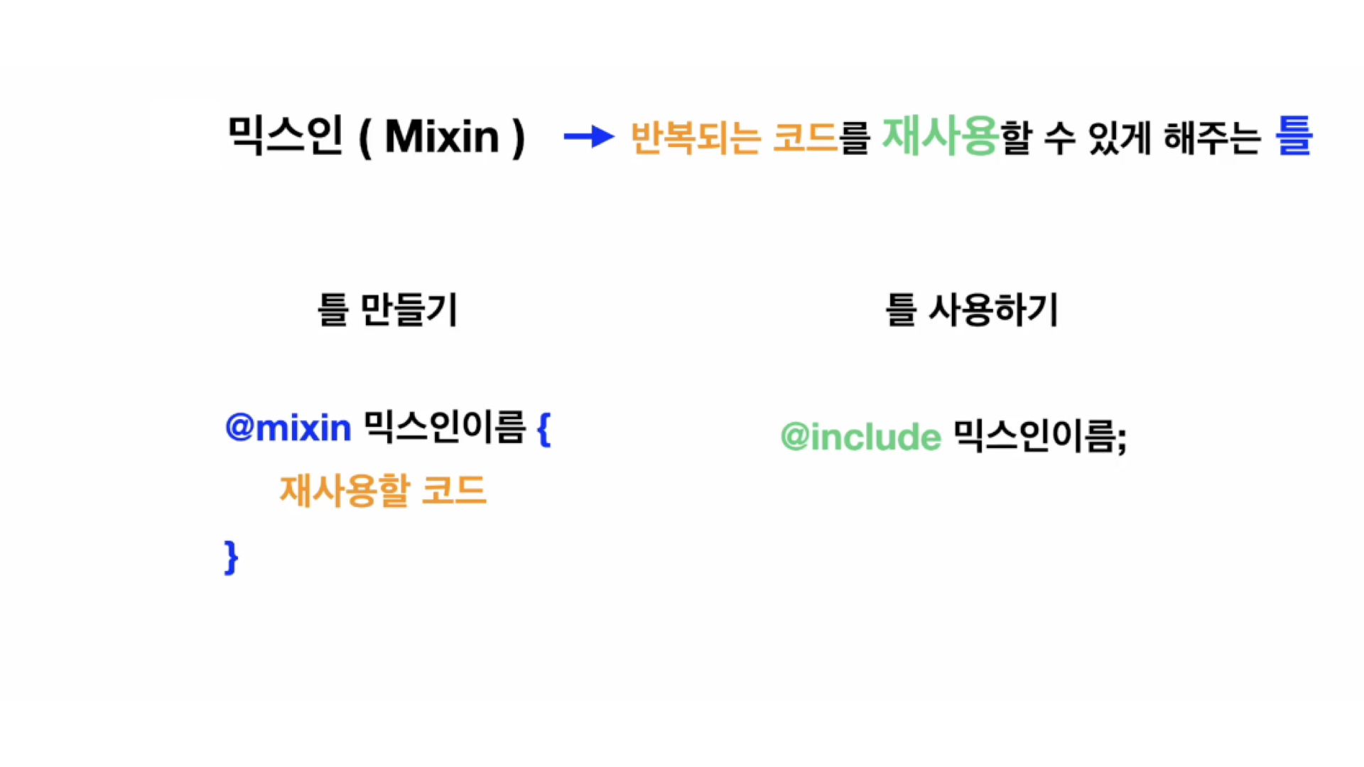
a. 믹스인 선언 및 호출 방법
선언
@mixin 이름 {
  // 스타일 속성들
}
호출
@include 이름;예시
@mixin flex-center {
  display: flex;
  justify-content: center;
  align-items: center;
}

.box {
  @include flex-center;
  width: 200px;
  height: 200px;
}
b. 인자를 사용하는 믹스인의 활용법
믹스인에 인자(argument) 를 주면 더 유연하게 사용할 수 있다
@mixin size($width, $height) {
  width: $width;
  height: $height;
}

.image {
  @include size(300px, 200px);
}
또는 기본값 설정도 가능
@mixin button($bg: #3498db, $color: white) {
  background-color: $bg;
  color: $color;
  padding: 10px 20px;
  border-radius: 4px;
}
c. 반복되는 스타일 블록 → 믹스인으로 분리 예시
기존 CSS (반복 많은 스타일)
.alert-success {
  padding: 10px;
  border-radius: 4px;
  background-color: #dff0d8;
  color: #3c763d;
}

.alert-warning {
  padding: 10px;
  border-radius: 4px;
  background-color: #fcf8e3;
  color: #8a6d3b;
}

.alert-danger {
  padding: 10px;
  border-radius: 4px;
  background-color: #f2dede;
  color: #a94442;
}
개선된 SCSS (믹스인 사용)
@mixin alert-style($bg, $color) {
  padding: 10px;
  border-radius: 4px;
  background-color: $bg;
  color: $color;
}

.alert-success {
  @include alert-style(#dff0d8, #3c763d);
}

.alert-warning {
  @include alert-style(#fcf8e3, #8a6d3b);
}

.alert-danger {
  @include alert-style(#f2dede, #a94442);
}
개선 효과
| 항목 | 개선 전 | 개선 후 |
|---|---|---|
| 중복 코드 | 많음 | 없음 |
| 유지보수 | 색상 하나 바꾸려면 3곳 수정 | 믹스인 하나 수정하면 끝 |
| 가독성 | 비슷한 스타일 반복 | 구조 명확, DRY 원칙 적용 |
5) 상속(Extend / Inheritance)
%base-btn {
  padding: 10px;
  border-radius: 5px;
}

.btn-primary {
  @extend %base-btn;
  background-color: blue;
}
6) 연산(Operation)
.container {
  width: 100% / 3;
}
7) 조건문/반복문 (if, for, each, while 등)
@for $i from 1 through 3 {
  .col-#{$i} {
    width: 100% * $i / 3;
  }
}
UI/UX디자이너의 코딩 공부